
Project Client: Champions Church || @championscc
Project Type: Brand Family of Main, Youth & Kids
Zero precent church.
That’s what Champions Church in Houston, Texas wanted in their new main church logo design and we were pumped to deliver. This group had lots of bold and punchy design inspiration pieces which are totally unconventional in the world of church space.
We pulled design inspiration from things like streetwear and 70s sporting good stores, while still keeping things refined and versatile across their different ministry groups.
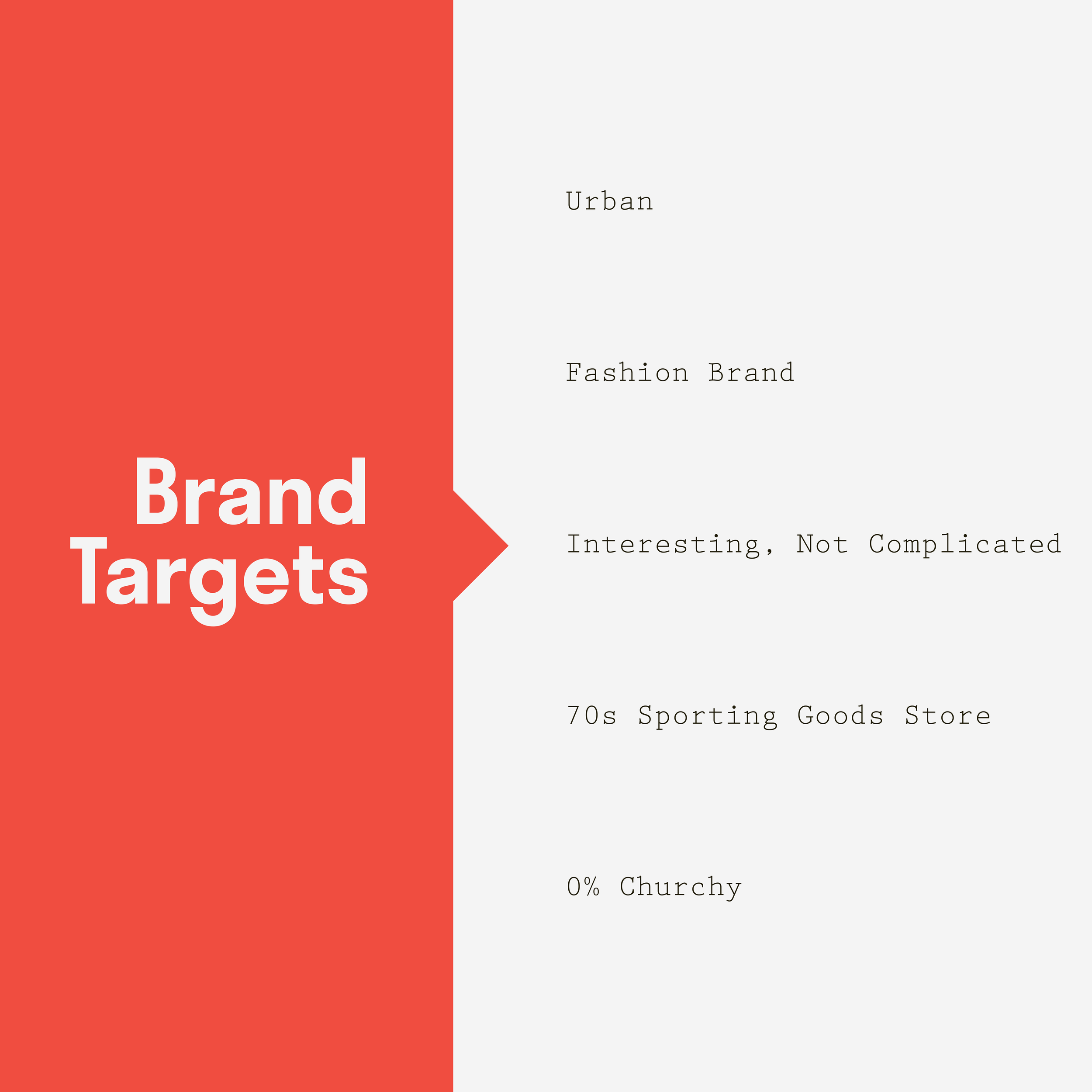

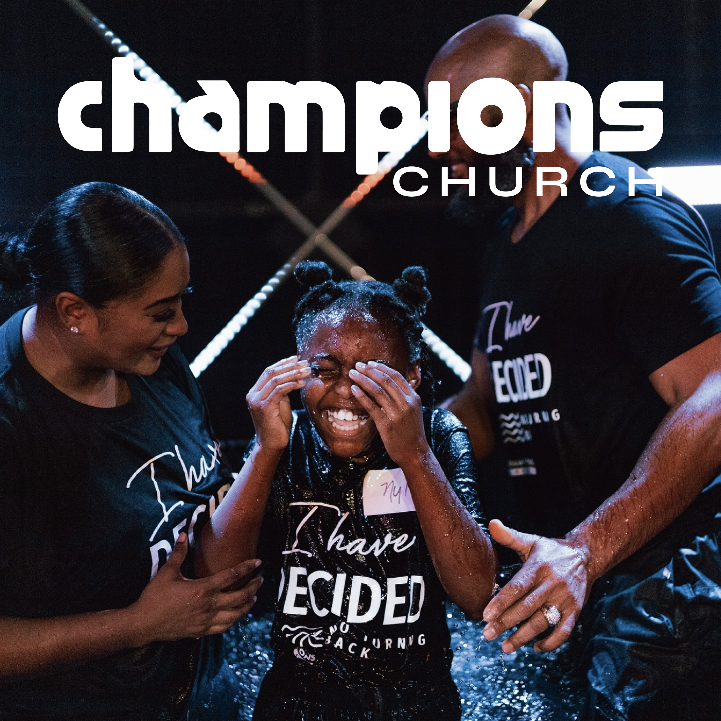
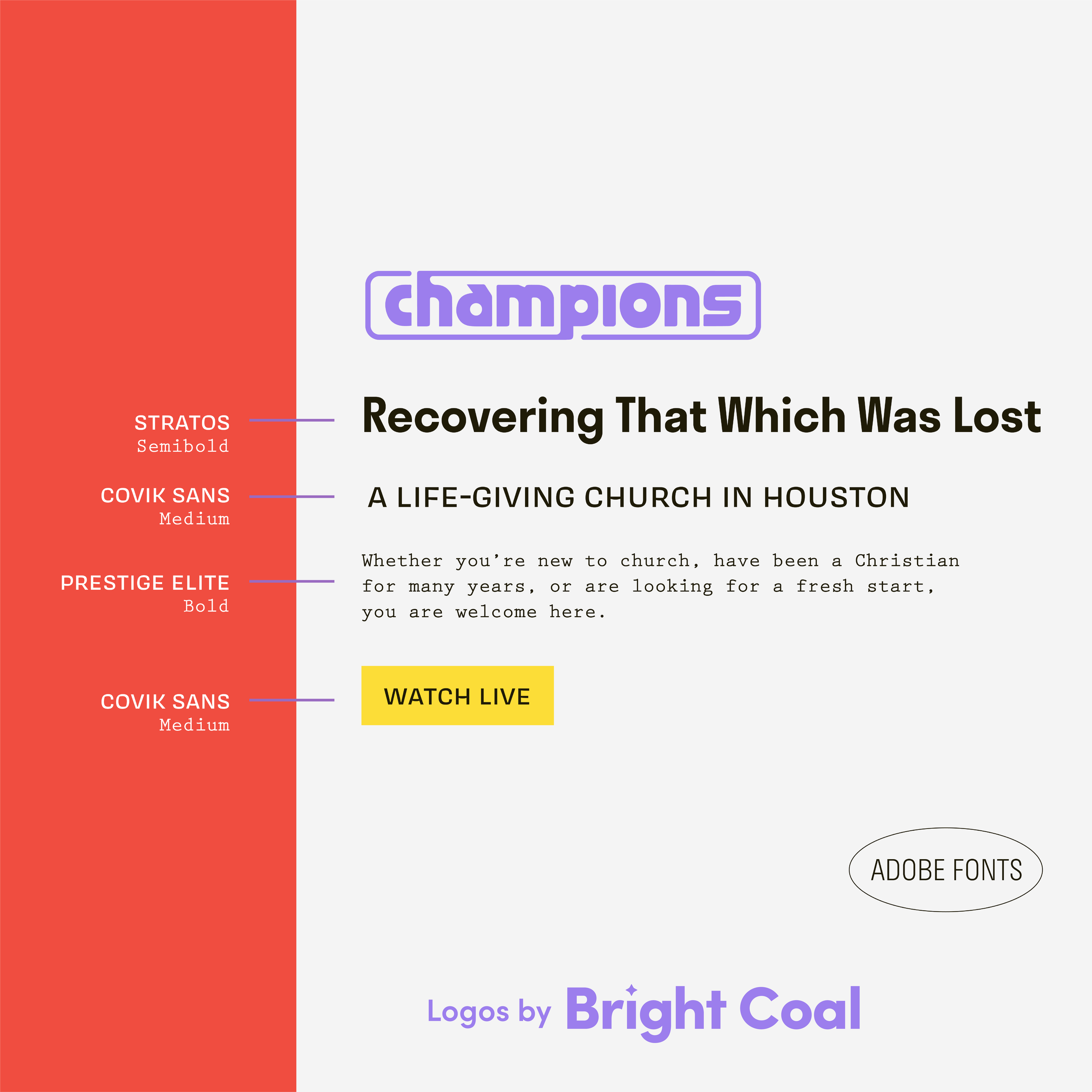

Does your main church logo need symbols and icons inside their main marks? Not necessarily. This word mark church logo design fits the neighborhood through its bold and kind of unruly nature. It’s closer to a sneaker shop or vintage athletic brand than anything you’d find on a bulletin.
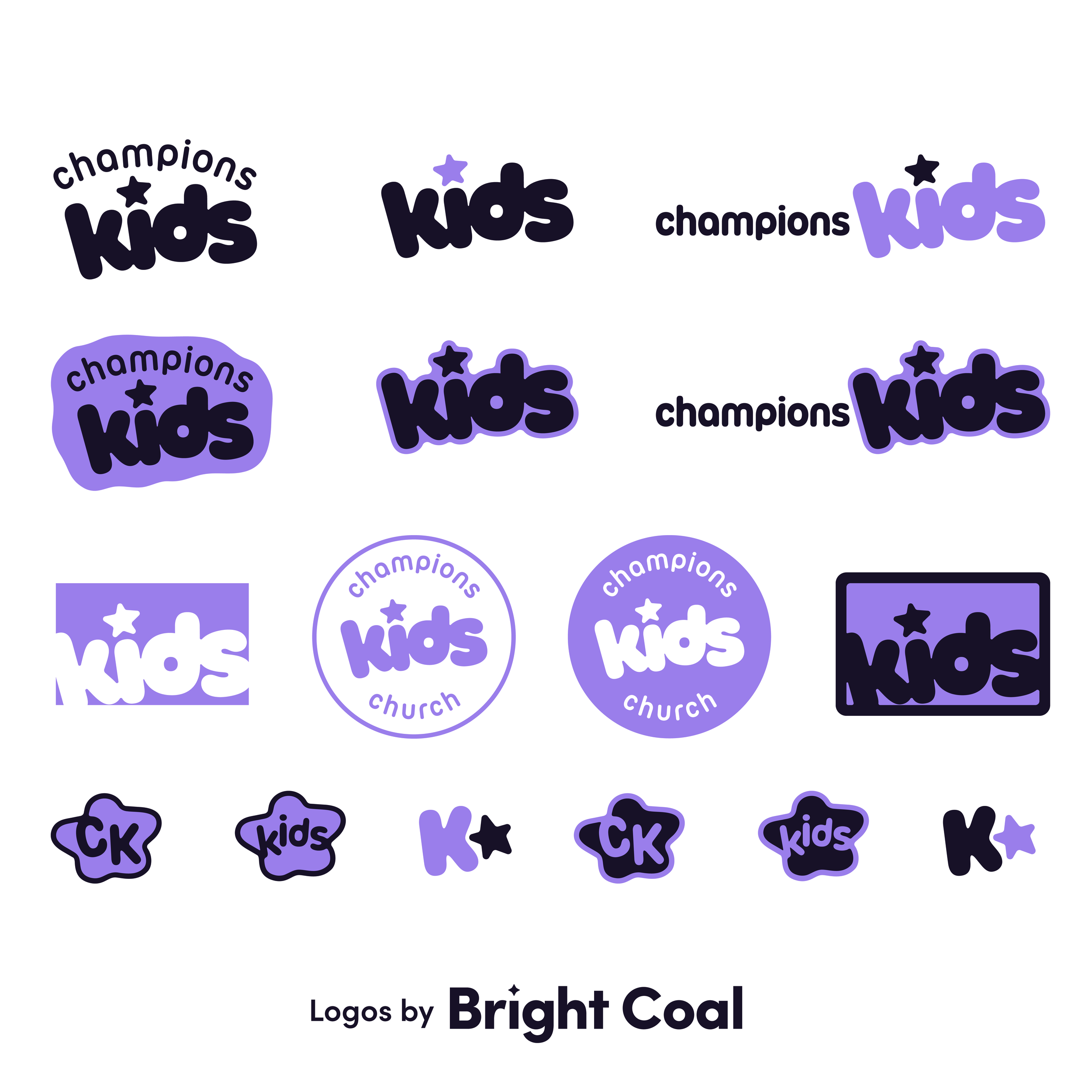
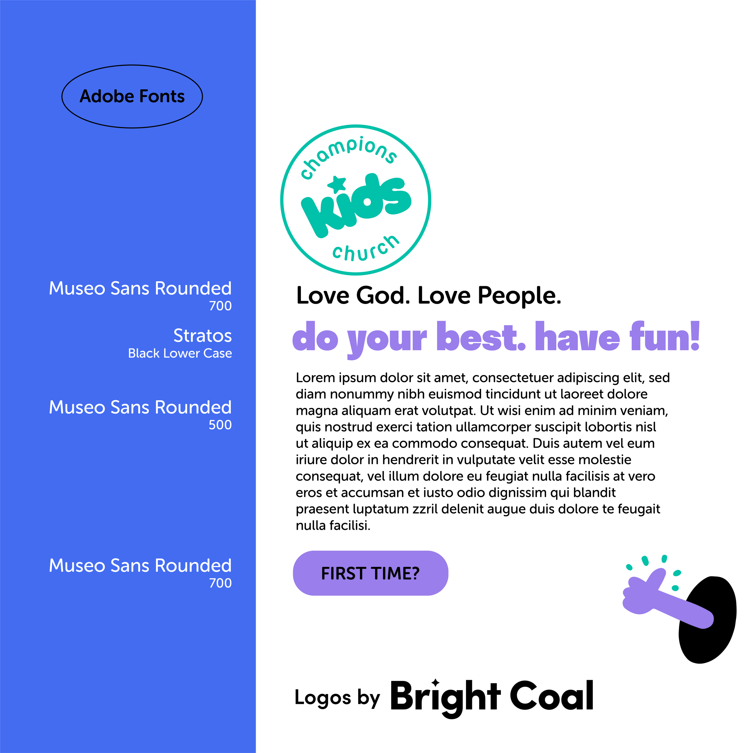
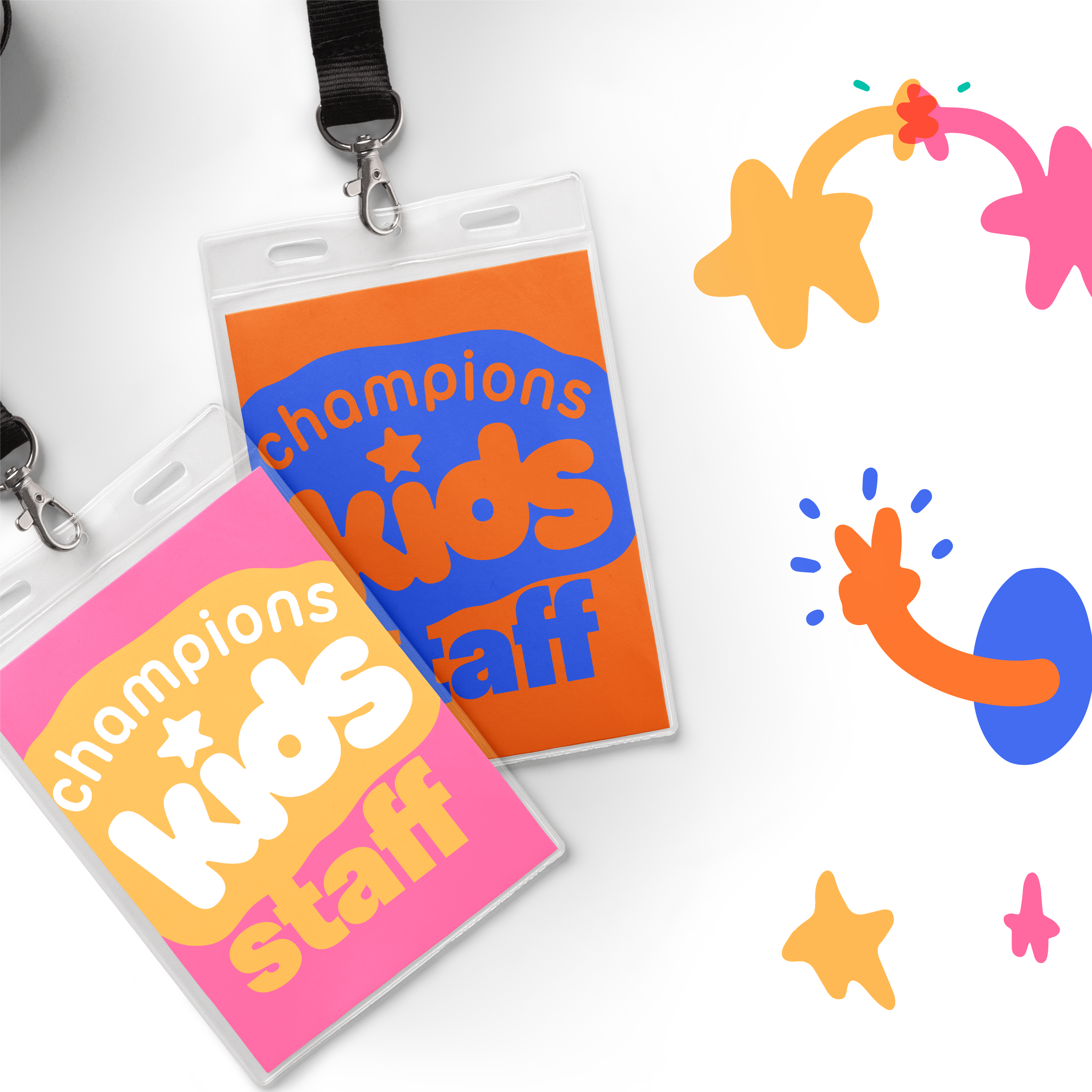
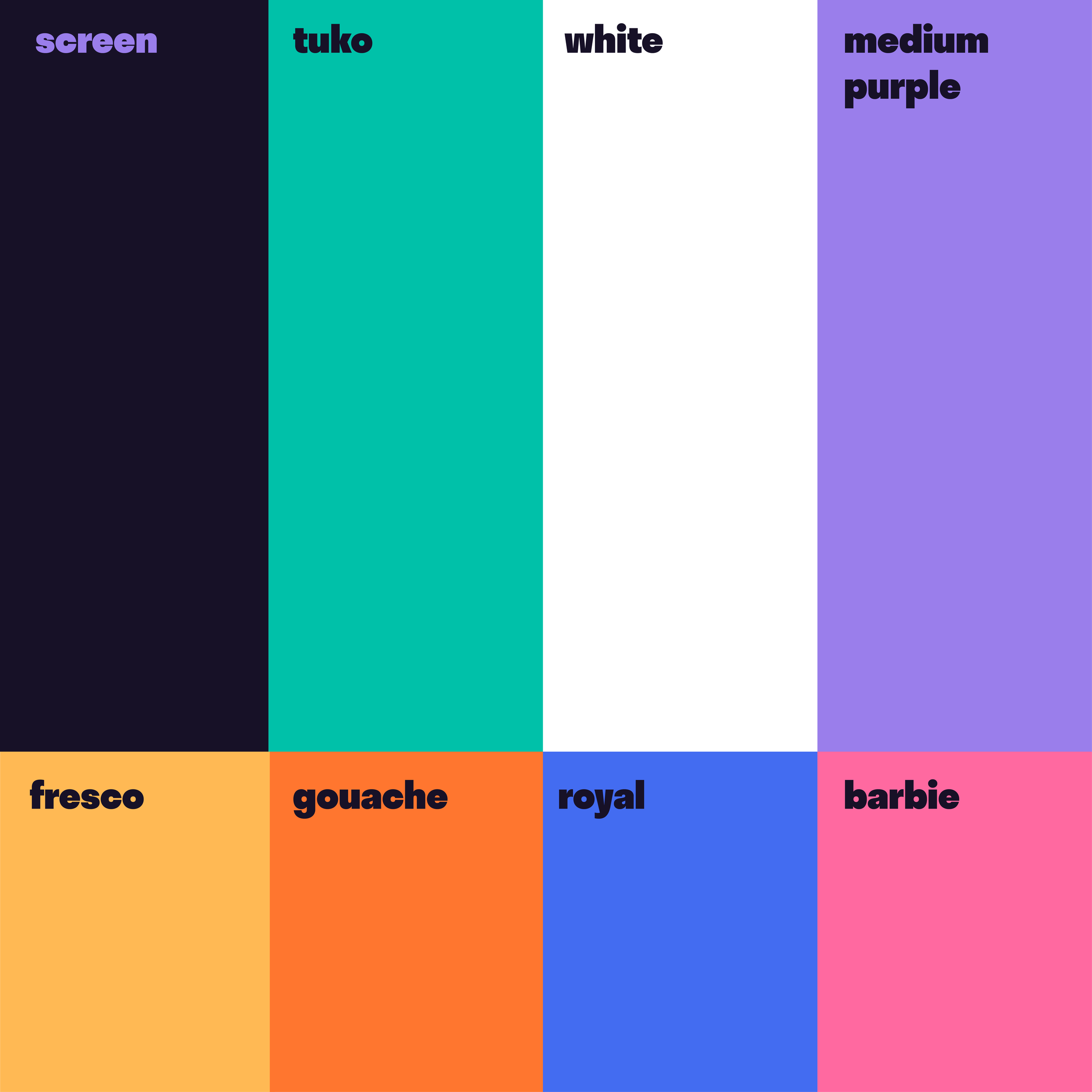
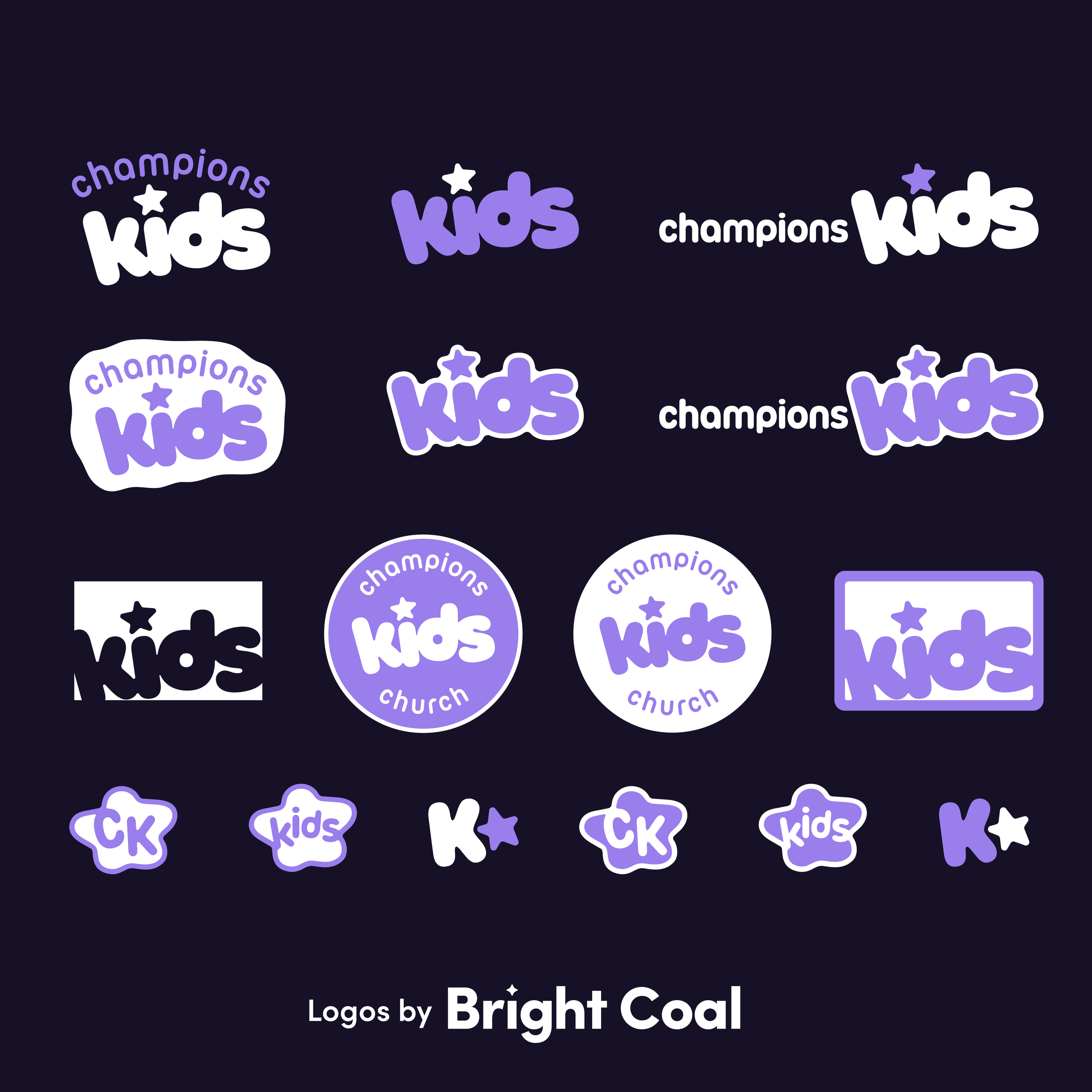
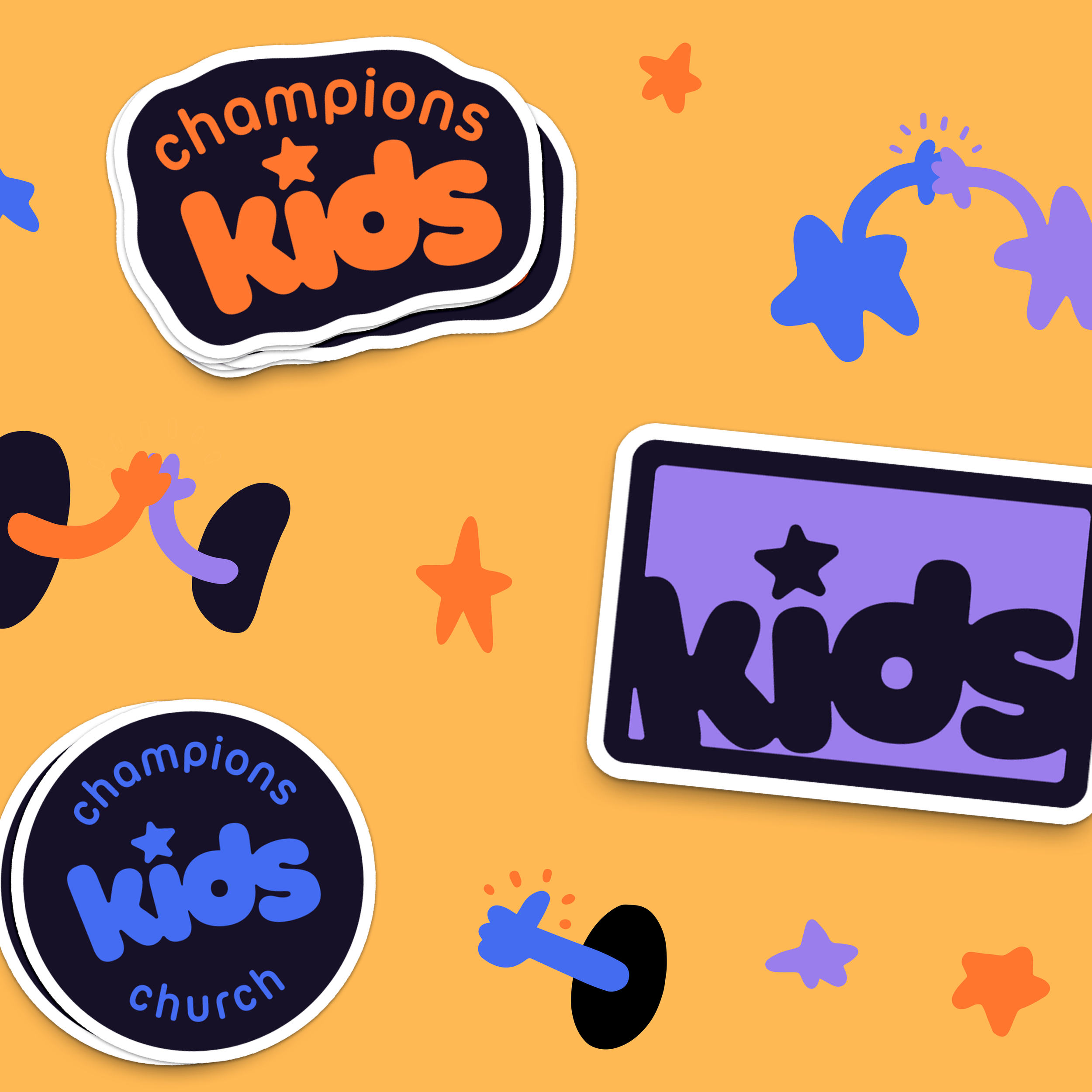
Dropping images that are overtly religious doesn’t mean Champions Church isn’t being true to their purpose. They’re trying to reach people no one is reaching. For a lot of people, seeing crosses and steeples might be a reason for them to think, “this isn’t for me.” This is a community that wants people to let their guard down and come as they are. We see these ideas translated across their coordinating student ministry logos and children’s ministry branding.
There's no other church in the Houston community who looks like this church. Most church and ministry logos look alike and start to blend together. A distinct, short word mark helps visitors not have to guess at what they’re experiencing. It's easy to recall, quick to recognize, and stands apart from everything else in the area. The custom font we built for the main branding does a lot of that work. It's polished and unique to this ministry.
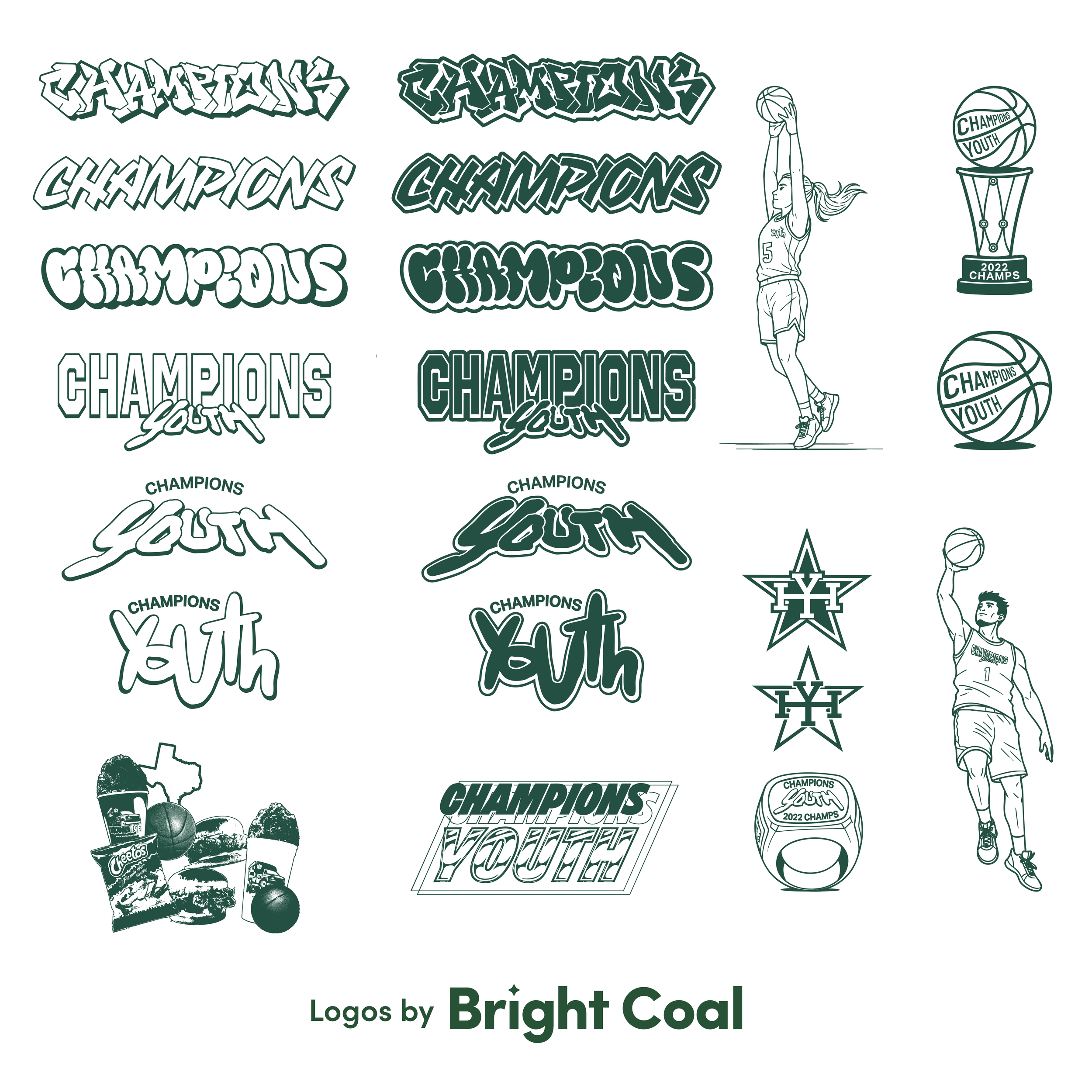

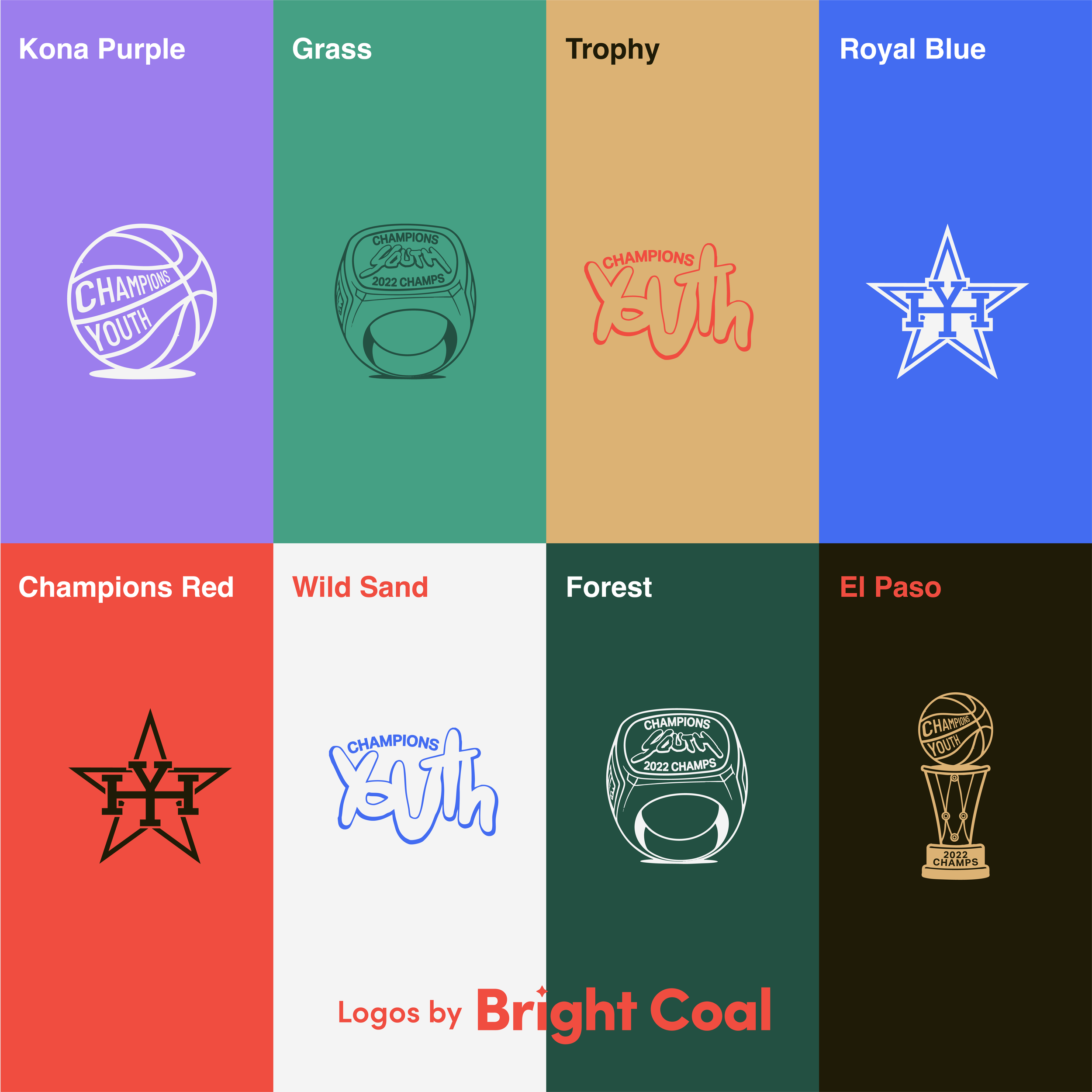
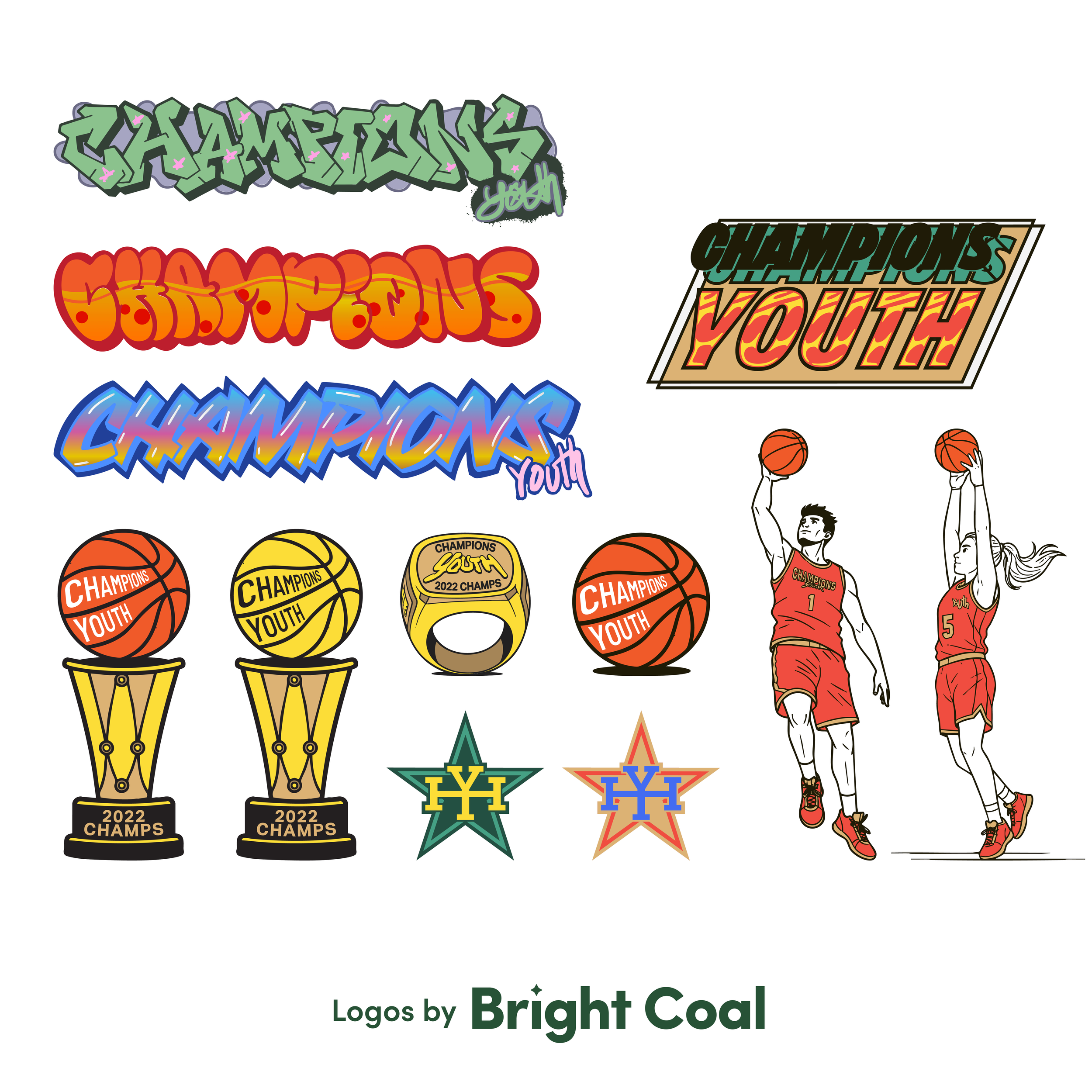
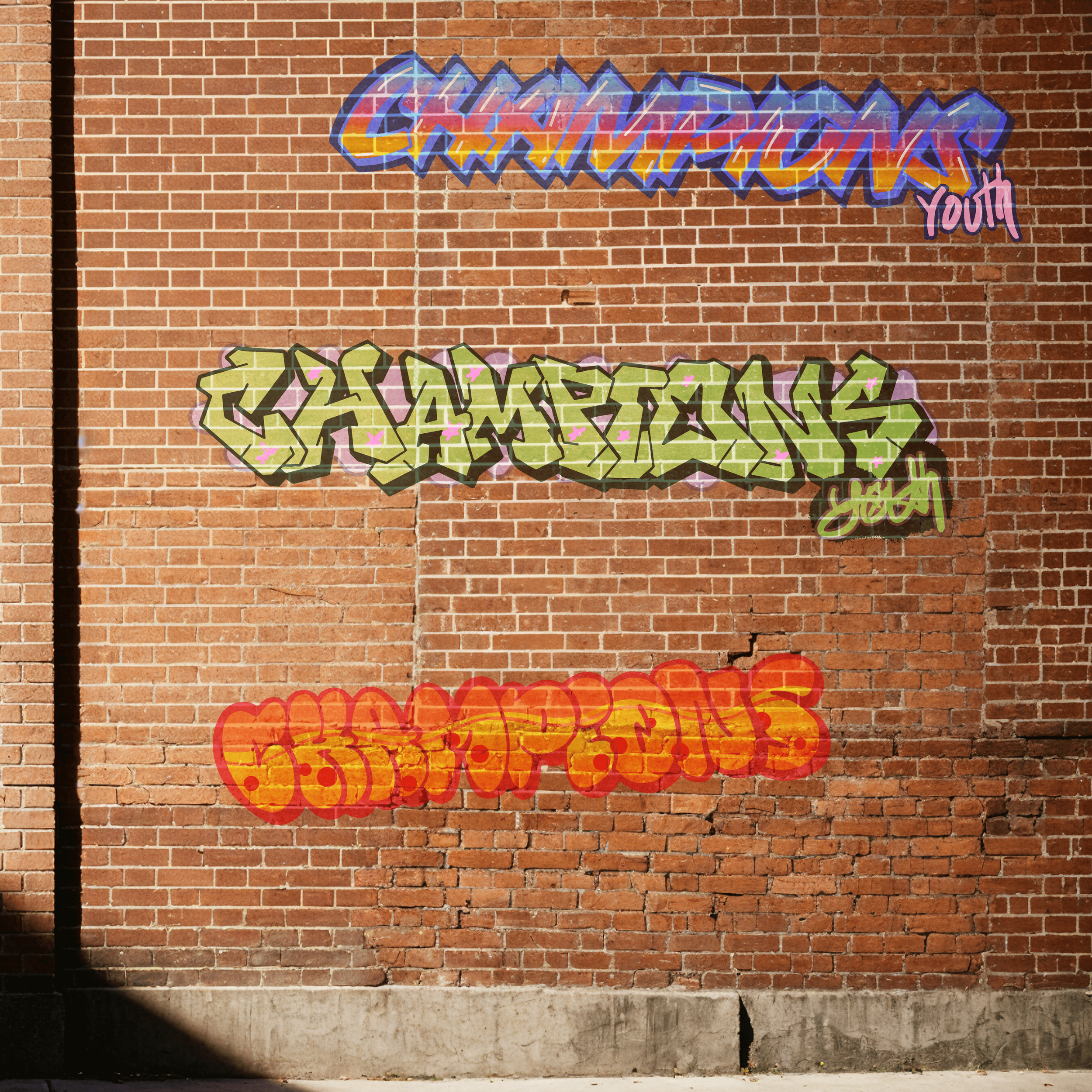
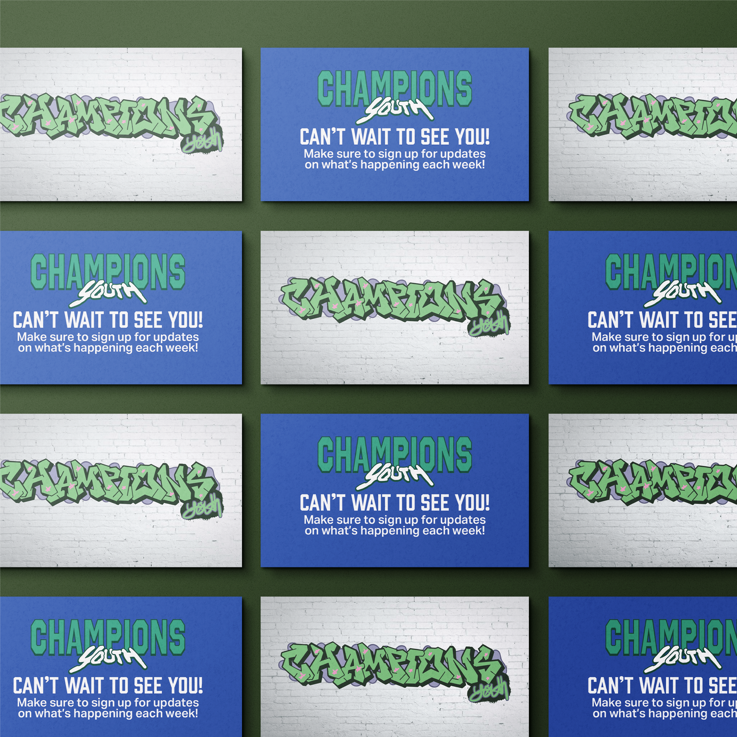
We do not recommend doing an edgy, unconventional church logo design if your culture can’t support it. It would be a bait and switch to have this modern church brand only to be met with a more traditional Sunday morning service. It won't be the right move for every congregation. Some churches are rooted in tradition, or have strong denominational ties. Other ministries will discover that a certain Biblical symbol is exactly the icon they want front and center.
Your unique church logo design should look like the community you actually are. If that happens to look like a 70s athletic wear brand with a little chaos in it, we know a graphic design studio that can help.