
Why Landmarks Make Great Church Logo Designs
When it comes to church logo designs, the key ingredient might be sitting right outside the front door. Let’s talk through some architectural logo design examples and why your physical landmarks, the ones people pass every week, might be the smartest logo inspiration.
Church Steeple Design Examples
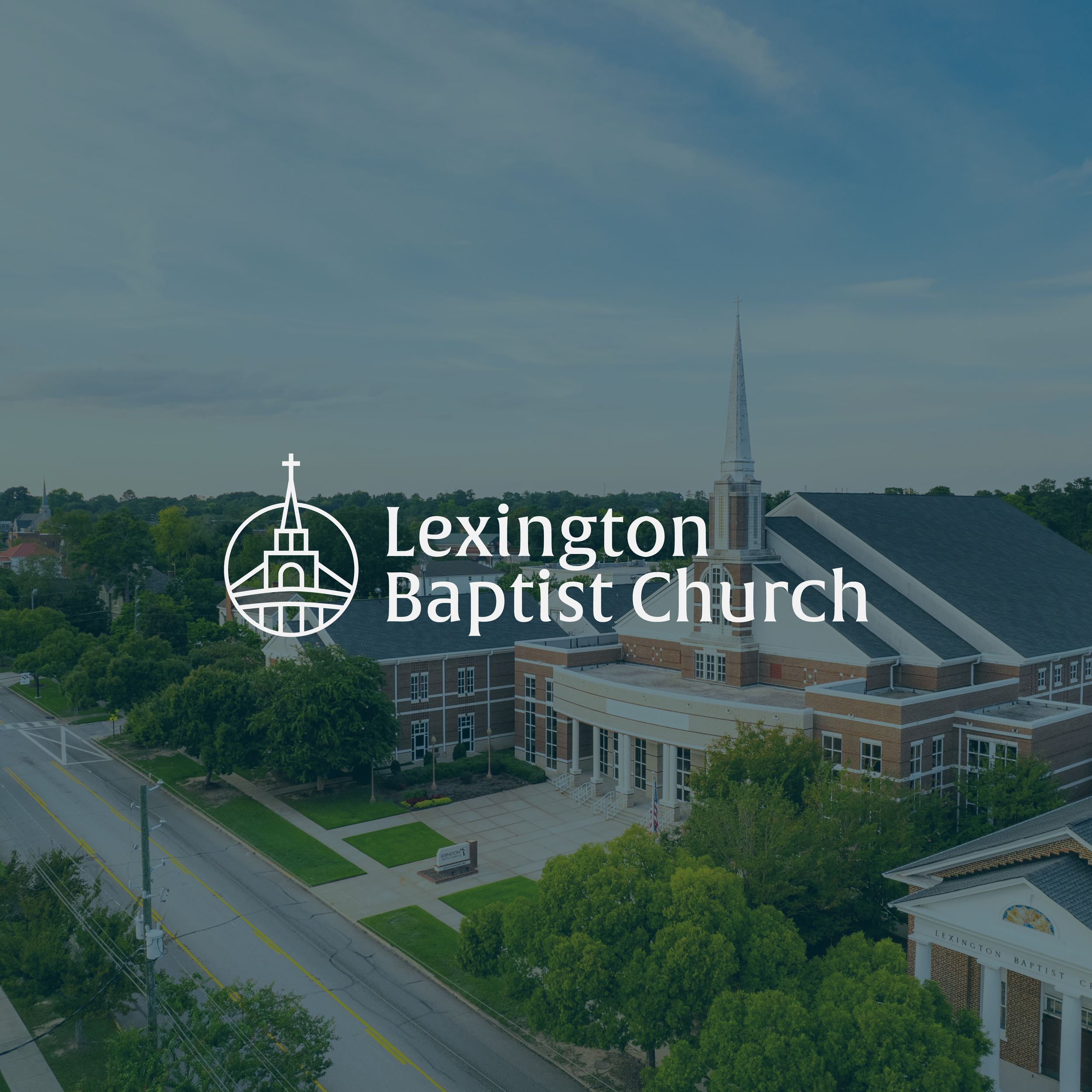
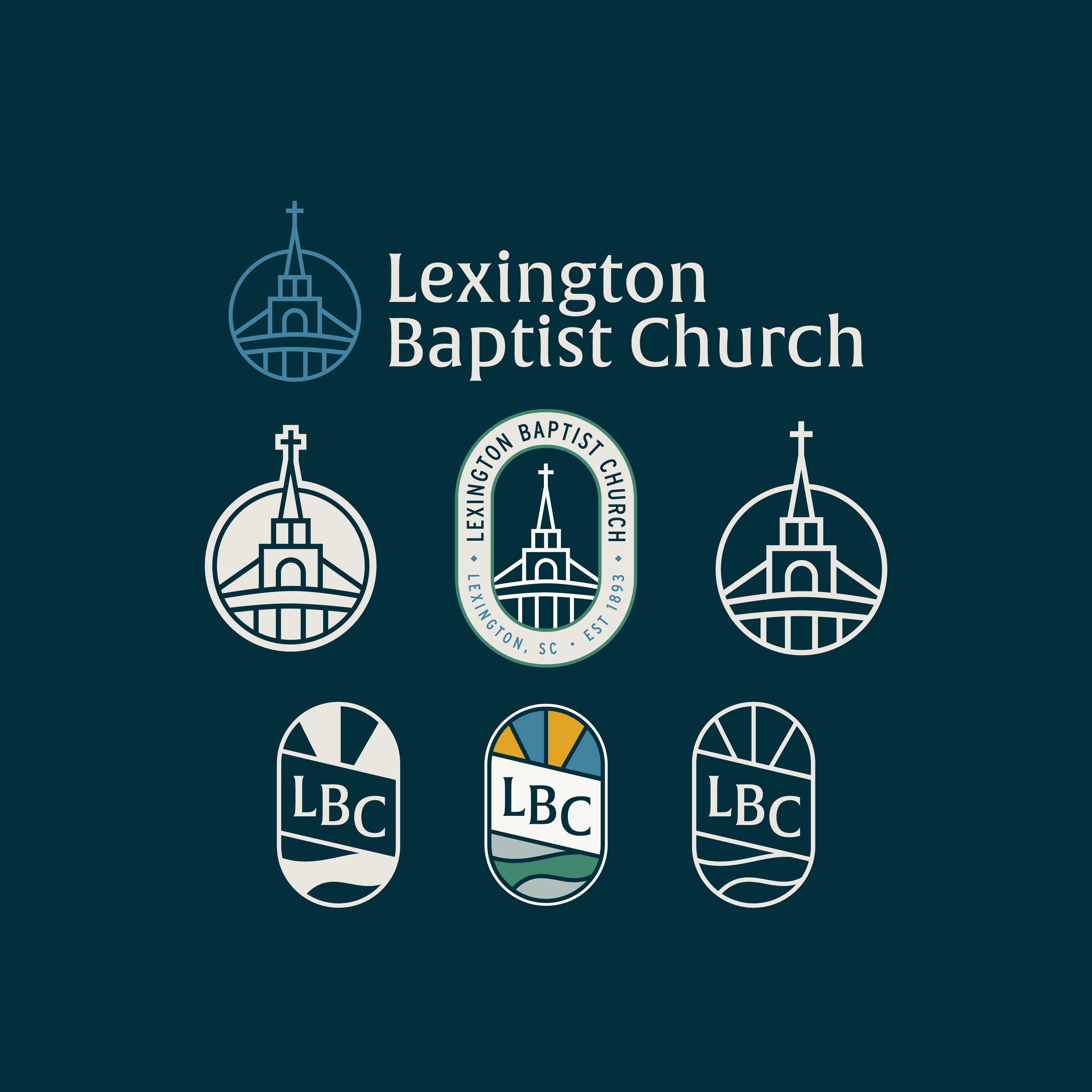
For Lexington Baptist Church, the design goals were to be distinct, memorable, and rooted in its community. Our inspiration came from the church’s iconic steeple and quintessential southern charm. The result is a church logo design that feels very recognizable across town. This type of building logo design can connect both long-standing members and first-time guests right away.
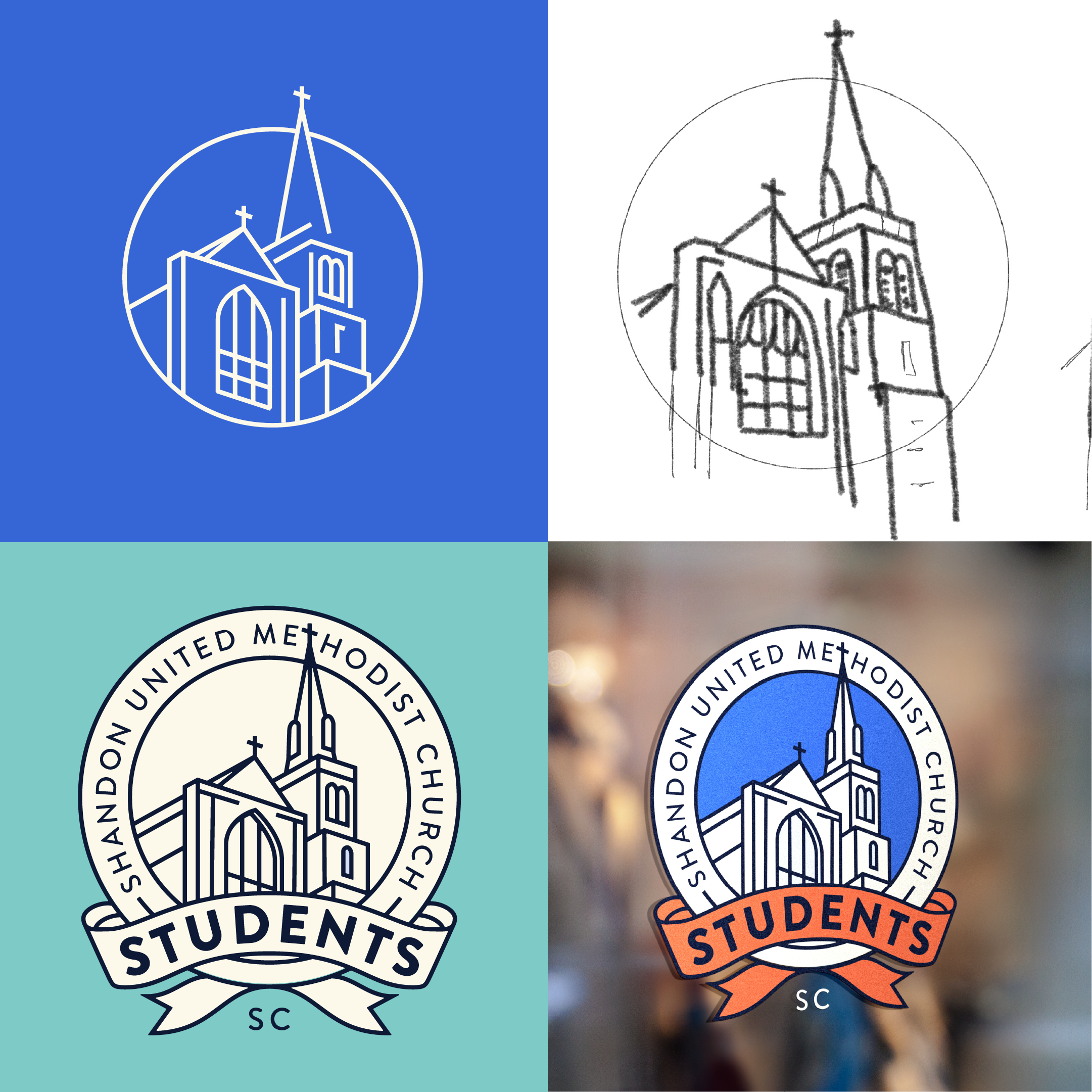
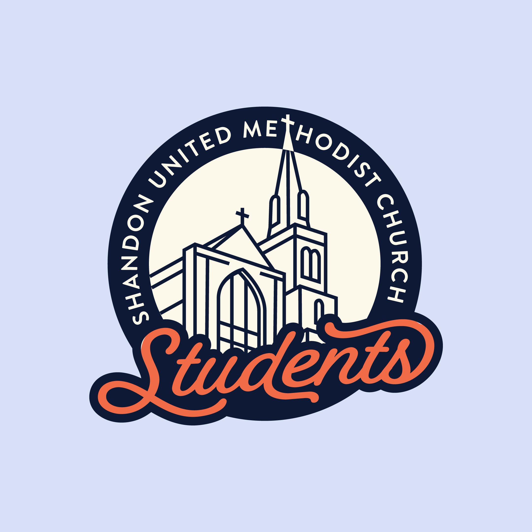
Shandon United Methodist Church decided to use their physical landmark as the central icon of their student ministry context. Doing this creates unity by keeping things anchored to the physical church house. No more church within a church - it’s all under one roof.
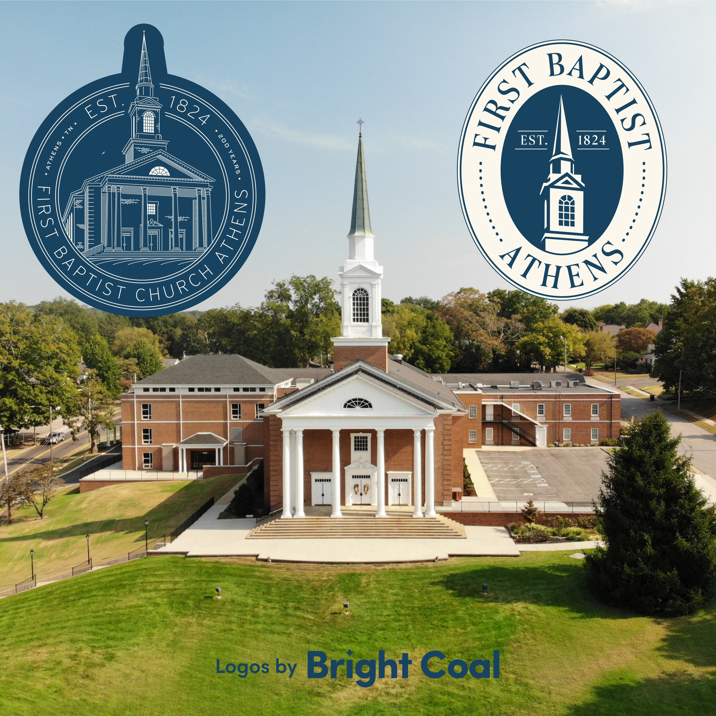
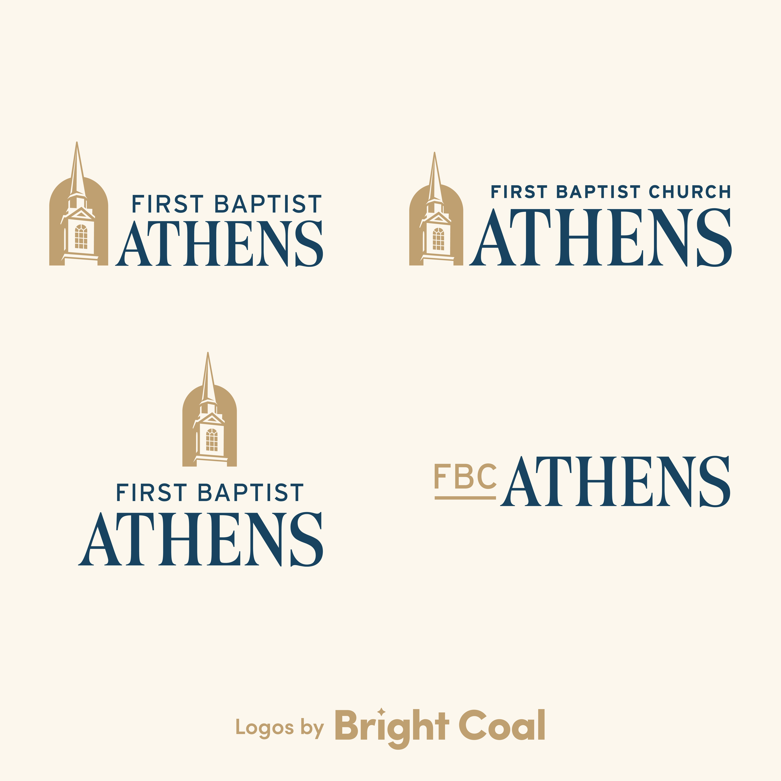
Working with First Baptist Church Athens shows another advantage of using your church building in the logo design. It makes it easy for newcomers to connect the dots. There is immediate local recognition which creates a mental shortcut in the minds of the community you're trying to reach. If a visitor can visualize the structure while scrolling online and then recall the location in real life, that’s an incredibly powerful logo design tool.
“Instead of trying to teach guests what your symbol means, let them instantly recognize it: ‘Oh, that’s the big white church on the hill.’”
Church Structure Design Examples
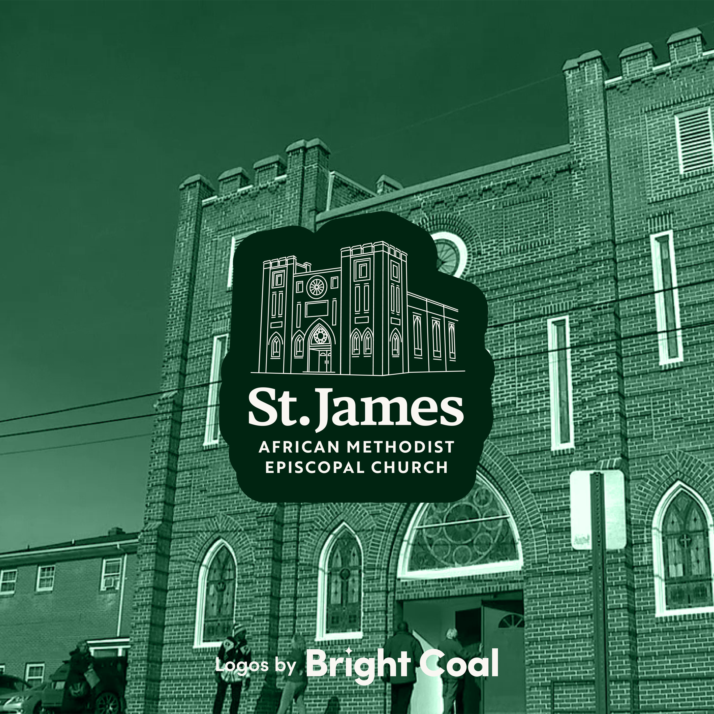
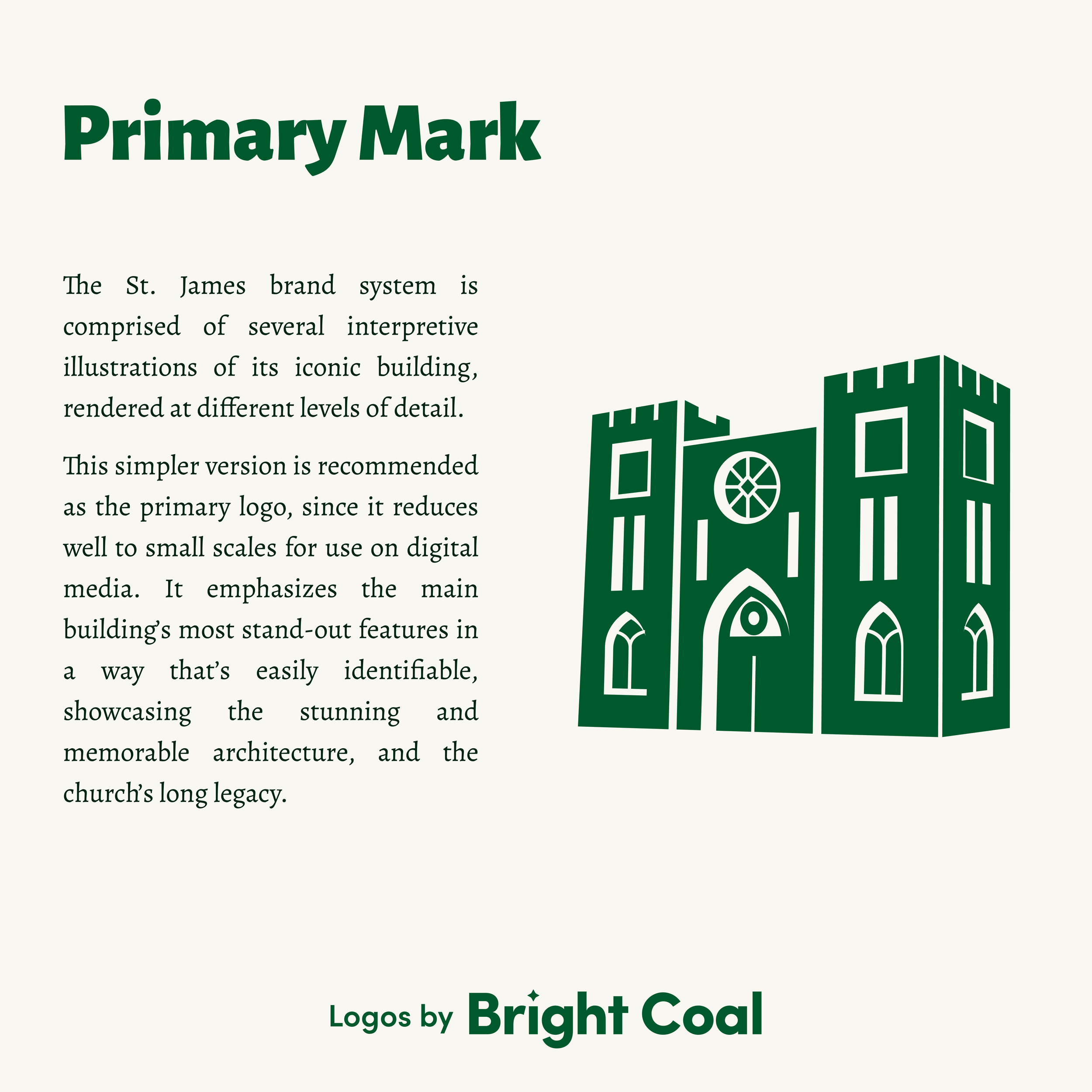
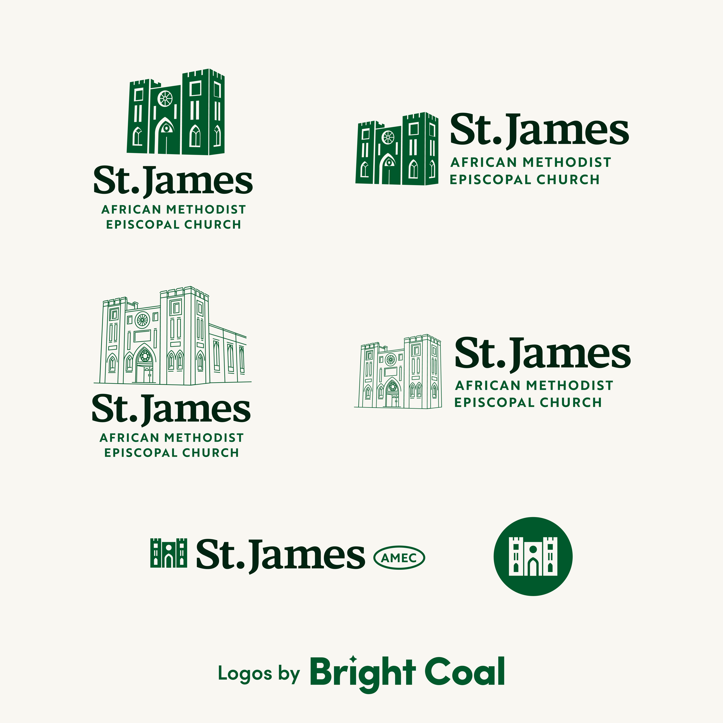
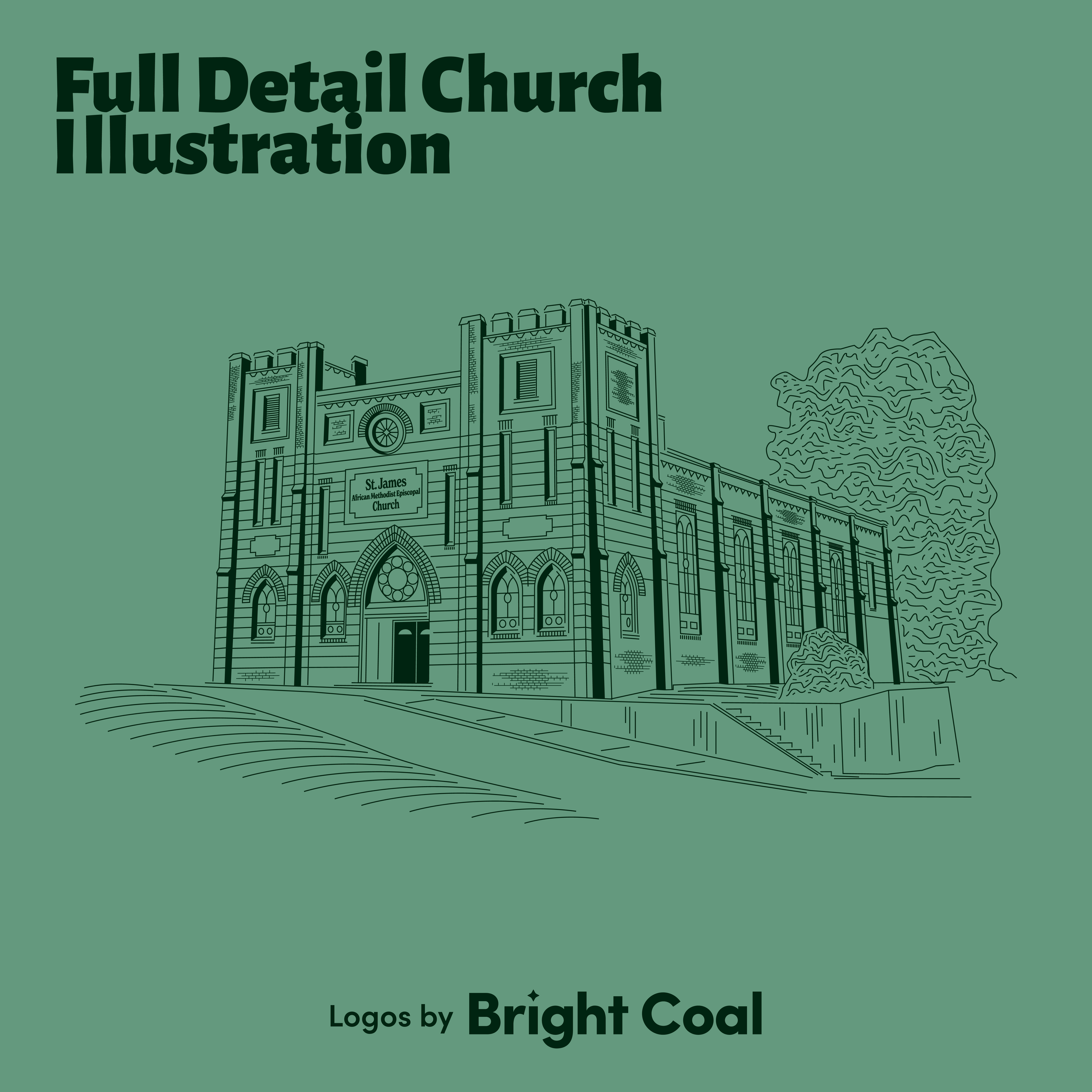
The historic St. James AME Church dates all the way back to the 1800s and is among one of the oldest AME churches in the United States. It is a bedrock in the community of Asheville. They felt confident that the rich heritage of their church building was well-suited to be the primary image for their Episcopal church logo design. The architecture is already well-known around town since they’re often called the church that’s “still standing after all these years…” This group hosts many civic gatherings and programs, making the building logo design an automatic must.
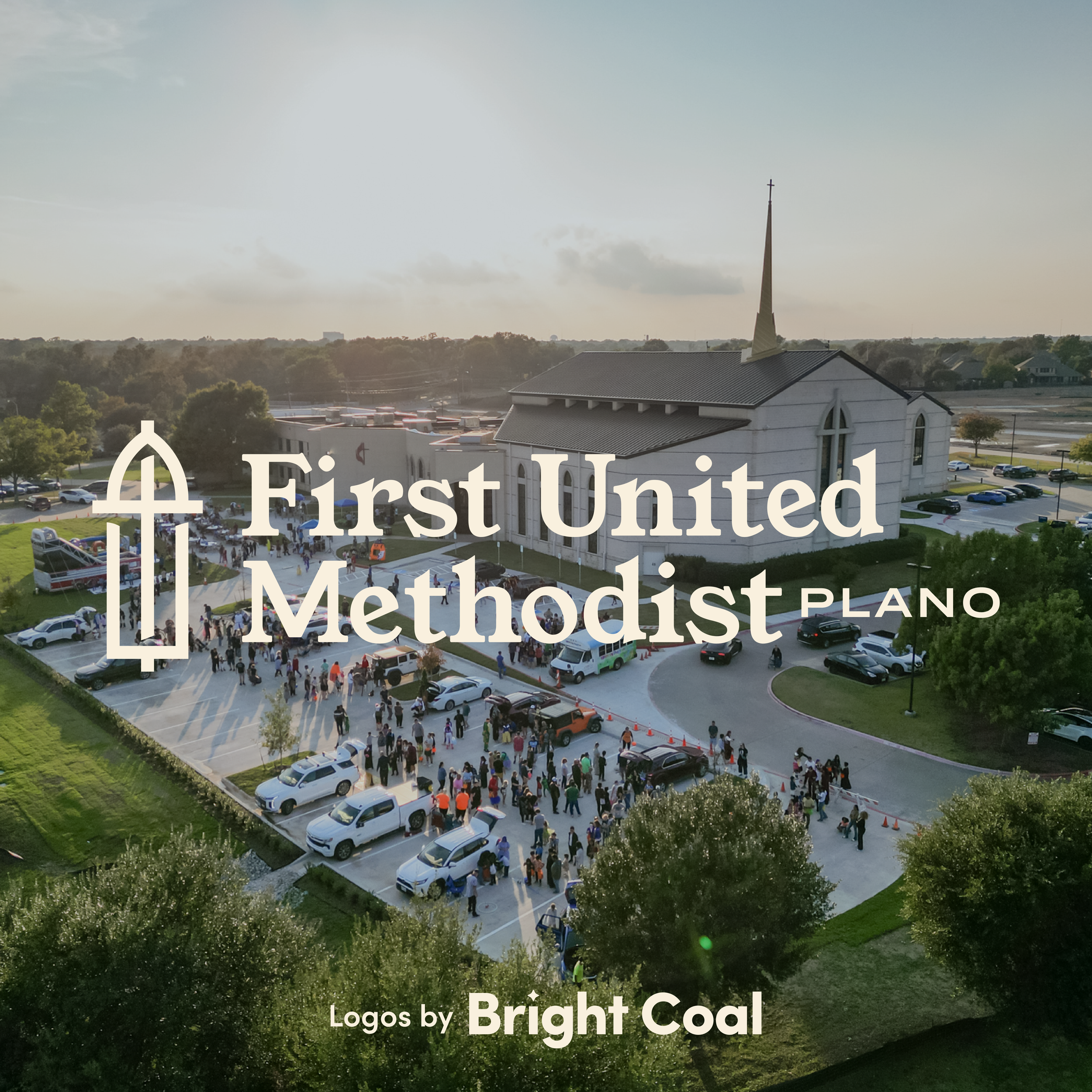
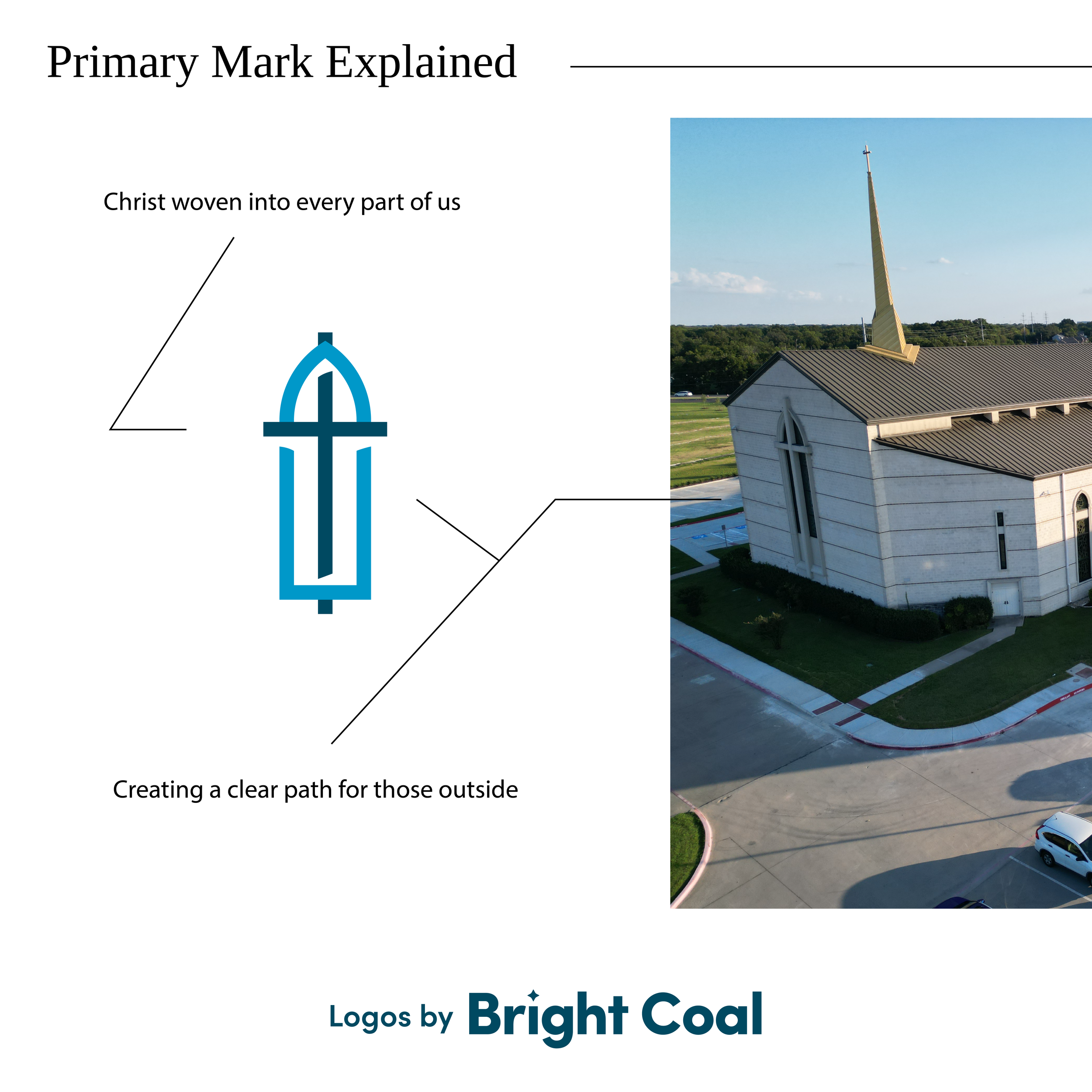
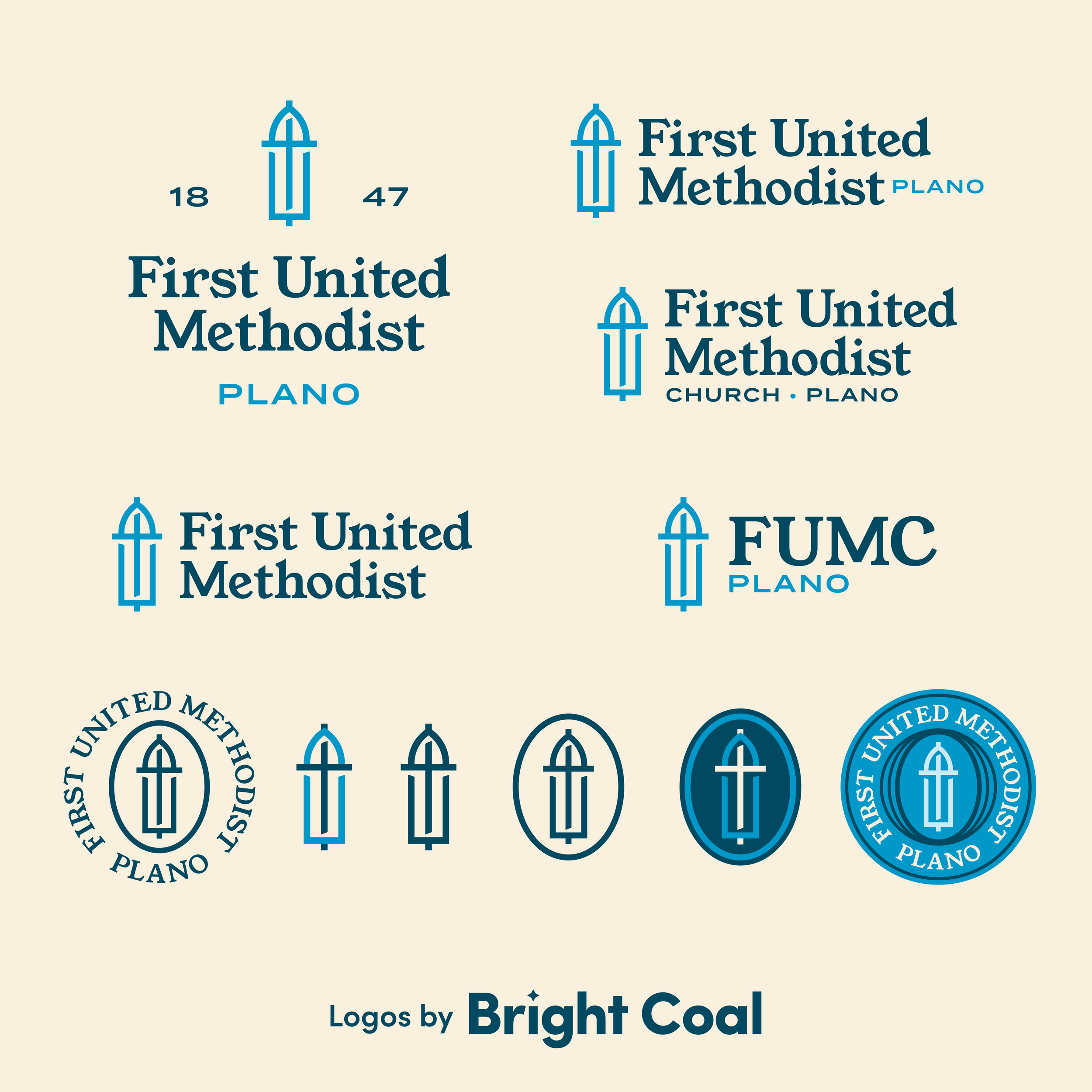
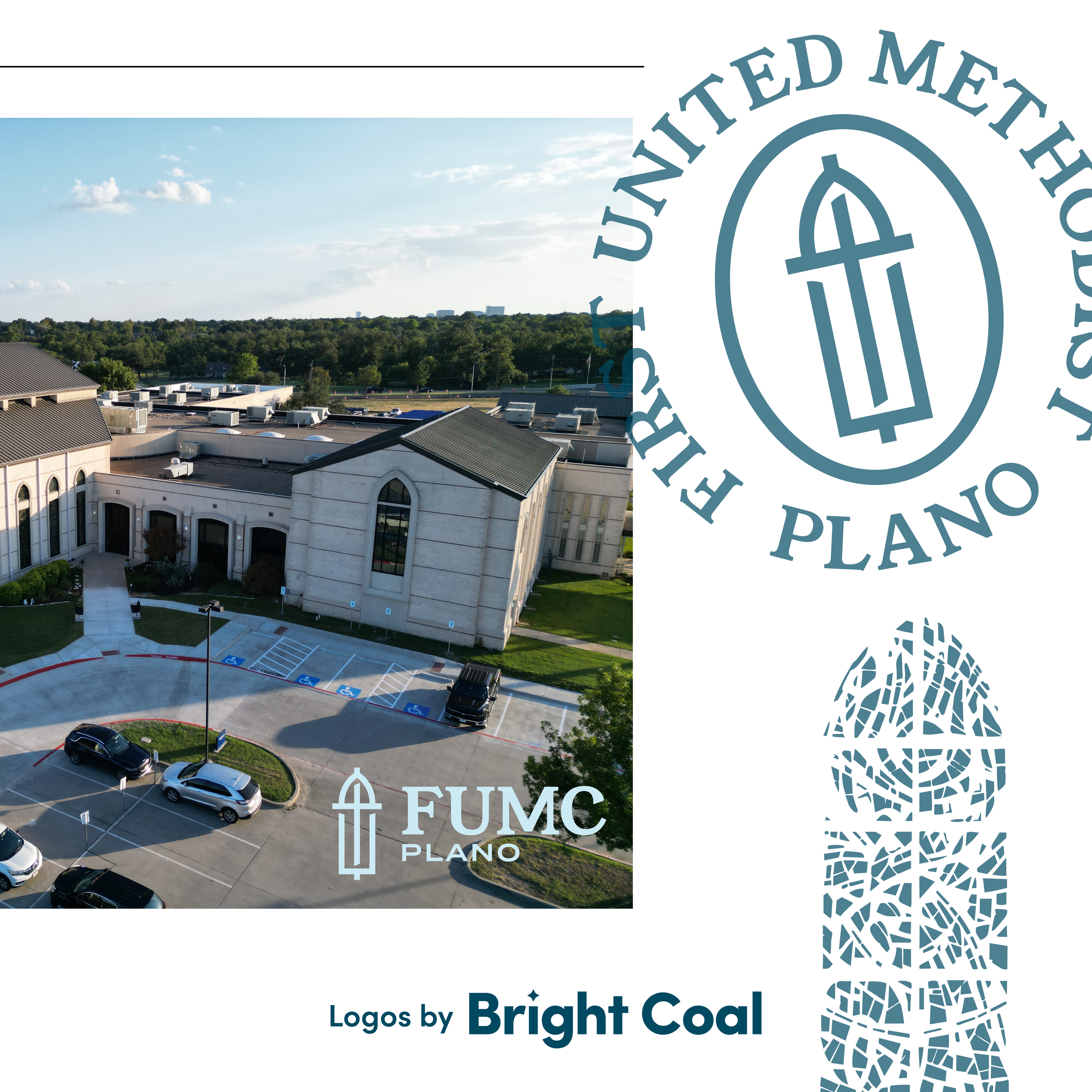
First United Methodist Church out of Plano, TX wanted their steeple and unique architecture to be the inspiration for their main church logo design. Incorporating their stained glass windows and bell tower features gives a strong sense of intentionality to the design process.
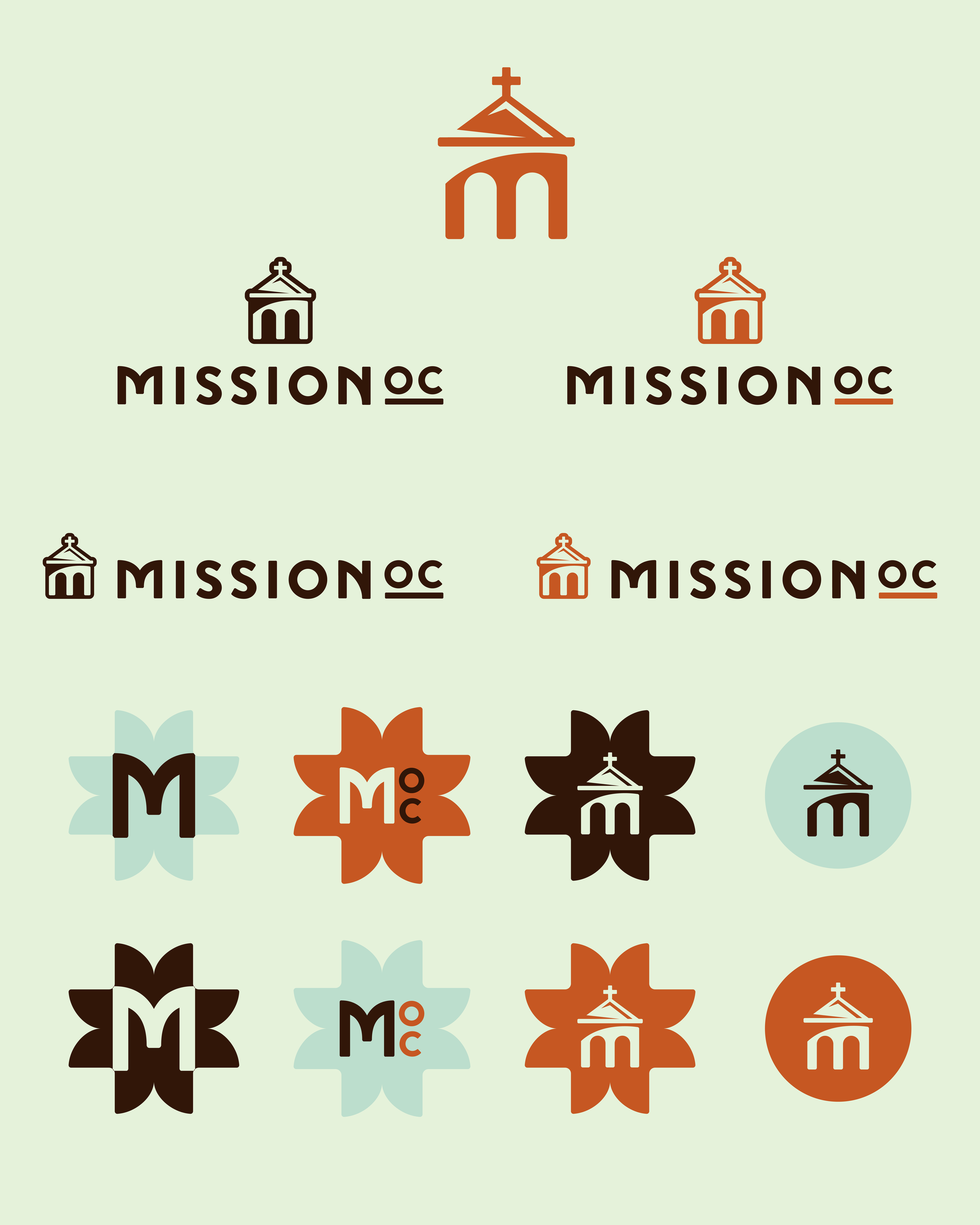
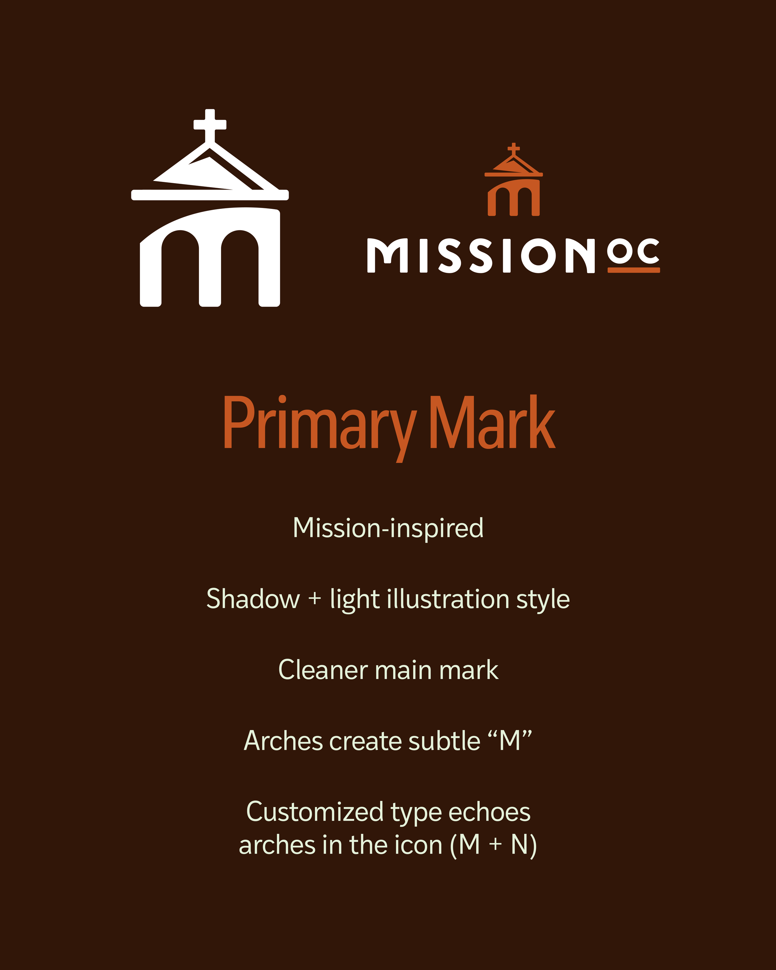
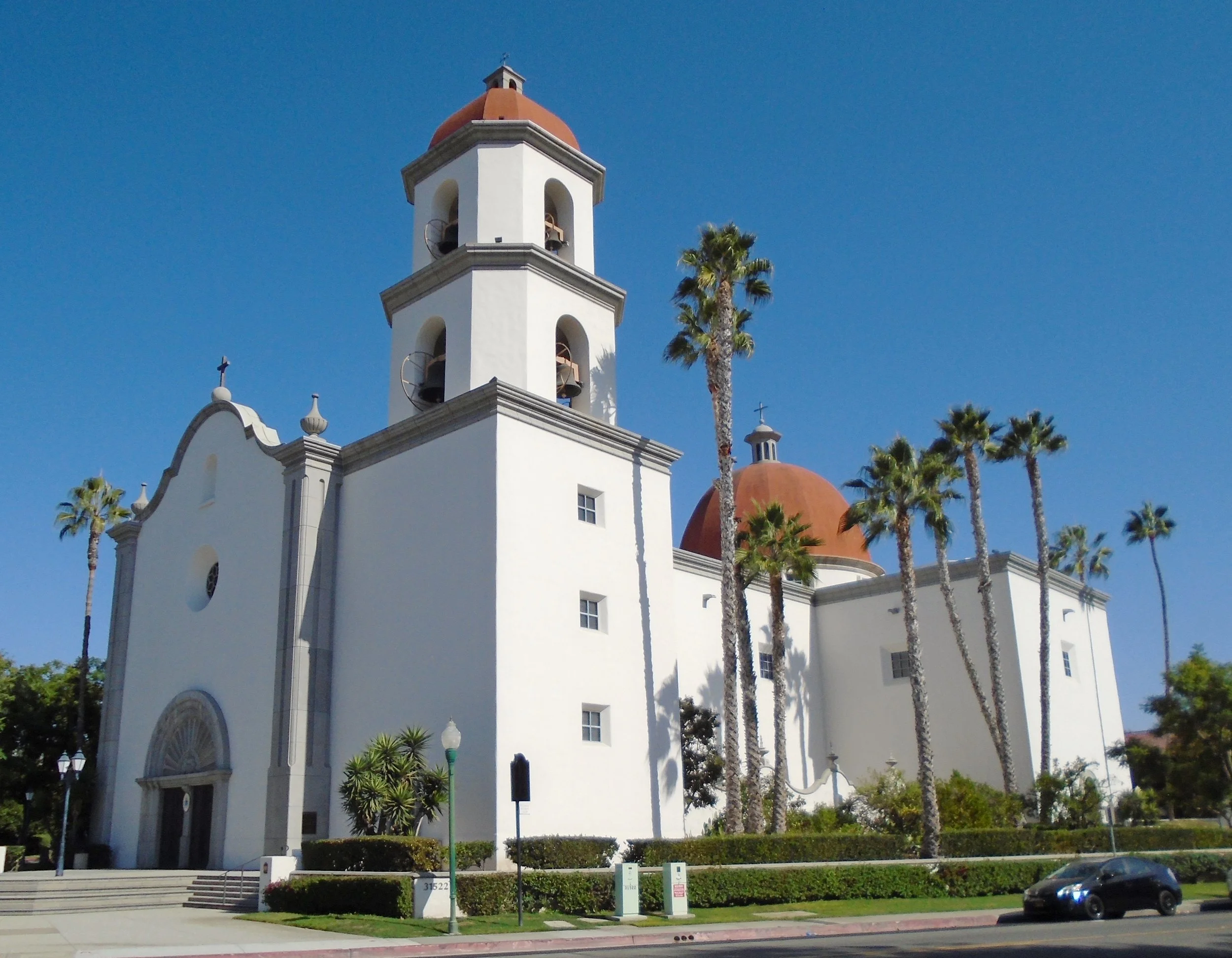
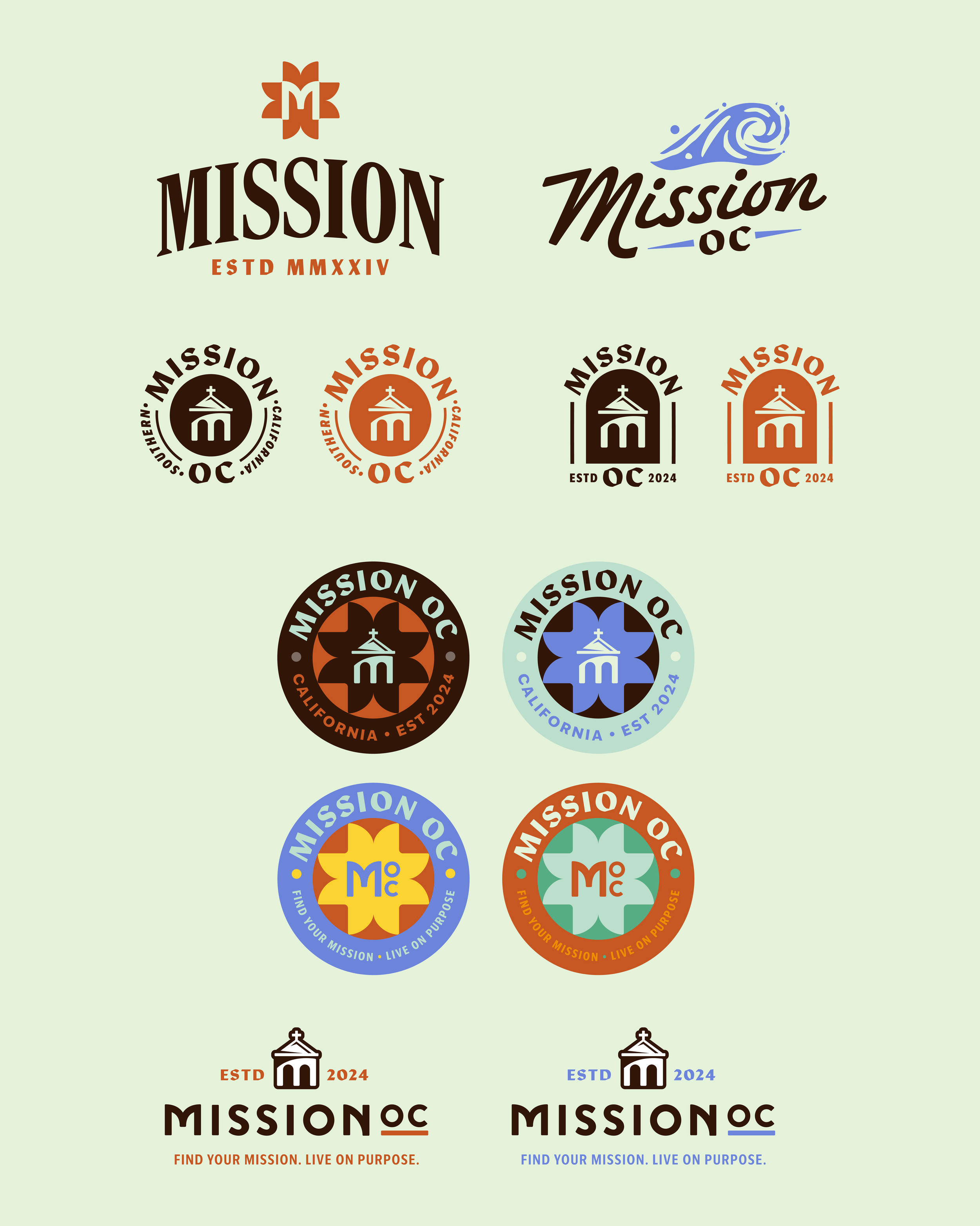
Mission OC built their logo inspiration from the famous architecture featured throughout their city. Surrounded by Spanish influenced structures and warm adobe textures, they embraced a local, comfortable brand that makes sense in the minds of their neighbors.
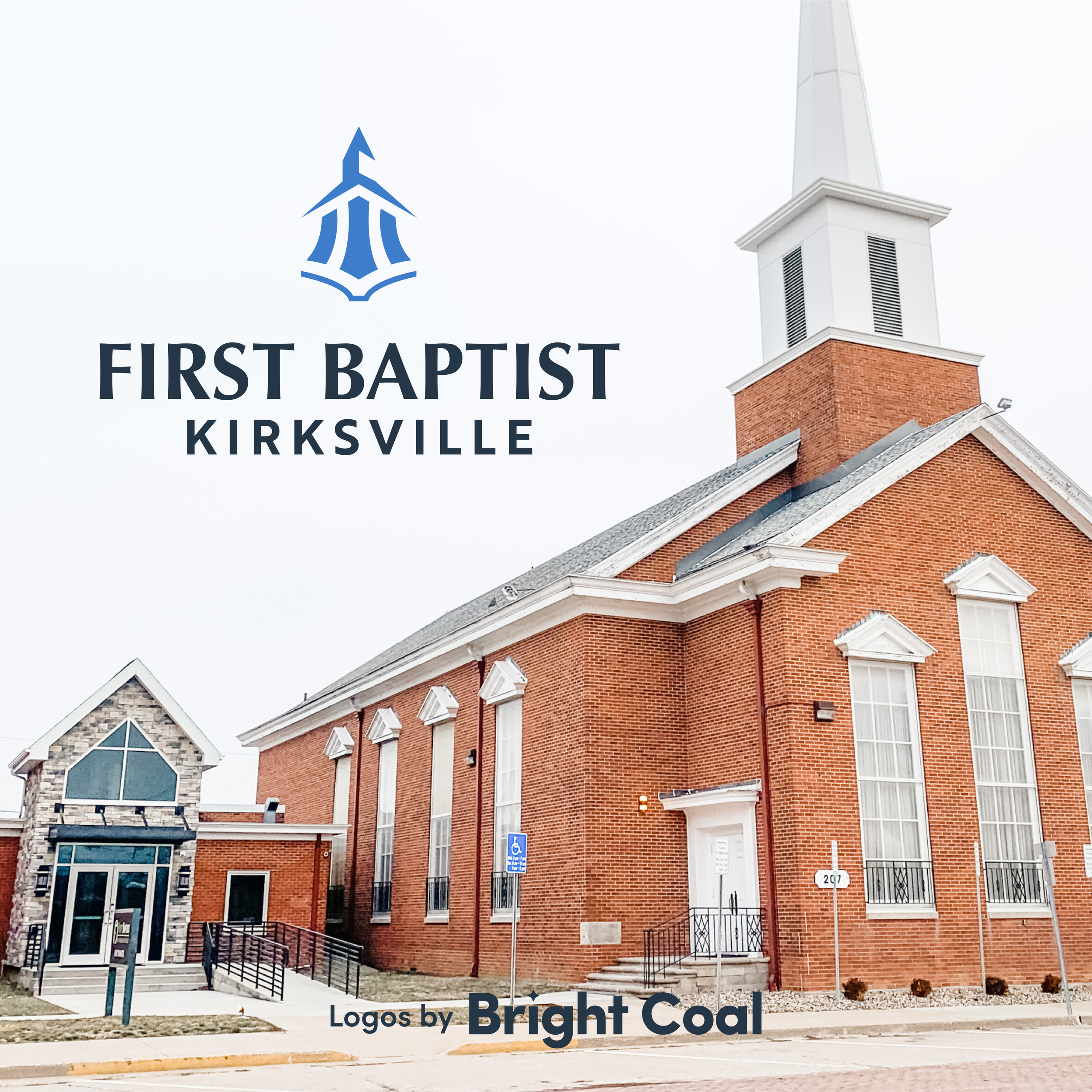
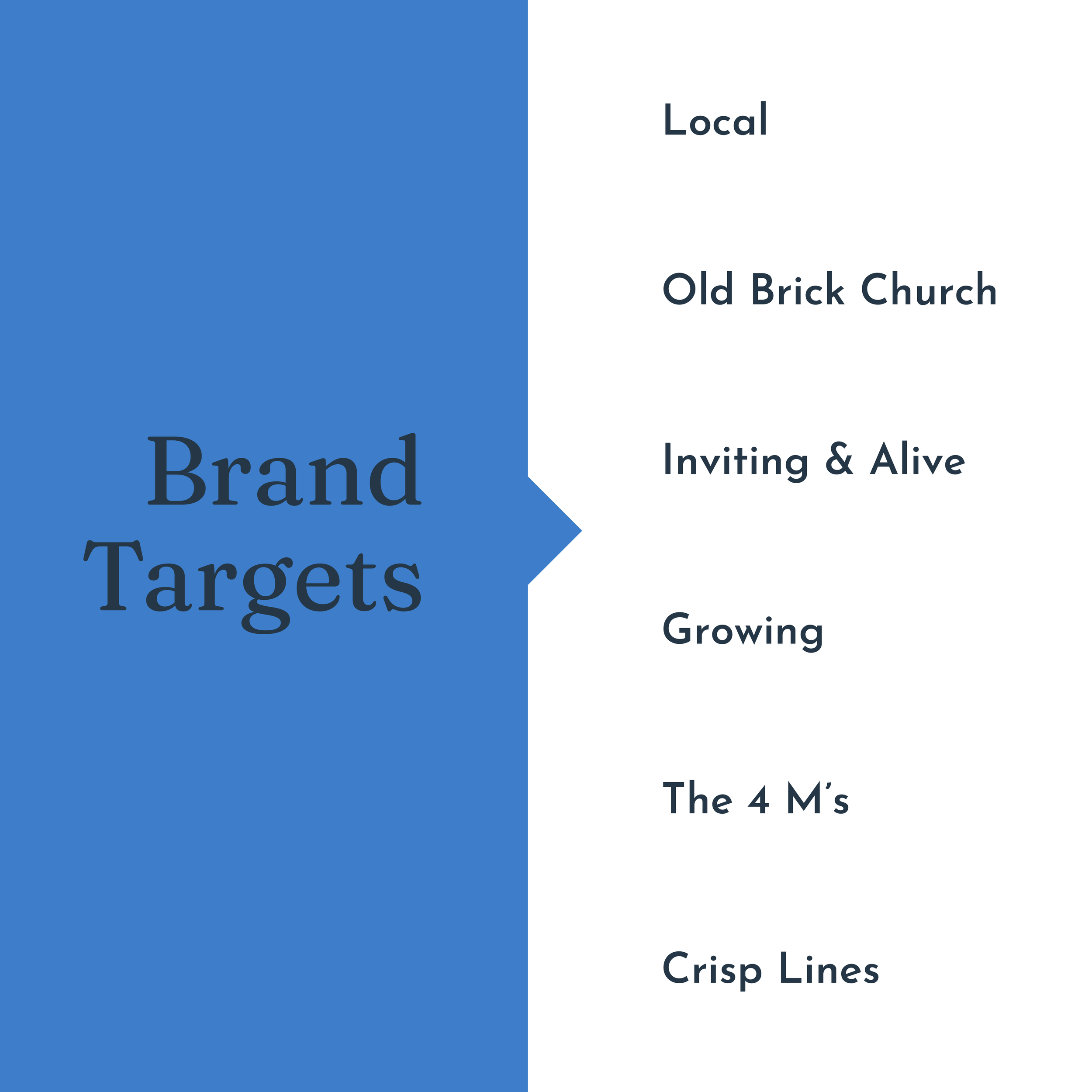
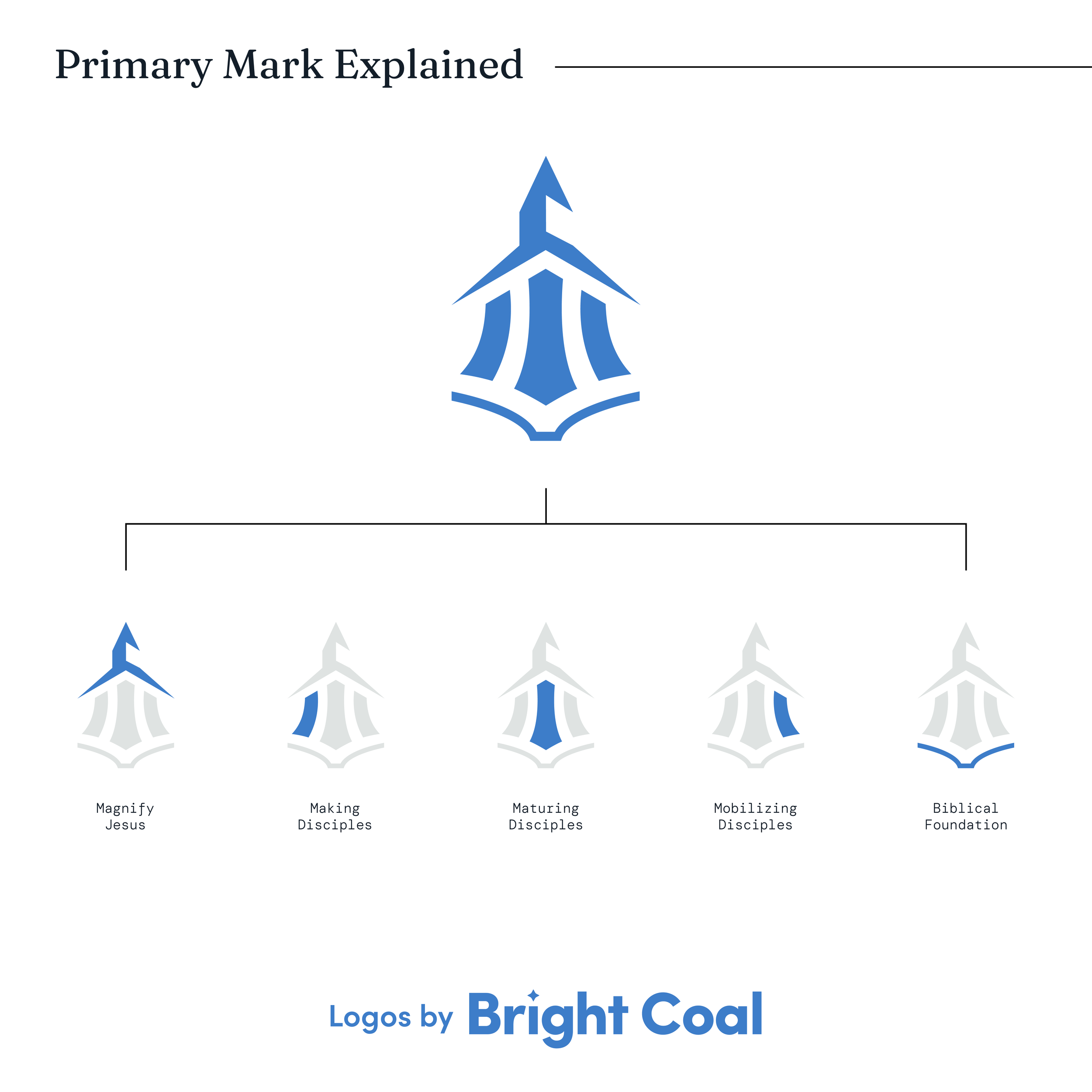
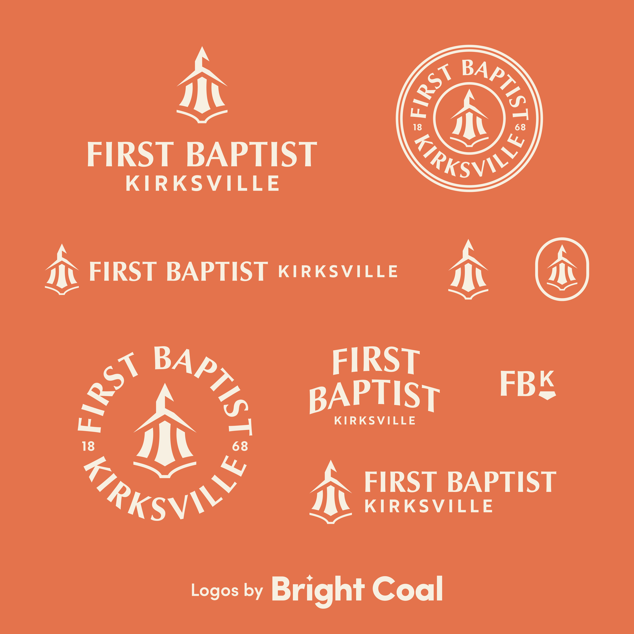
First Baptist Kirksville is another successful landmark based logo design. This family-oriented, older, brick and mortar style church chose a logo design that also ties in the pillars of their ministry. This is a great encouragement that thoughtful church logo designs can reach beyond aesthetics and capture the heart of the church itself.
Turning your physical asset into a brand asset is another way to create pride of ownership among long-standing members of the church. It helps weekly attenders have something clear to point others towards and also be proud of - almost like a family crest.
Two caveats to this logo design concept are if your church is multi-sited or due for renovations in the near future. Utilizing one landmark can isolate other locations or become counterproductive if the steeple is scheduled for demo next month. However, there are clever ways to keep architectural motifs going even if you’re multi-sited. If you schedule a call, ask how Patria Church handled this for their growing church. Perhaps the best inspiration is waiting just outside the front door.