
Simple, One-Word Church Logo Designs
Do churches need an icon or symbol in their logo designs? Let’s talk simple church logo designs and how owning your one word brand has great payoffs with a few caution signs to watch out for.

Ministry is complicated enough, but creating a unique church logo design doesn’t need to be. Less might be more when it comes to creating a strong church brand. Clear will beat cute. Instead of spending a ton of energy coming up with creative brand marks and tons of revisions, check to see if the sauce is in the one-word church name itself!
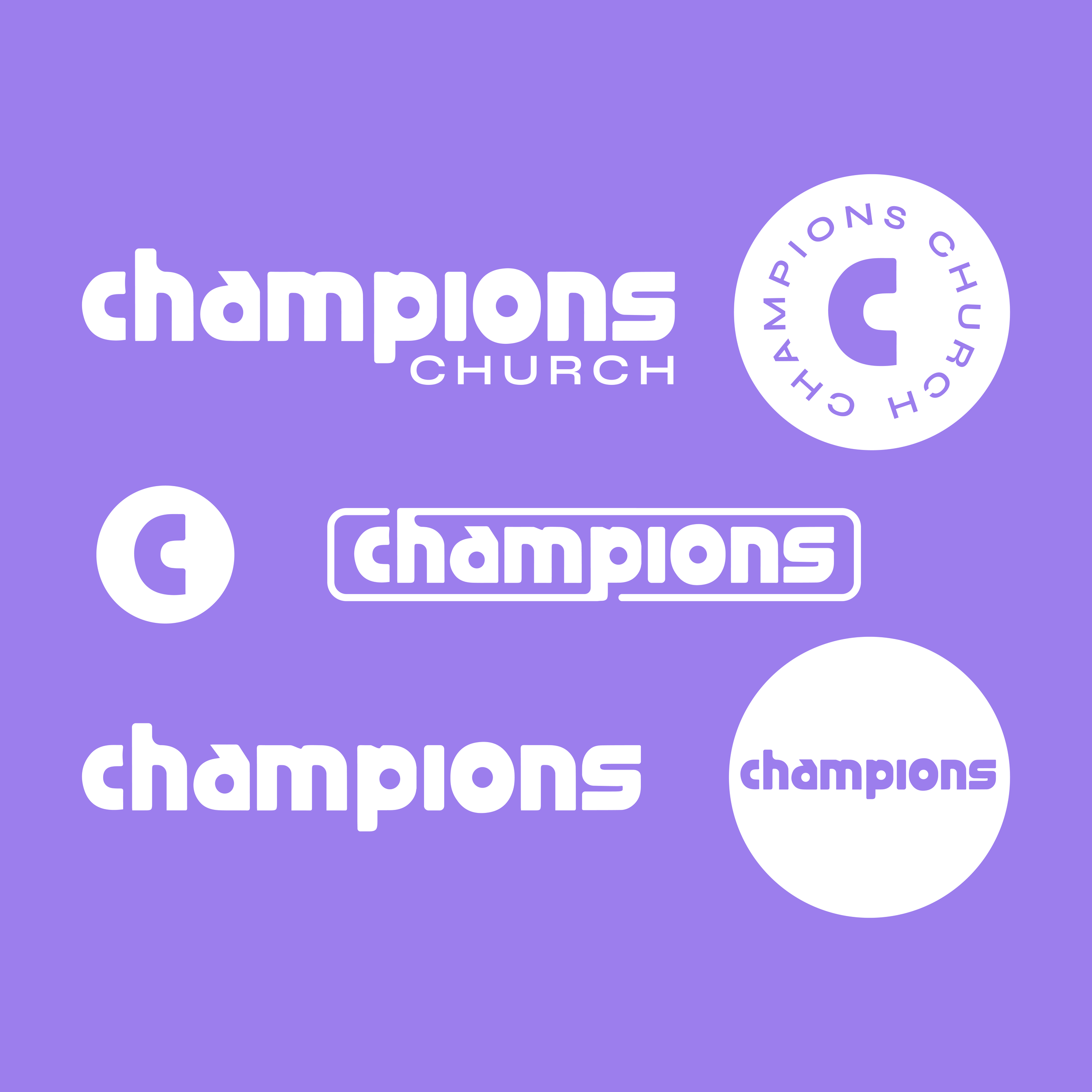

Many ministry logo designs rely on familiar symbols like crosses, doves, or flames. While meaningful, these can sometimes look very similar from church to church. A word mark allows a ministry to stand apart while still communicating clearly. To help set them apart, Champions Church wanted to be distinctly “not churchy” when it came to their logo design.
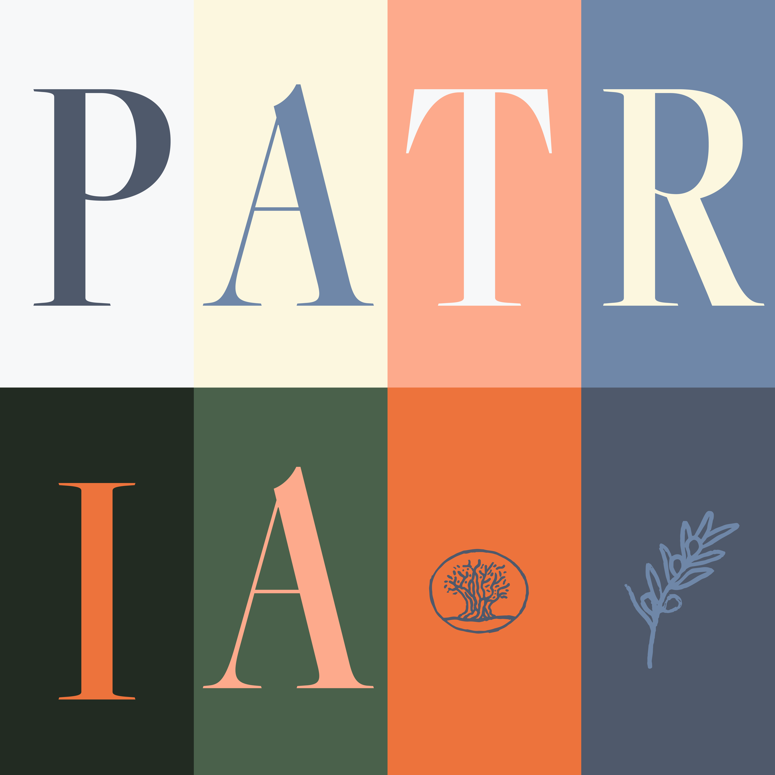
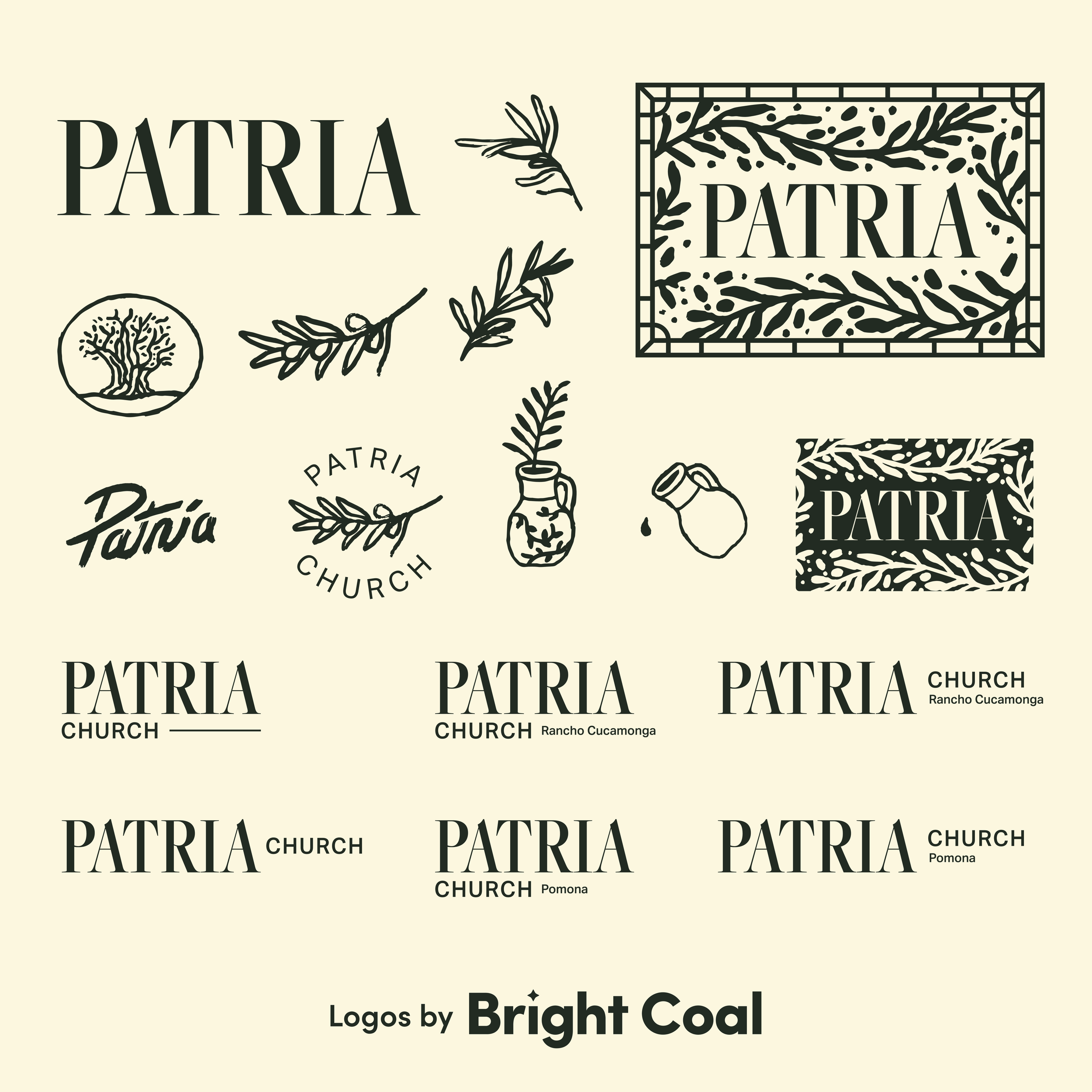
Patria Church serves as another example of why short word logo designs are a strong option. The simplicity of the word mark can be repurposed across different ministry subheads and brings a natural, inviting warmth to the church brand.
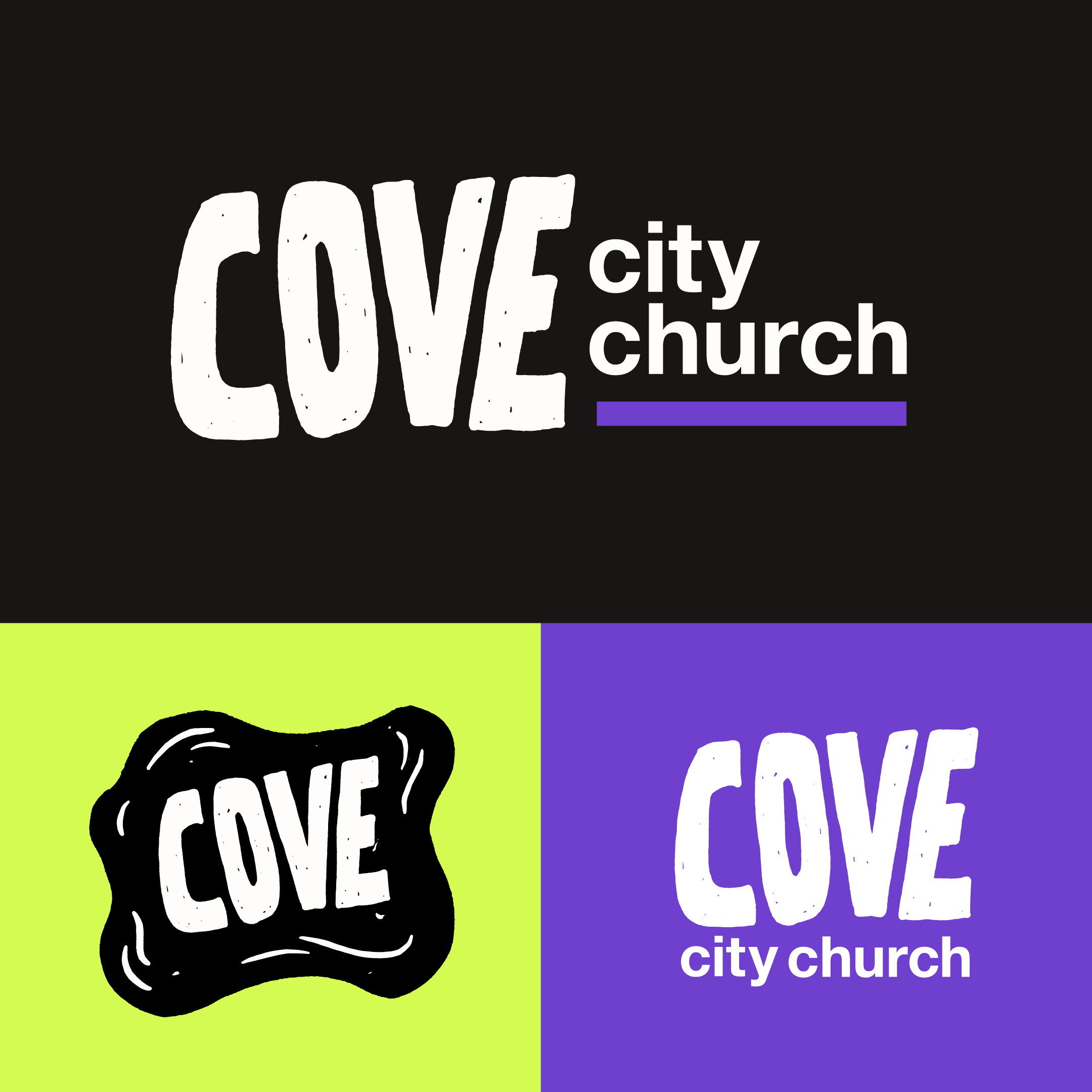
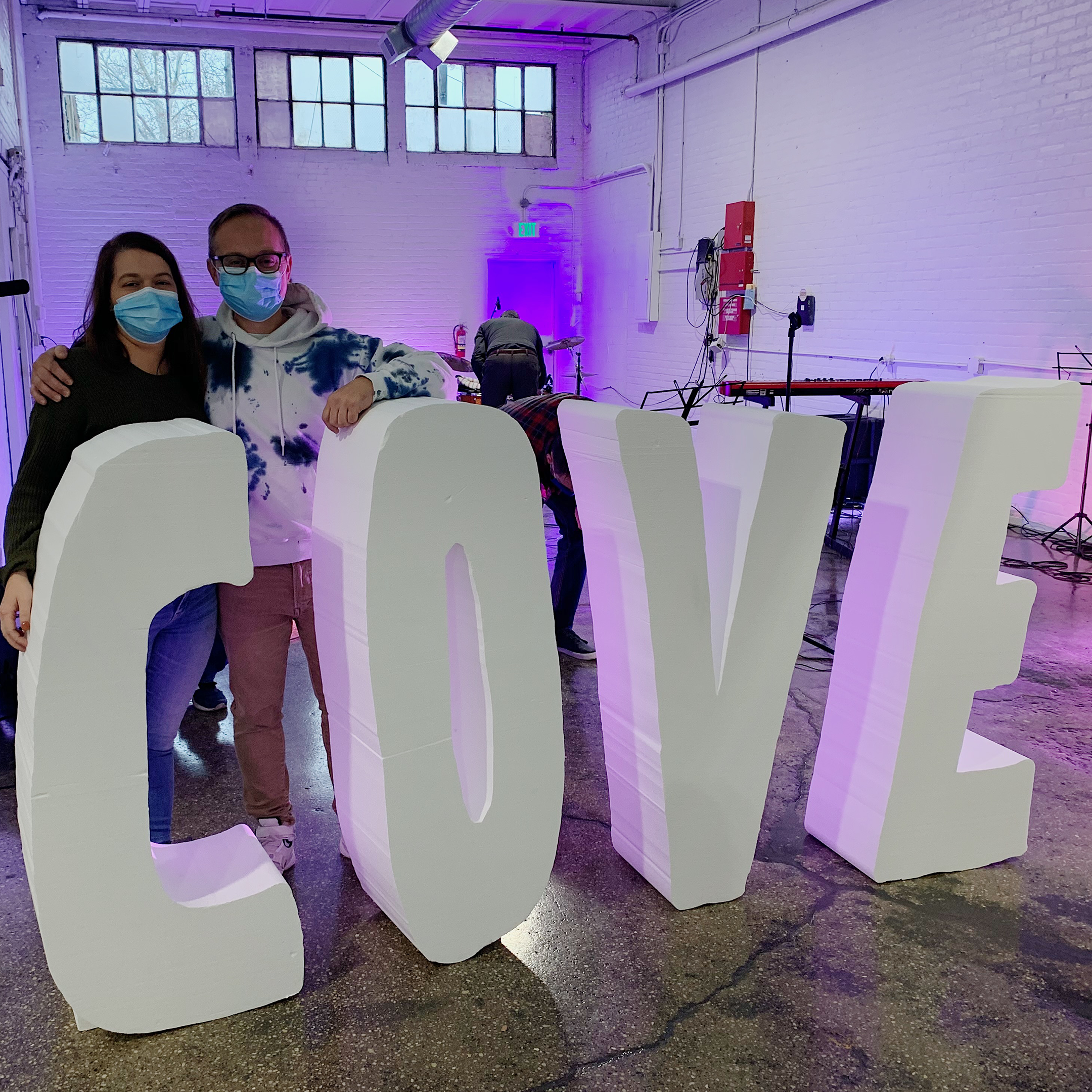
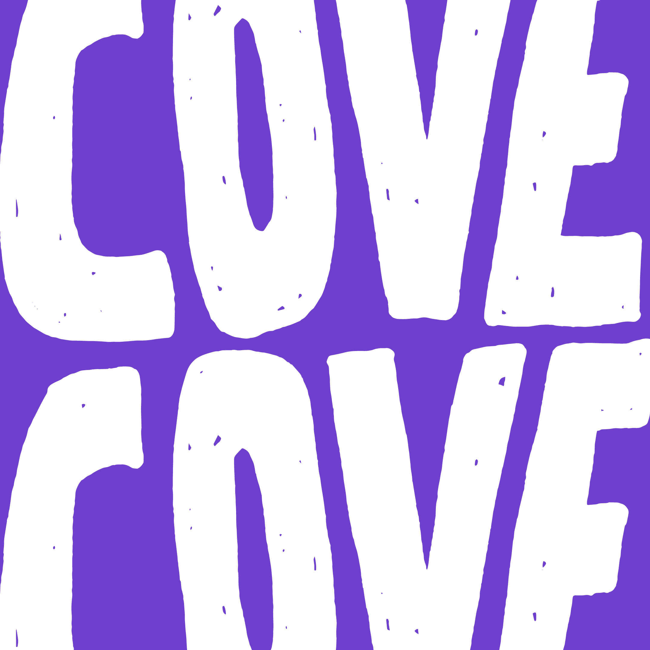
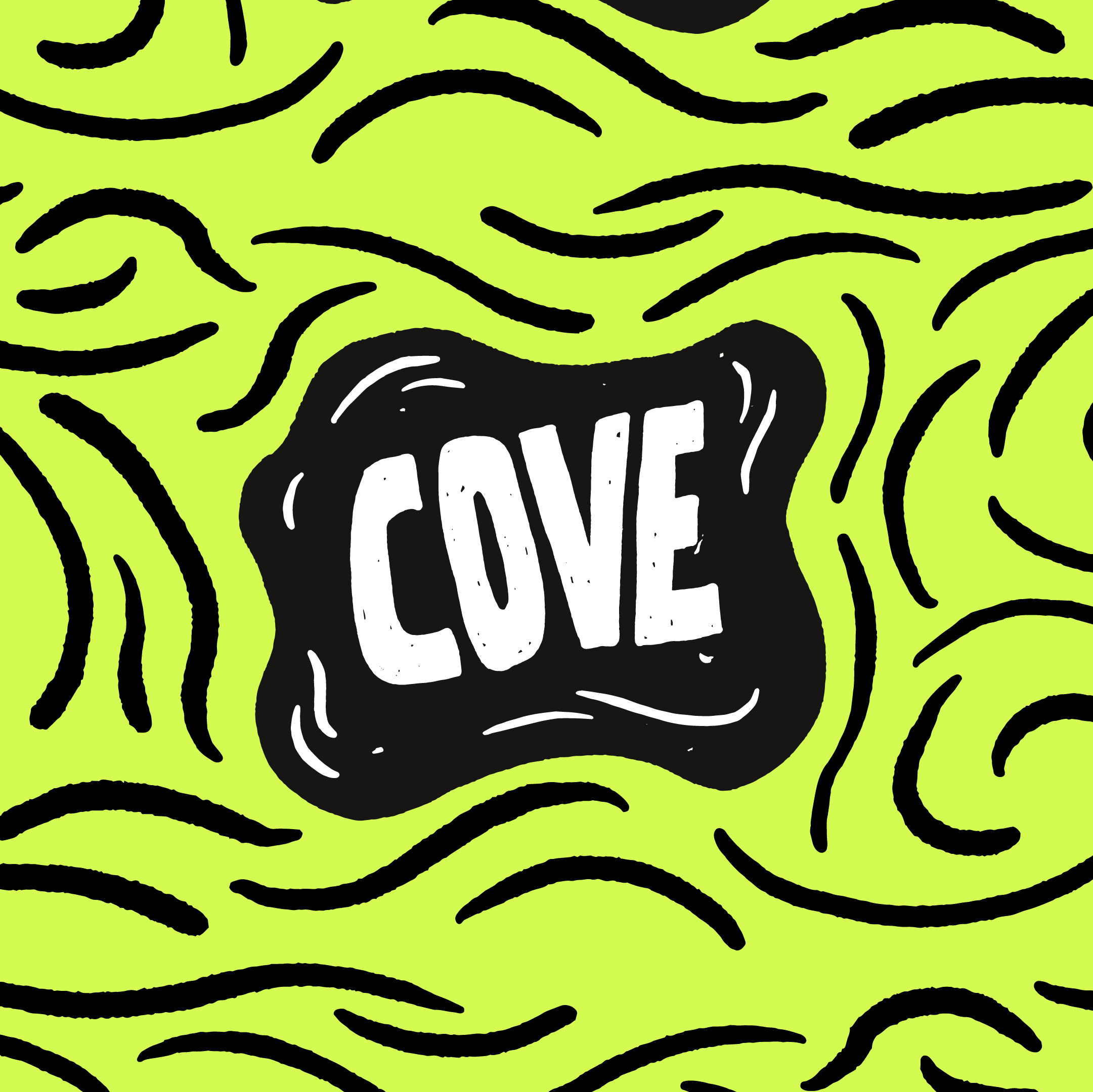
Cove City Church is another example of a short logo name idea that really opens up the door for unique typography with interesting spacing and custom lettering. This will look awesome on all kinds of church merch and really anything else across town. The bright logo color options help them stand out in the already loud environment of Cleveland. This ministry has its roots in college-age outreach and so the color scheme needed to be younger and vibrant.

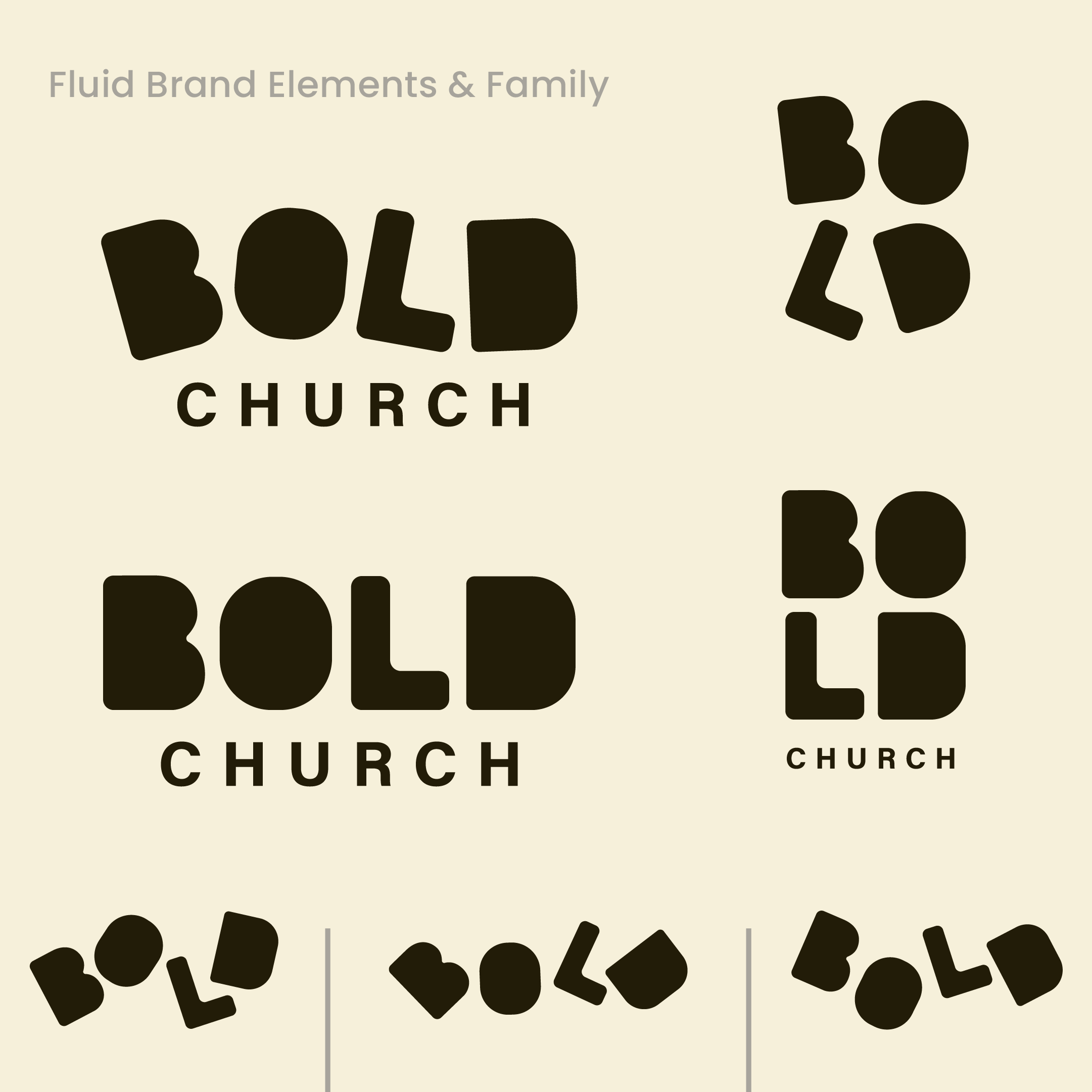
For Bold Church, the word mark itself carried the entire church brand identity. Rather than splitting attention between a logo symbol and the text, a one-word logo design can carry the full weight of brand recognition. Many people encountering a church for the first time online or on a sign may have no prior context. A word mark removes guesswork and clearly communicates the church’s name (and likely their style) right away.
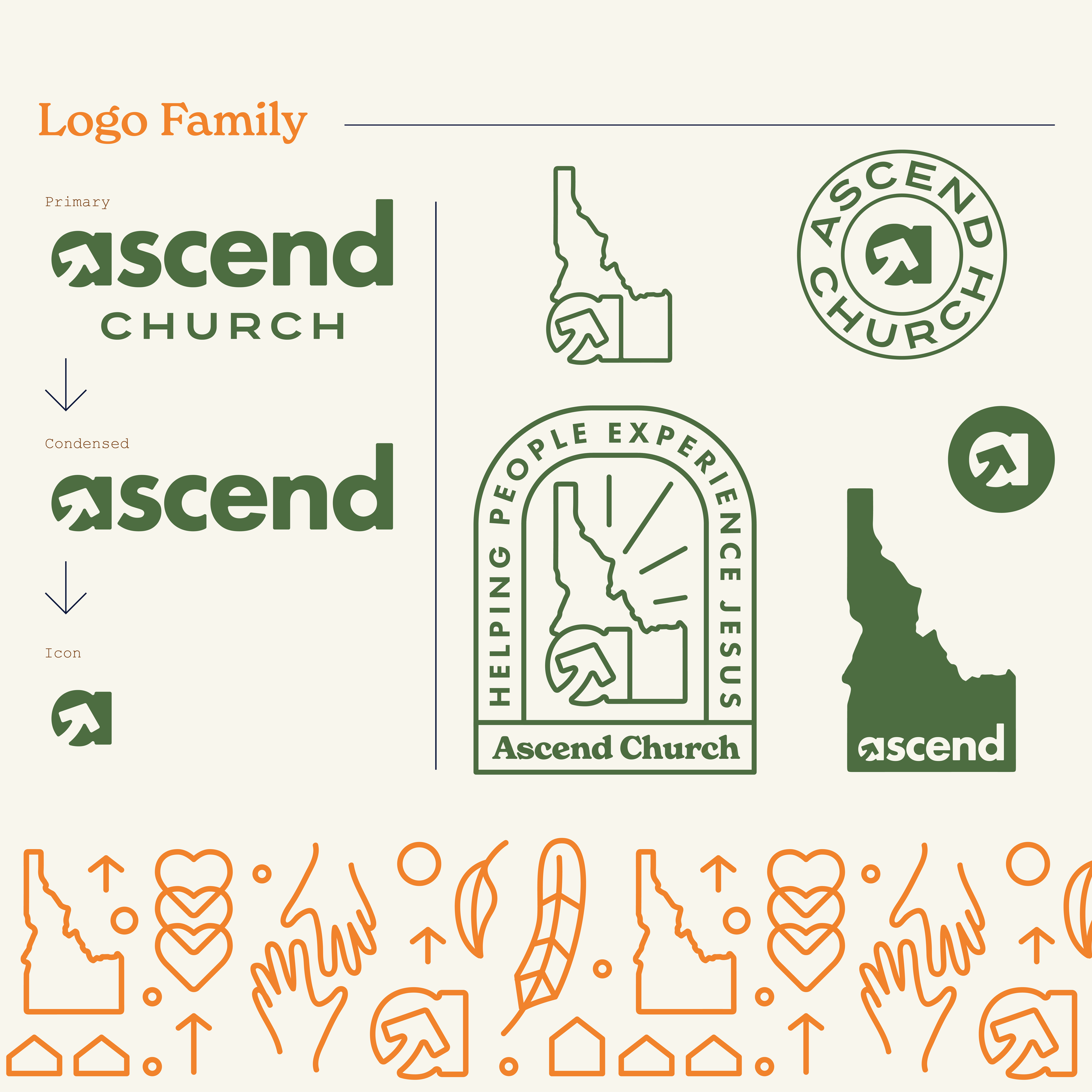

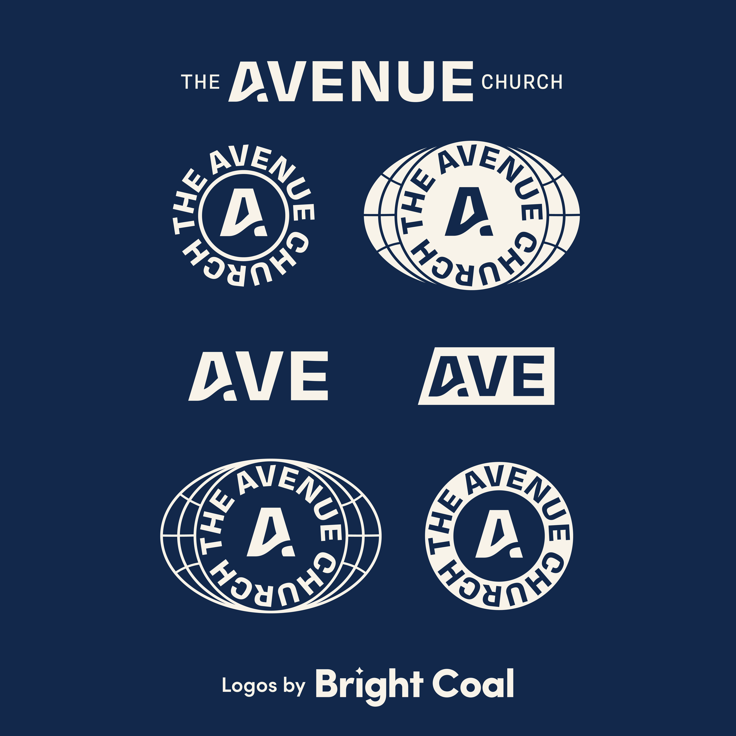
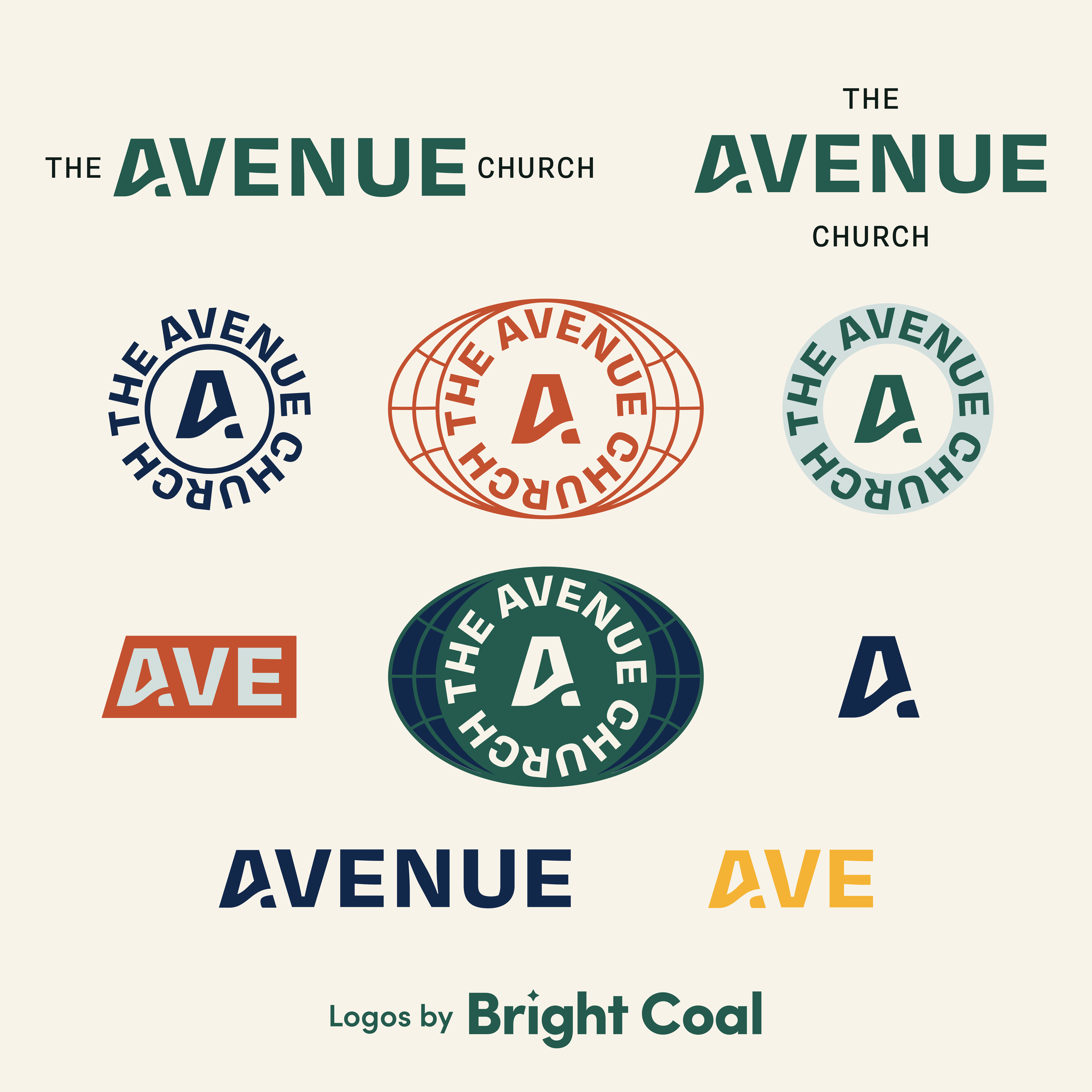
With a longer logo name, the lettering can sometimes have less room to breathe and feel overly complex. These “A’s” we created for Ascend Church and Avenue Church are full of movement but still legible because there’s less text competing for space. It’s also visually engaging when it’s found standing alone.
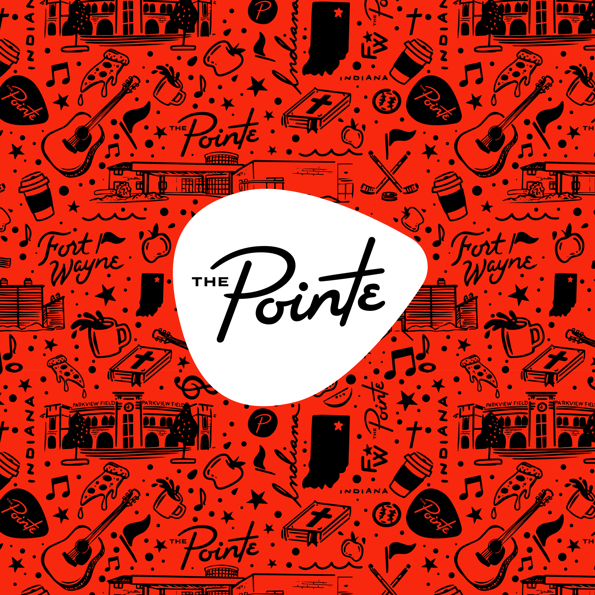
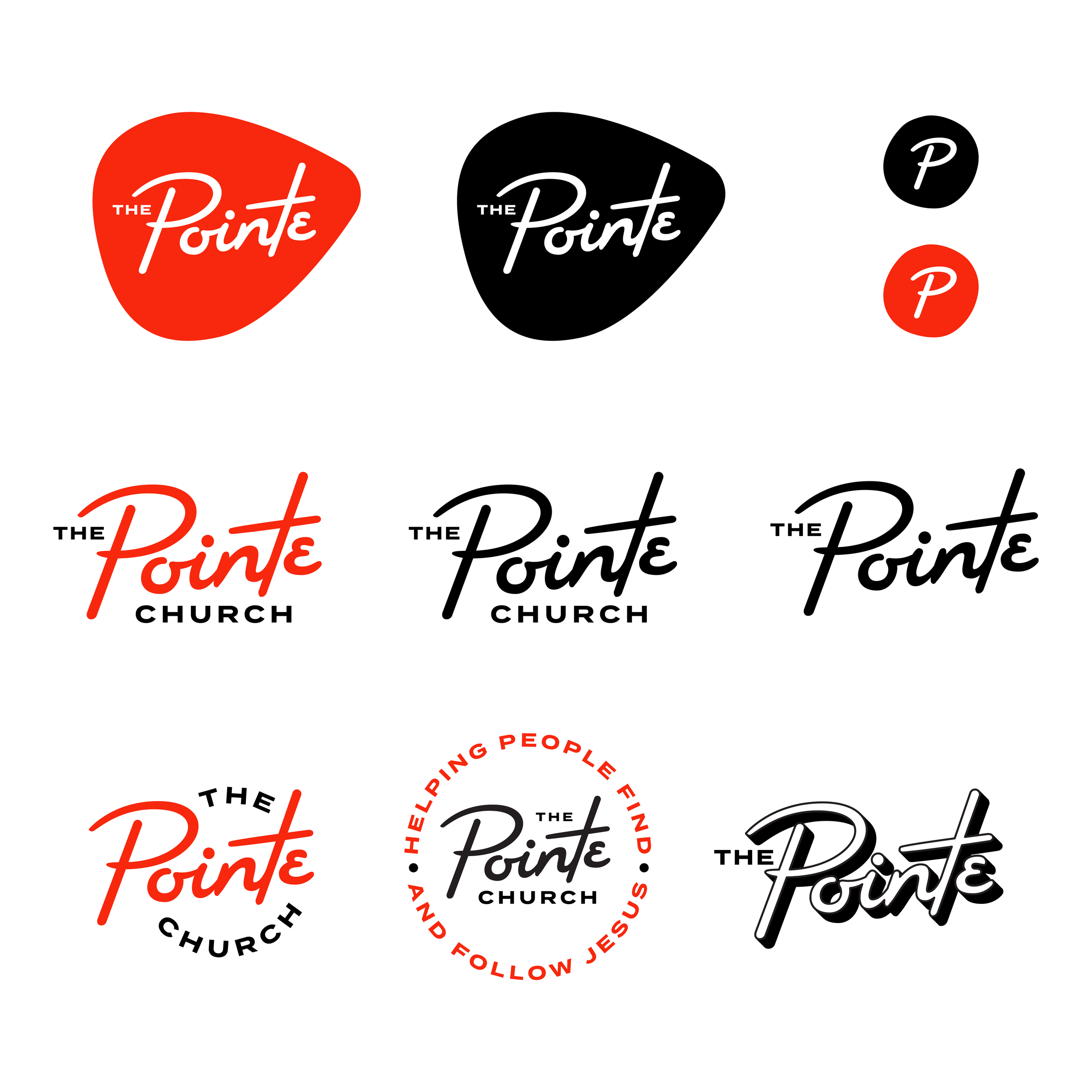
Pointe Church was looking for something retro and rowdy, with a guitar solo sprinkled in. This is another example of strong and simple word mark branding. This type of mark will also age well since it’s not dependent on a design trend that could change tomorrow.
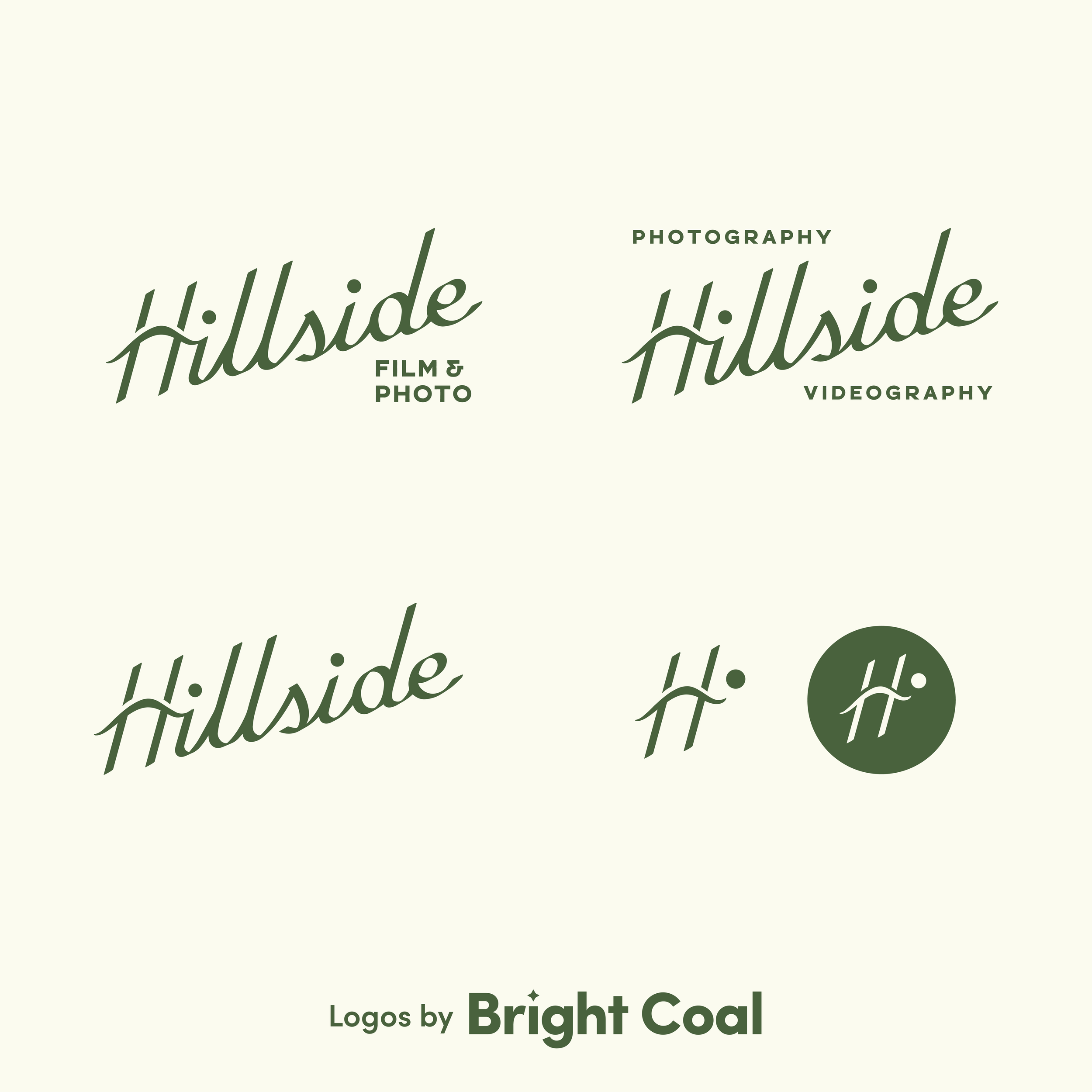
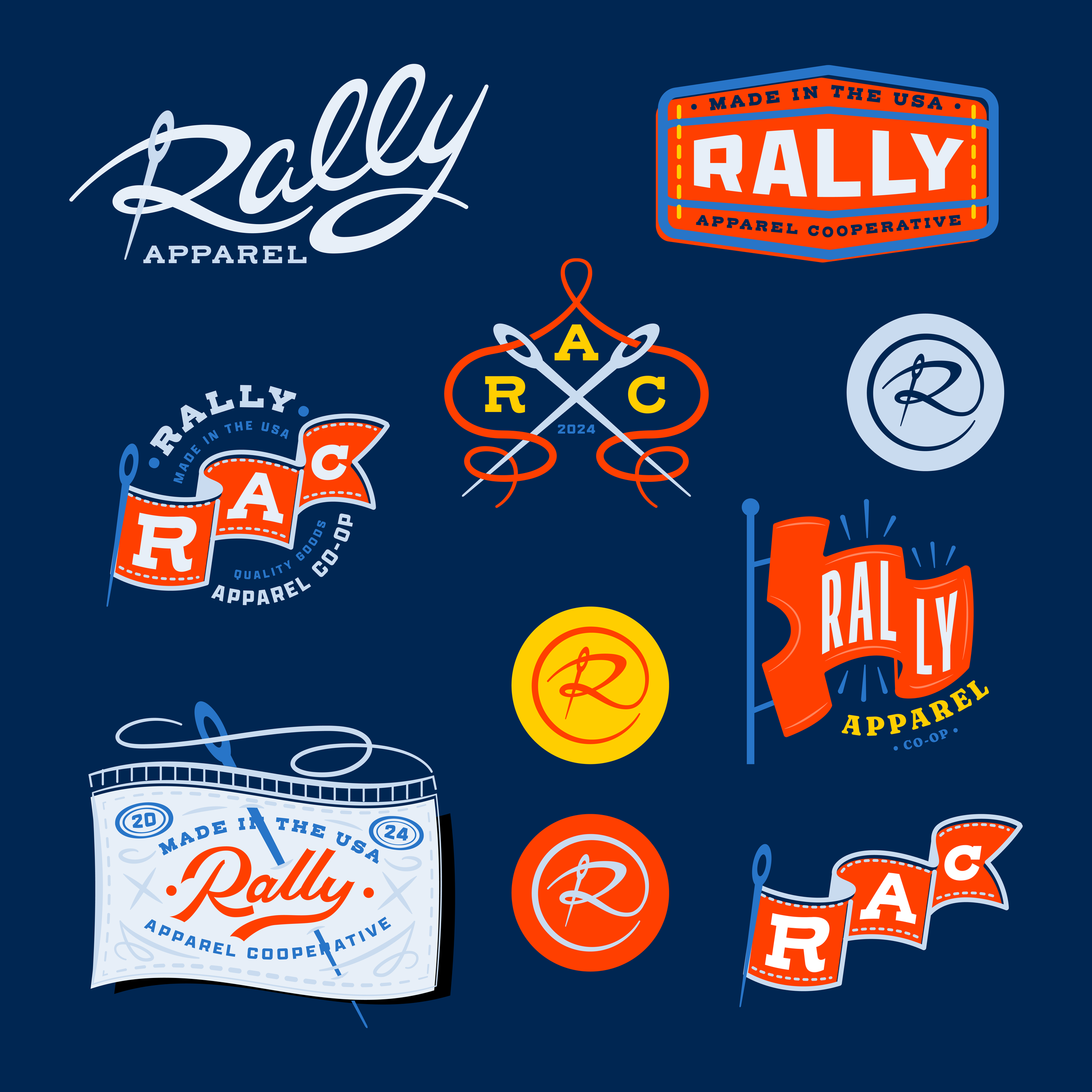
If your name is your logo, people instantly know what they’re looking at. There’s no guessing and no learning curve. Brands that rely on symbols usually have to invest years of marketing to teach people what that icon represents (think: bird = Twitter). A word mark eliminates that and gets people familiar with your brand faster. This translates over to small businesses like Hillside and Rally Apparel. You can also do some really great things through logo animation when you keep your logo design simple.

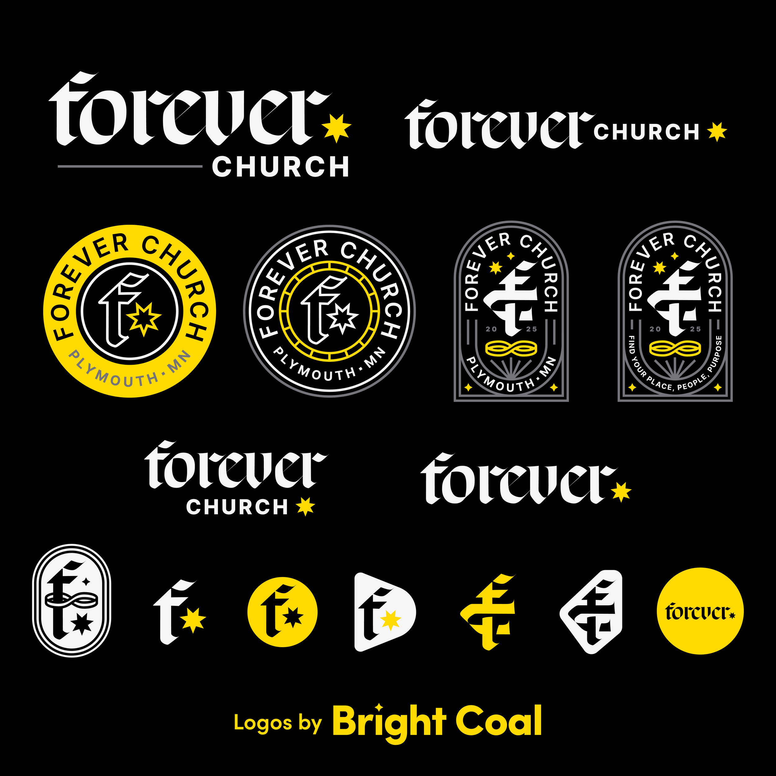
Forever Church kept things unapologetically hardcore and to the point. What is this church interested in? Forever. Rather than losing their identity in an icon, they’re able to directly communicate something of lasting value through their unique logo design.
PROCEED WITH CAUTION: Not all singular words make great word marks. If your church name is abstract already, turning it into a one-word logo idea might not fully capture the message you’re trying to put out. Maybe ask this, as well: Is the word itself too hard to own? It’s always a good time to be reminded to choose our words wisely!
Speaking of cutting things short…
Do you even need the name in your logo design at all? Peep this creative logo design we did awhile back. It might spark some small, but mighty, ideas.