
A Church Logo with Hidden Meaning
Project Type: Main Church Logo
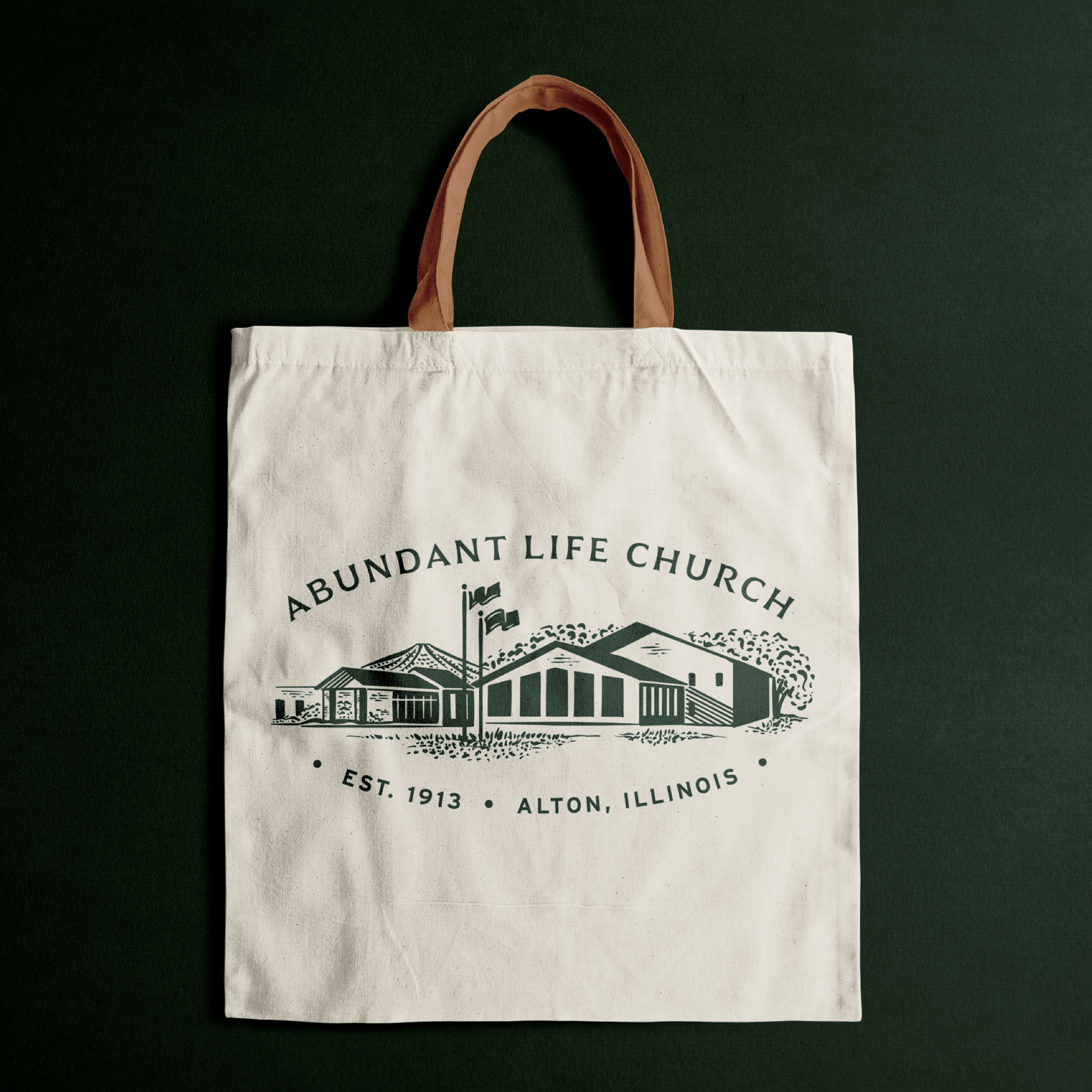
Project Client: Abundant Life Church || @abundantlife.alton
Lead Designer: Rachel Baker
When it comes to logo designs, people are typically looking for that “aha” moment. “We’ll know it when we see it!”So when that moment hasn’t happened yet, the response is sometimes hard to explain. It just needs a little...more. While adjustments and tweaking might be the solution for some projects, other times the greatest design ideas come through restraint. Instead of adding more elements to tell the story, a great strategy might be to leverage what’s being intentionally left out.
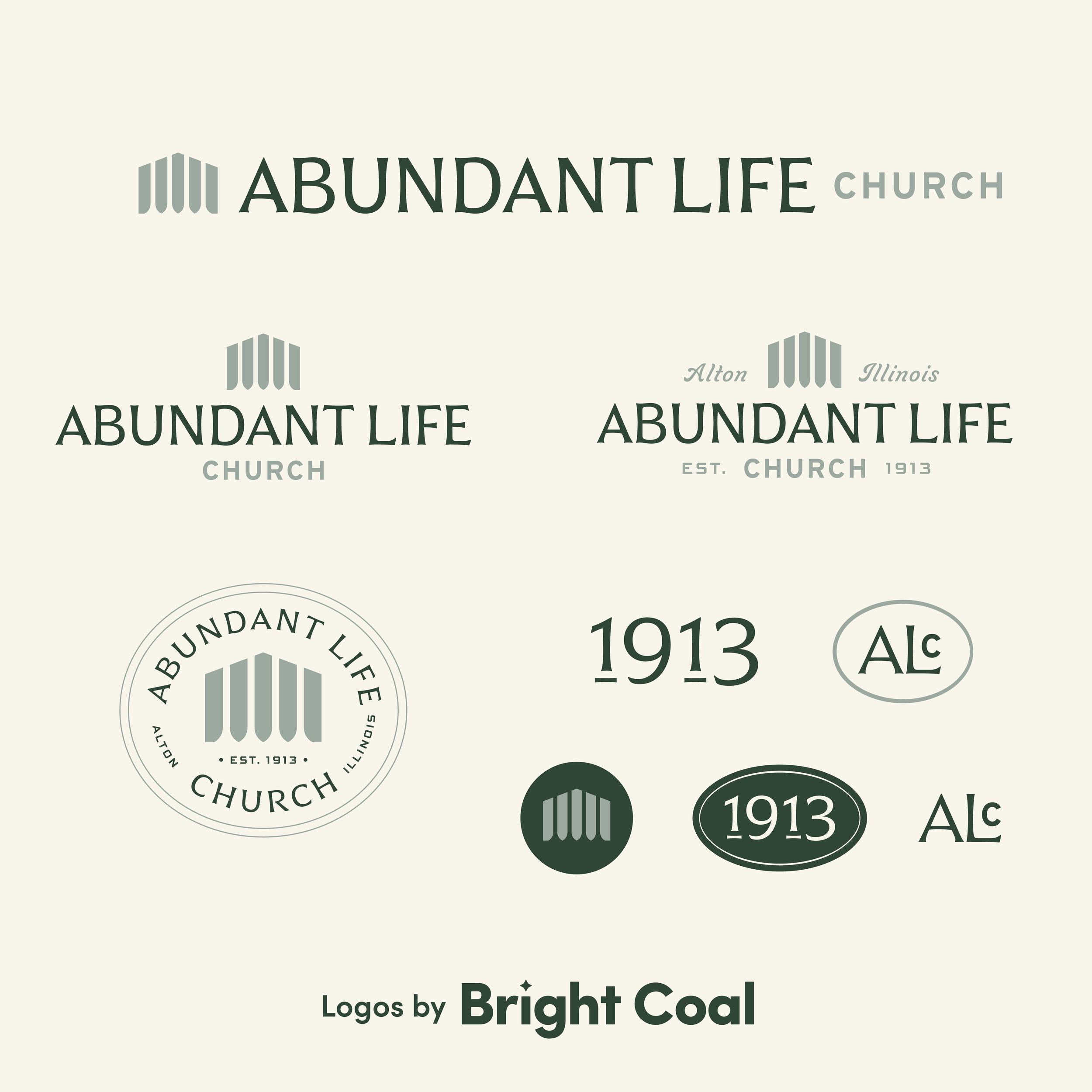
Abundant Life Church has been around for well over 100 years and is a trusted part of their Illinois community. Their people are down-to-earth, friendly and warm. We wanted to honor their rich legacy while still introducing a visual identity that felt modern and ready for the future.

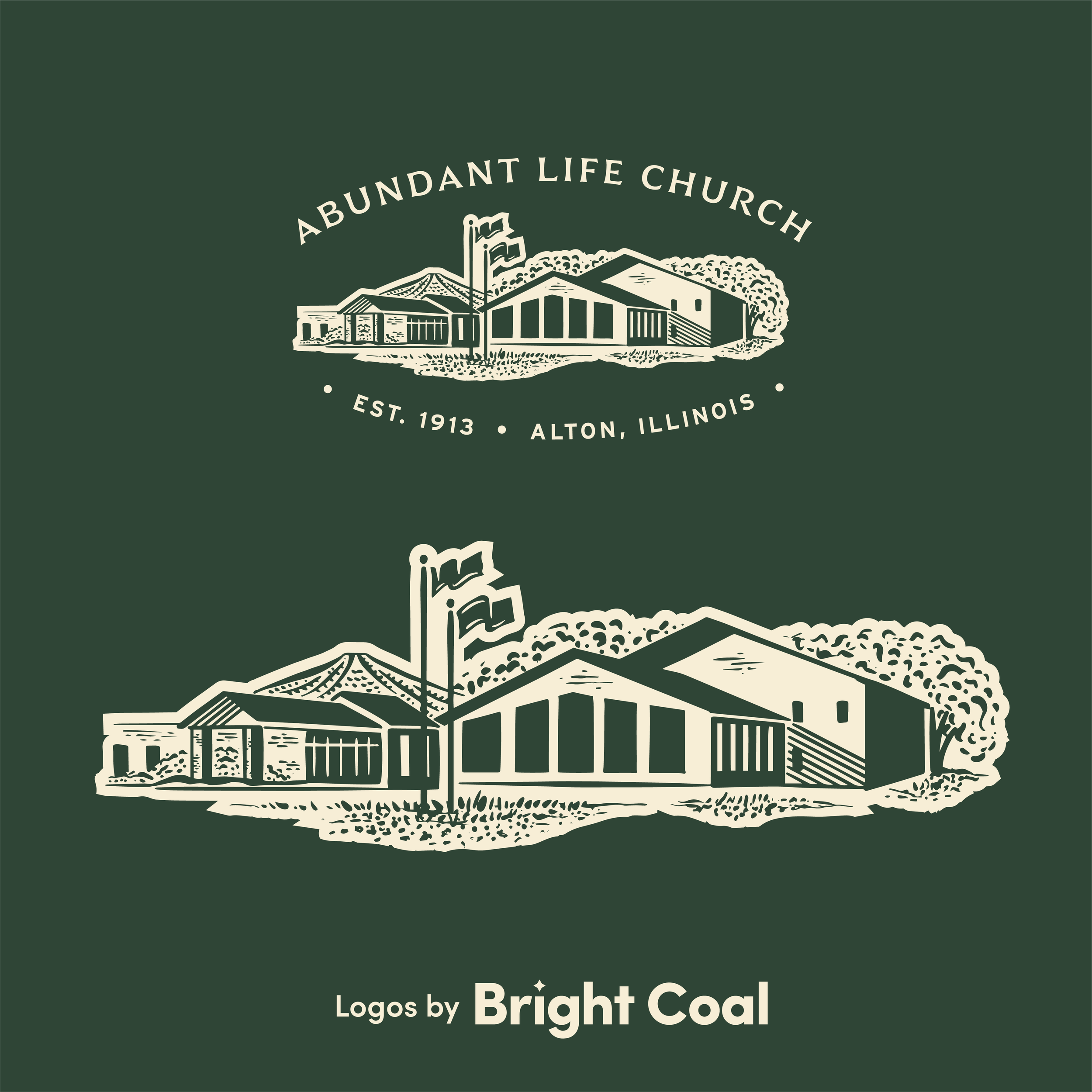
We struck gold with their church logo icon, crafting a mark that does two things at once. It reflects the locally known window formation on their building's facade, which anchors it in a real place. At the same time, the negative space naturally forms a grove of trees, which reflects the church's core tenet of having "faith like a redwood."
“Working with Bright Coal was so much easier than we expected. They helped us drive the vision of our church through visual identity that we could have never achieved on our own. Their style of work helped us see things we didn’t know were there!”

Using a negative space logo style works well because it communicates layered meaning. The church’s ministry values are able to be included through a modern design style. This is a church that is deeply committed to a greater goal, rather than just trying to be trendy through their logo re-design process.
“It’s rewarding to design logos that carry multiple meanings within one simple mark. Magic happens when we can create logos that go beyond the obvious!”


It was an added bonus to get to craft their iconic youth ministry logo design that falls directly in line with the overall church brand. Should the main church logo match the student ministry logo? We’ve covered this topic over here if you’re interested!
Most churches and organizations default to literal, direct symbols in order to communicate quickly and broadly. Negative space design asks something different of the viewer by slowing them down to give time for discovery. Ready to explore a more thoughtful identity for your church? Let’s talk.