
Should Your Church Logos Match?
Back in the early 2000s, there was a popular branding approach sweeping through church culture. We’d hop on the phone with clients and hear some version of, “We want to be a branded house, not a house of brands.” What followed was first time guests requiring a glossary in order to understand the insider lingo around the church. Churches quickly recognized their branding was messy and too convoluted, so they began to overcorrect towards a branded house concept. Branded house solutions included one logo system that should stretch across every other sub-group. A branded house logo design was clean and simplifying, but in time, many of the unique personalities of individual church ministries lost their luster.
Branded House - Corporate Example
While it made sense to align names and culture, did each ministry group have to match stylistically? The biggest miss of the branded house approach is it assumes every ministry, department or audience should communicate the exact same way. But they don’t serve the same people. A women’s ministry audience is fundamentally different than the youth ministry. When every group is forced into one stylistic system or tone, all the life gets sucked out of the group identity.
INTRODUCING: FAMILY BRANDS
We’re big fans of a third path forward called family brands, or logo families. After years of building brands for churches and organizations, we kept hearing the same pain point from clients: how do you create unity without making everything feel the same? A middle schooler, young adult, and a parent don’t experience church the same way, so the brand identity has to be built with its audience in mind.
Today, a logo family framework is central to how Bright Coal operates and how we advise clients. After refining the design process through repetition, we will always champion a branded family approach because it is the healthiest and most effective strategy out there. Should your kids or youth ministry logo match the main church logo? A branded family remains to be the best answer for clients and no one can convince us otherwise!
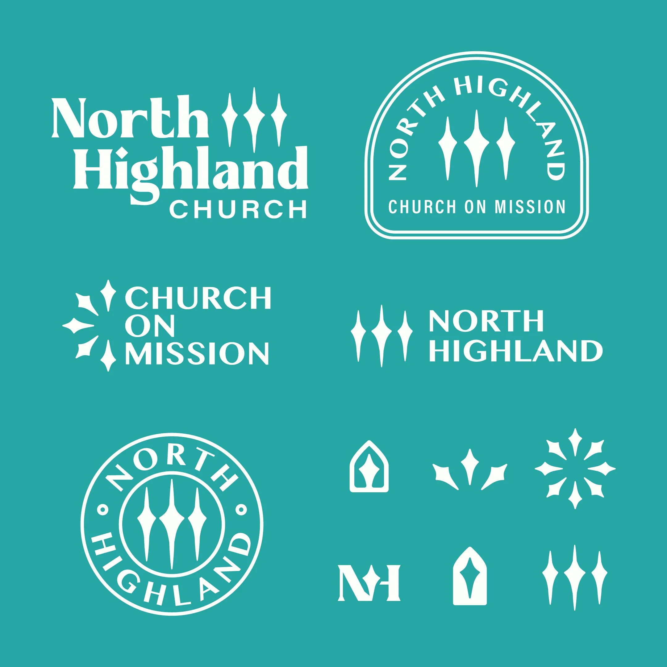
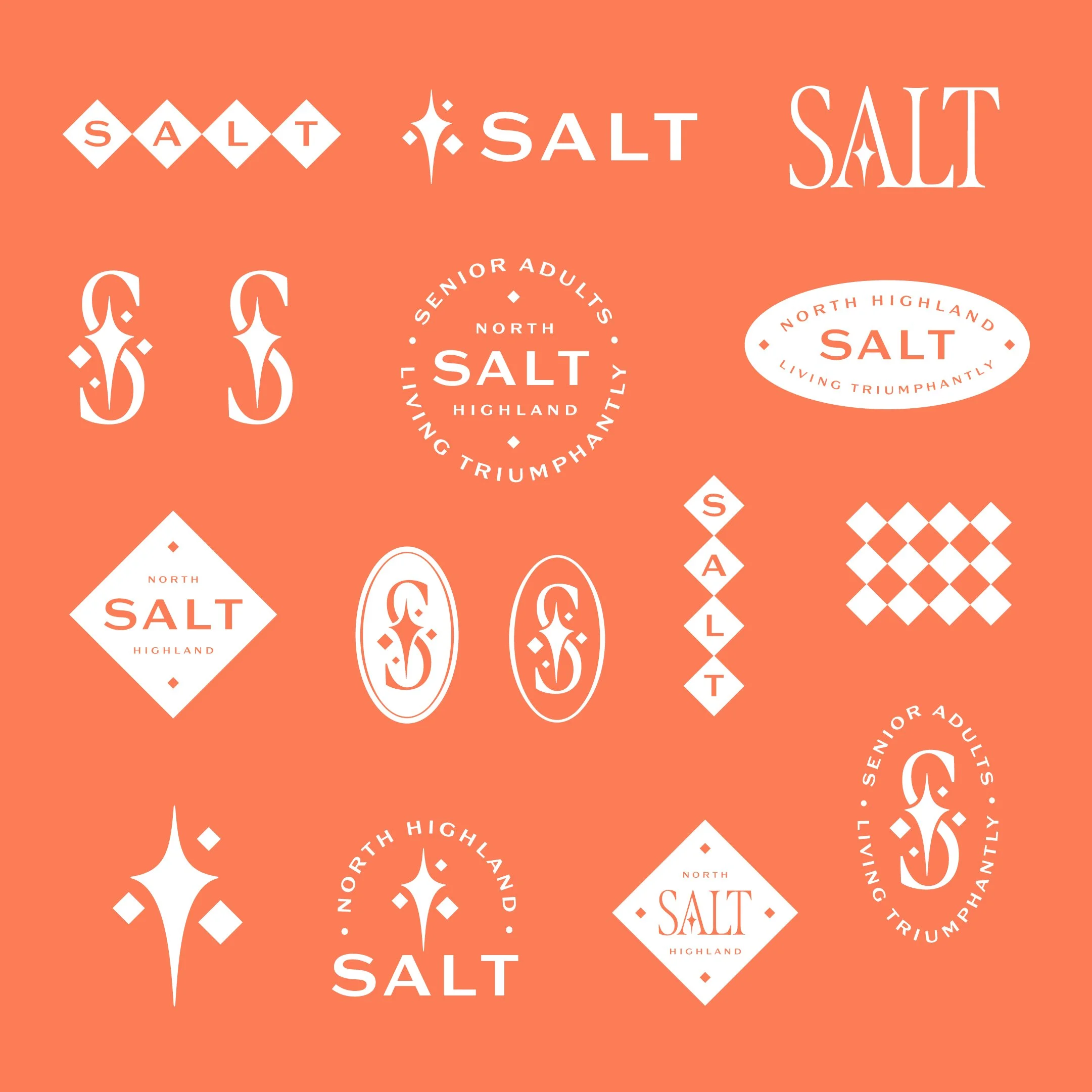
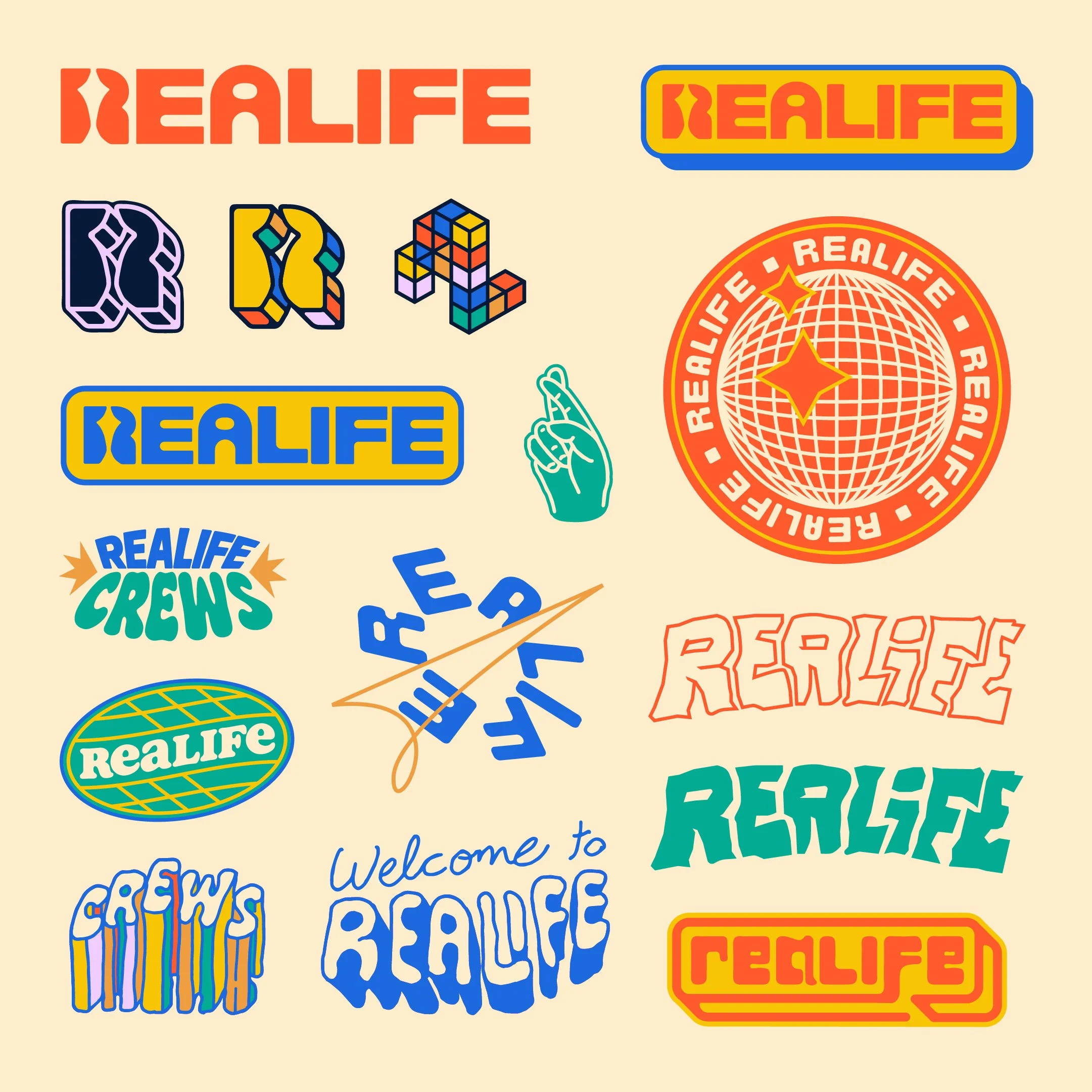
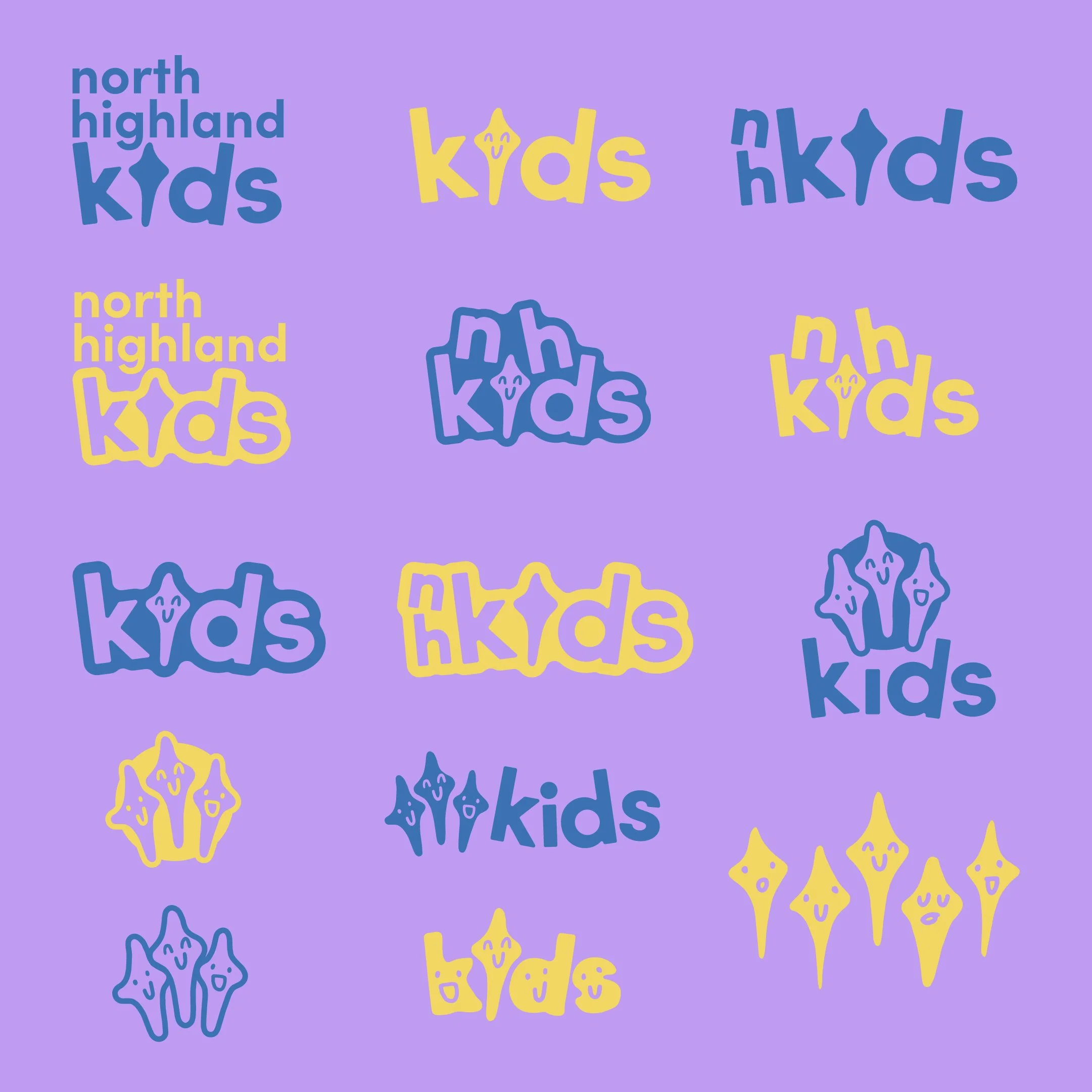
Let’s look at a few examples:
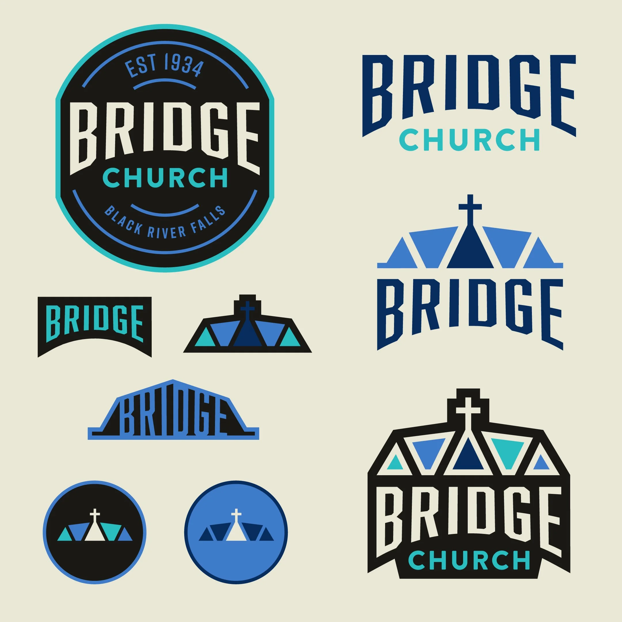
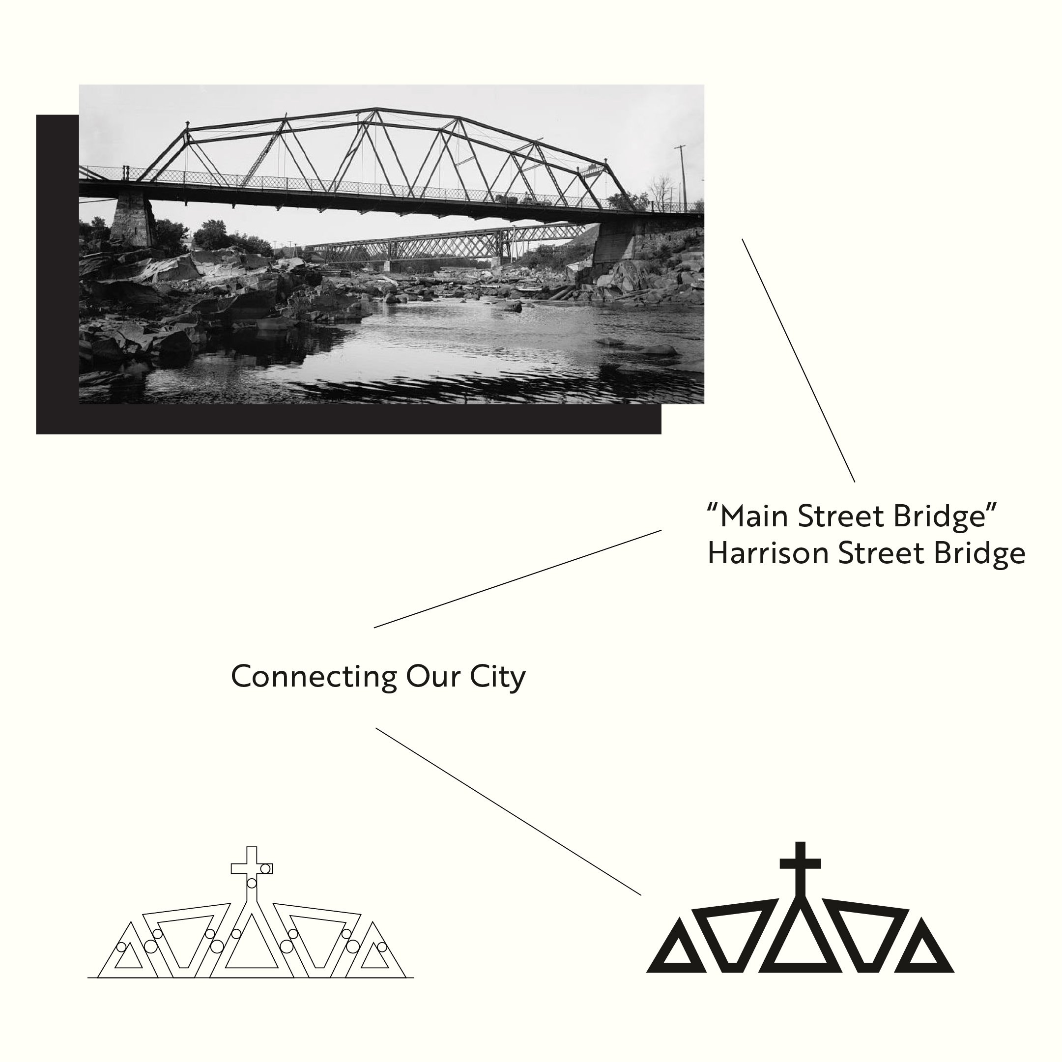
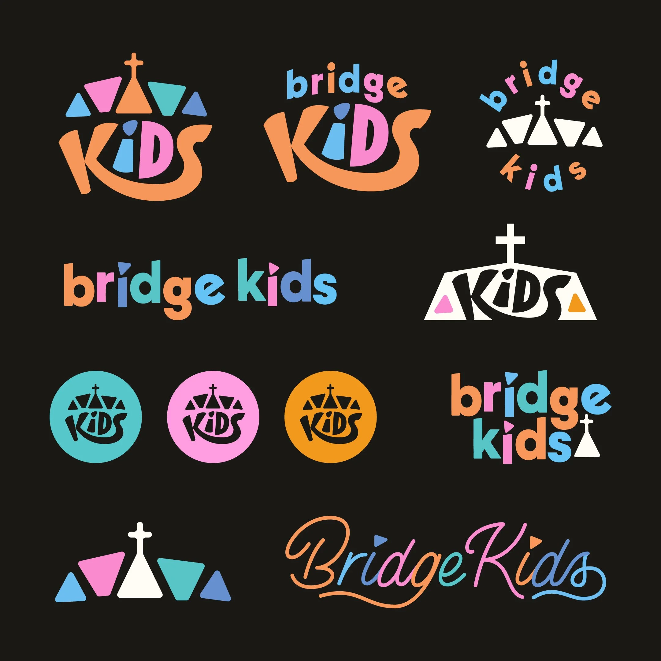
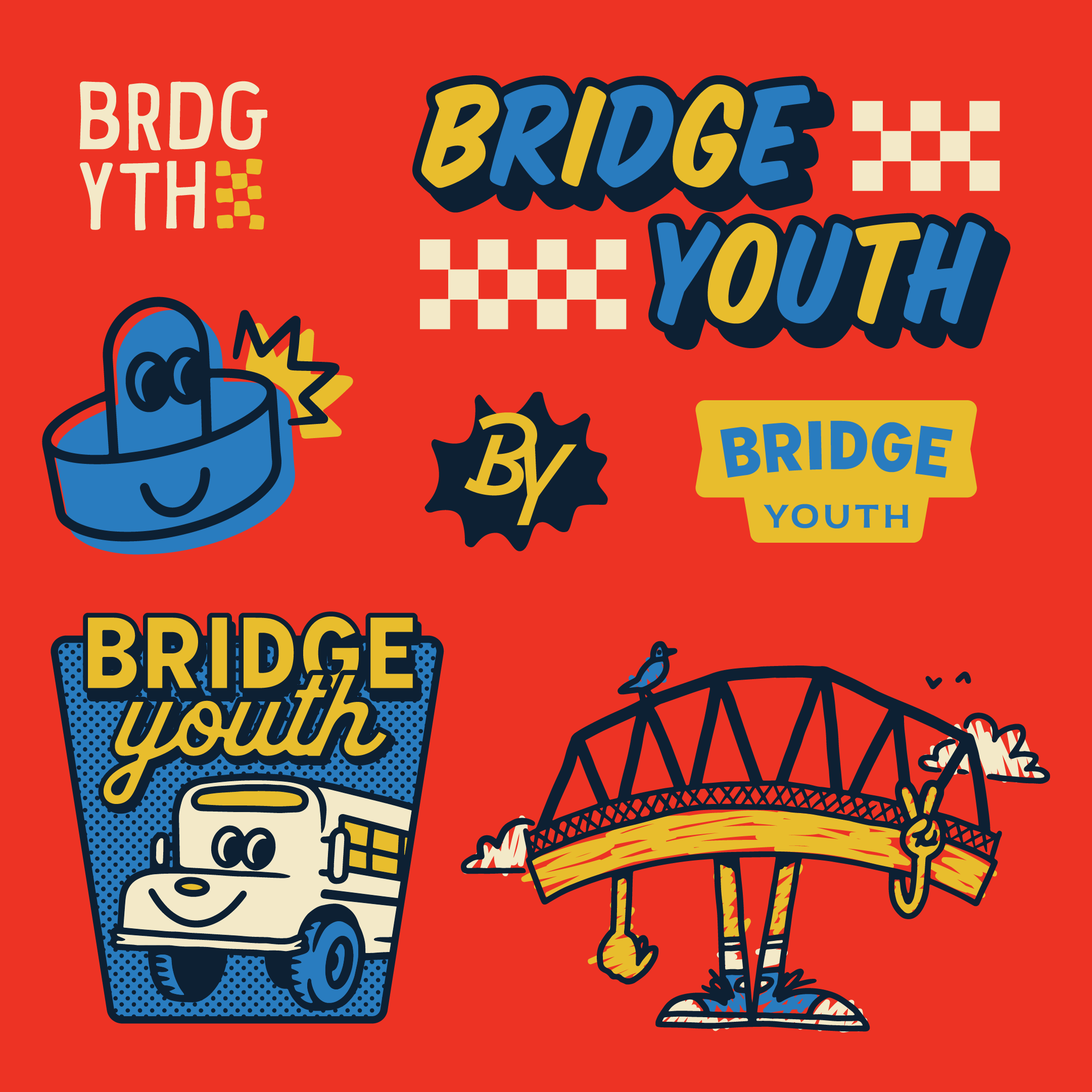
A family brand church reflects diversity and personal expression where each member gets to be their own unique self, while still reflecting the head of household’s core values. Some of the shared DNA could come from repeated metaphors, reoccurring symbols, or storylines that get adapted and explored further across different ministry groups.
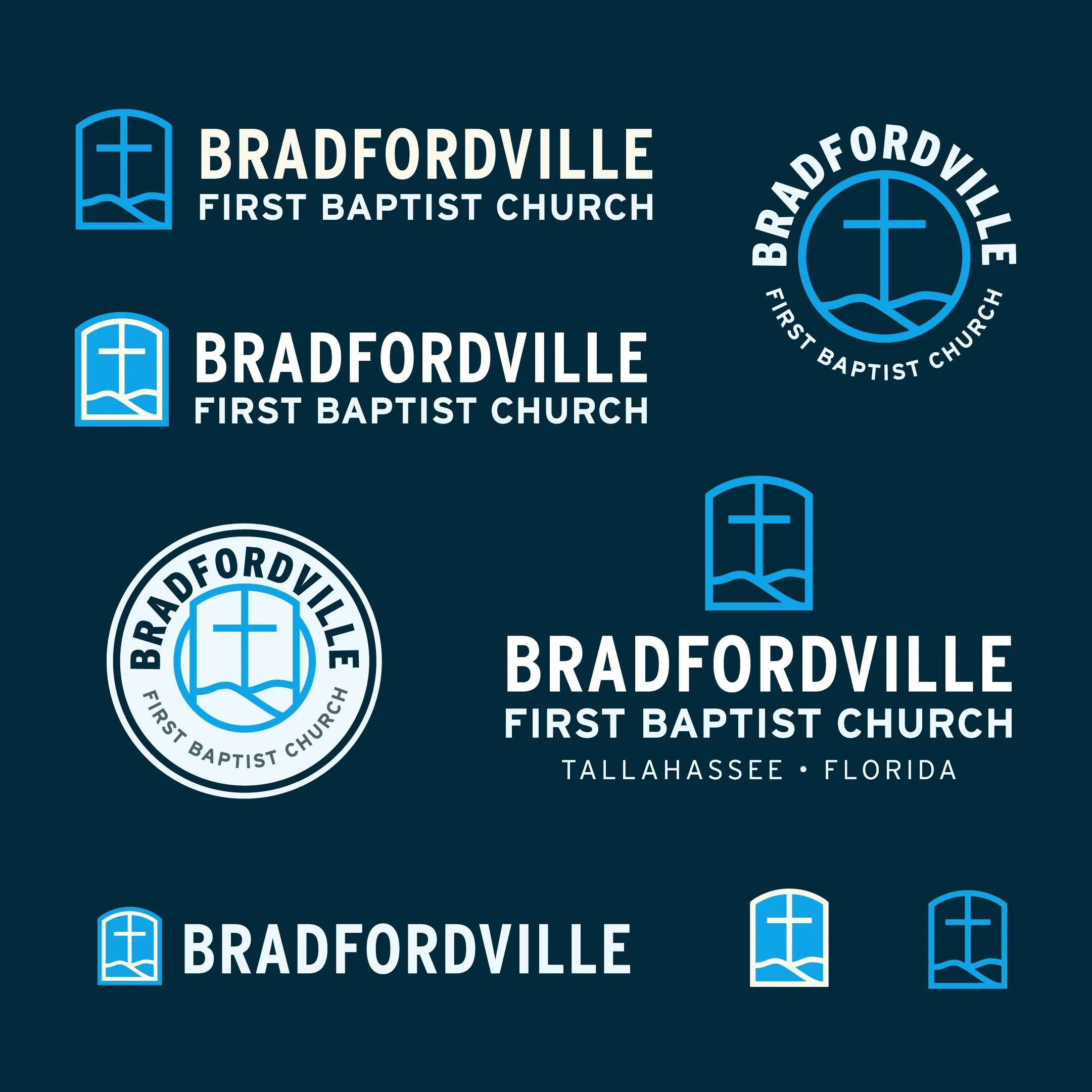
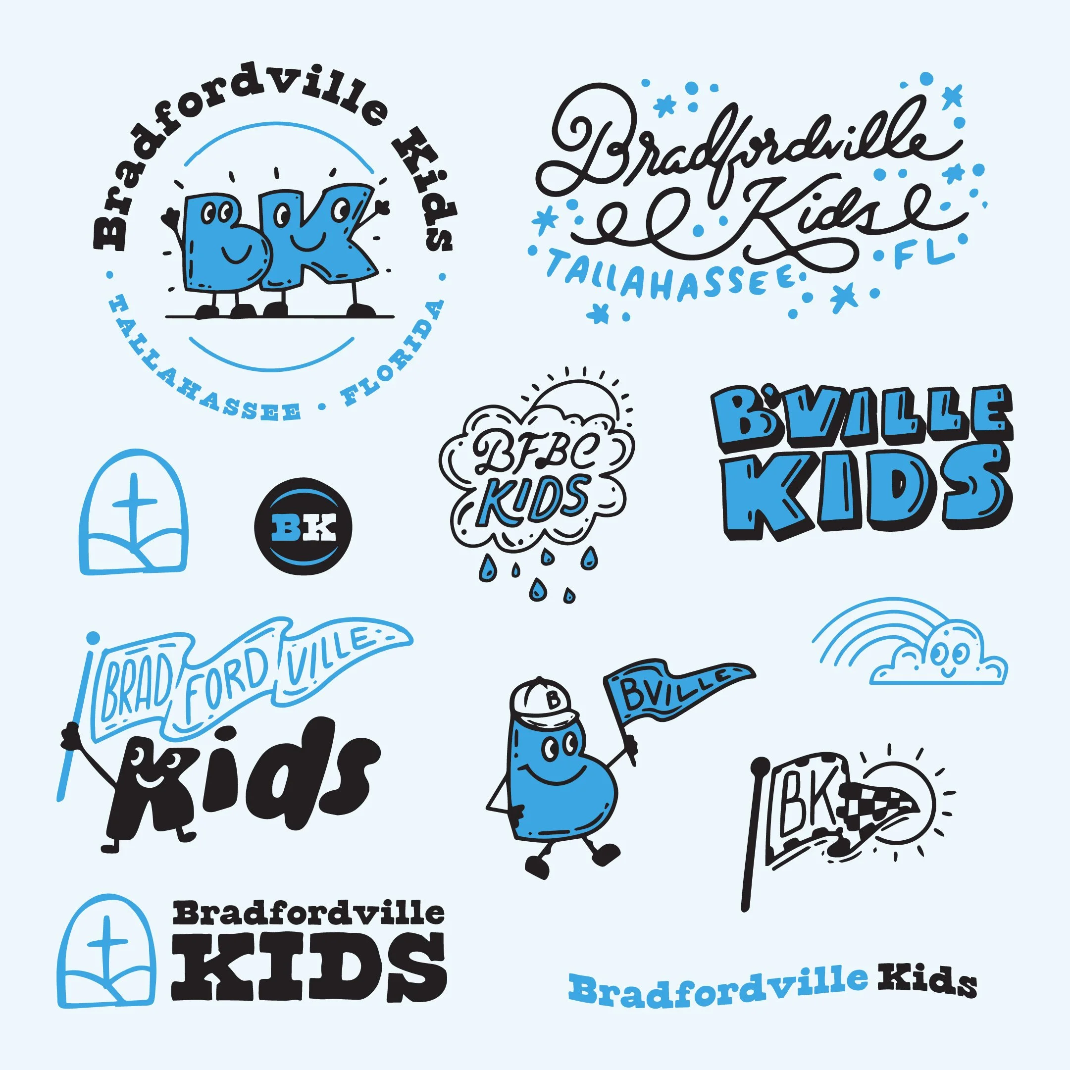
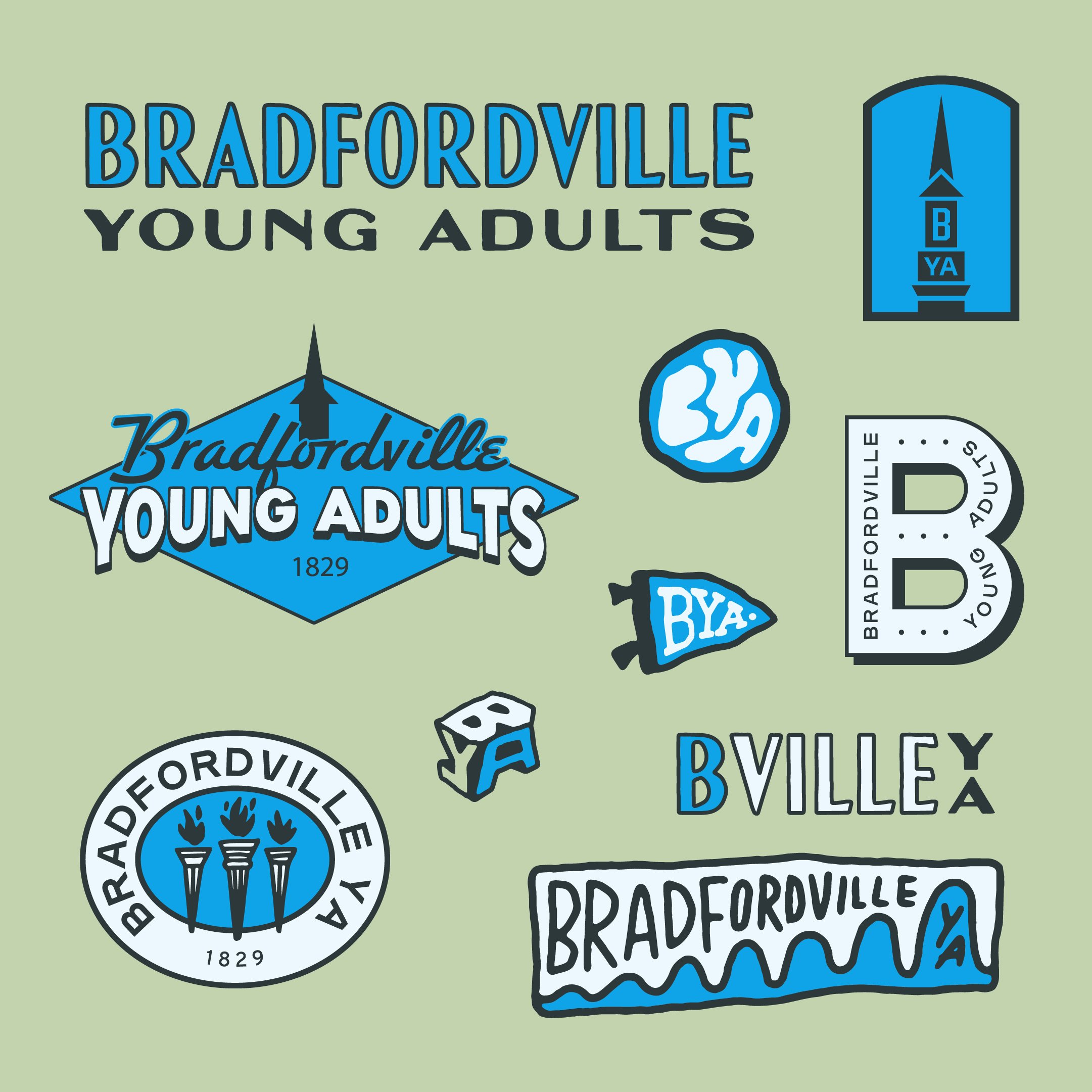
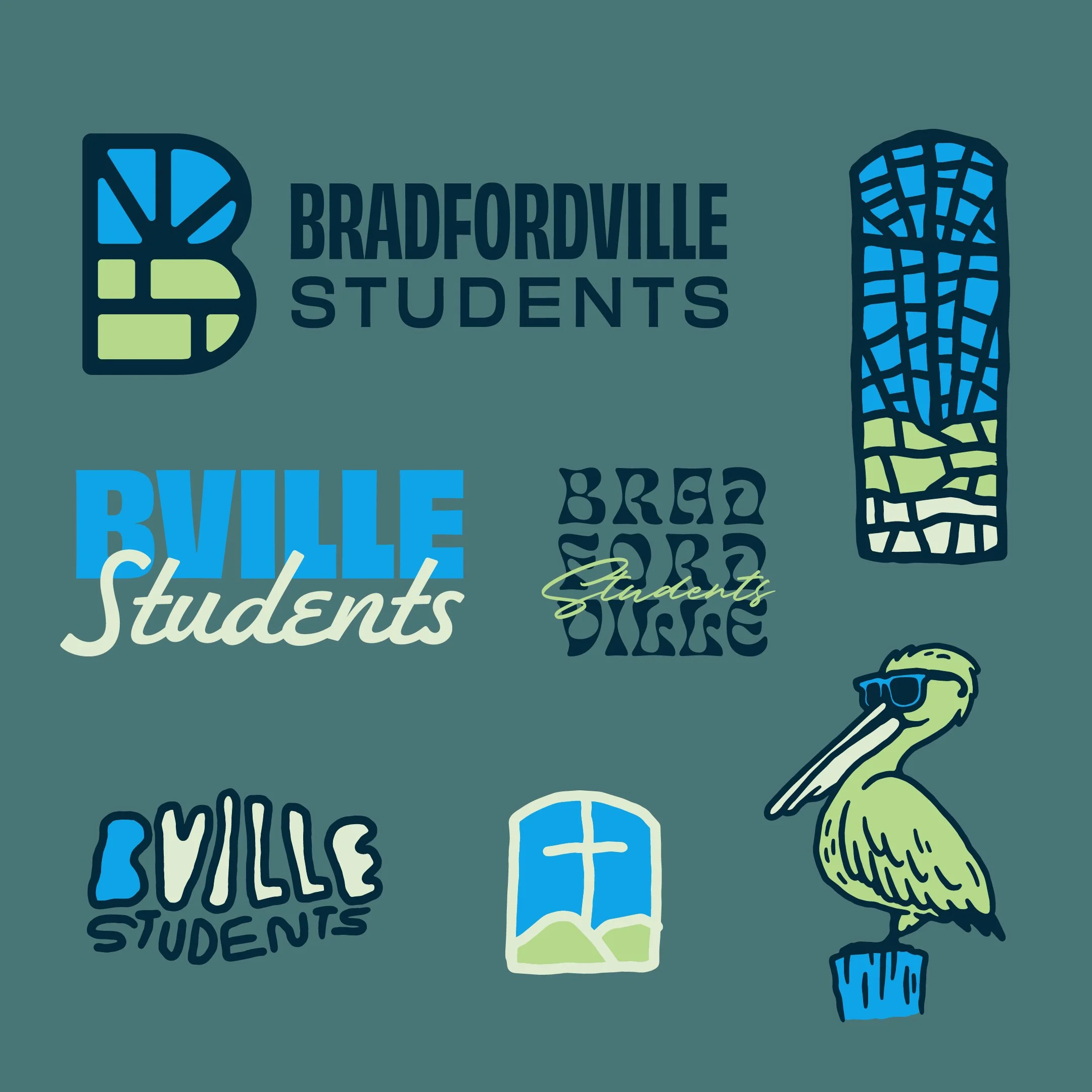
Just as the body has many parts with different functions, so too, should each ministry subgroup function on their own towards a common goal. Even color palettes, font styles and tones can shape up like siblings inside the family. Each has their own flare while remaining connected to their respective, parental guiding light.
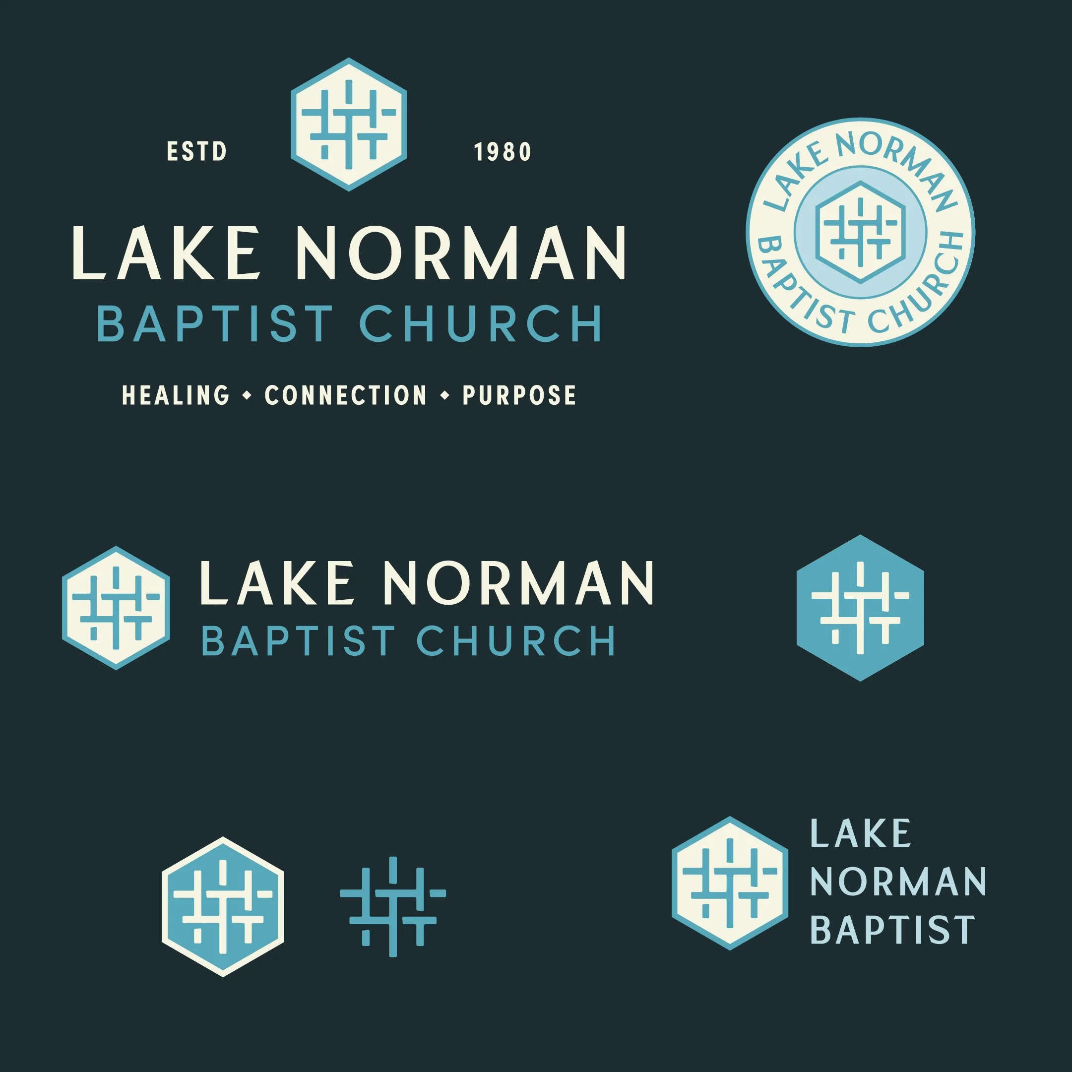
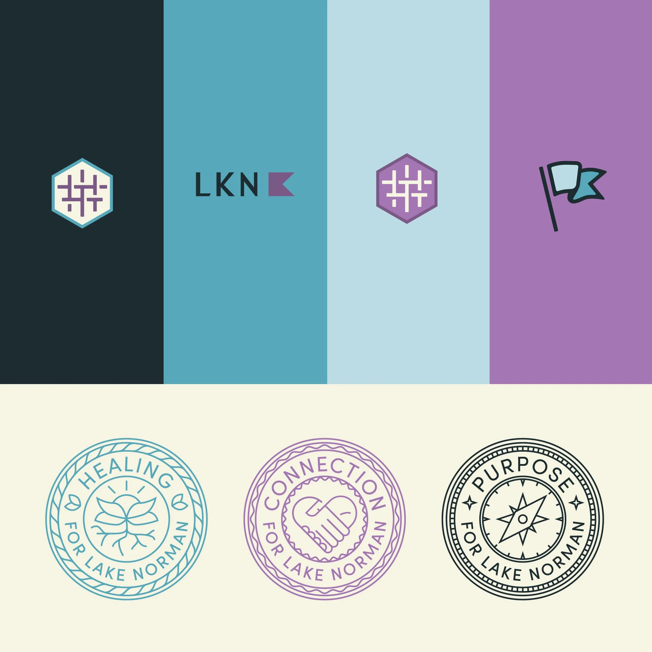
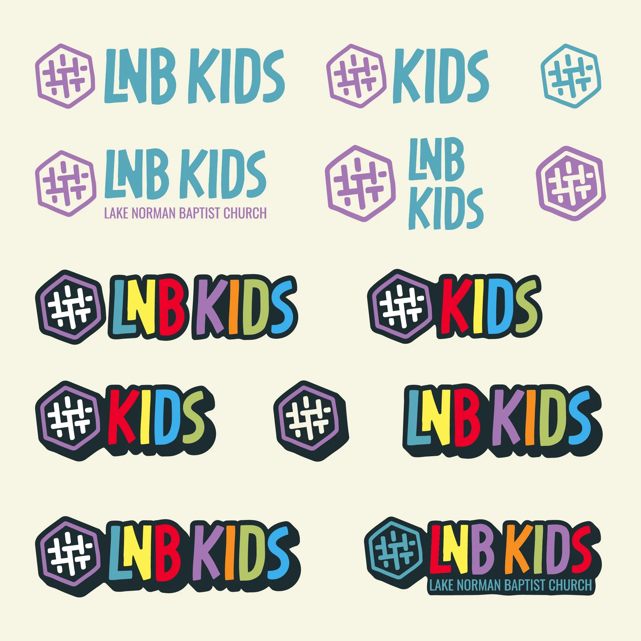
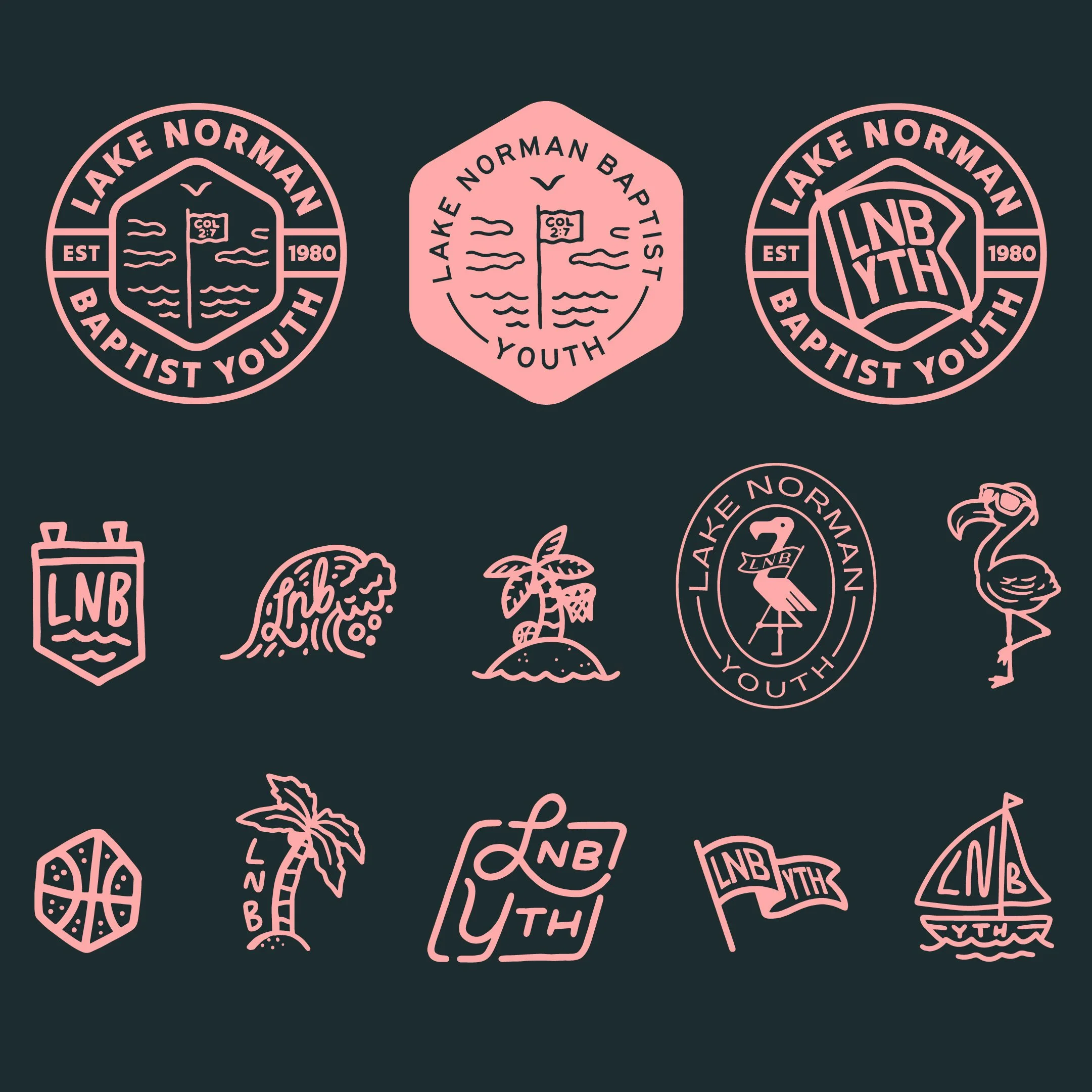
Committing to the community brand concept helps each logo design feel intentionally crafted with people in mind. It can help the senior adult logo design communicate legacy and trust while the youth ministry logo idea stays energetic. The mature, professional main church logo looks great throughout the building, while the youth group logo works better for summer camp merch ideas.
To be fair, we understand the tension between keeping each group unique while trying to tighten up brand awareness. Bright Coal will continue to advocate that the logo family brands approach as the best logo design approach when the goal is for different logos to tell the same story. If we can help your ministry maintain a family resemblance under one roof, have us over for dinner, metaphorically speaking.