
Church Brand Strategy: Lexington Baptist Church
Project Type: Brand Family
Project Client: Lexington Baptist Church || @lexbaptsc
One of the biggest challenges ministries face as they grow is brand inconsistency. It happens unintentionally, but before you know it, the student ministry feels disconnected from the children’s ministry. Mixed messaging and programs that feel disconnected from the main church itself are likely to follow. Creating a cohesion, family of brands is the best church branding strategy. Let’s look at a recent example in Lexington Baptist Church.
Like a family, each member has a unique personality that gets to shine while still belonging under the same roof. At the center of the family brand is the parent, or main church logo design. For Lexington, we wanted to make sure it felt expansive, creating enough space for future growth. The church steeple logo design is polished and deeply rooted in a local, Southern feel to help members recognize it across town. Utilizing your physical landmark as your main logo design has great advantages that you may also want to consider.


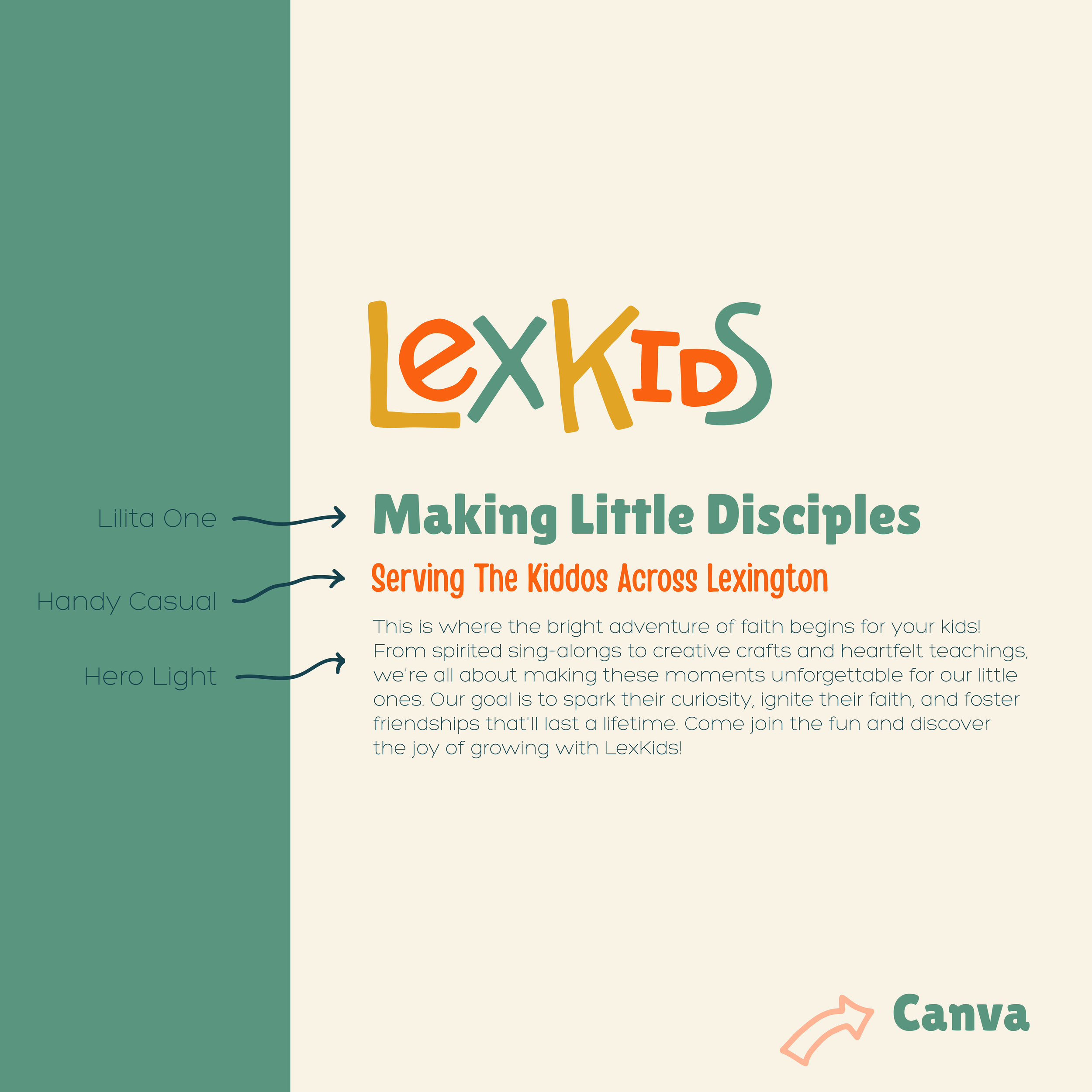
Instead of each group operating as a standalone visual system, each logo design is built on a shared foundation. Their children’s ministry logo has a lot of playfulness while still having a harmonious color palette with the main church logo.


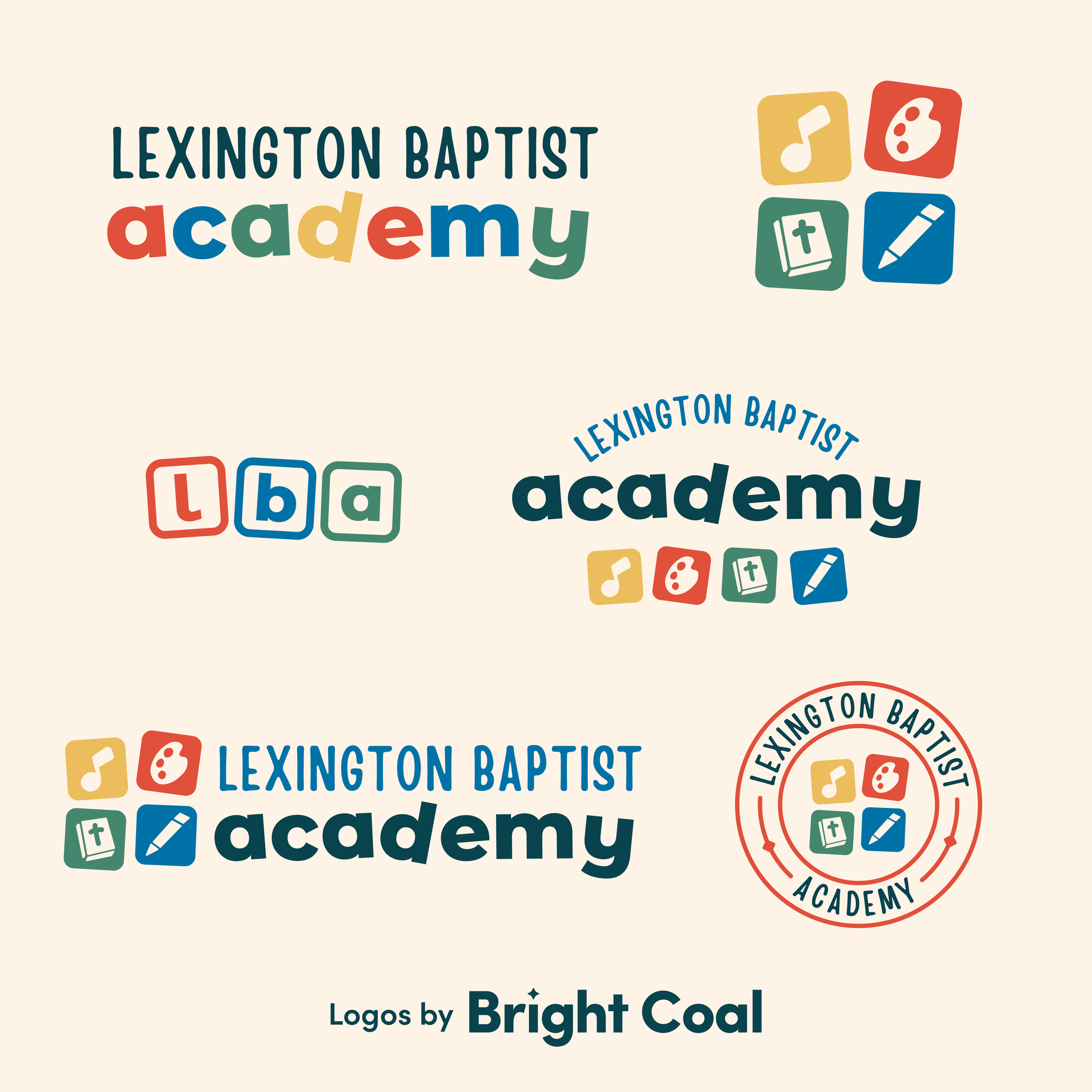
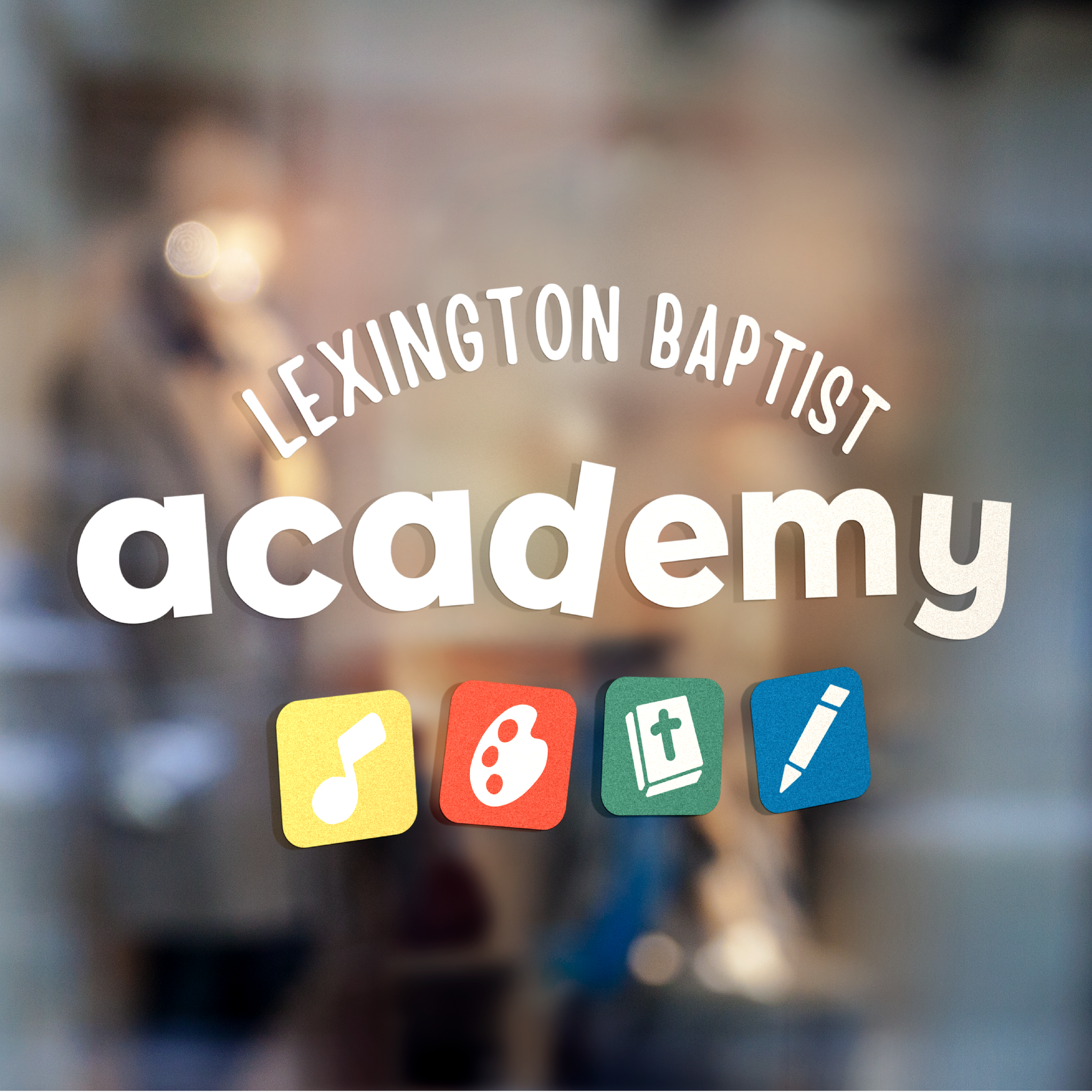
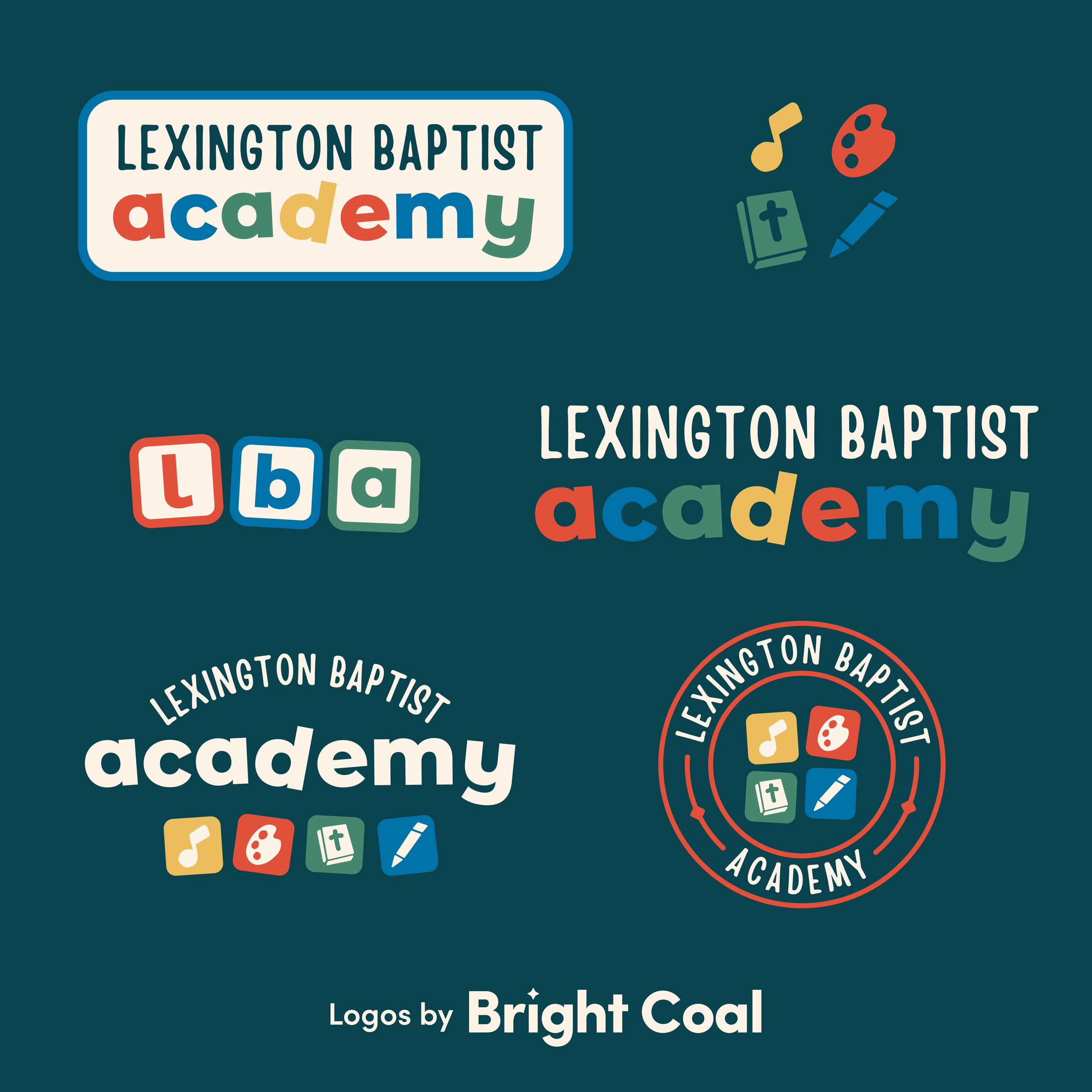
Fun illustrations and a similar, colorful logo design were created for their childcare center. Since the children’s ministry shares space with the daytime learning academy, these logo designs needed to be able to live in the same hallway.
Should the youth ministry logo match the main church logo? This is a question we get all the time! From a design standpoint, the student ministry brand needs to be connected to the main church rather than separate from it. For LexStudents, we achieved this by building the identity as “under the shadow” of the main church brand.


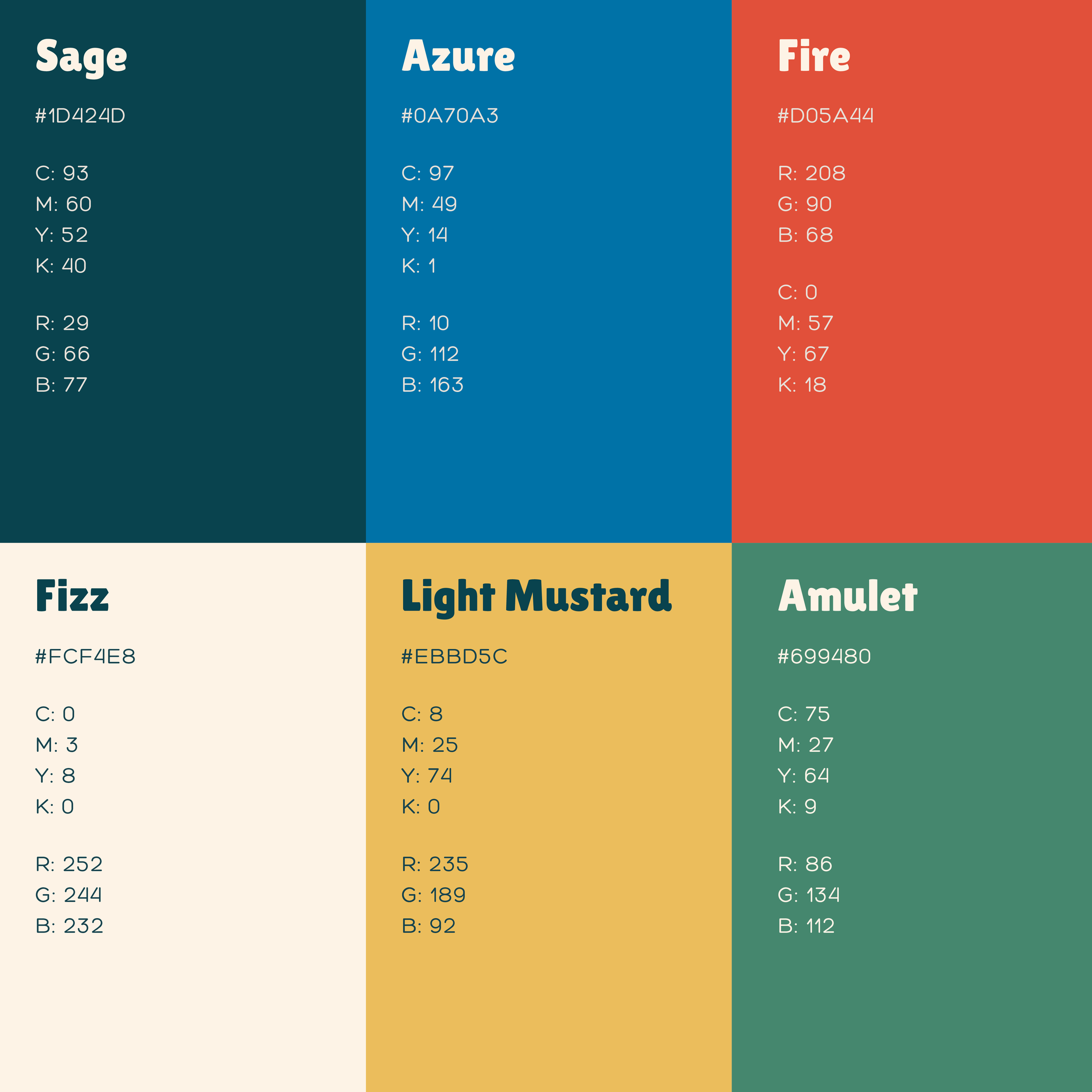
A shared foundation can be found through consistent design elements, color schemes and even through font patterns. Doing this helps create clarity for church members while still giving each ministry group the relevancy it needs to connect with their specific demographic.
“The Bright Coal process, which we’ve now used for both our main church logo and 5 ministry logos, has proven to be incredibly effective in getting everyone moving in the same direction. Bright Coal has a unique ability to guide clients so you feel heard and so your church’s unique identity shines through.”


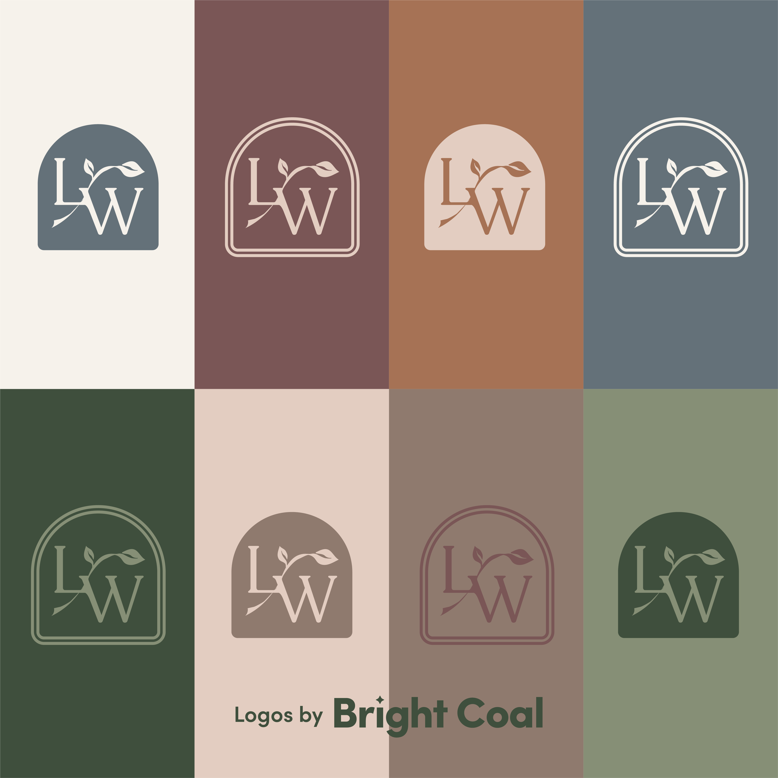
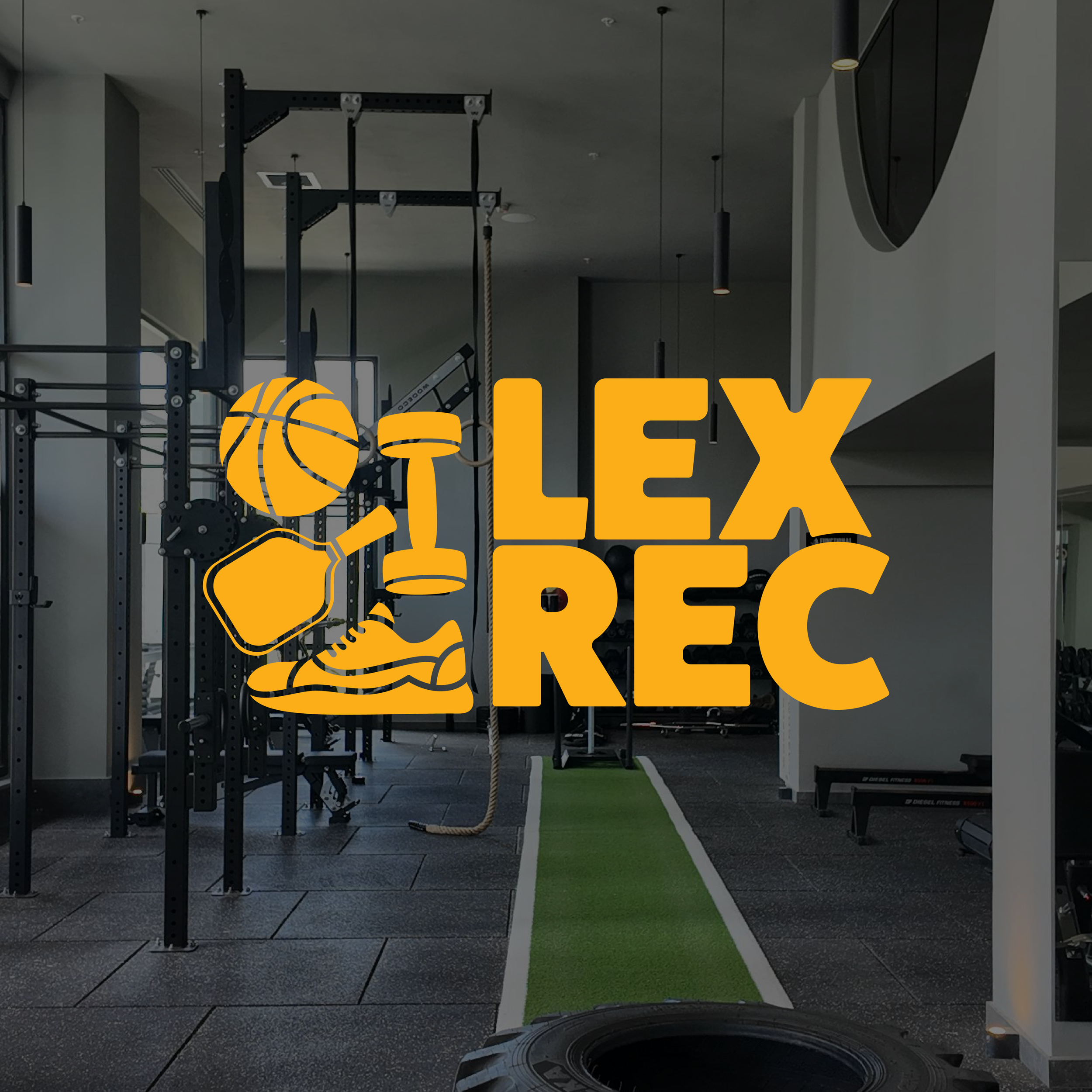
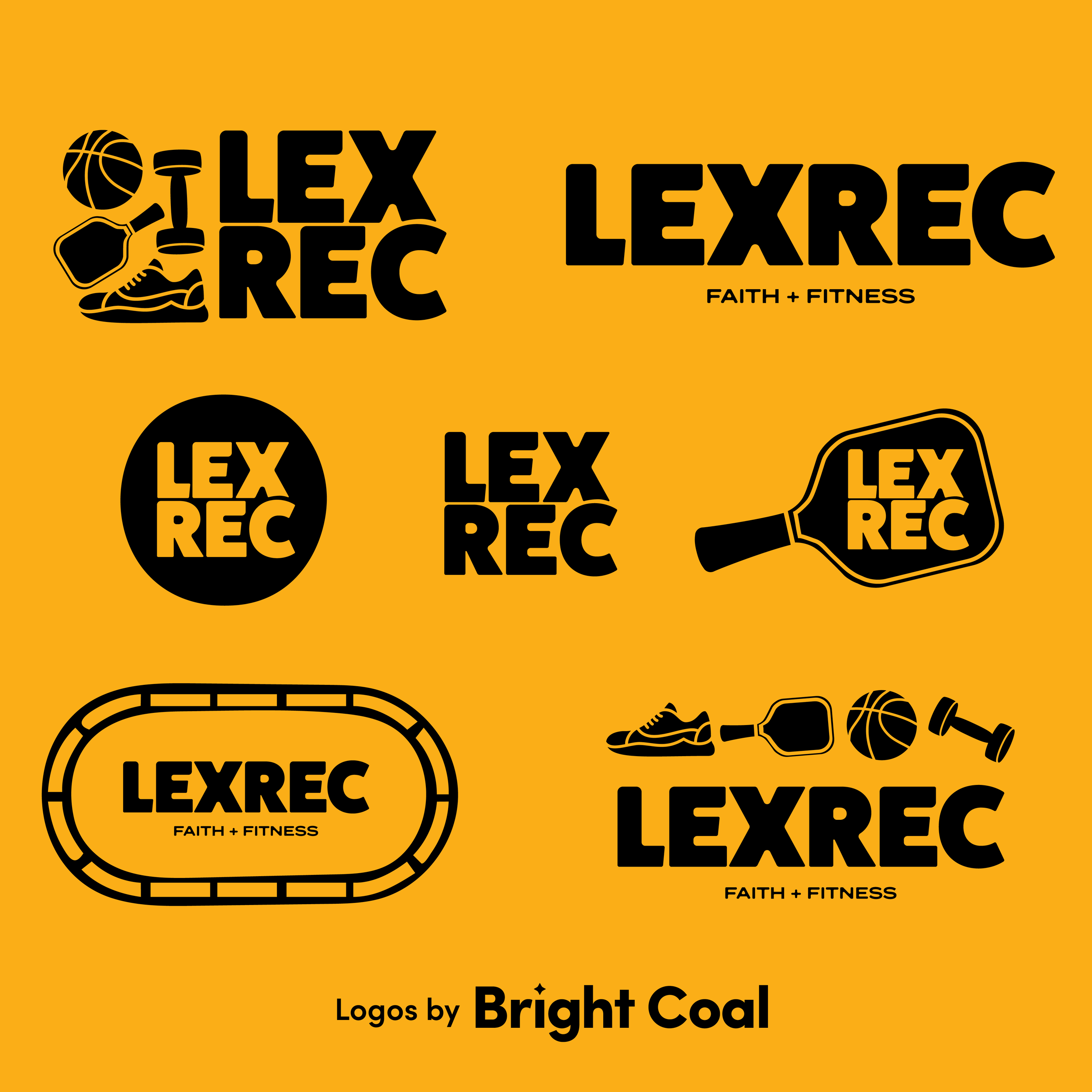
The women’s ministry logo design carries the same visual DNA through the shared steeple icon. Repeating a symbol creates an immediate connection to the main church but still allows the women’s ministry its own gracefulness. The church recreation center design also ties in well with the entire brand family.
How can you keep church logos from all looking the same? A family brand strategy helps build a consistent visual system as the ministry grows over time. If your church is searching for a church branding agency, this is the kind of design approach Bright Coal believes in. Let’s schedule a call to build a unified family of church logos.