
Great children’s ministry branding should help kids feel like they belong and give parents confidence that their children are in capable hands. We’ve gathered a list of 11 memorable kid’s ministry brands we’ve worked on to spark creative conversations around your own kids ministry identity.
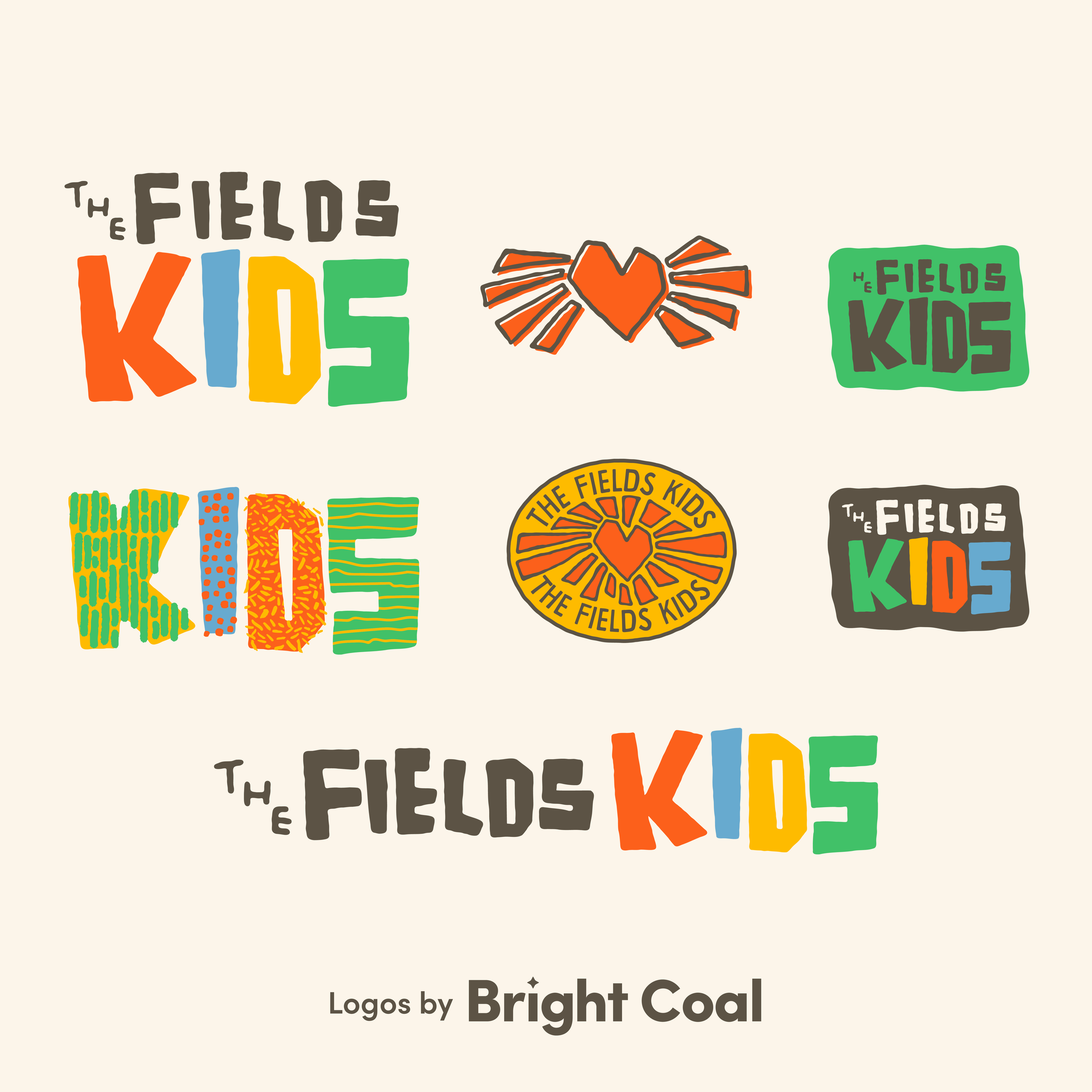
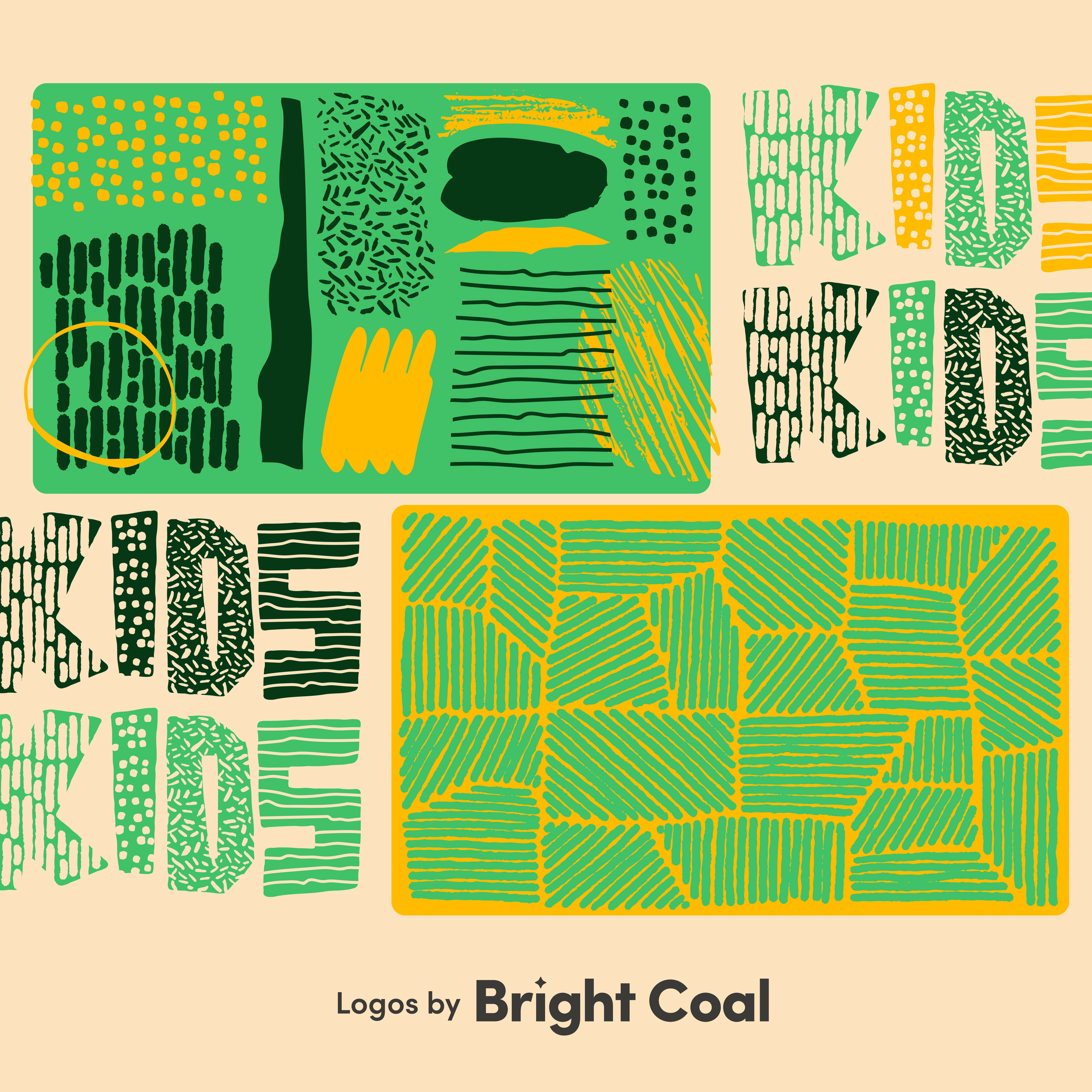
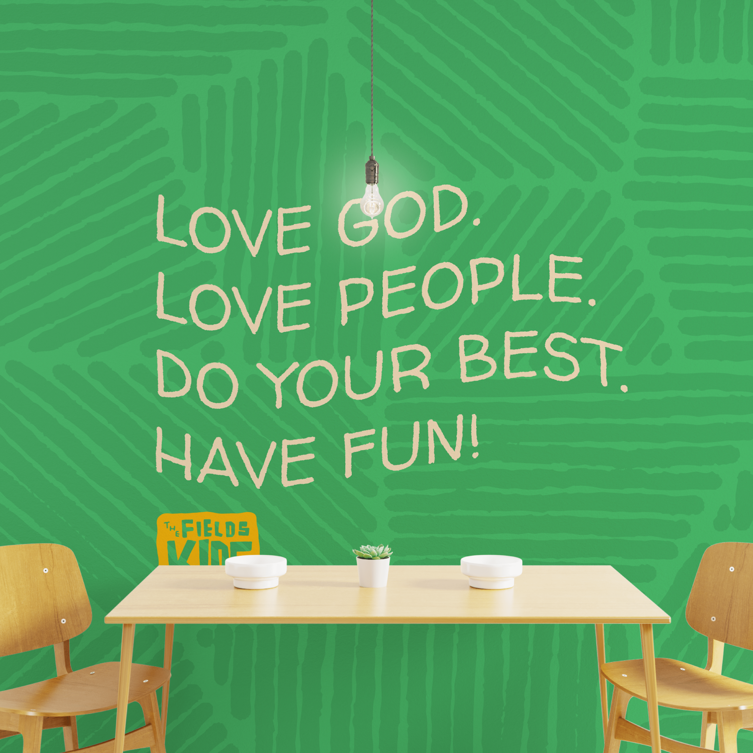
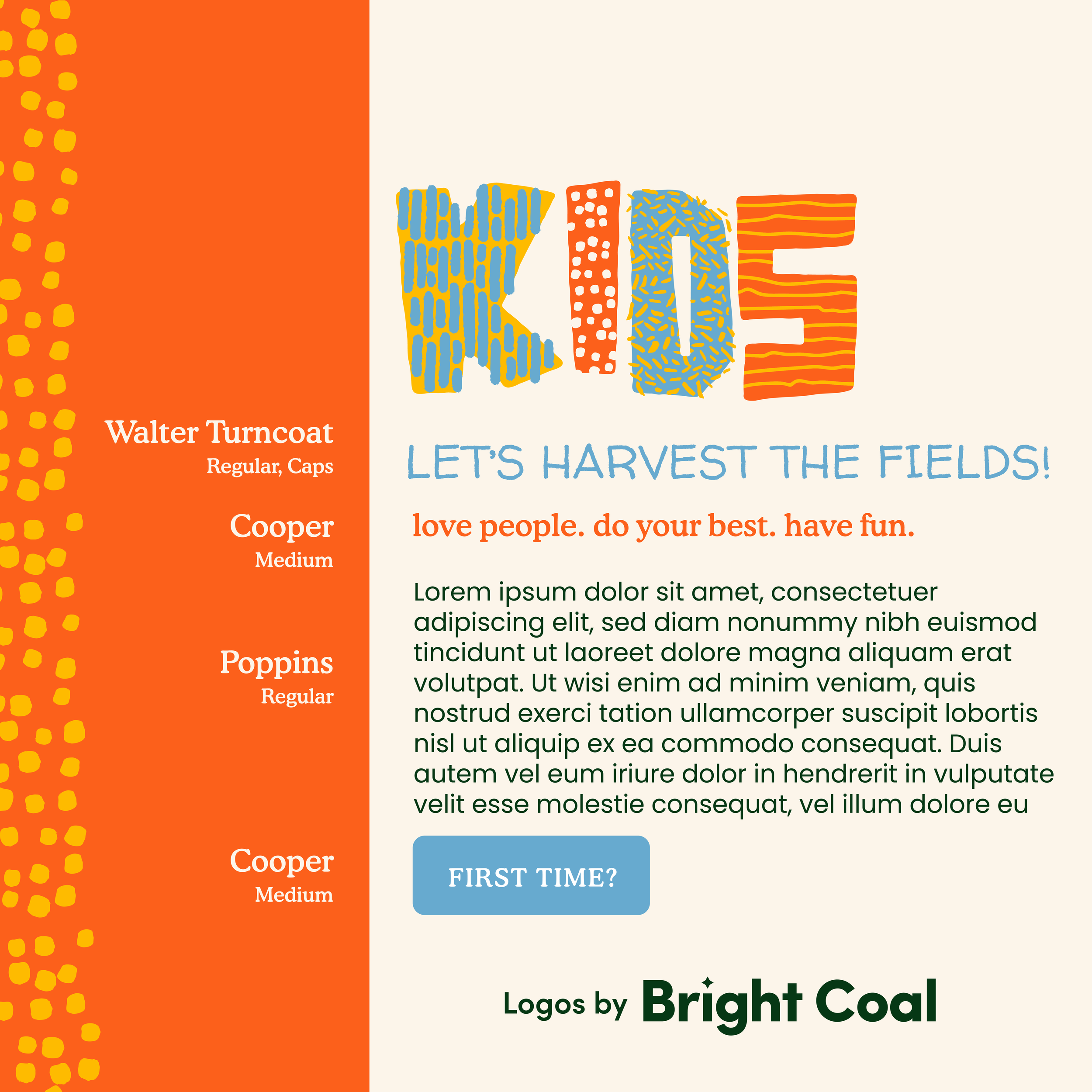
Fields Kids logo design is a bright, hand-drawn identity rooted in core values of heart, home, light, and truth. We included healthy things like light beams, scratchy textures, and aerial-inspired details of fields surrounding the church to celebrate the place these kiddos call home.
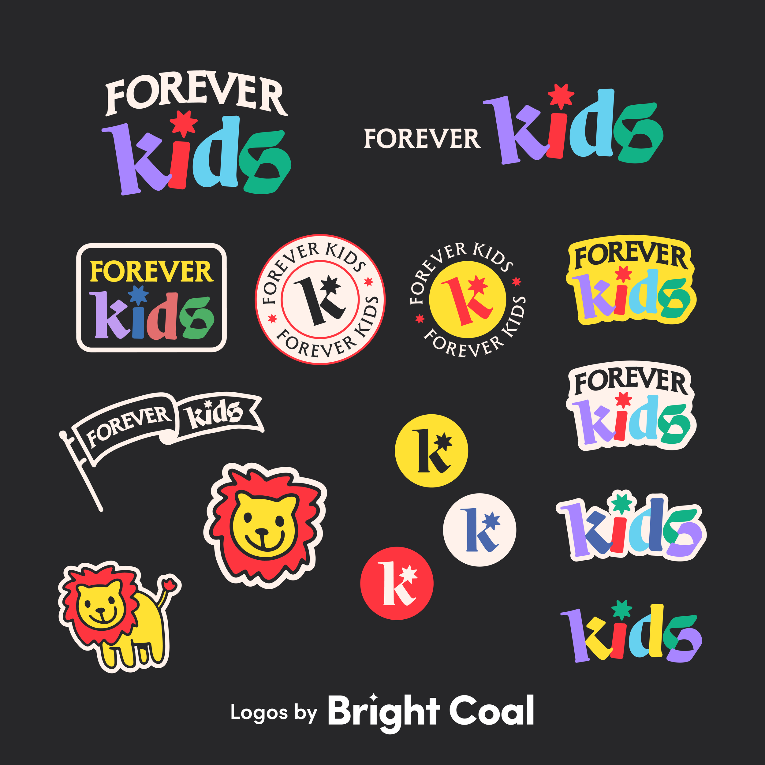
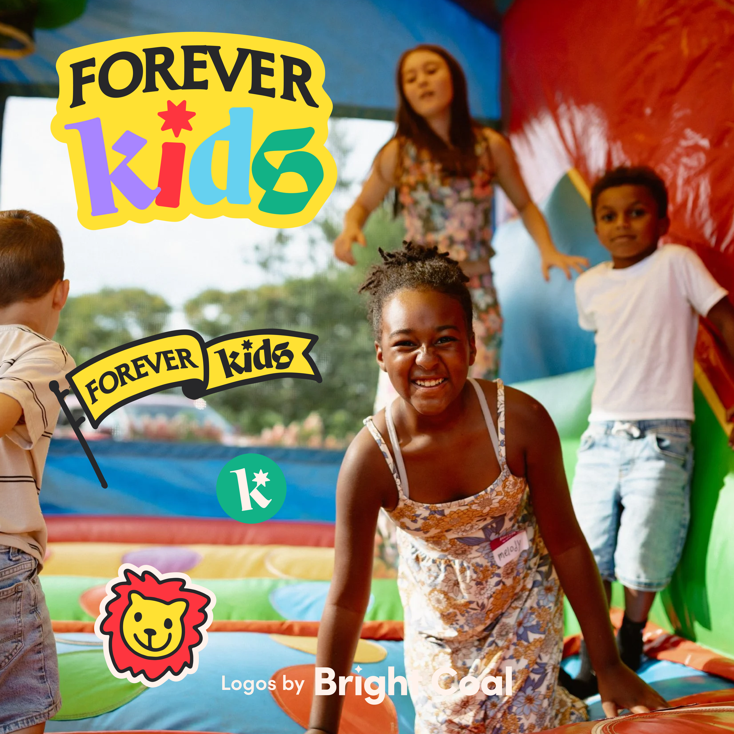
The personality of Forever Church is carried over into a playful, kid-centered world through this bold and colorful brand. We utilized the star pattern from their main church logo to tie these ministry groups together. The confident lion mascot gives a strong visual aid for kids to rally behind.
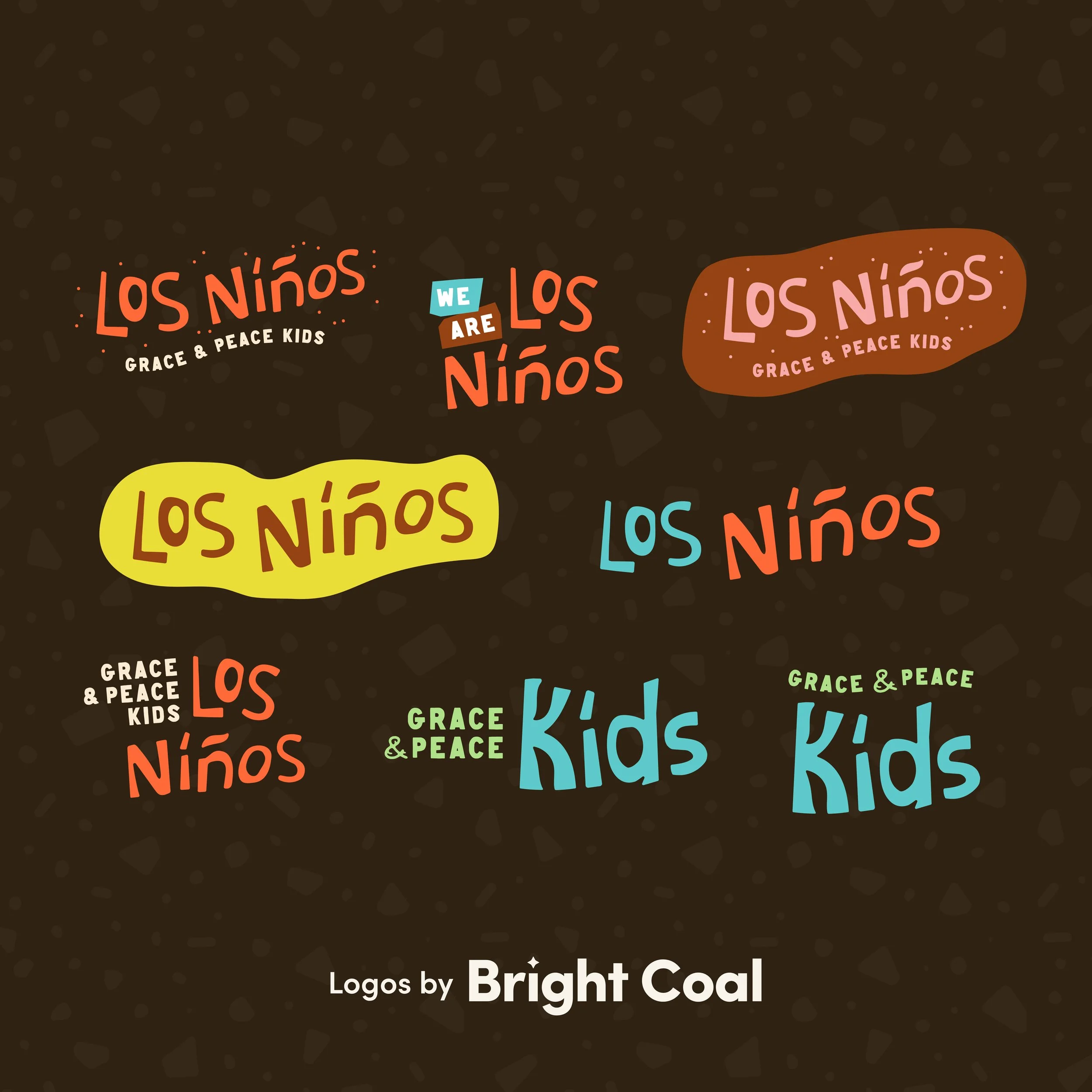
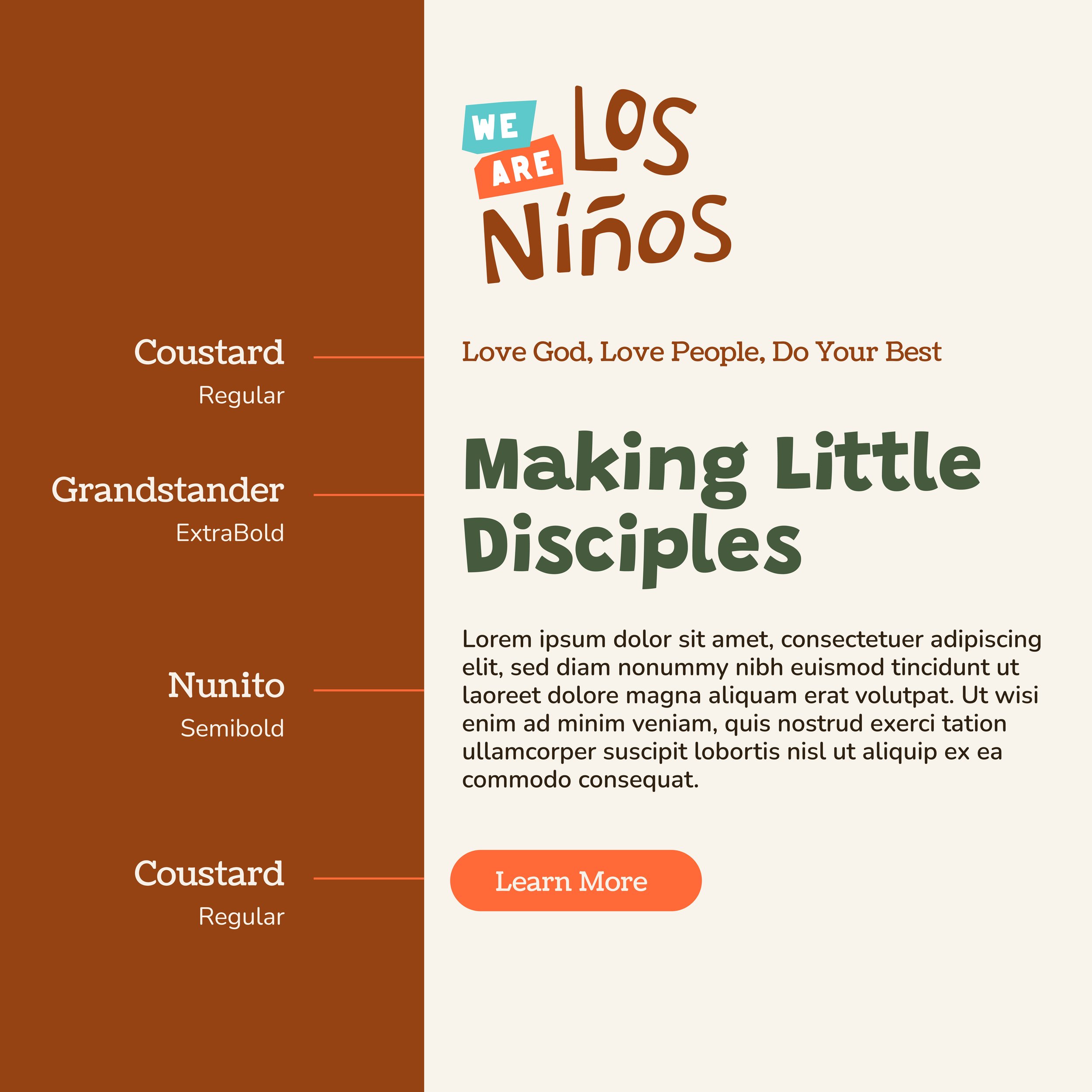
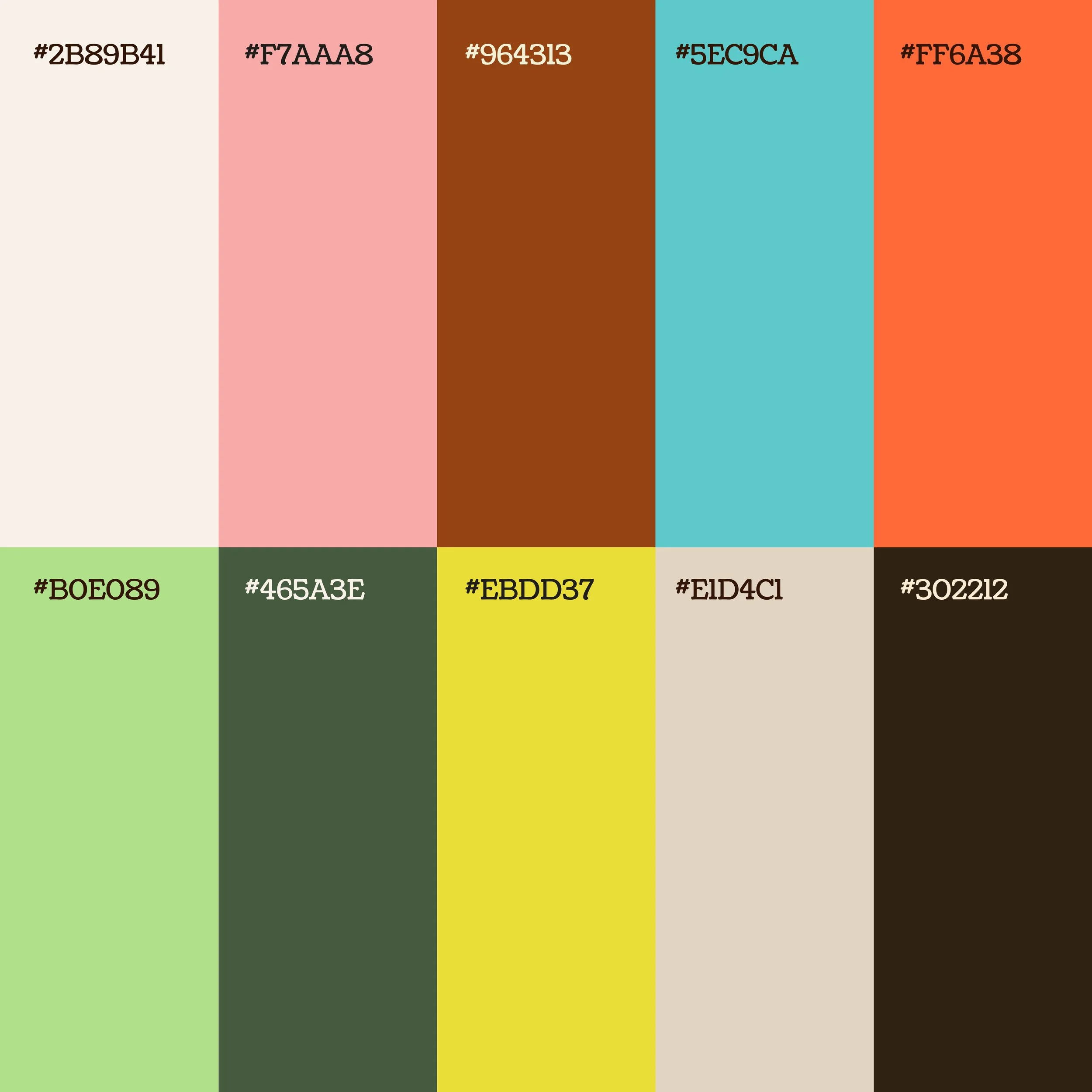
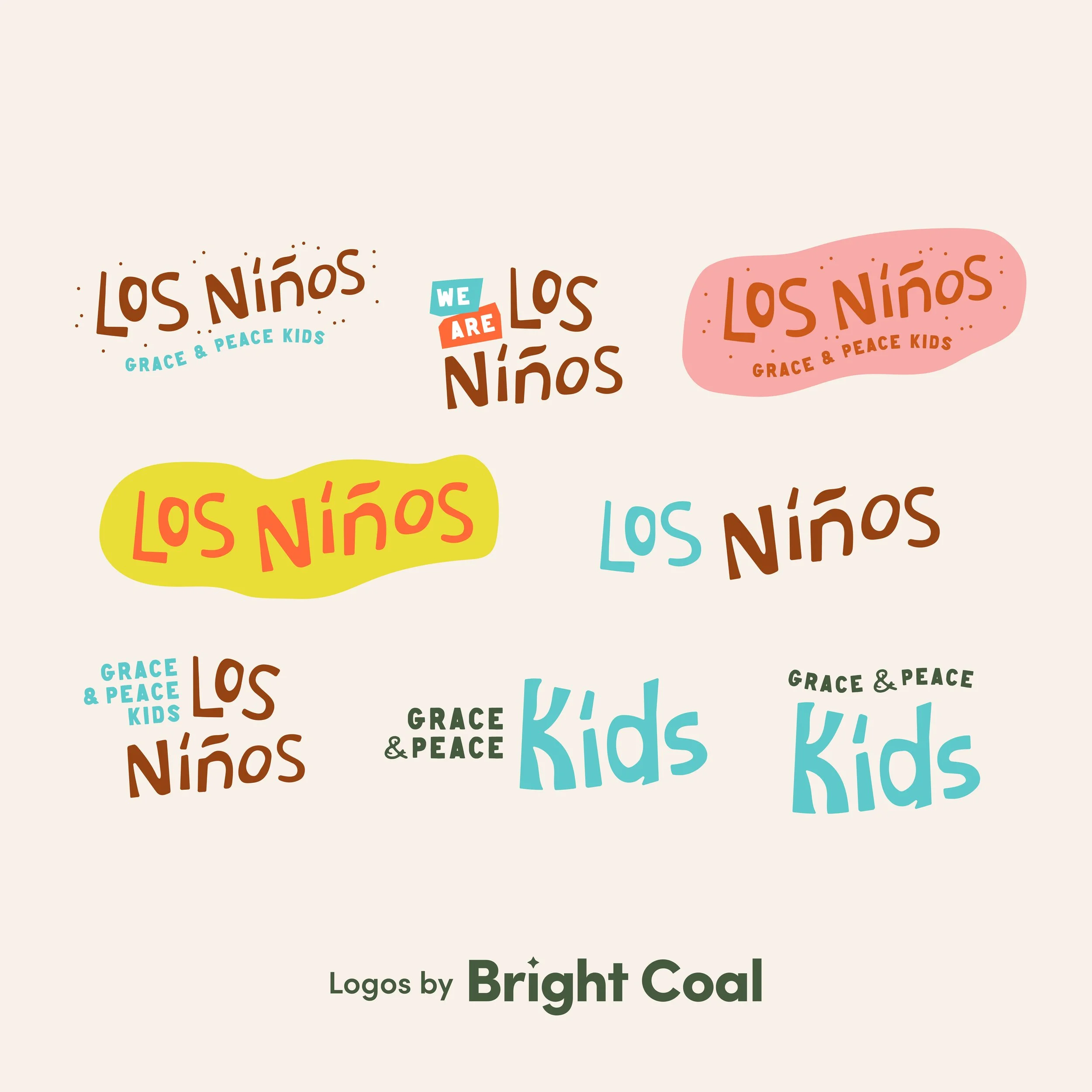
This bilingual church ministry design includes a custom font and slightly more peaceful color combination. This type of kids ministry artwork keeps things bright and welcoming inside their children’s ministry space.
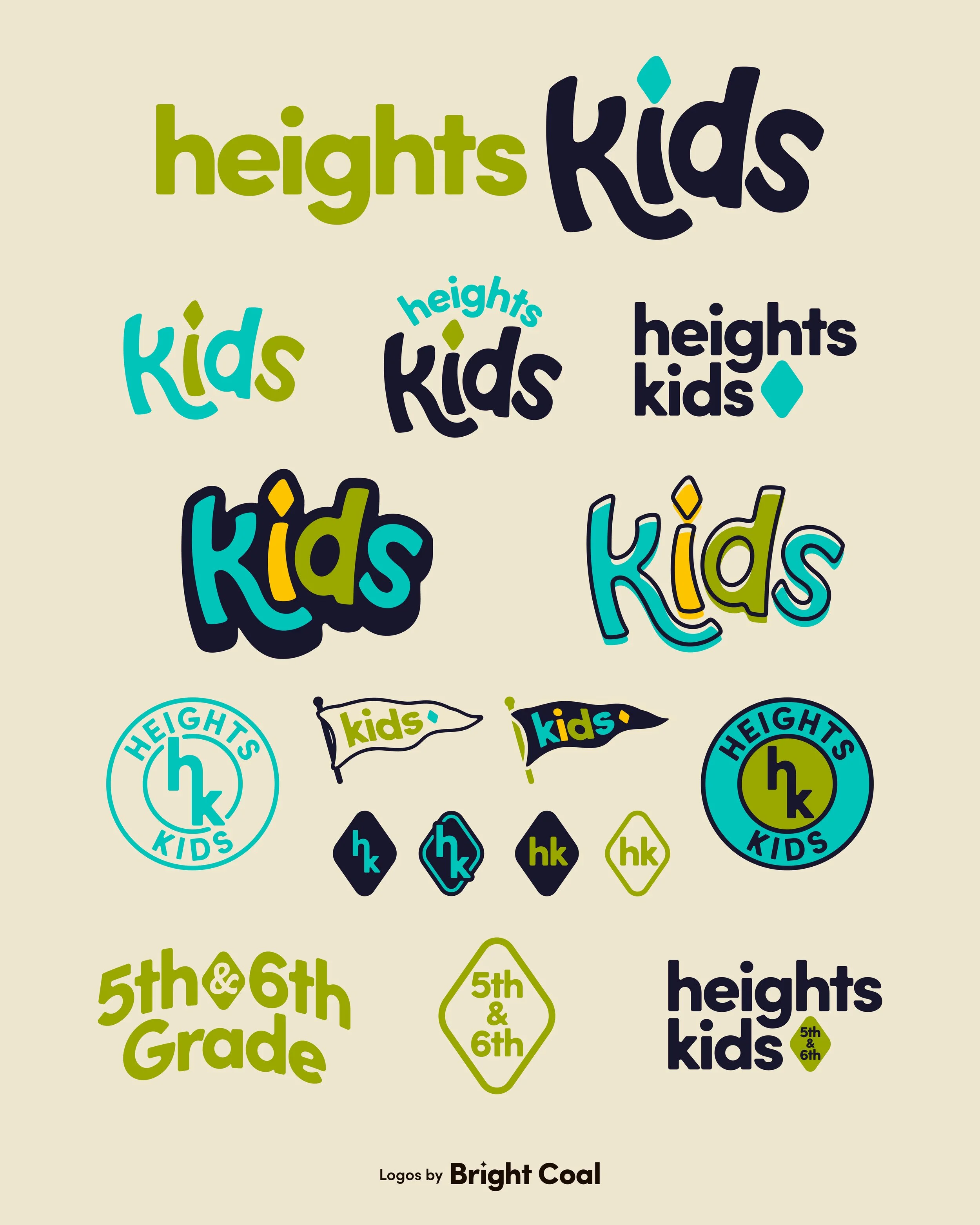
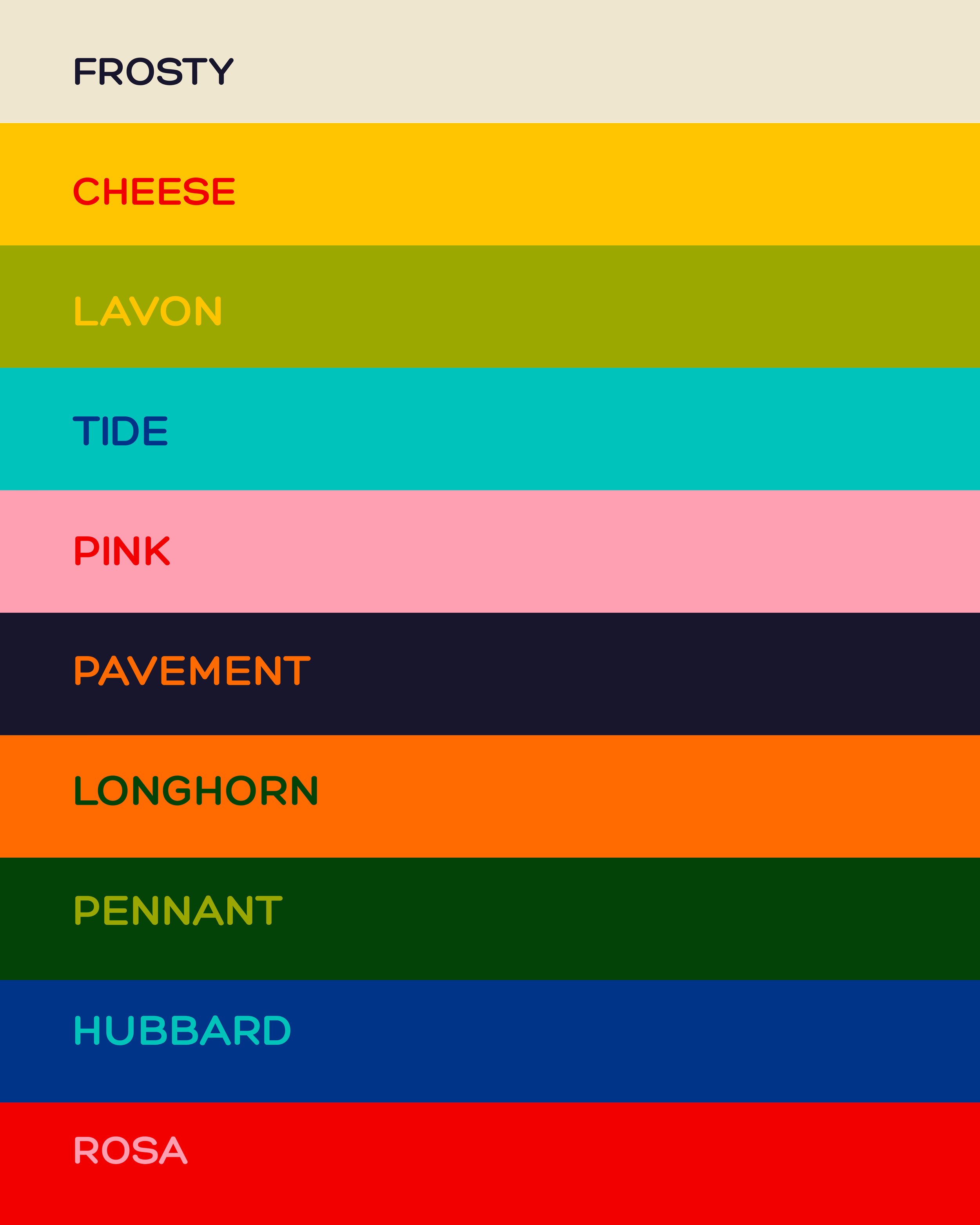
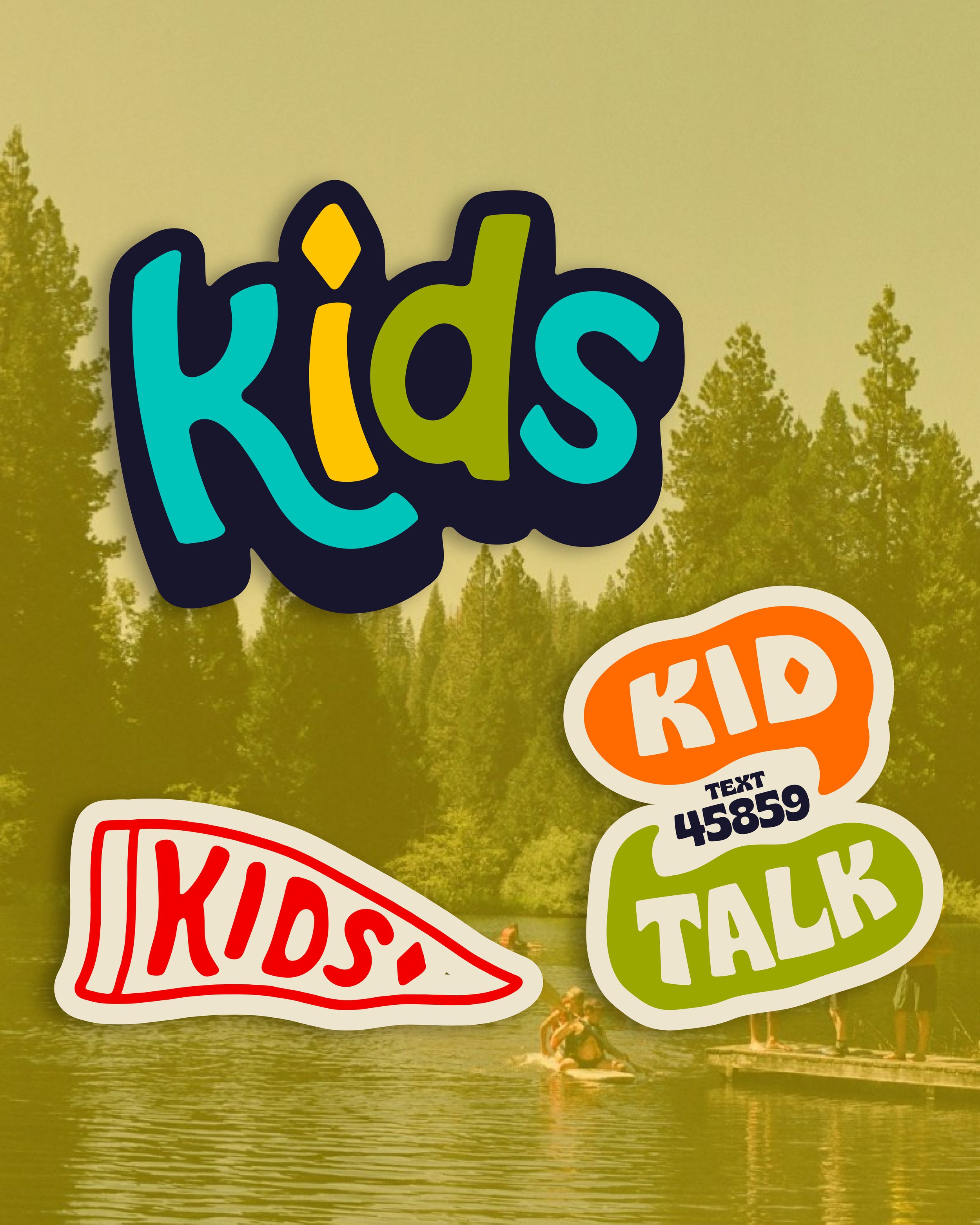
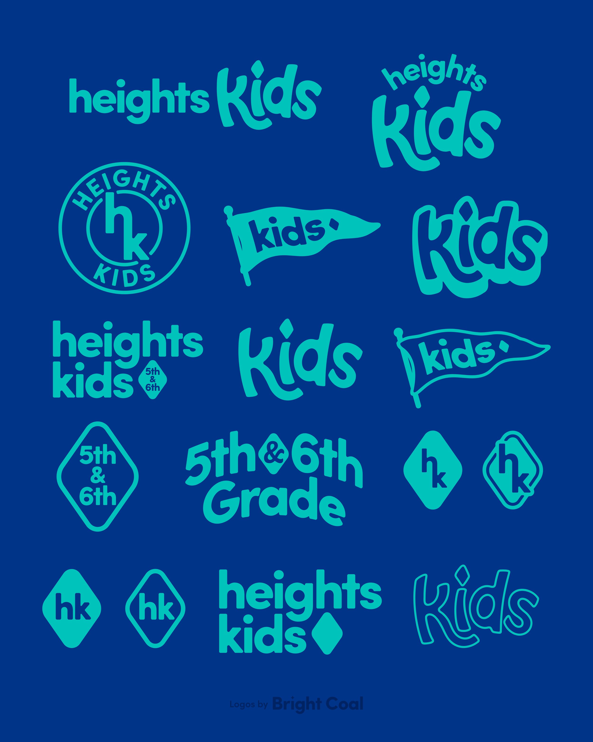
Heights Kids is a great example of how to connect the main church logo design to the children’s ministry identity. The diamond-shape icon is carried throughout their branding to create similar ingredients so kids and main church stay connected.
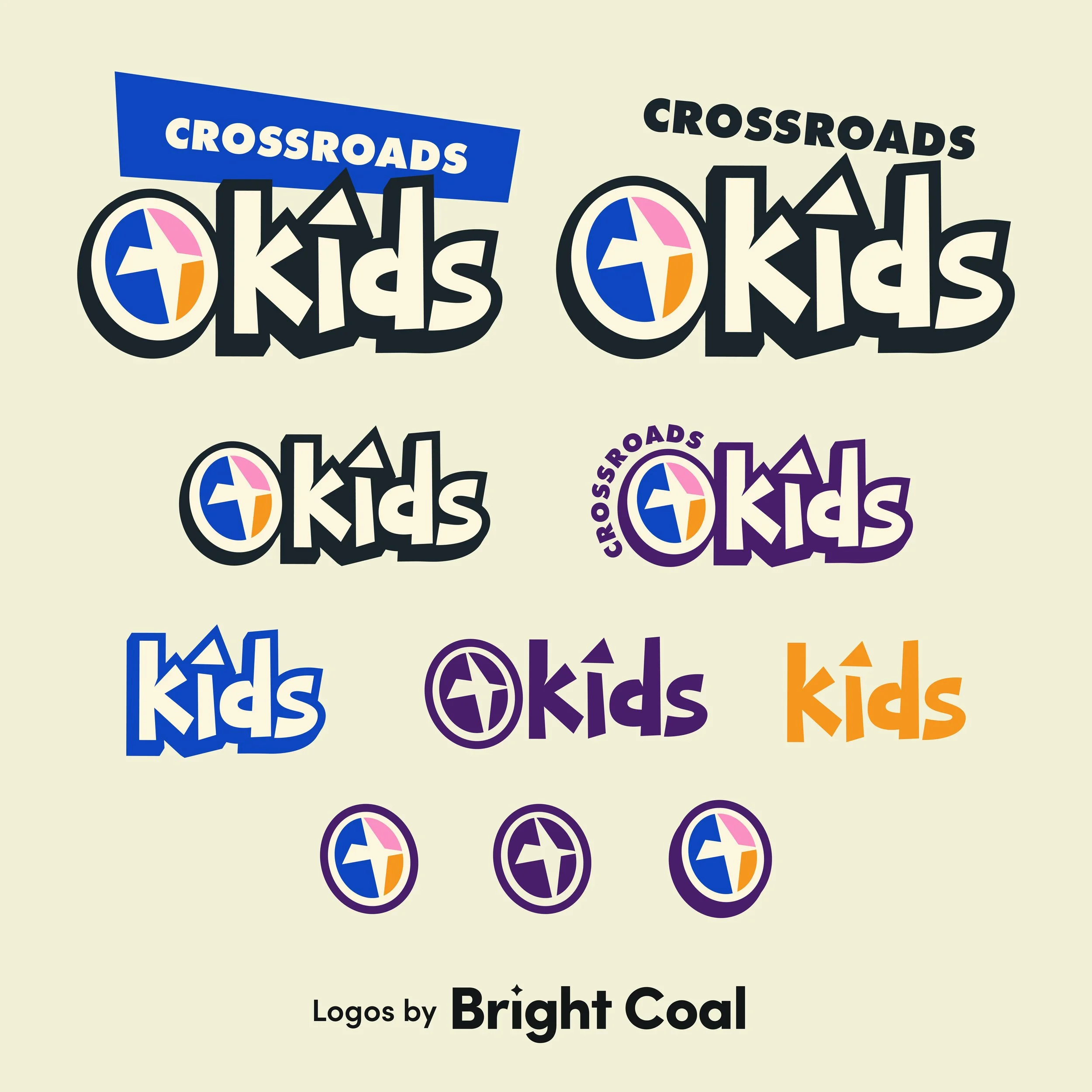
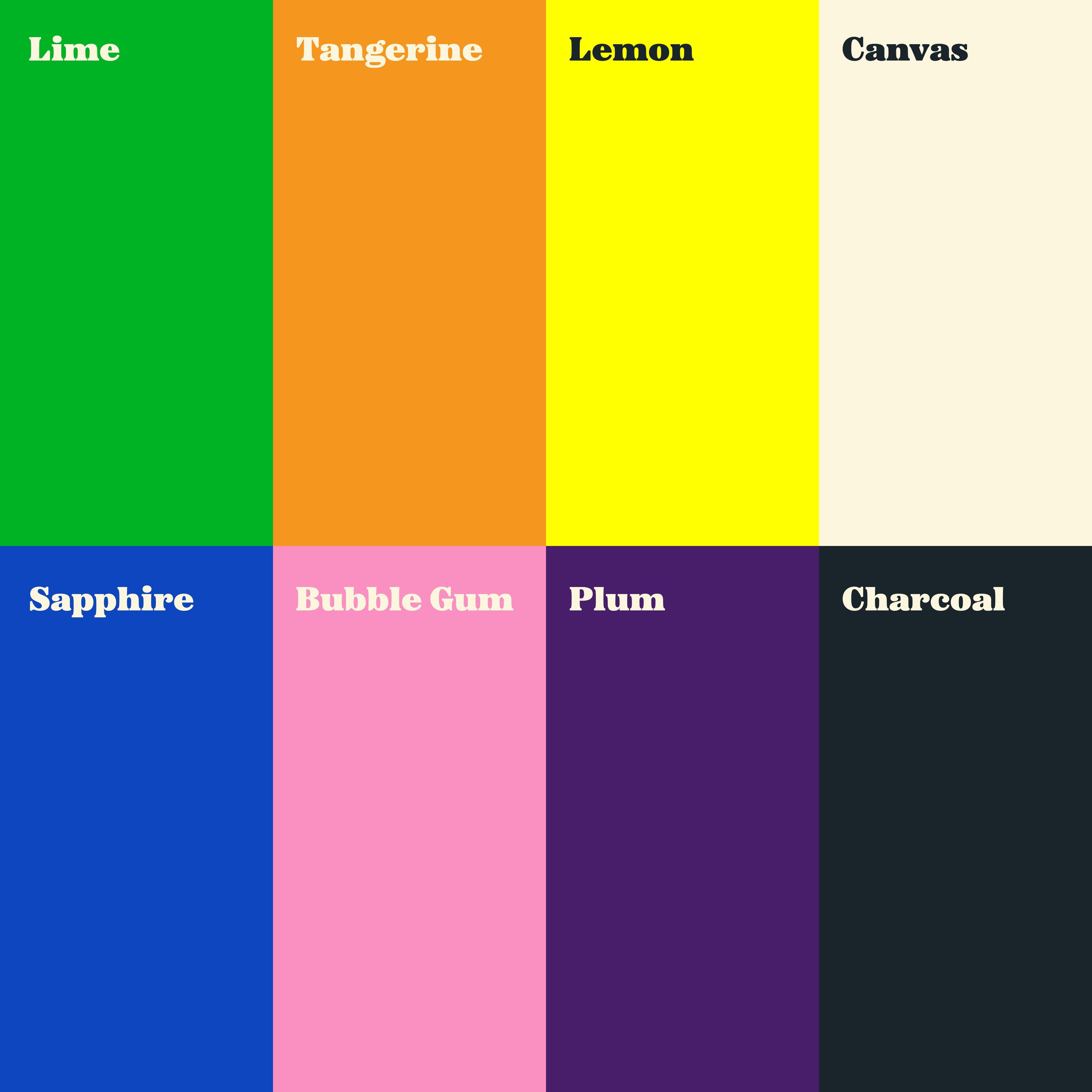
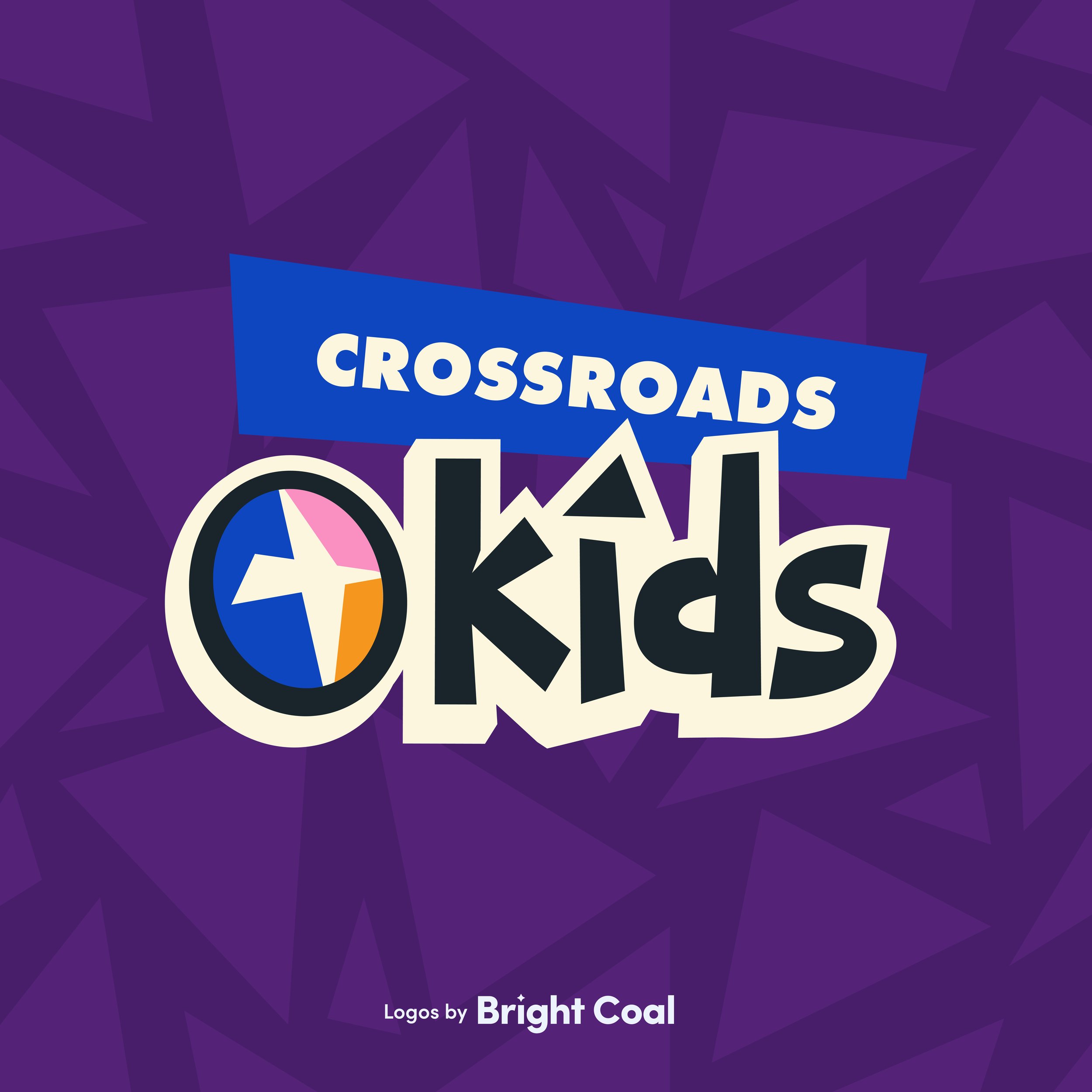
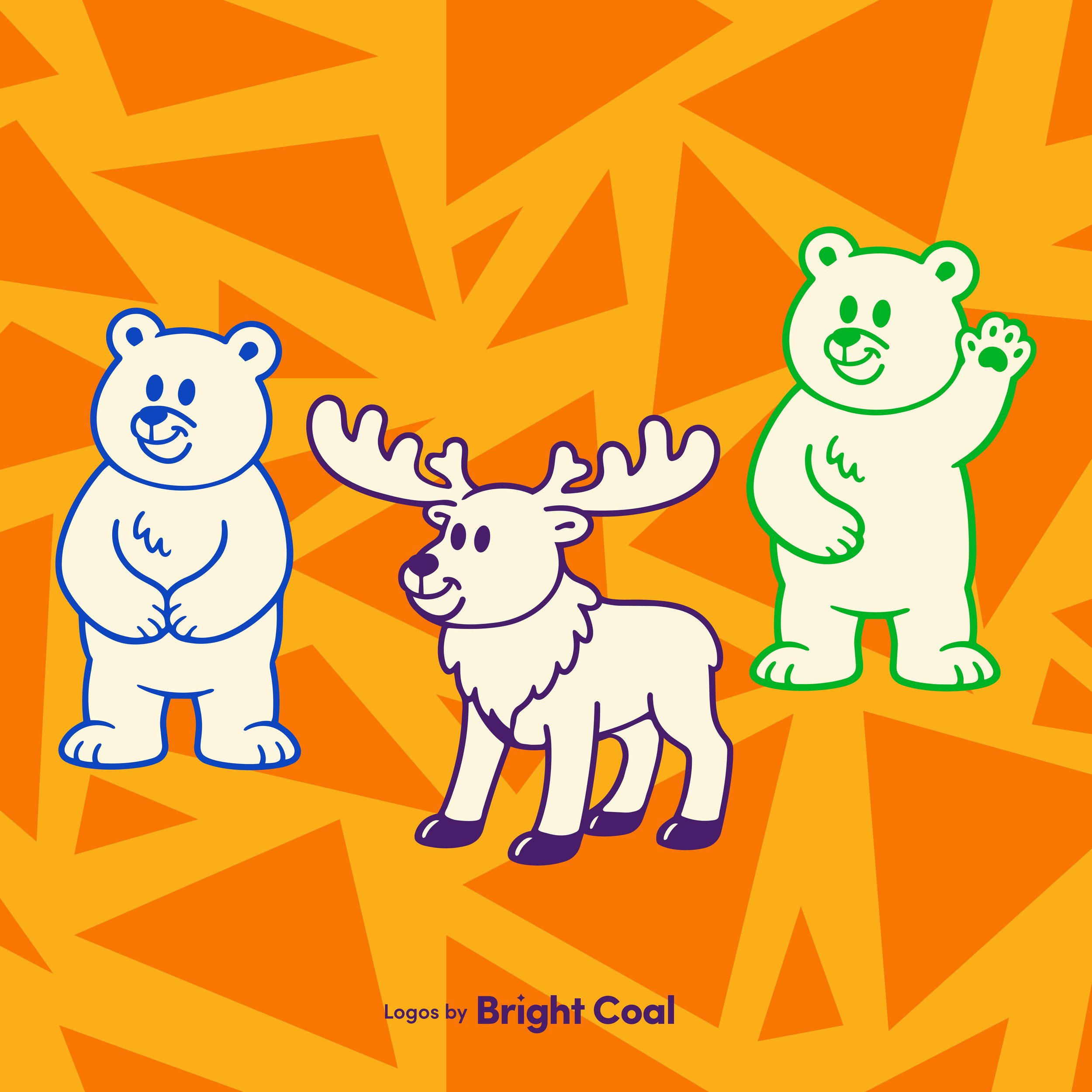
The mountains of Colorado surround this church, but they wanted something a little unexpected for their kids ministry brand. We played around with the cross icon from the main church logo and added triangle motifs as a nod to the mountains, while still bringing in a few woodsy creatures as characters they can utilize for cohesive church resource materials.
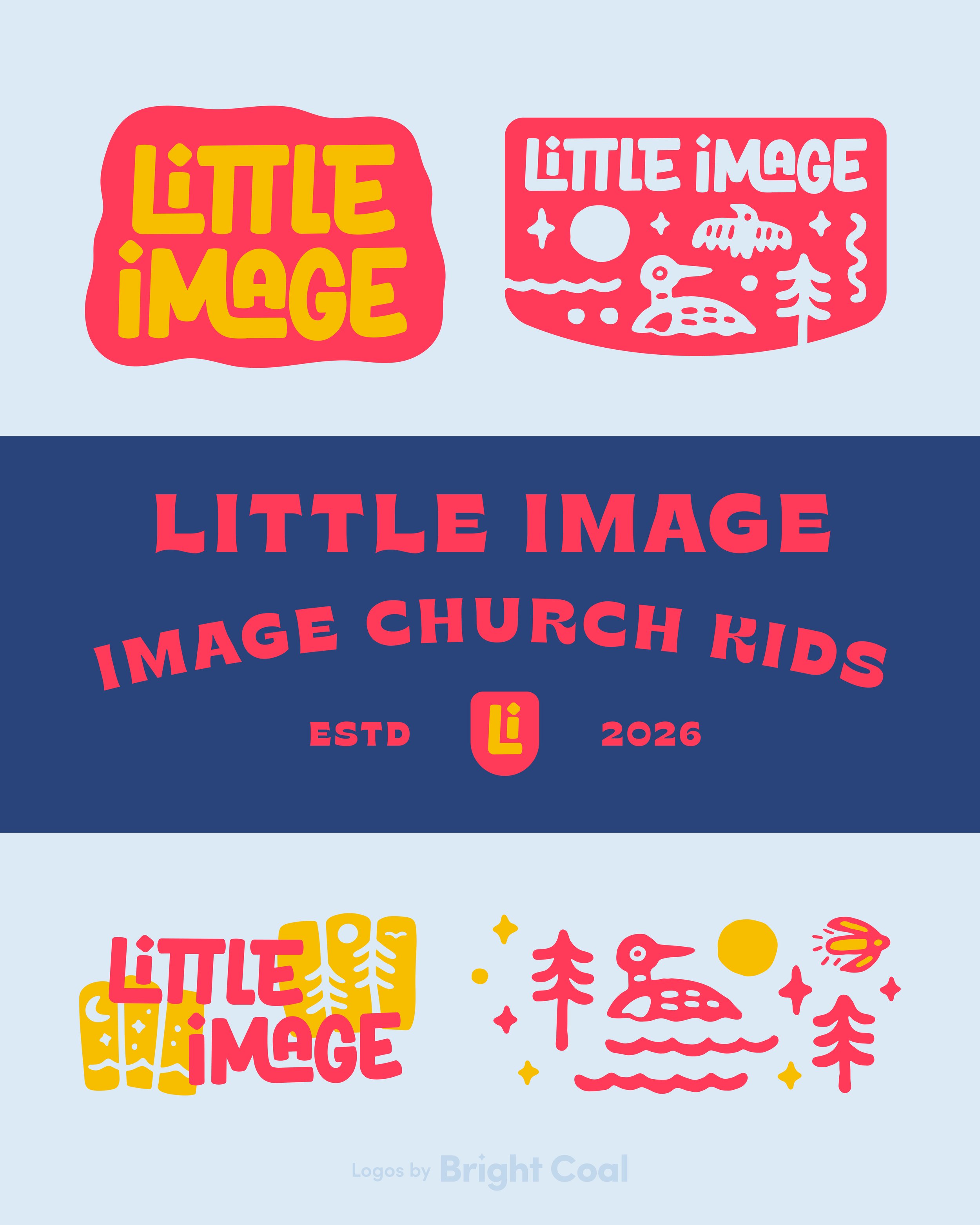
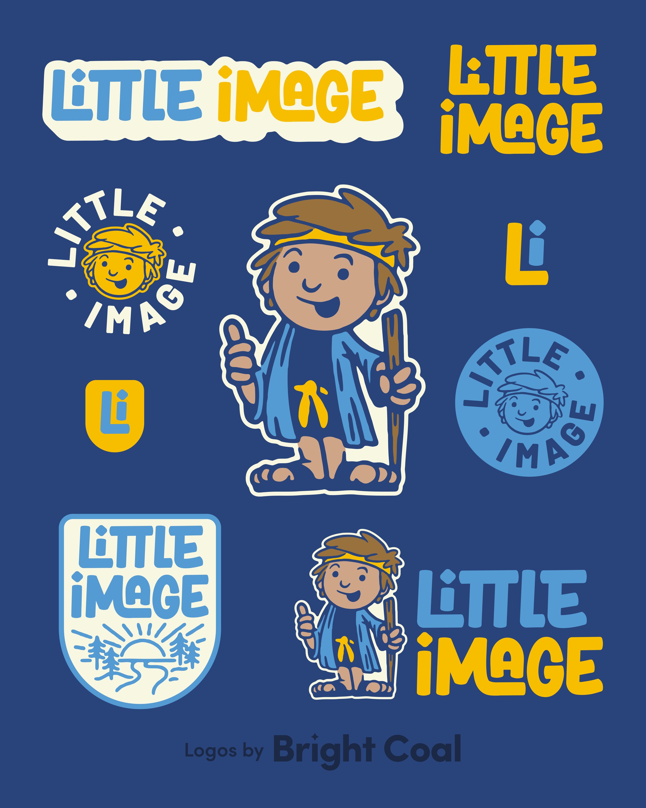
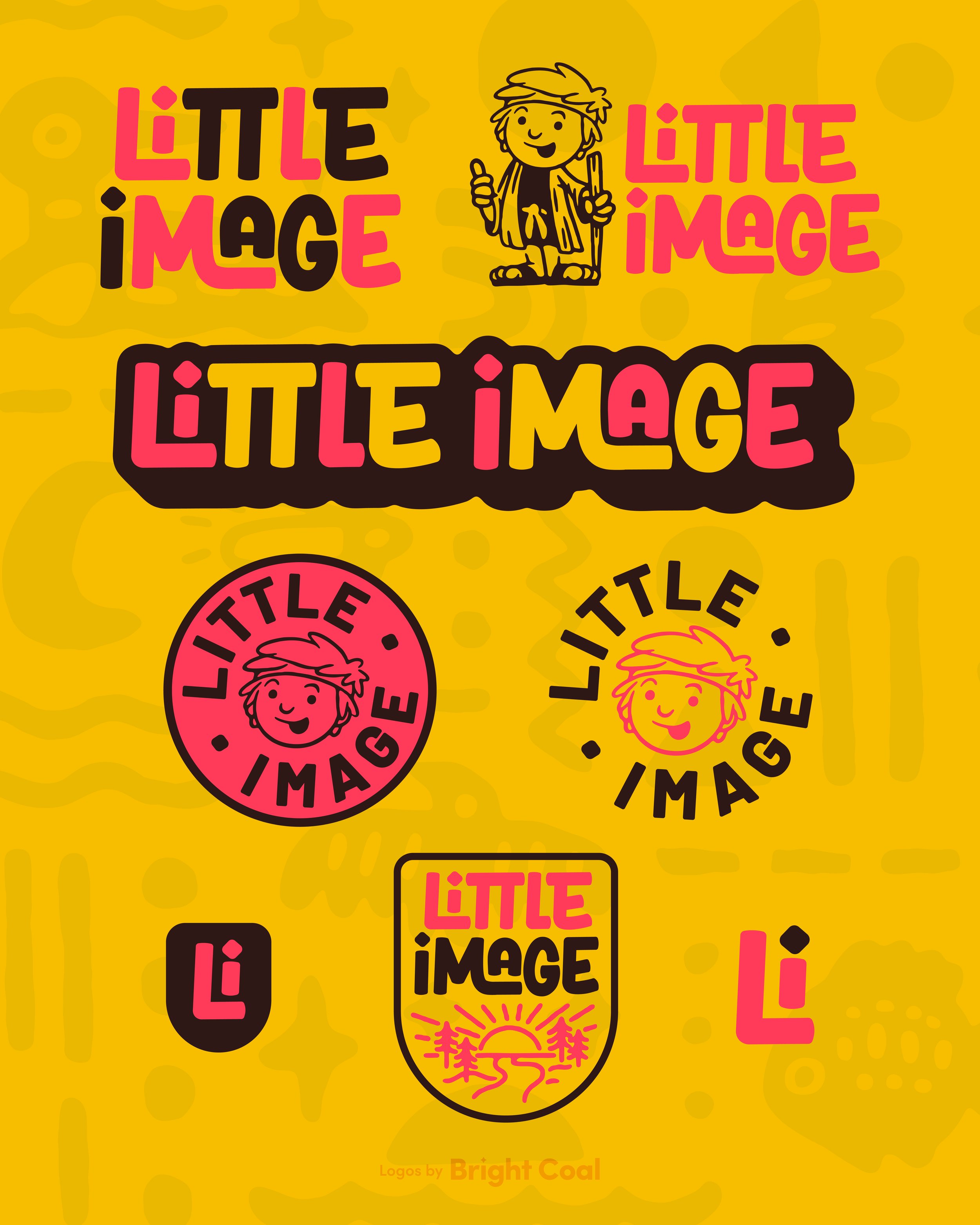
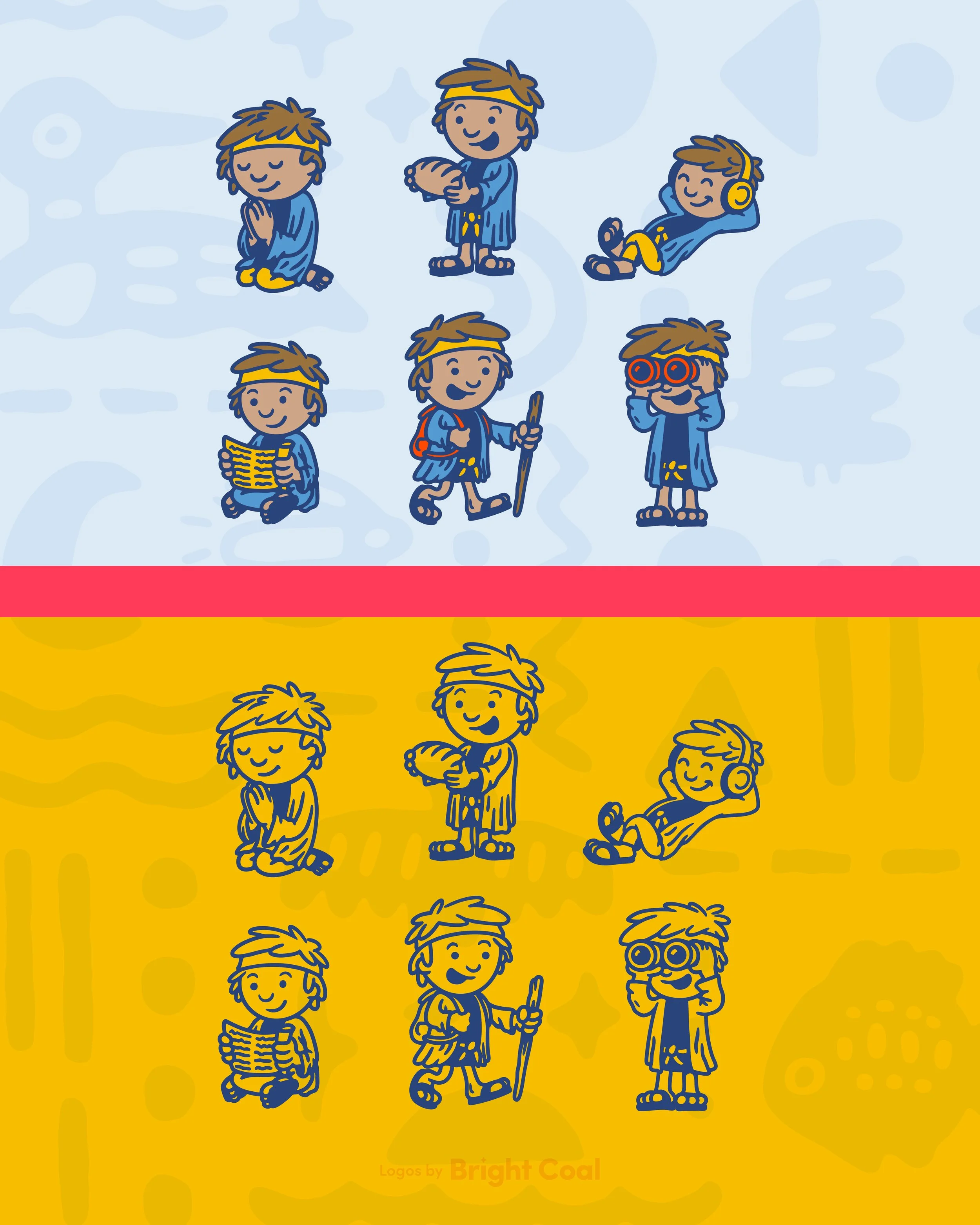
The design concepts for Image Church are meant to capture strong ideology of every child being created in the image of God. A fun and playful character icon was formed and now they have a brand system to help guide kiddos in their faith as they grow and remind them of who they are in Christ.
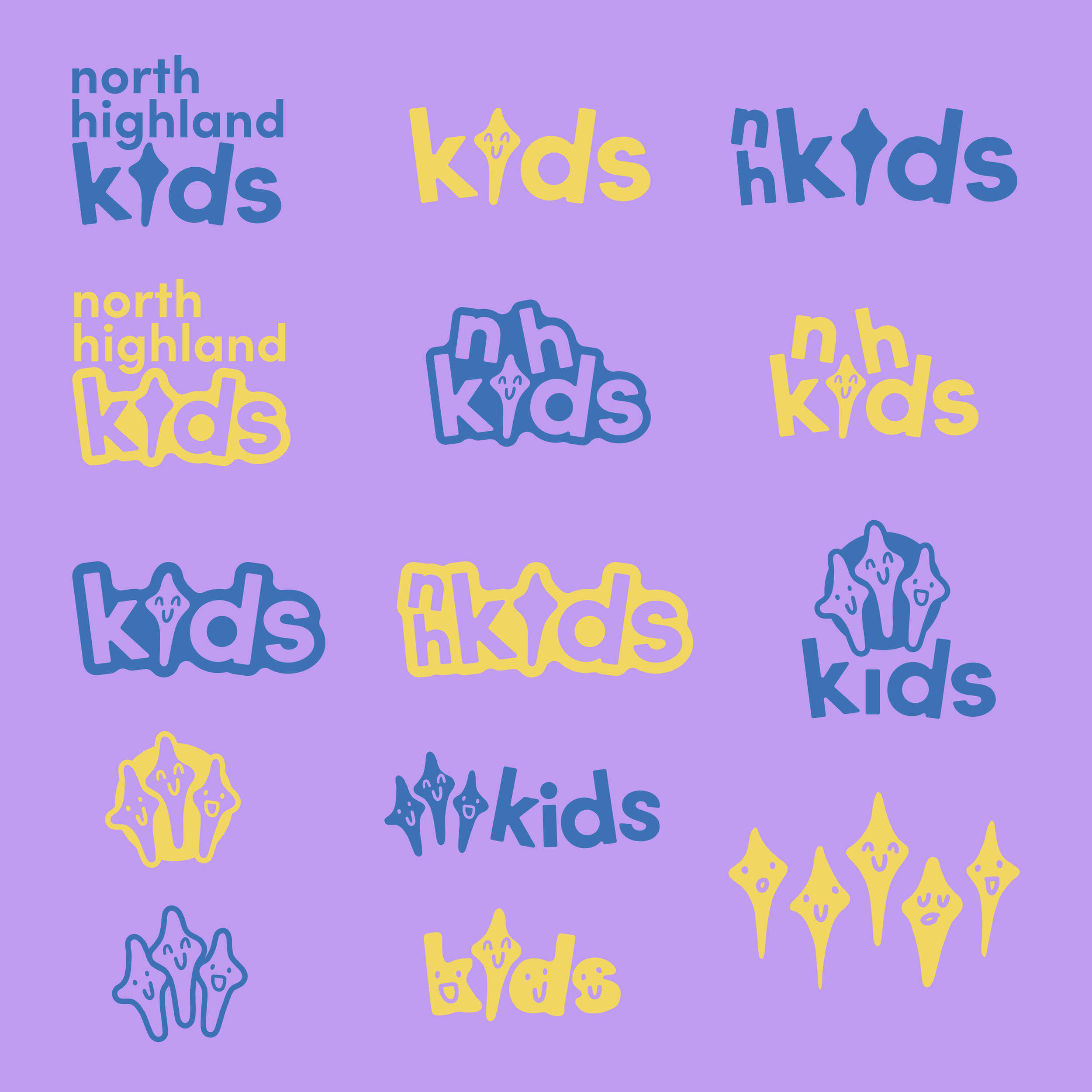
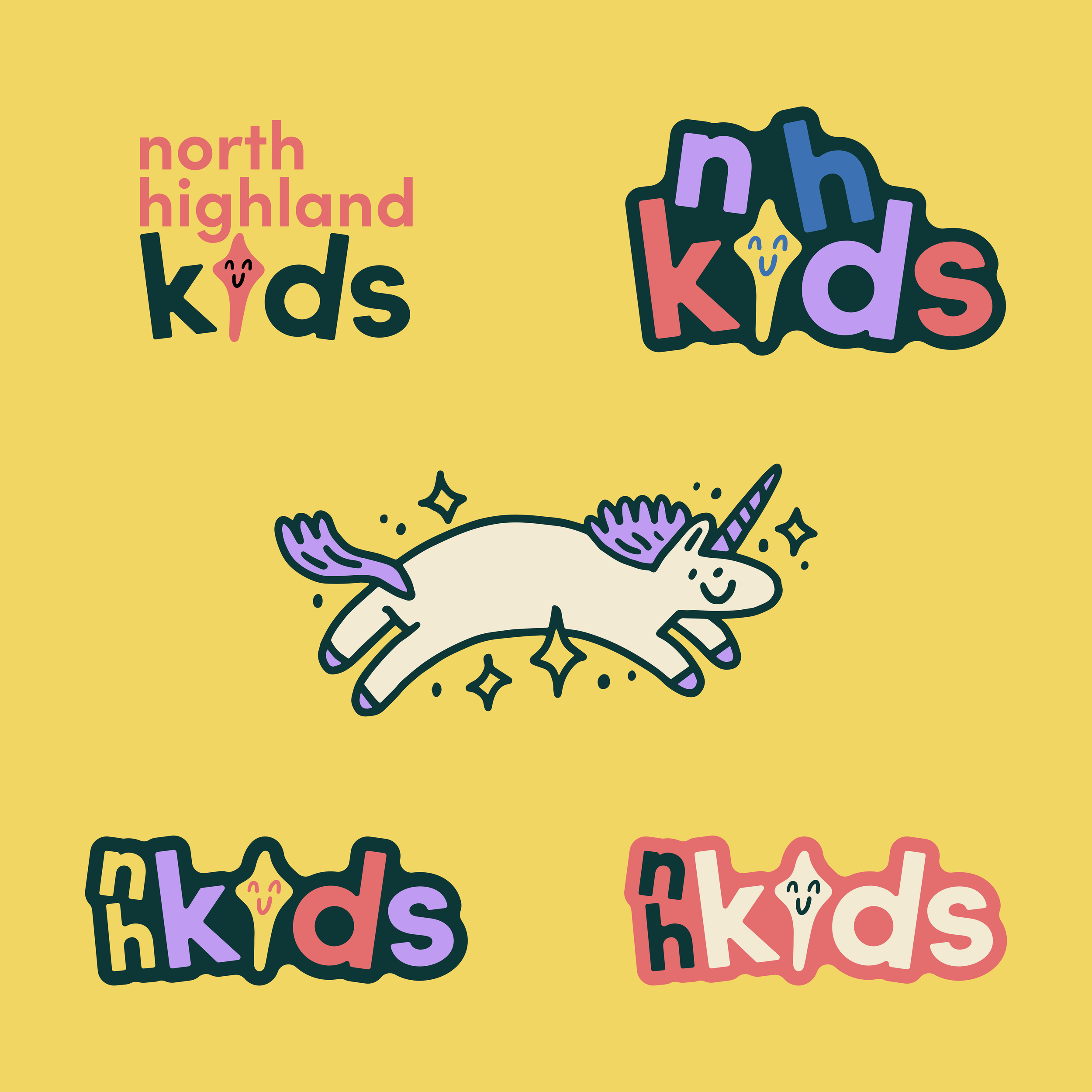
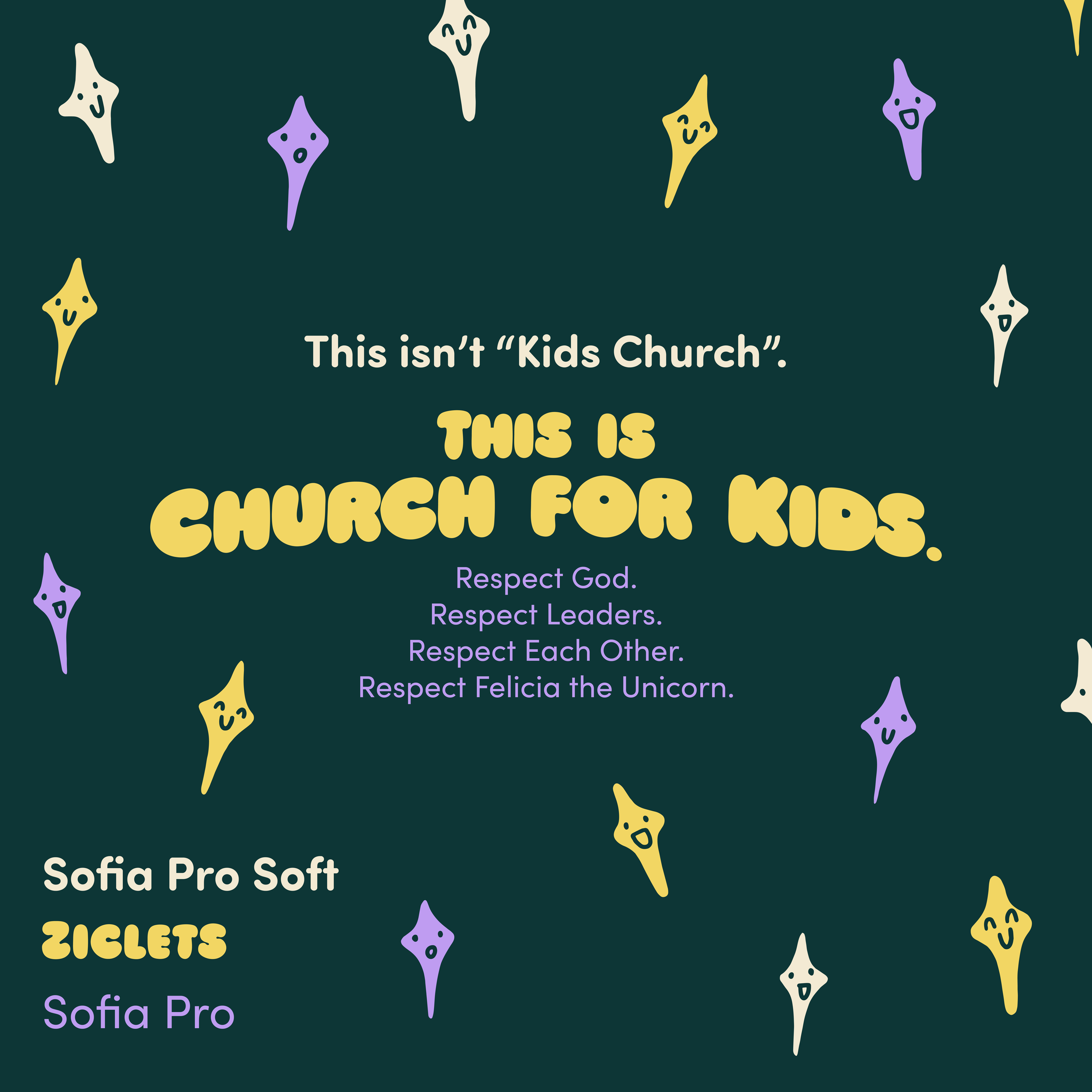
For North Highland Kids, we decided to lean into the goofy and make a ministry tool out of their silly countdown video unicorn. These types of creative choices reflect a church that’s intentional about its mission without being afraid to have a little fun the way. See how we integrated children’s and youth with the main church logo design here.
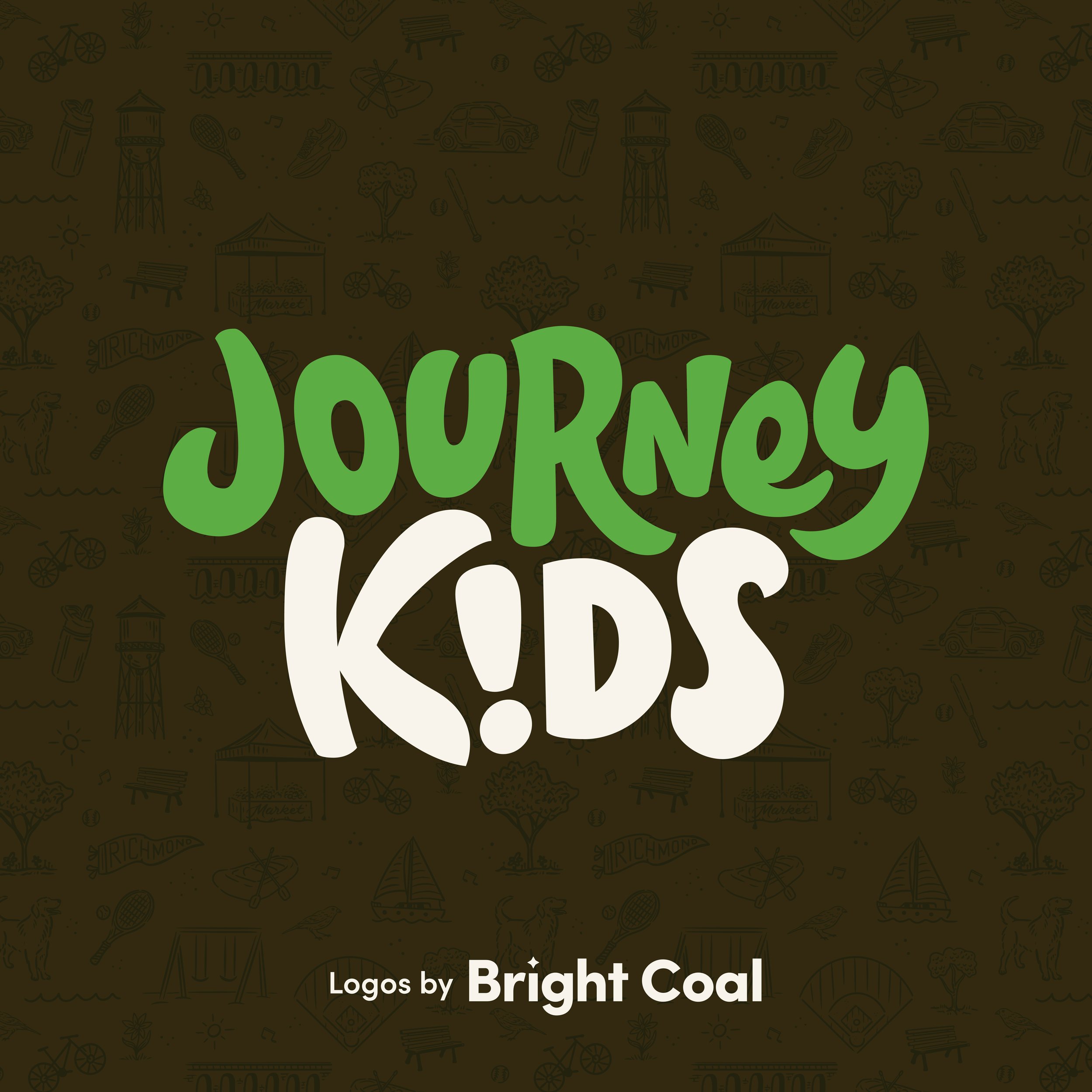

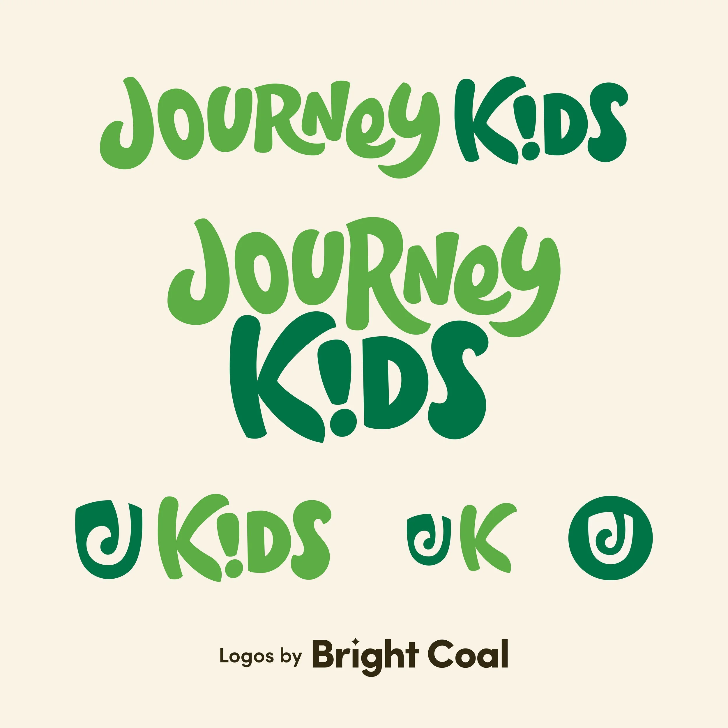

Journey Kids is an adventure-inspired brand built around their main church identity, but with chunky hand-drawn lettering, strong color blocking, and playful illustrations. We pulled inspiration from Richmond’s parks, rivers, and city surroundings to create a custom skyline illustration.
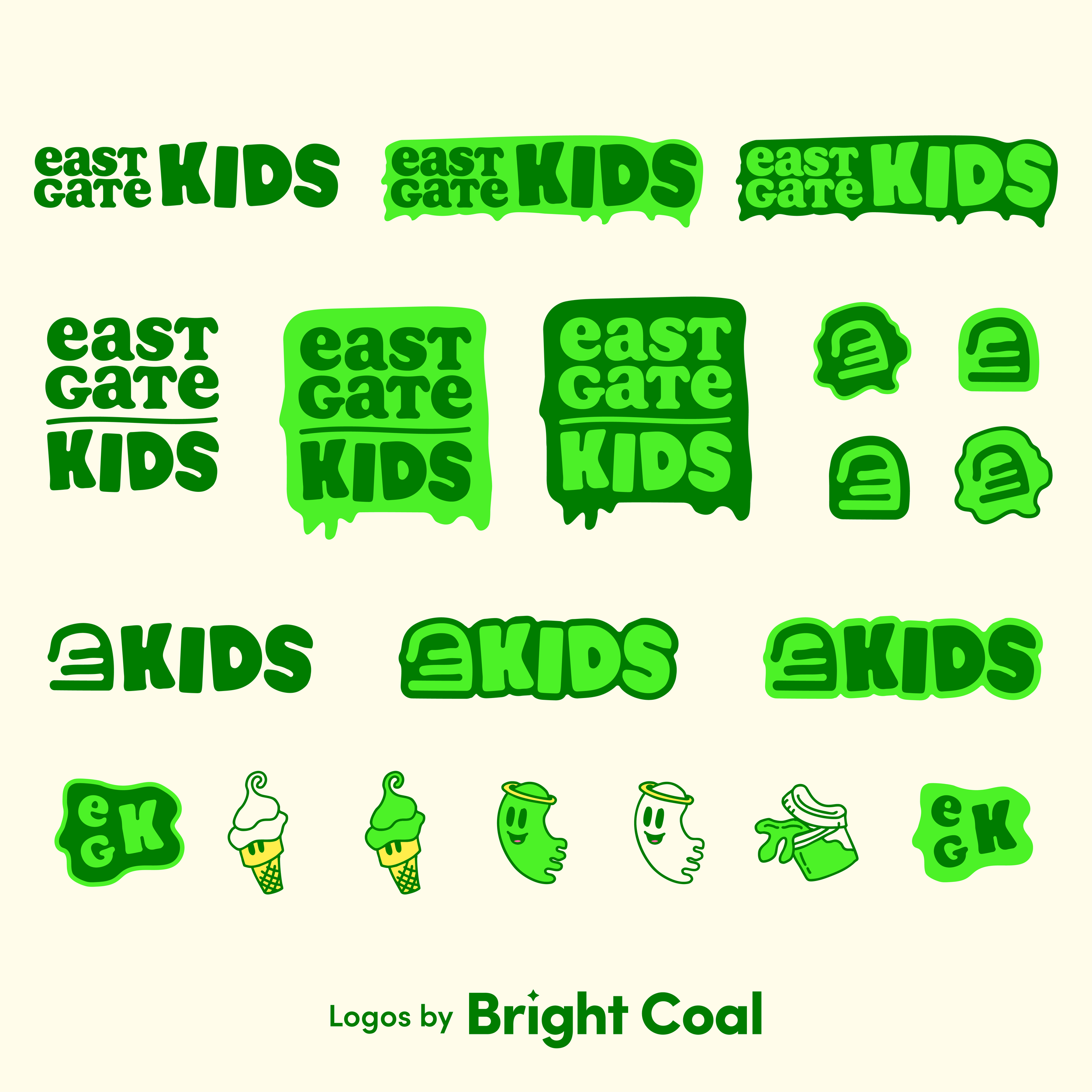
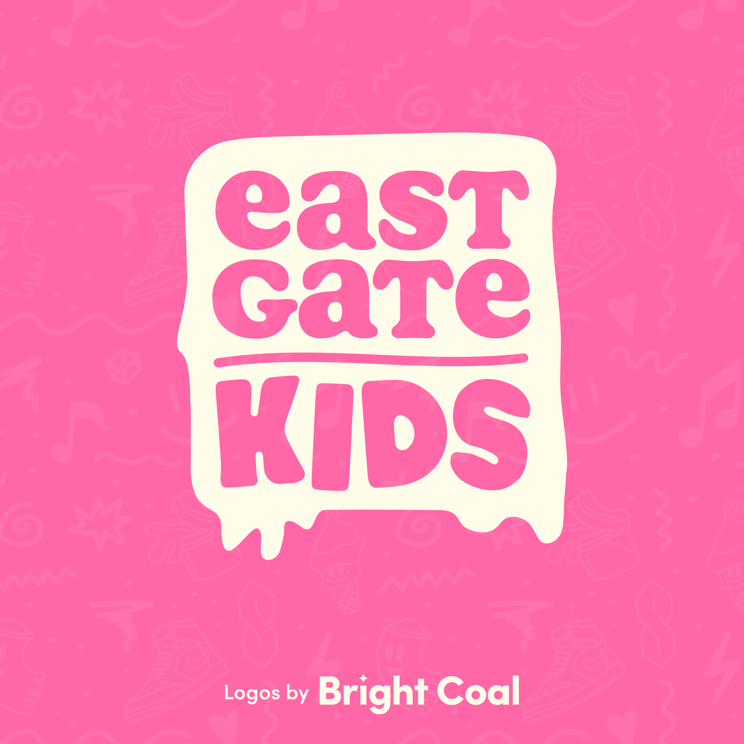
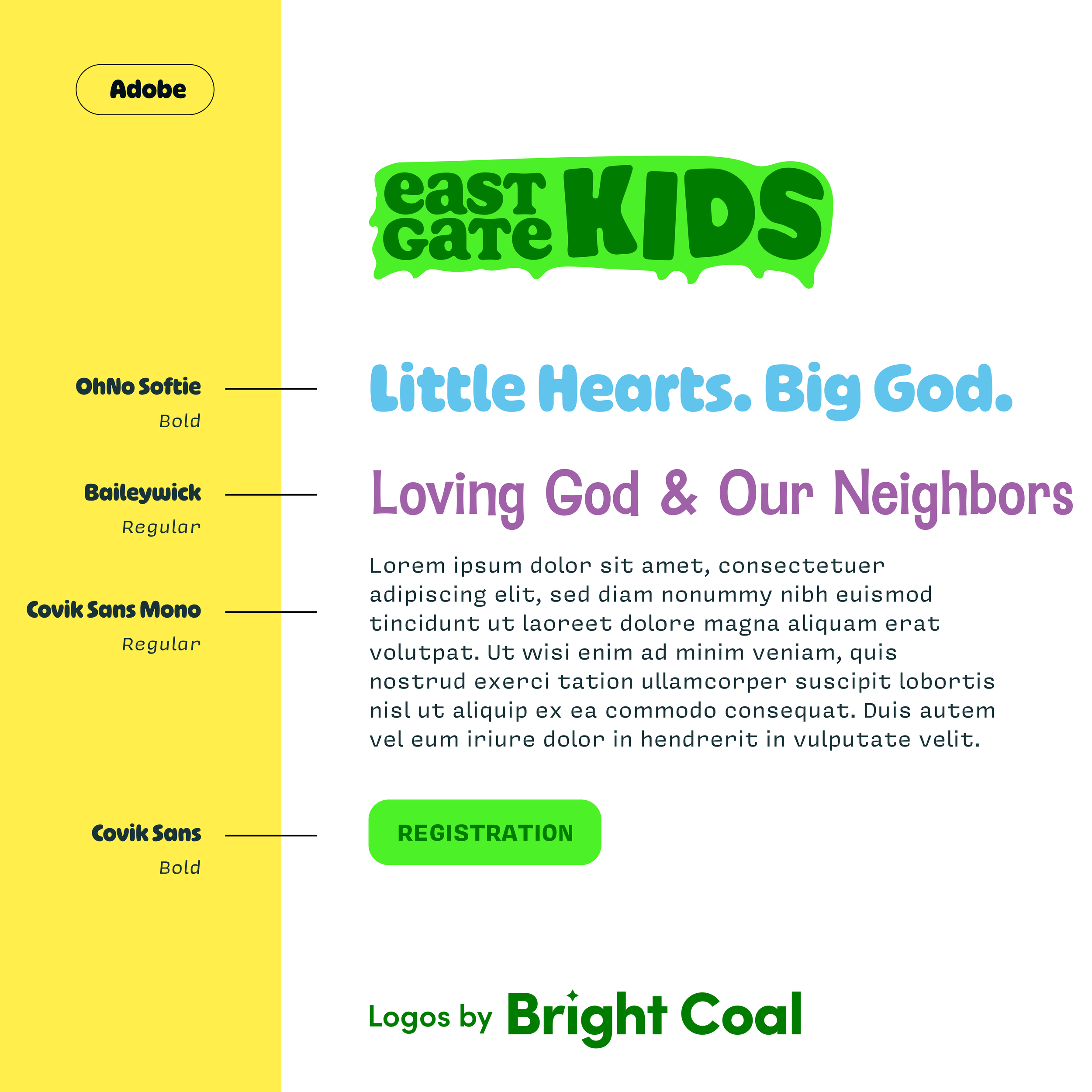
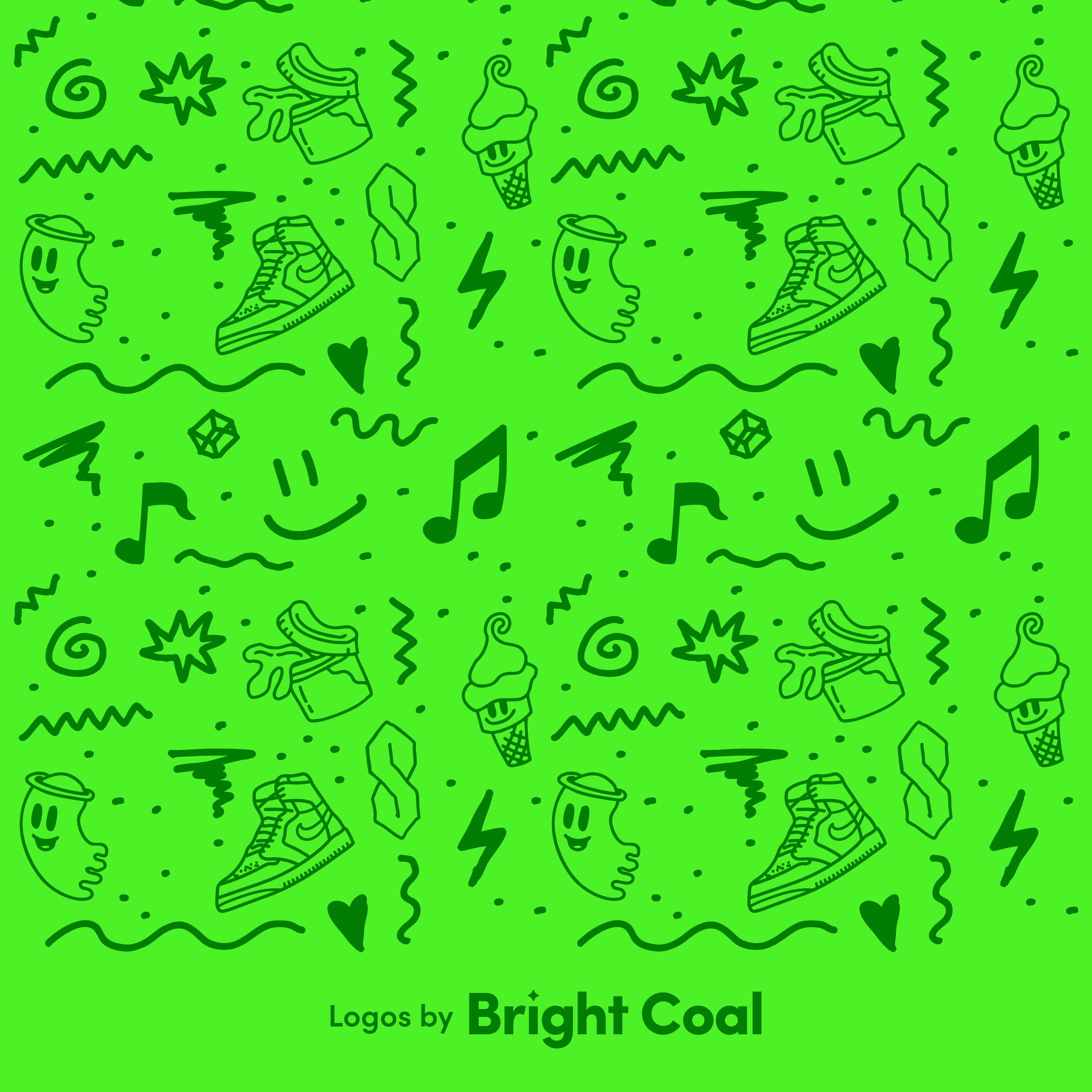
East Gate Kids has a high-energy kid’s church personality with bold colors and plenty of visual character. When you pair this nearly neon green with things like ice cream cones and slime elements, the details become super expressive and impossible to ignore, even if you’re not a kid.
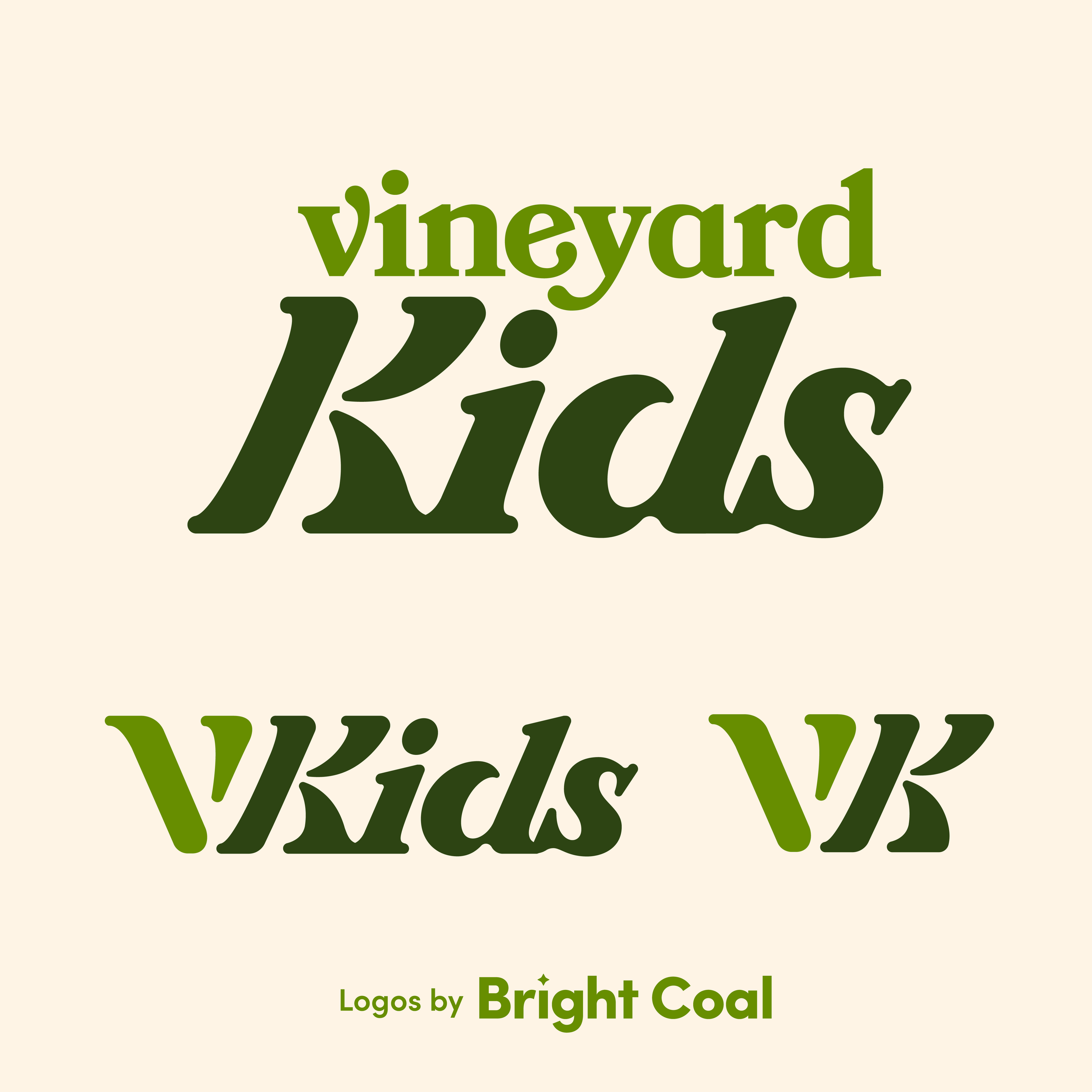
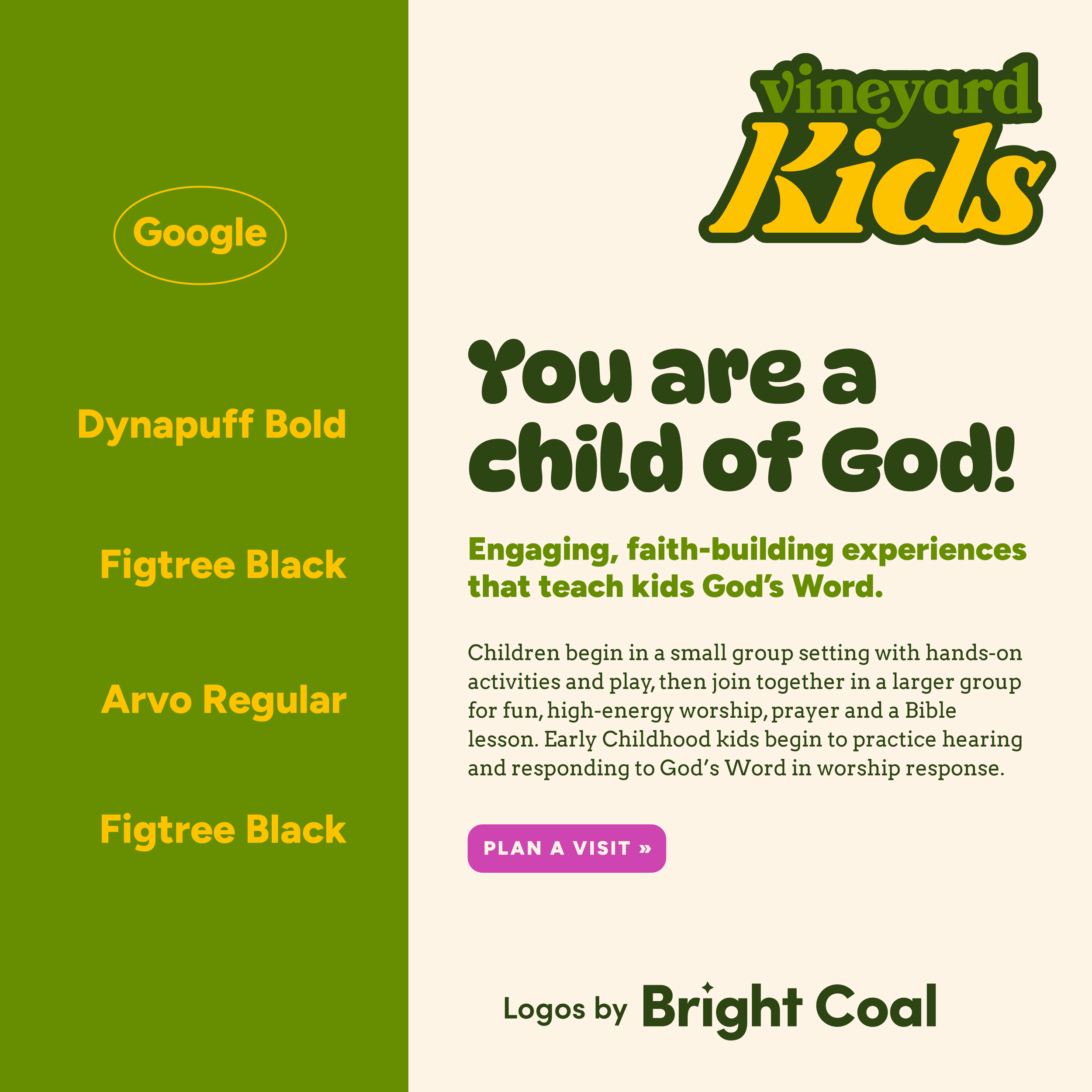
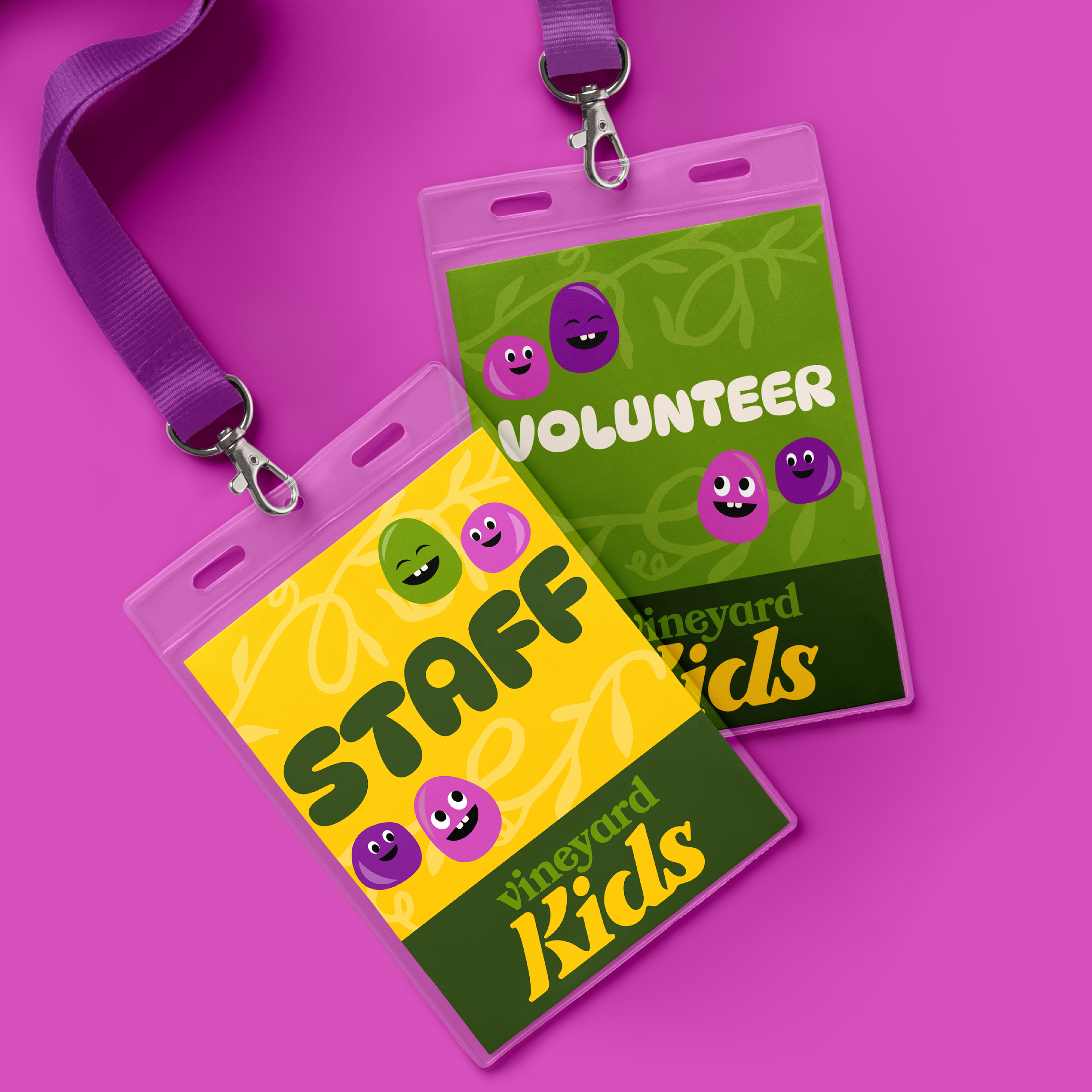
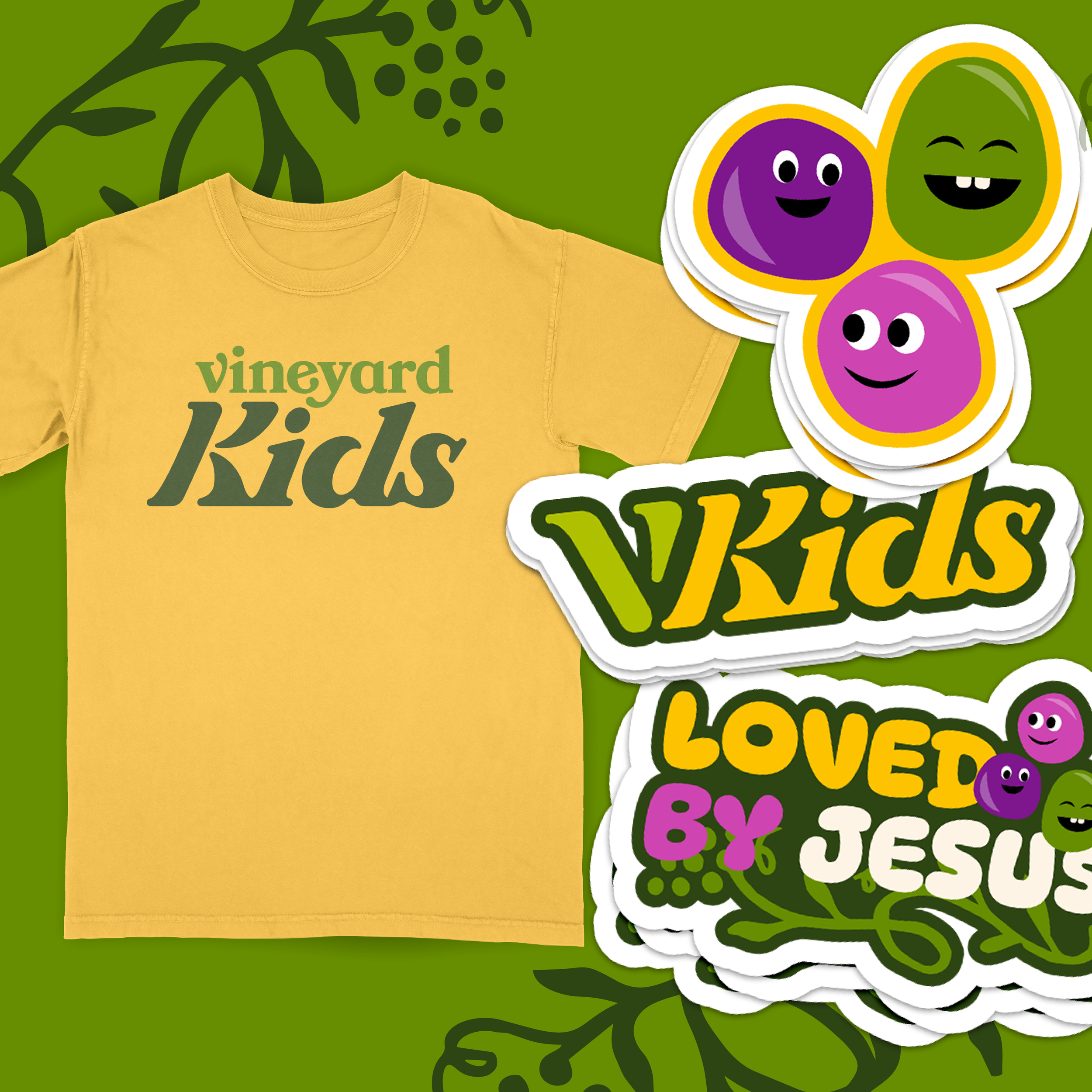
Any children’s brand with characters is an opportunity to have fun! Kids brands are a fun challenge in strategic thinking – how can we tie this into the primary church brand in a way that makes sense, but give it its own unique personality tailored to kids? We think it’s a grape job!
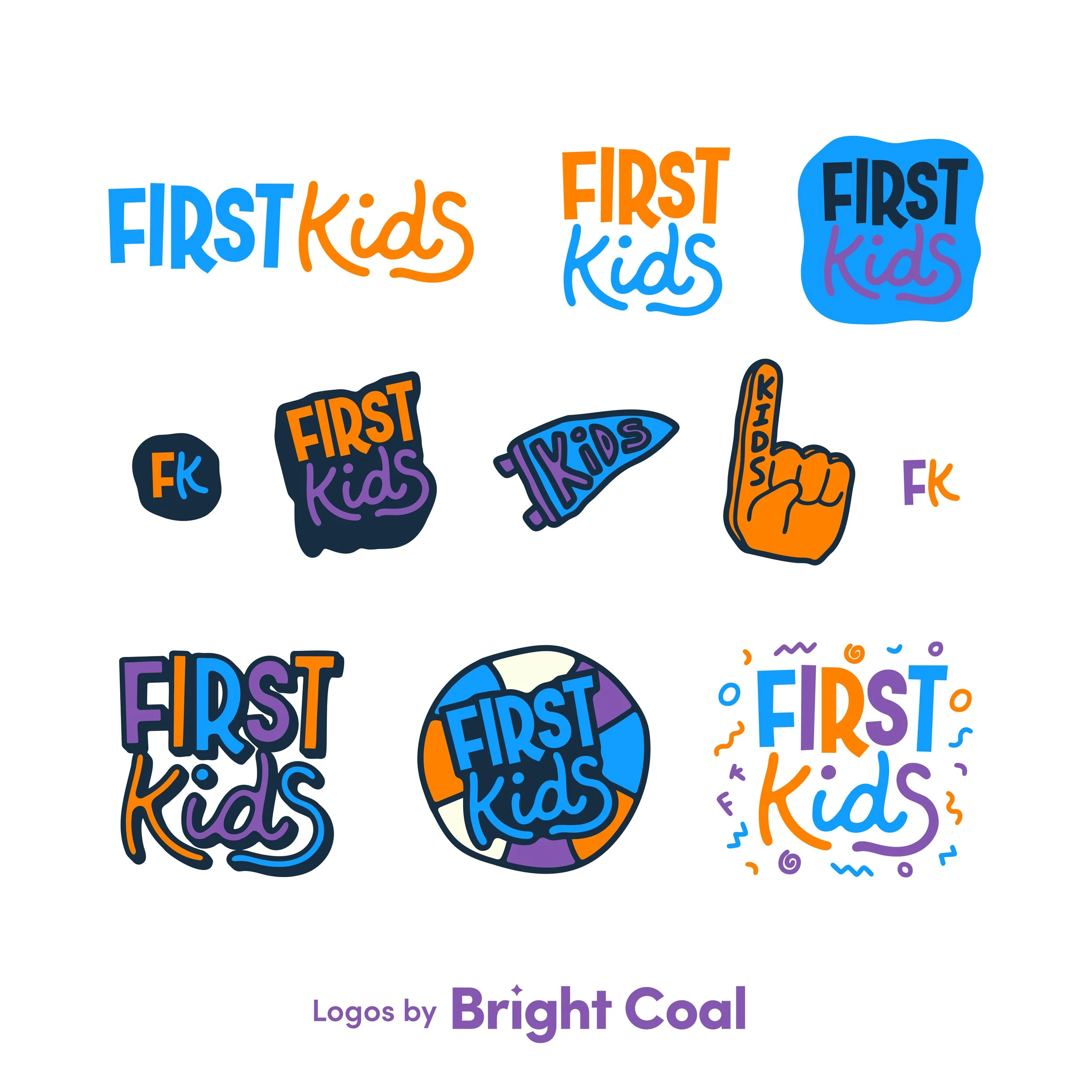
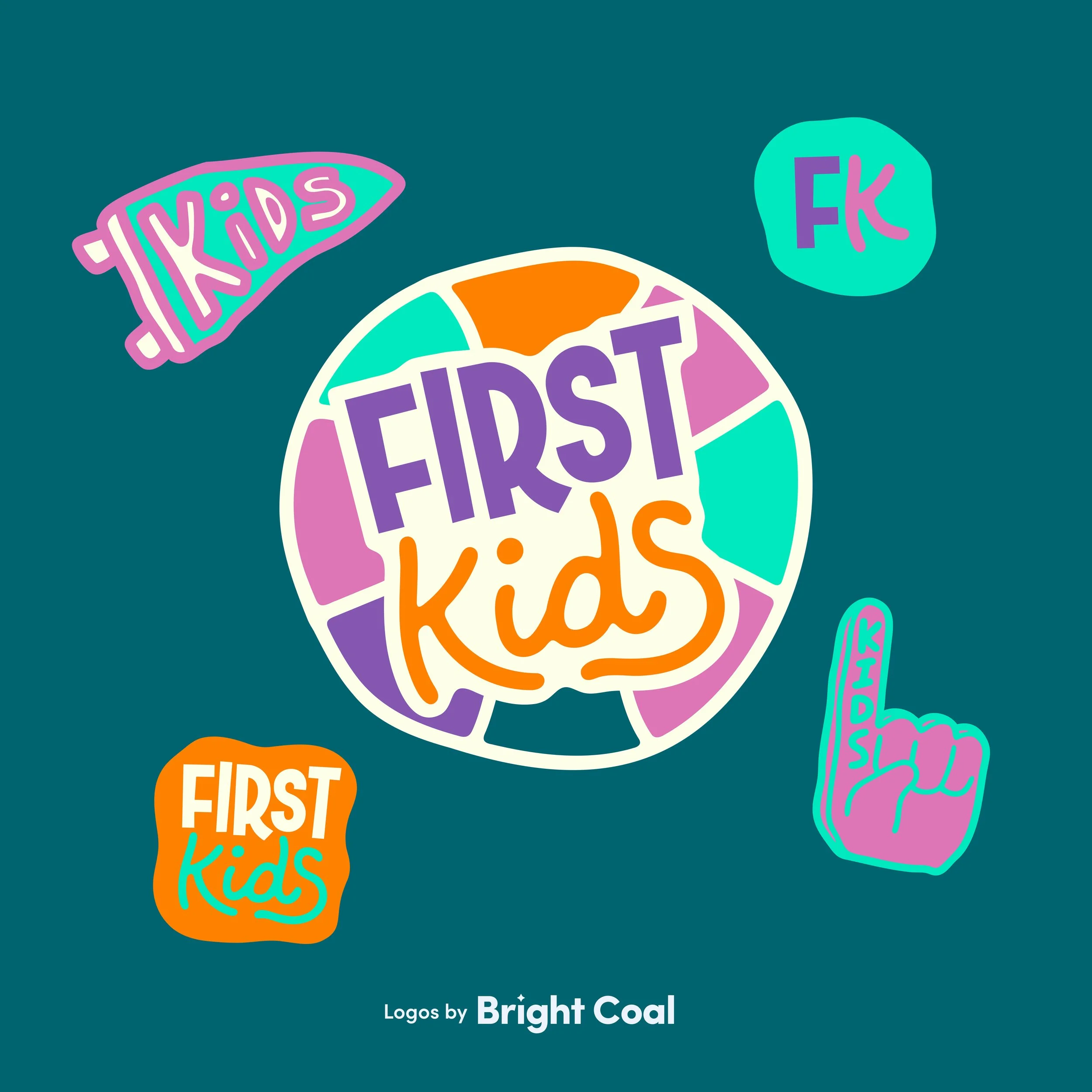
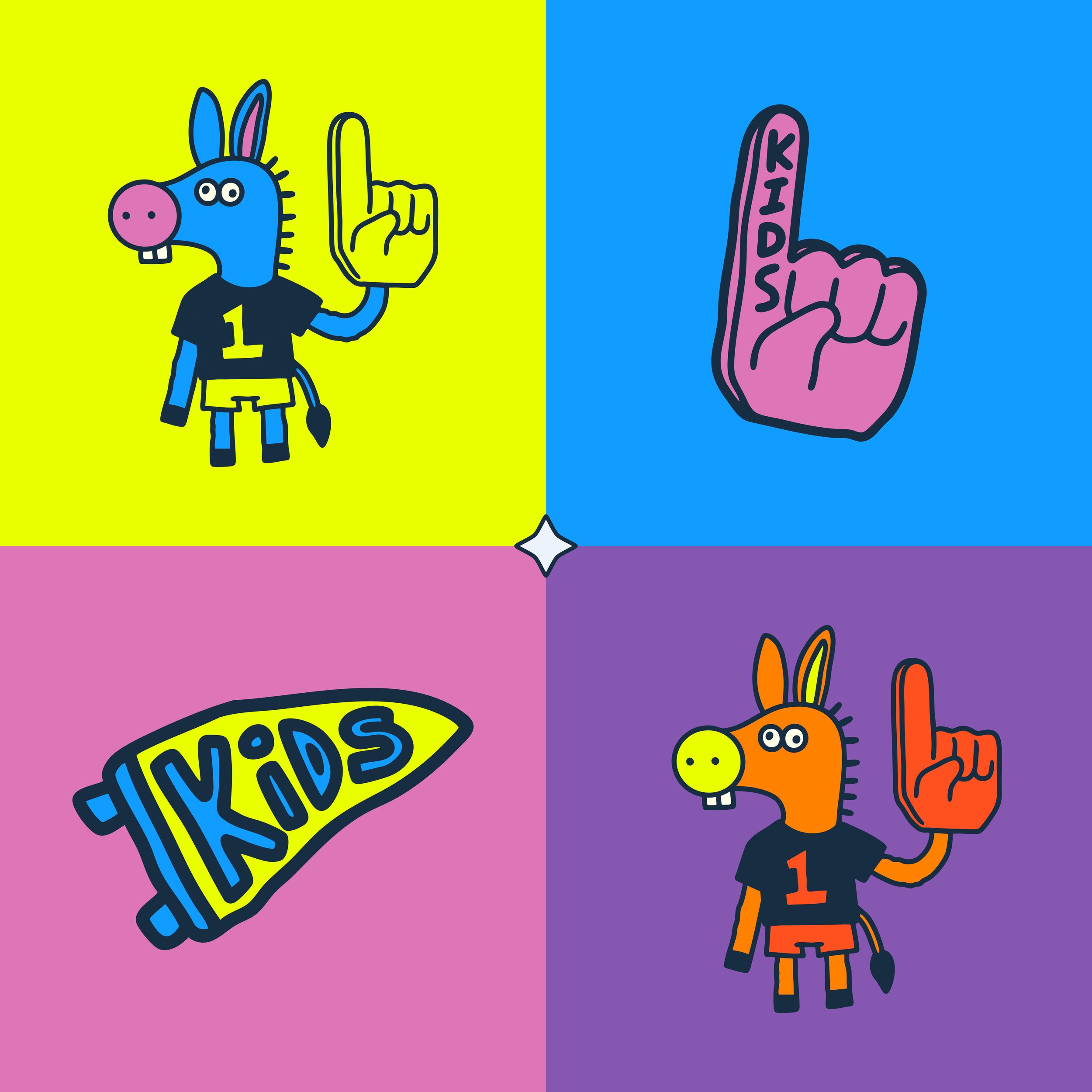
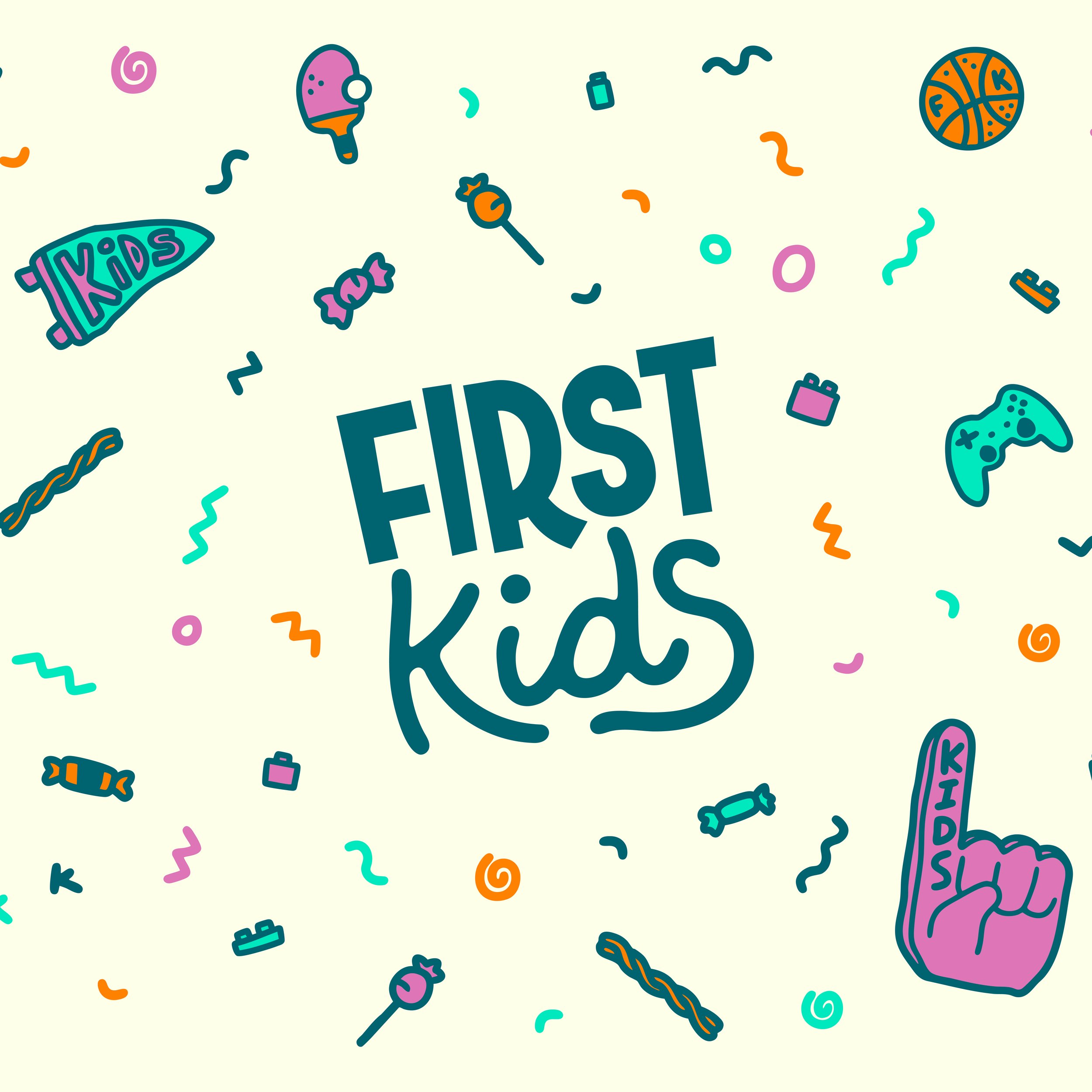
Kirksville Kids leans into the excitement of healthy church rivalry, where every week brings a new game and a reason to come back. Their classic kids church brand captures the momentum of a growing ministry with an “anything silly can happen” kind of vibe that makes parents stick around, too.
Ready to give your kid’s ministry crew a fresh look? Let’s start something new today.
MORE KIDS MINISTRY INSPIRATION
What Desperation Church does for their kids ministry should be studied and stolen! Read more here.