
A Full Church Rebrand: First Baptist New Orleans
Project Client: First Baptist New Orleans | @fbnola
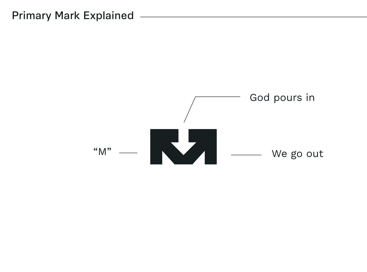
Project Type: Full Church Rebrand + Sub-Ministry Logo Designs
First Baptist New Orleans set out to rebrand their church to better reach the growing number of young professionals in the area. Their old logo design worked, but it didn’t carry the impact they were wanting to make moving forward. The bones they decided to keep were in the iconic steeple that’s visible from a busy interstate nearby. Sometimes the physical landmark as your brand anchor is something strong to consider.
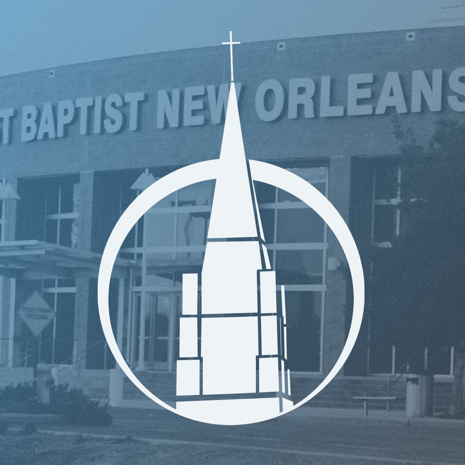
First Baptist New Orleans Old Logo
Here’s a look at their logo design before our design process began.
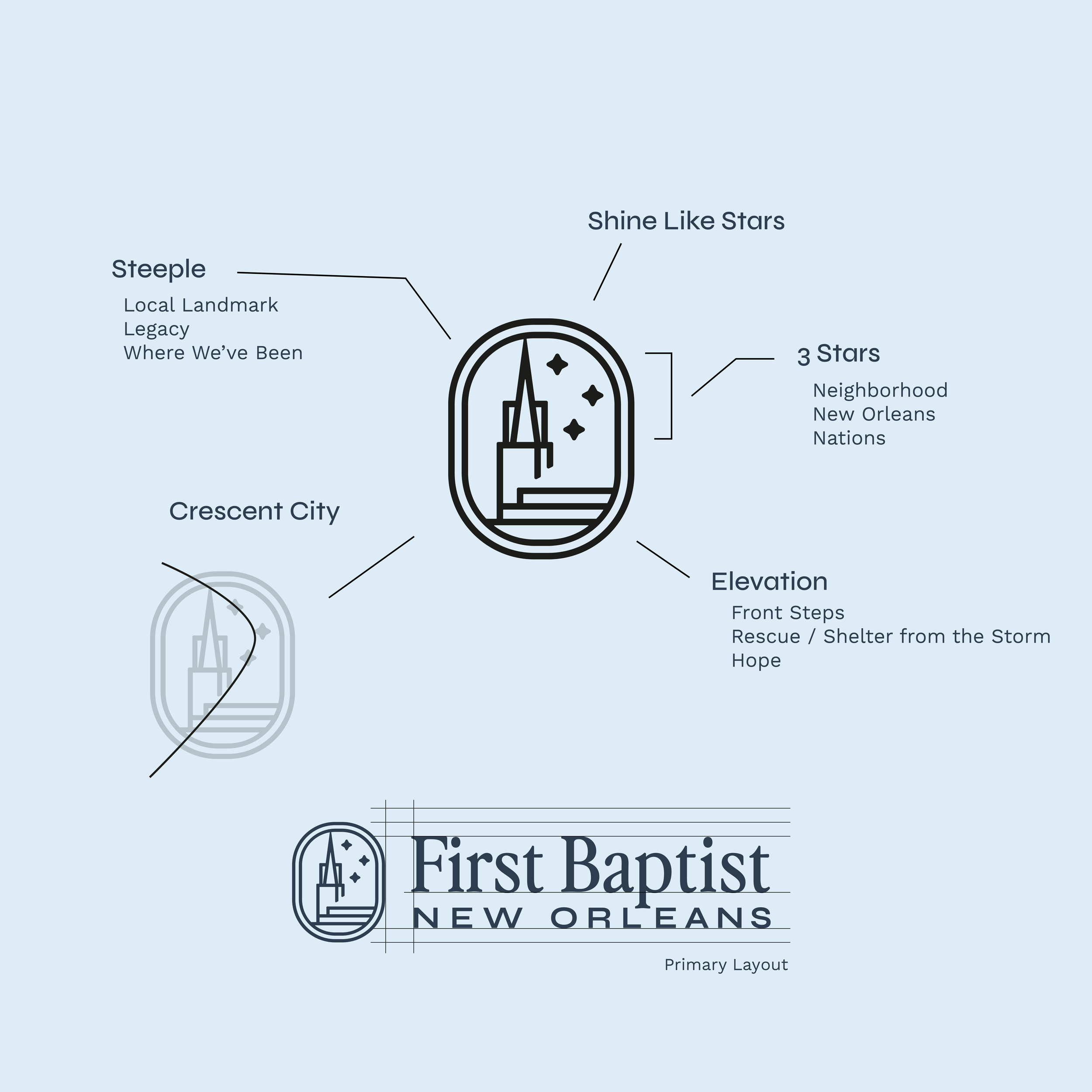
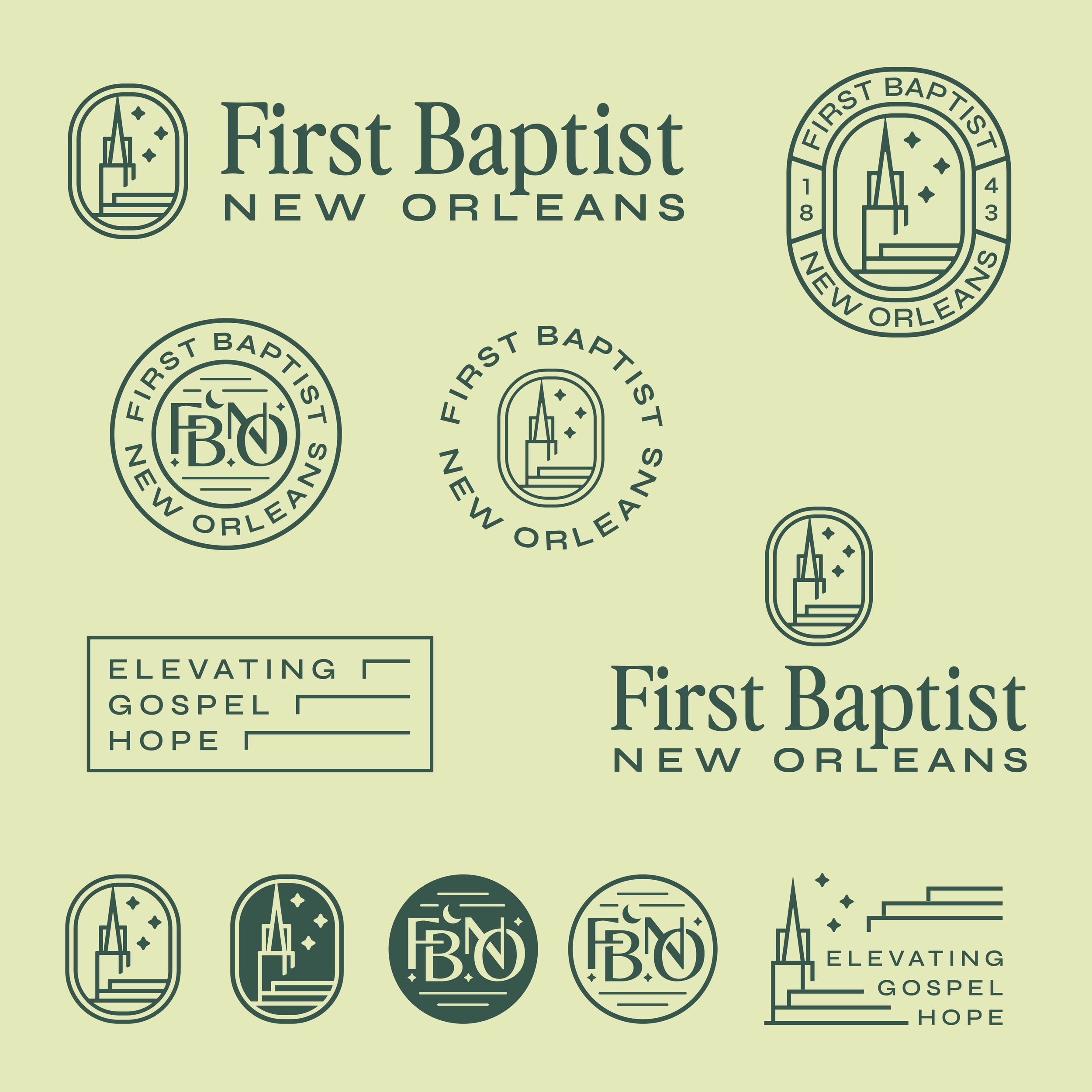
Elevating the church steeple in the logo design brought clarity to their traditional identity. The curve around the three stars was a nod to the “crescent city” curve of the Mississippi River in town. Choosing three stars was intentional. It was meant to mirror the threefold outreach strategy of the church of reaching the neighborhood, New Orleans and the nations.
The stair-step feature within the design is a direct connection to the church itself since it sits on a higher elevation point in the city. The church is quite literally a refuge during times of catastrophe - an experience they witnessed firsthand during Hurricane Katrina. These visual elements serve a dual purpose of representing their physical positioning while highlighting deeper convictions of being a place of stability and hope throughout the city of New Orleans.
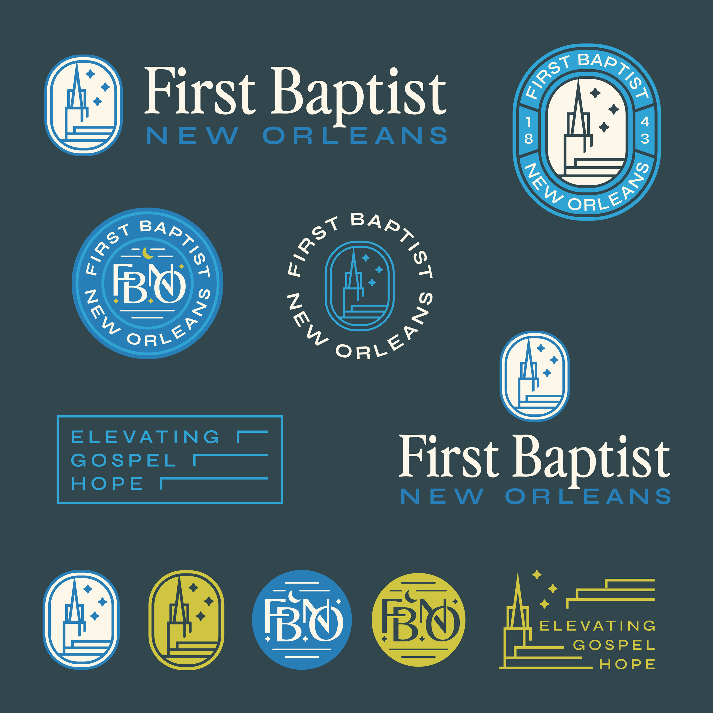
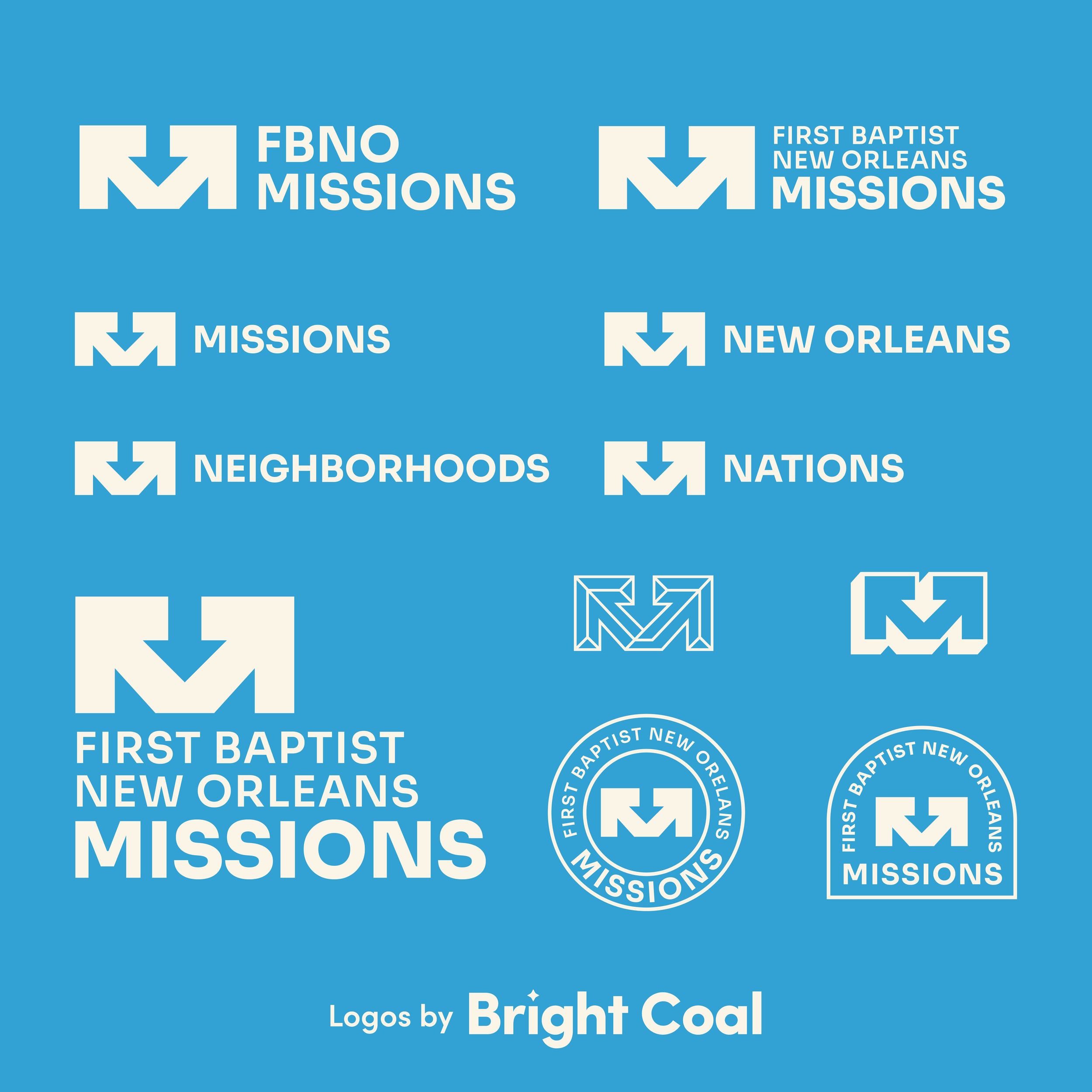
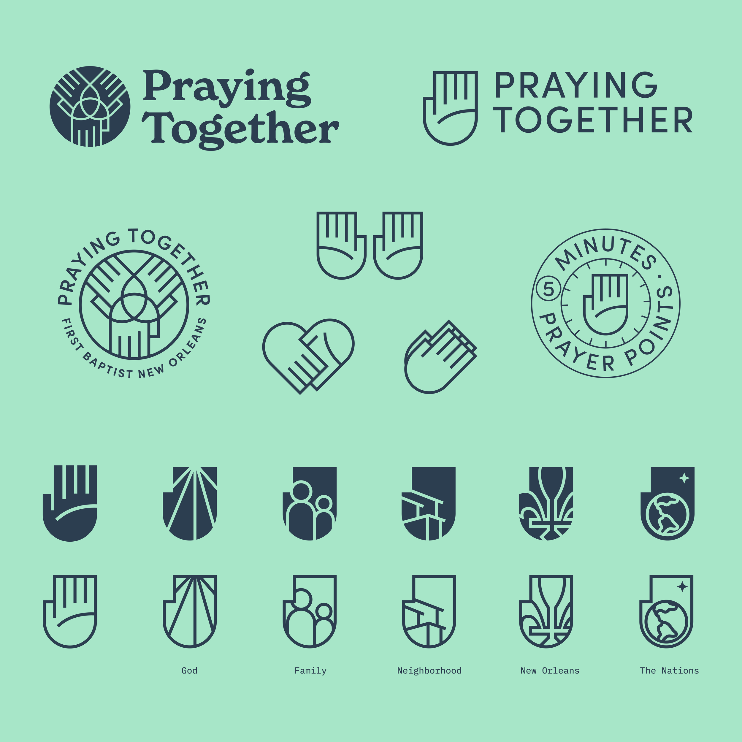
After finishing the main church logo design, we were able to focus on a few sub-ministry projects. Should your children’s, youth, women’s or missions logos match the main church logo? We’ve covered the topic of branded house before, but are big believers in the community brands concept.
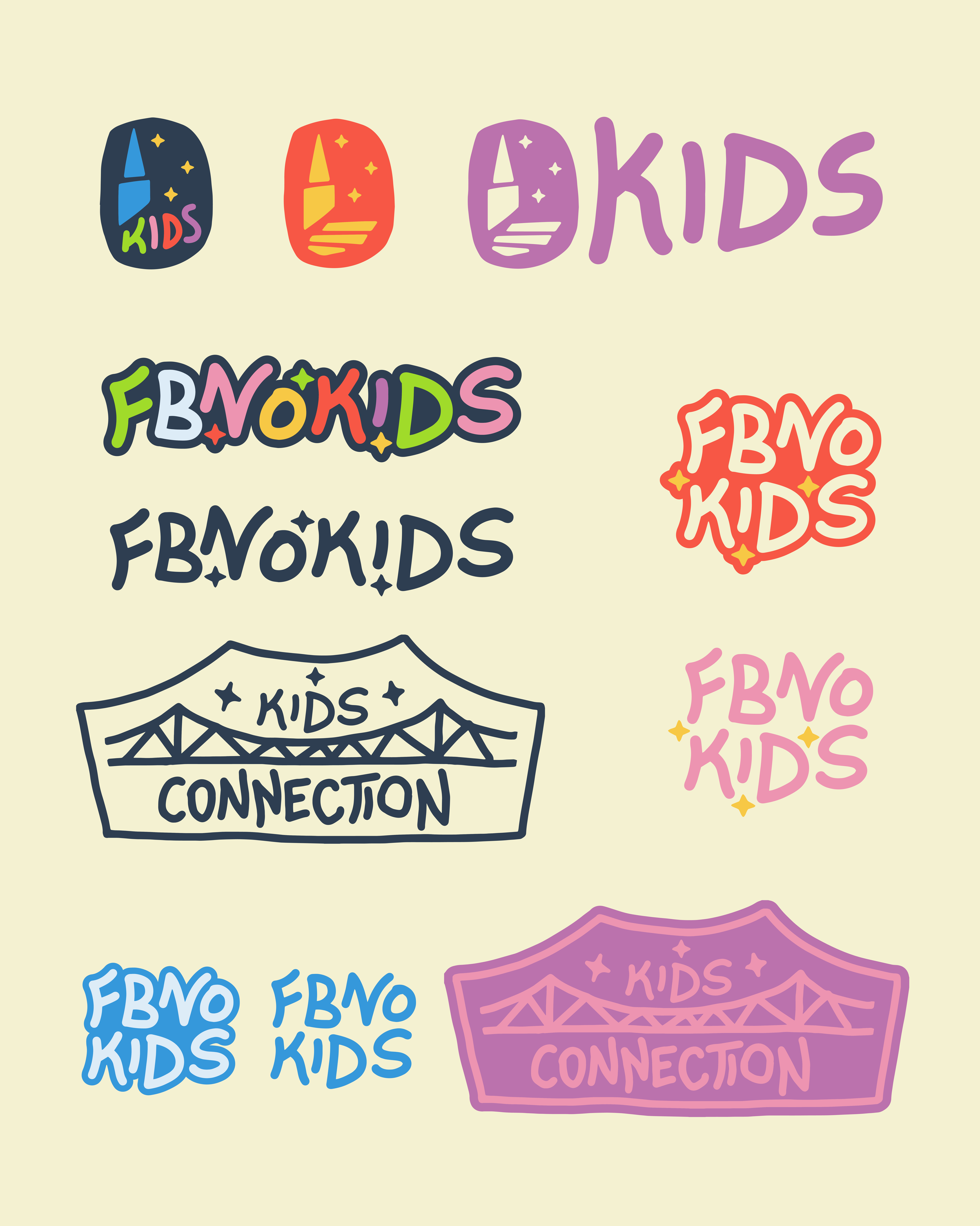
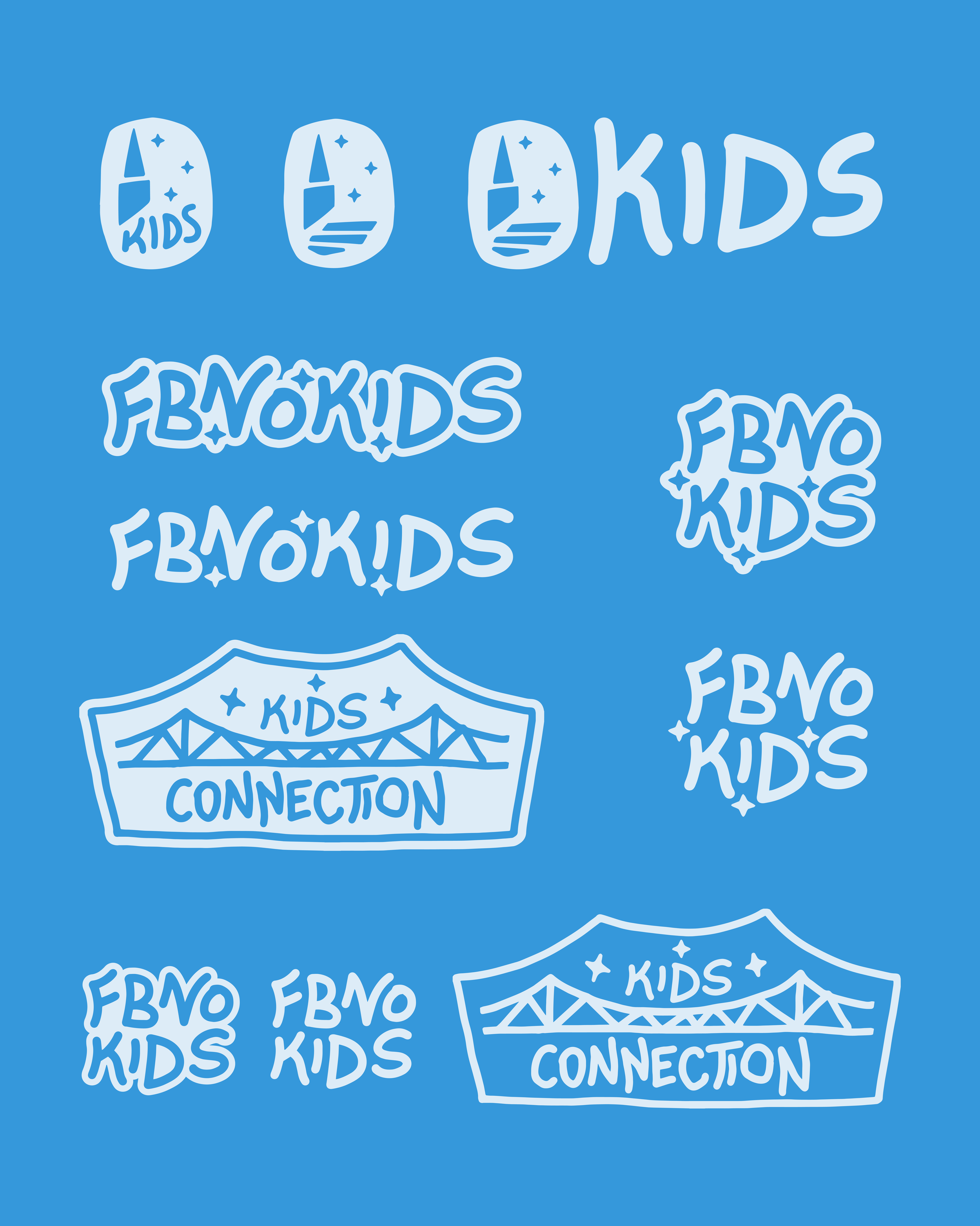

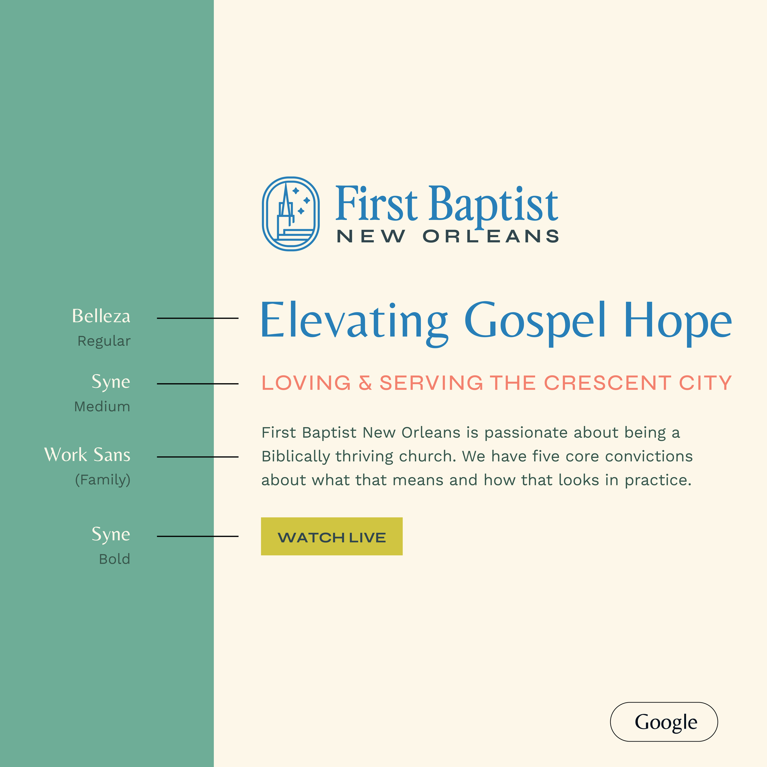
For FBNO, the main church logo functions as the parent of the family. This logo design anchors the rest and sets the tone of the overall core values. It also opens the door for the sub-ministries to function more like siblings inside the house. The children’s logo and the women’s ministry logo can each have their own personality and style, but guests can tell they’re related to one another.
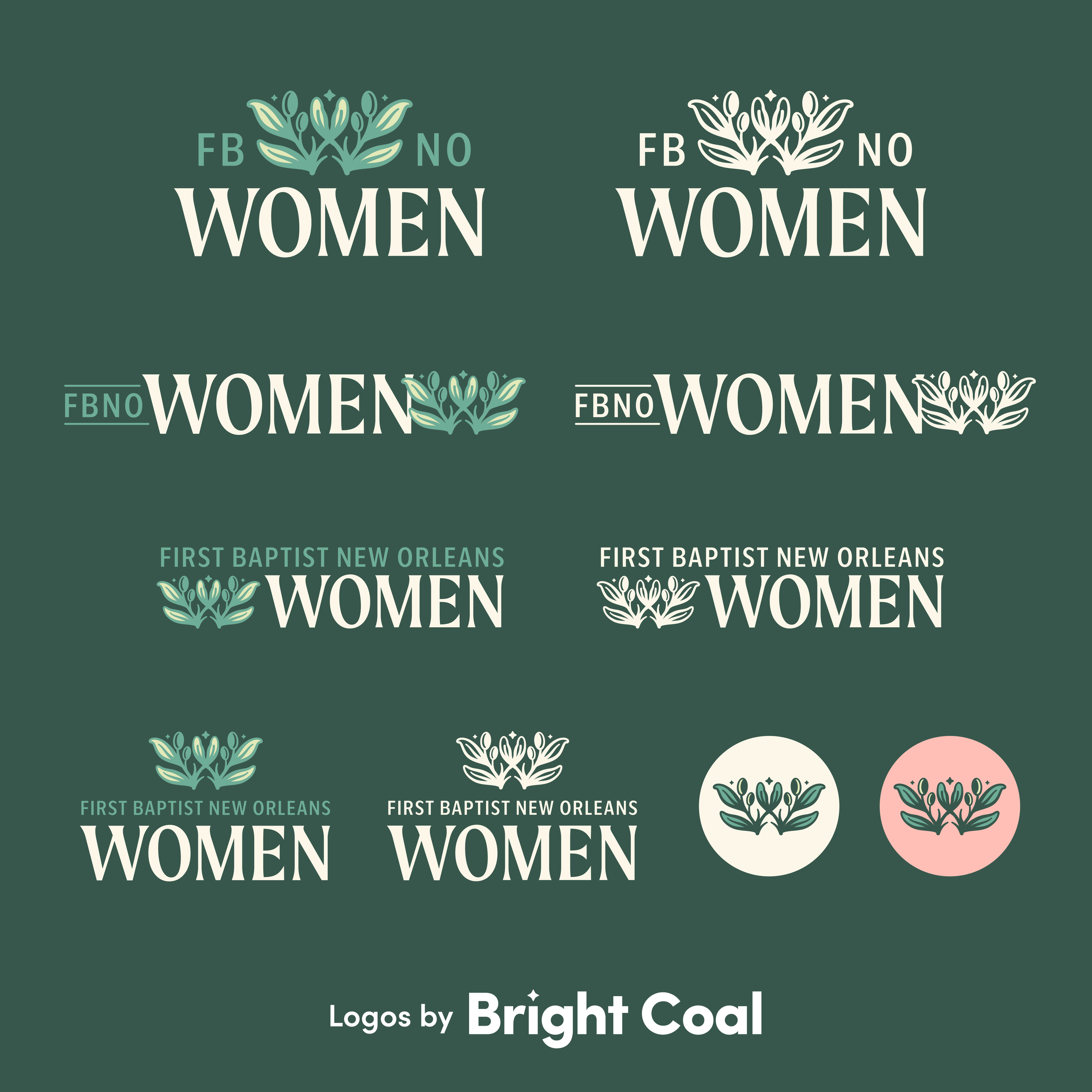

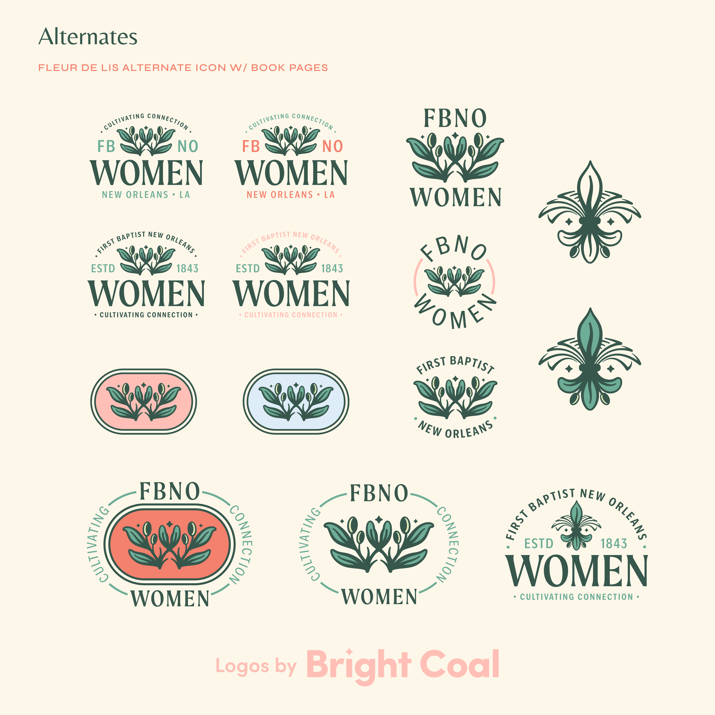
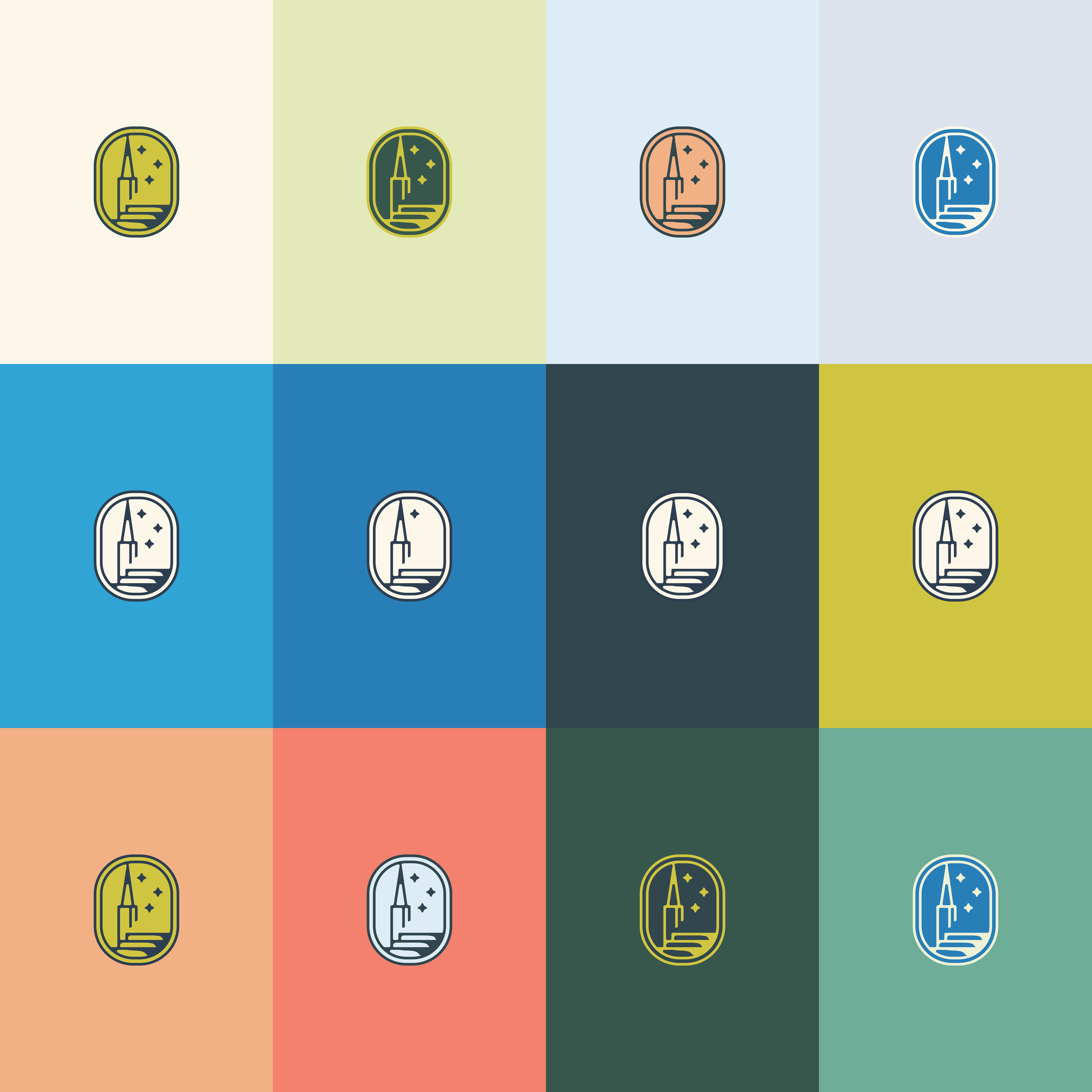
Complimentary color schemes and shared icons keep these ministries within arms length of the parent logo while still giving every group a chance to shine. What’s playful and bright in the children’s ministry logo becomes warm and encouraging in the women’s ministry logo. The extended family members of missions outreach and church-wide prayer campaigns are other initiatives that connect to the overall church brand.


This kind of full church logo design package reminds us that blending a variety of zesty flavors can create one cohesive meal. When each ministry carries its own personality and reflects the heart of the whole, unity happens. That type of synergy makes the work the church is doing very compelling and shows we can always do better when we work together.