
Case Study: Living Word Church
Project Client: Living Word Church | @livingword_nj
Project Type: Church Rebrand
Lead Designer: Rachel Baker
Living Word Church is located in a part of New Jersey that’s extremely diverse in both background and age. The community surrounding the church isn’t widely accepting of the Gospel and cultural norms are increasingly postmodern. When it came to upgrading the church logo, the team knew exactly what they wanted, but they also kept an open mind throughout the creative process.
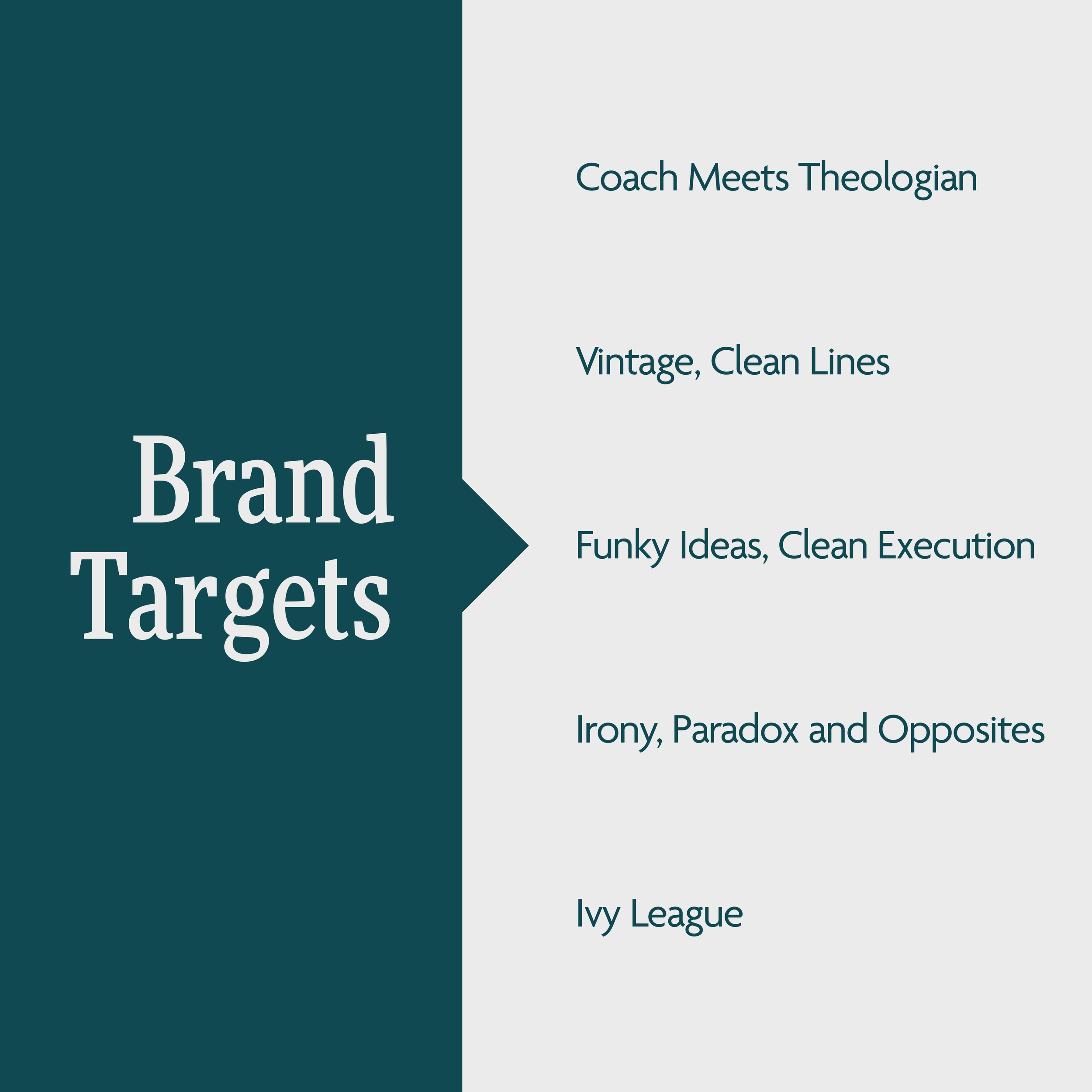
The project itself could’ve gone in a lot of different directions because of the diverse group of stakeholders who sat across from us at mood meetings. This fun group was a mix between energetic coaches and Ivy League type theologians in the best possible way. Their team makeup created the right amount of design fuel that landed us with a funky, yet clean, logo design.
“Seeing the looks for the first time was my favorite part because the project could’ve gone so many different ways!”
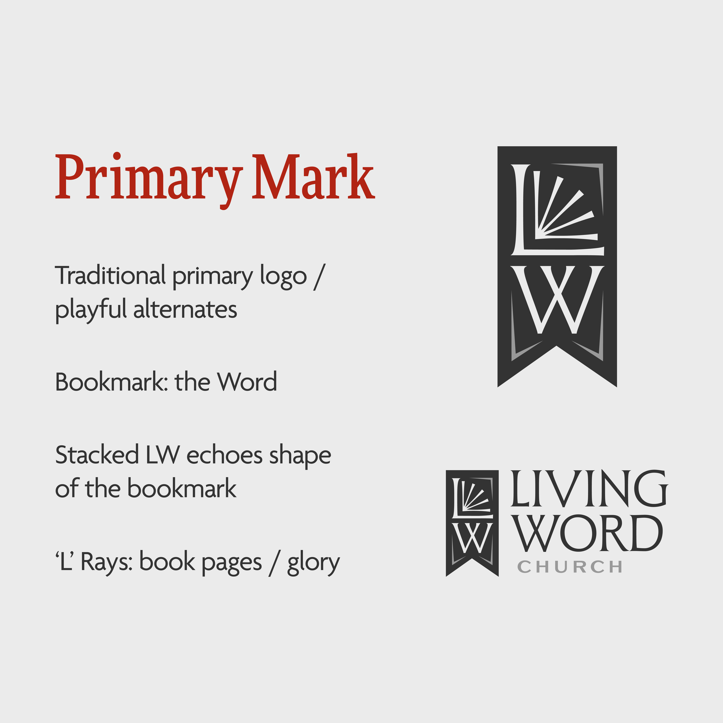

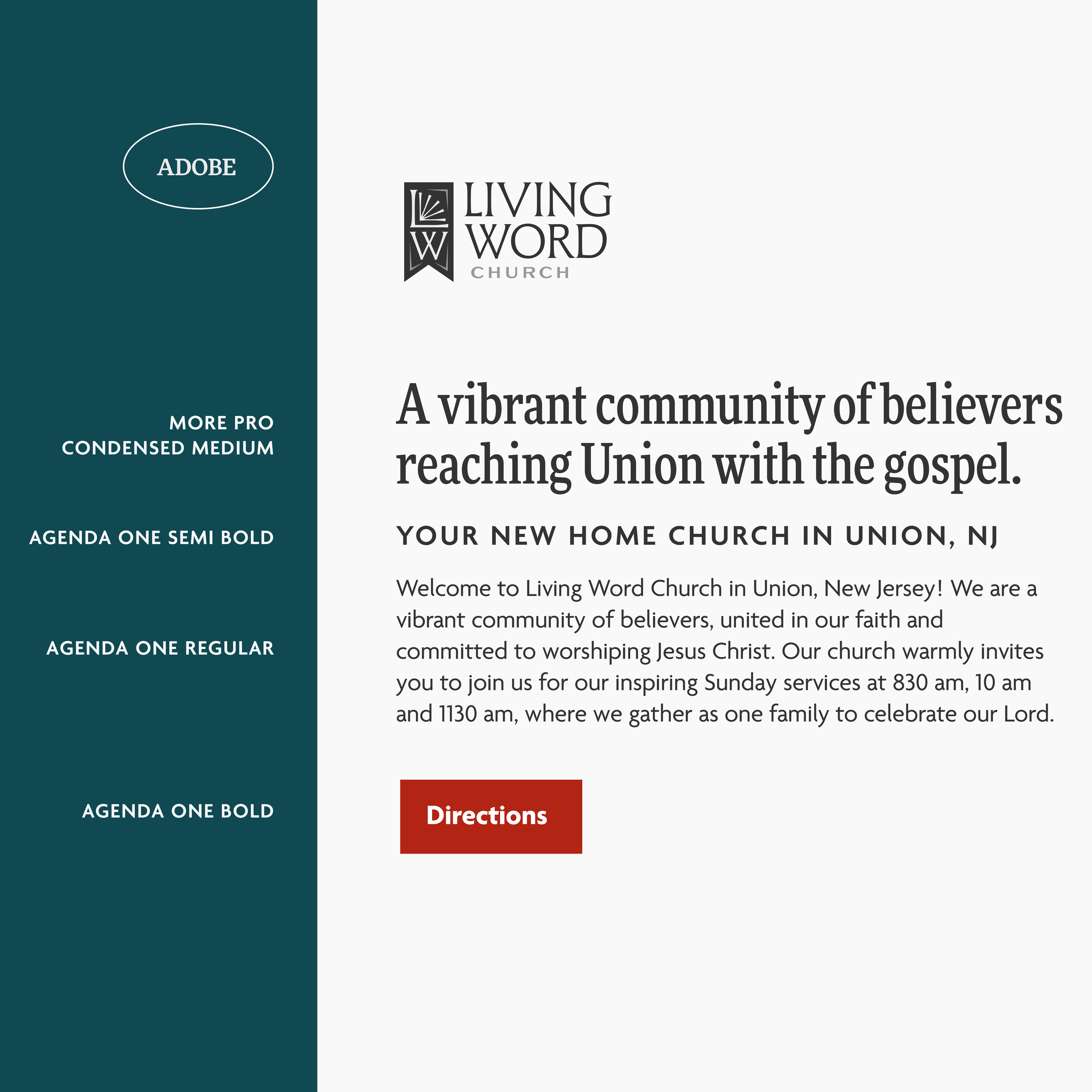
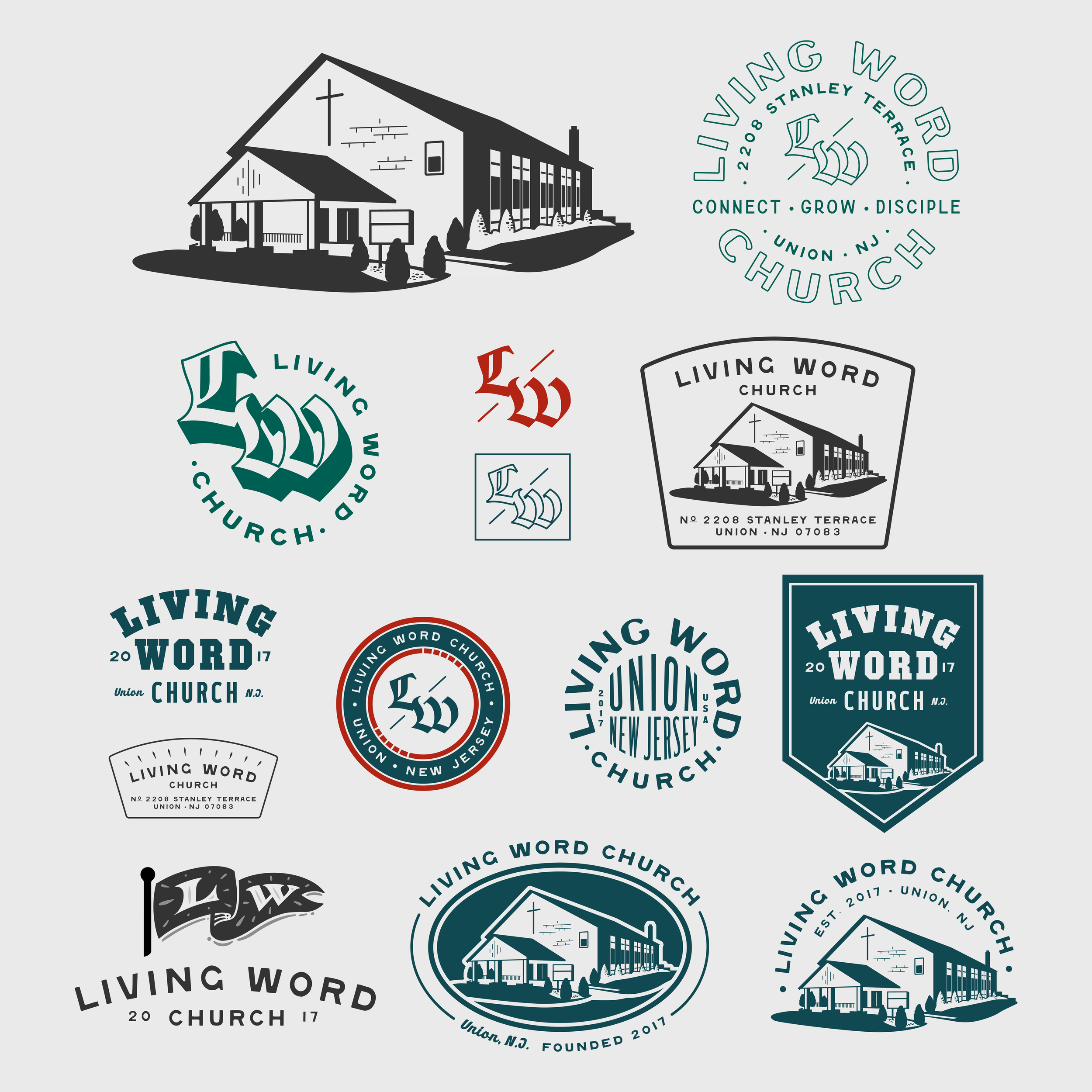
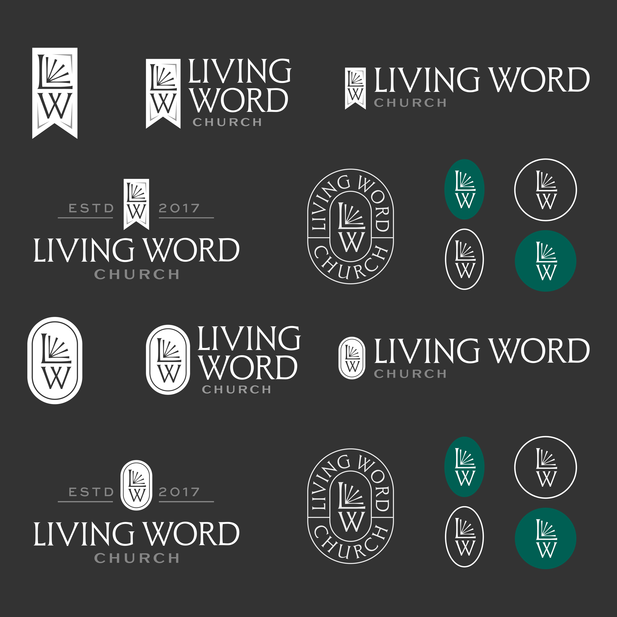
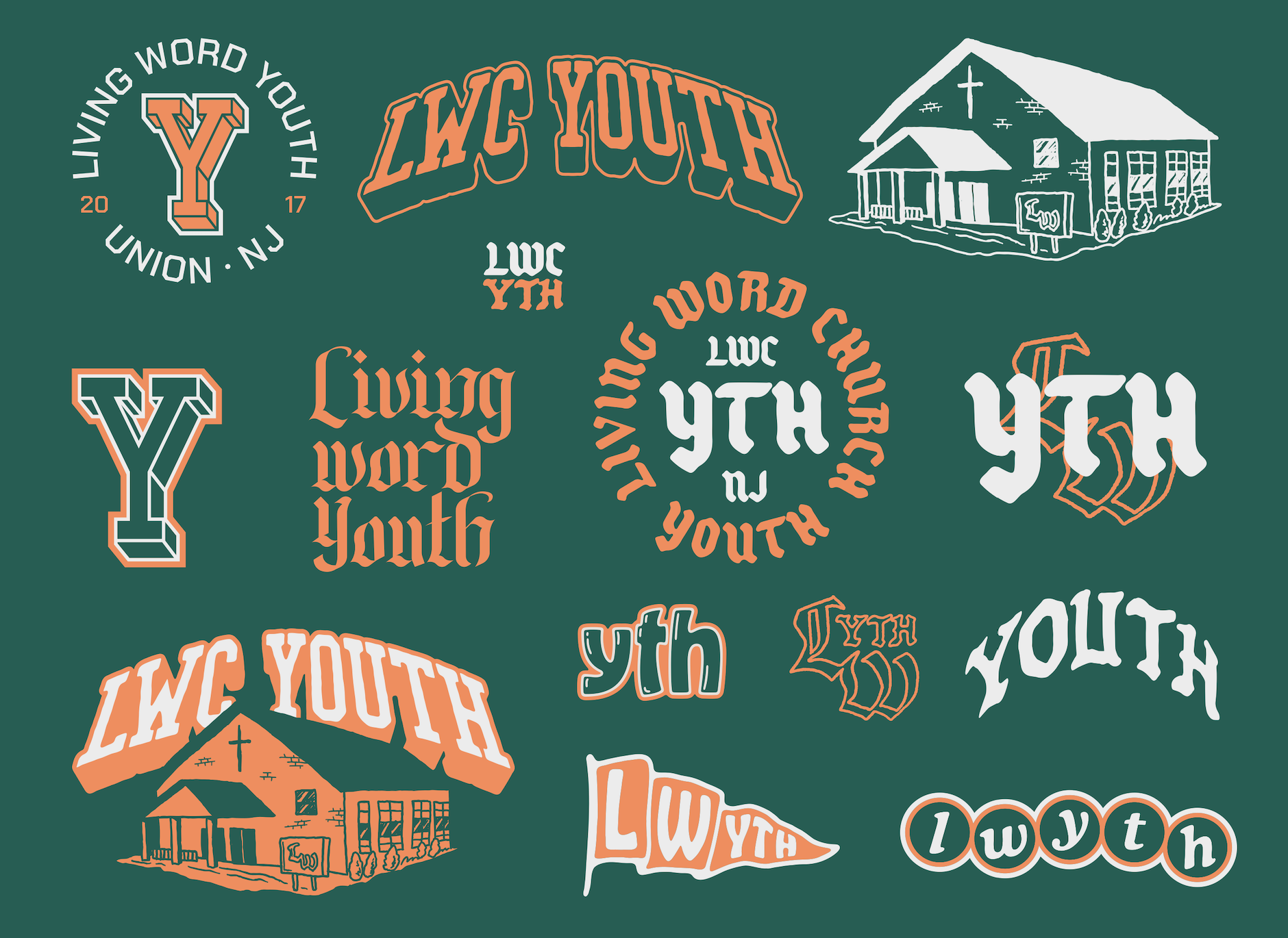
The color combinations were mixes of moody, serious tones and pops of color. This created a vintage, clean feeling without cluttering up the design. Their mission of “Connect, Grow & Disciple” helped push us towards an approachable and clear font style that didn’t feel static or closed off. Even the young adult and youth ministry logos were welcoming and still grounded within the main church logo design.
This church logo design reminds us that every unique personality type has value at the table. A church who has this kind of heart is one where everyone belongs and the doors are always open. Next time you’re in the upper Northeast, check out this vibrant church!