
Branding for a Church-Owned Community Space
Client: Social House | Home Church Roswell | @homechurchroswell
Project Lead: Josh Whiting
Logo Designer: Rachel Baker
Many churches might sit empty throughout the week while they wait for their next in-person gathering. But what can happen when the group decides to build a more rooted in the neighborhood, open throughout the week, type church model? Meet: Home Church Roswell.
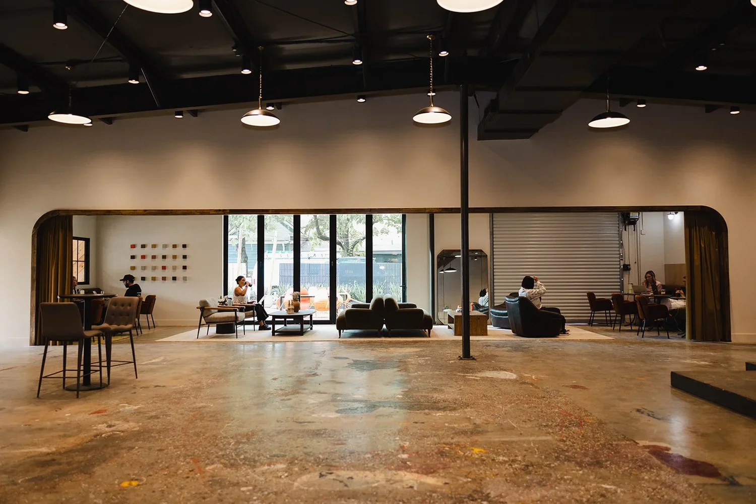
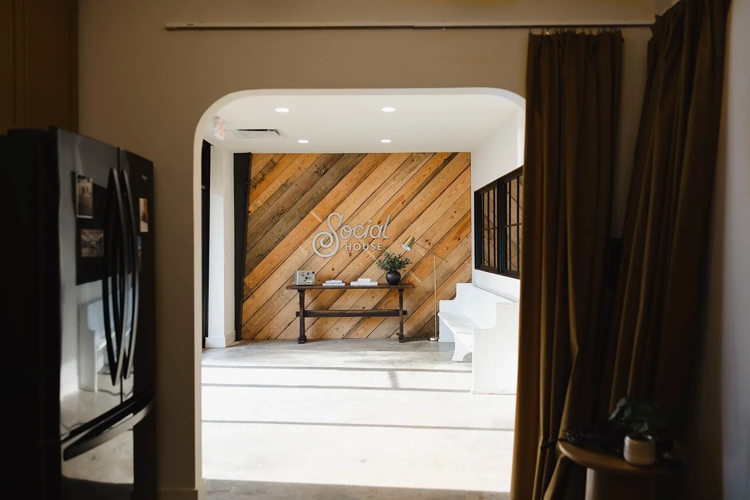
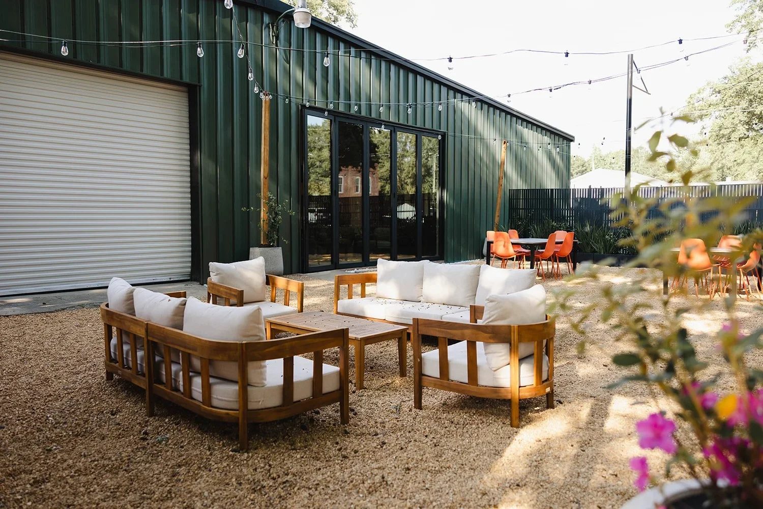
We’ve worked with these guys on many branding rollouts over the years and one thing remains constant: Home Church has a heart for their community. Even their tagline “there’s no place like home” nods to their out-of-this-world approach to ministry. They’re a group who want to make sure people feel like they belong. When they decided to purchase and build up a non-profit ministry called Social House, we were thrilled to play a small role. Social House is a rentable venue space that is also a gathering place for their weekly church activities. Imagine hosting your next church volunteer training at the local wedding venue!
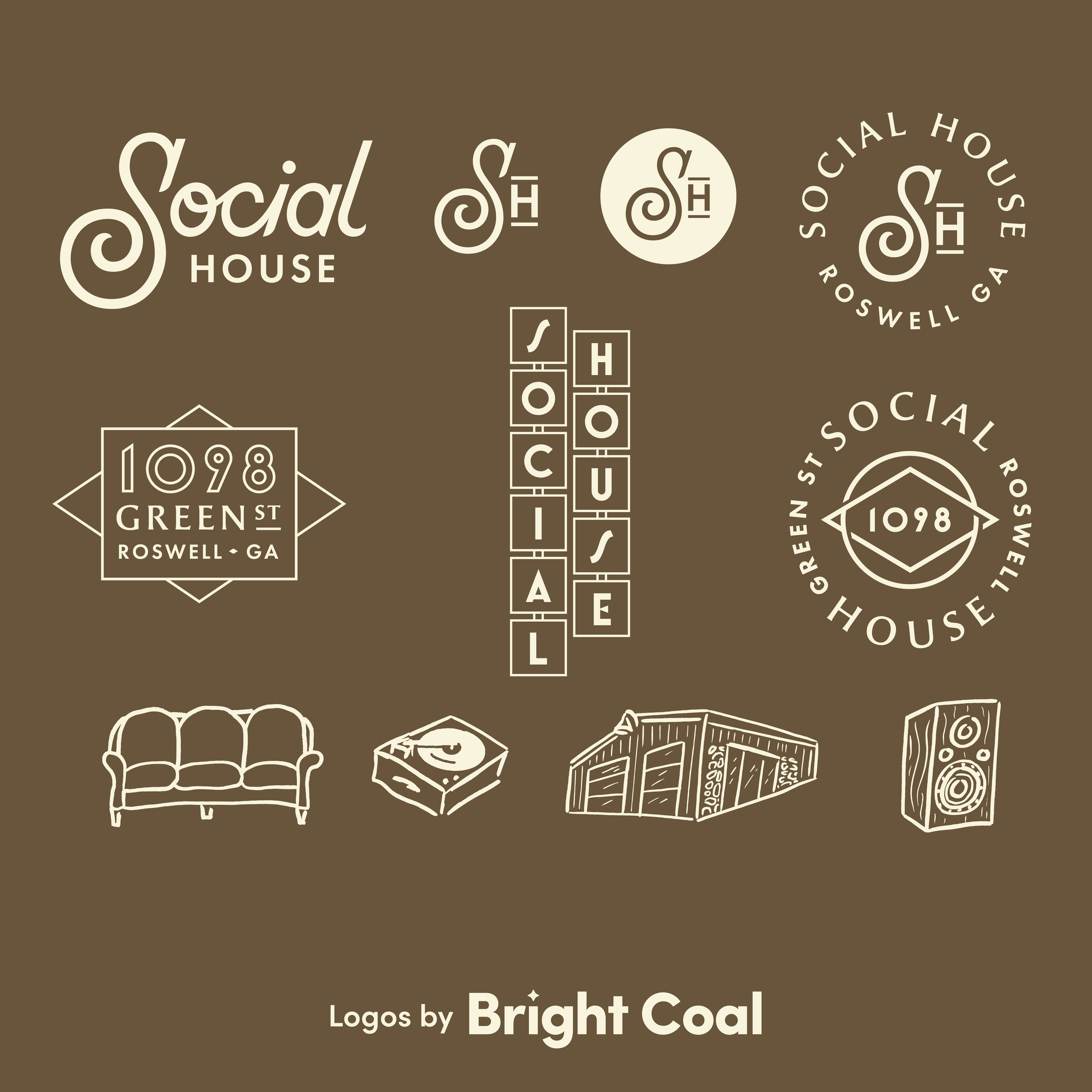
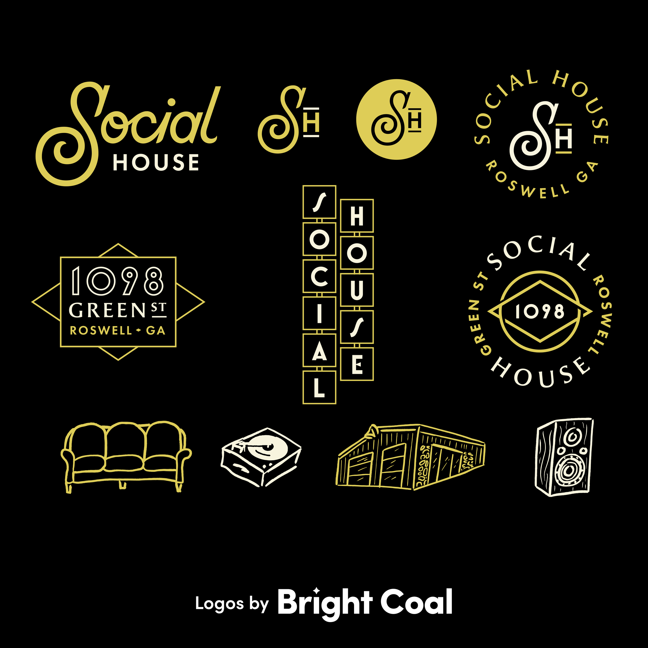
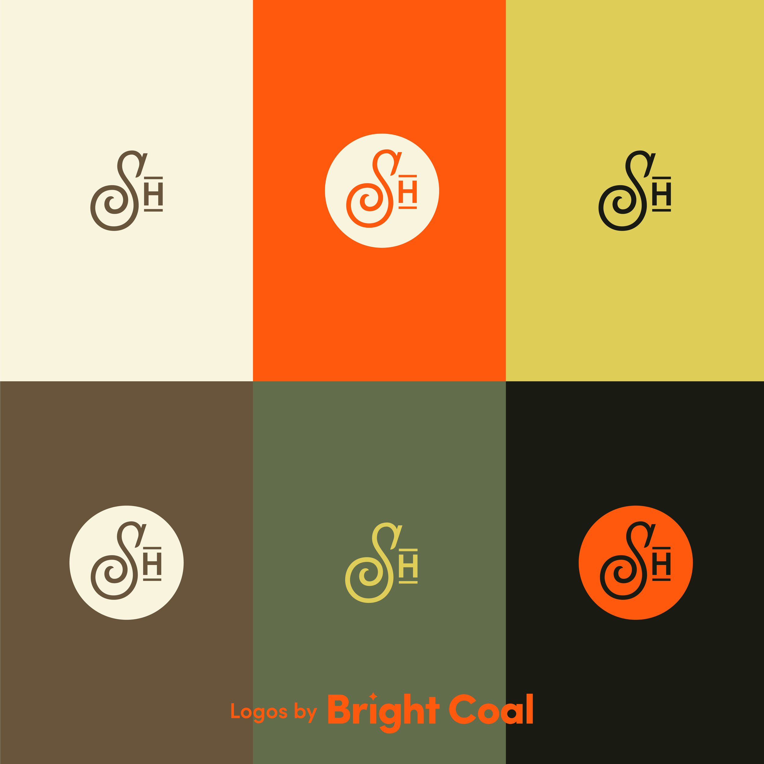
“It's the details that make this mark so special... like having only some letters connect. Love the extra pizzazz on the “S,” too!”
- Rachel Baker, Logo Designer
Home Church dove all in on this concept of missional spaces. This venue space is now an extension of the local church ministry that gives back to the community tenfold. When you host an event at Social House, you’re giving back housing to those who need it the most through the other charitable organizations the church partners with.
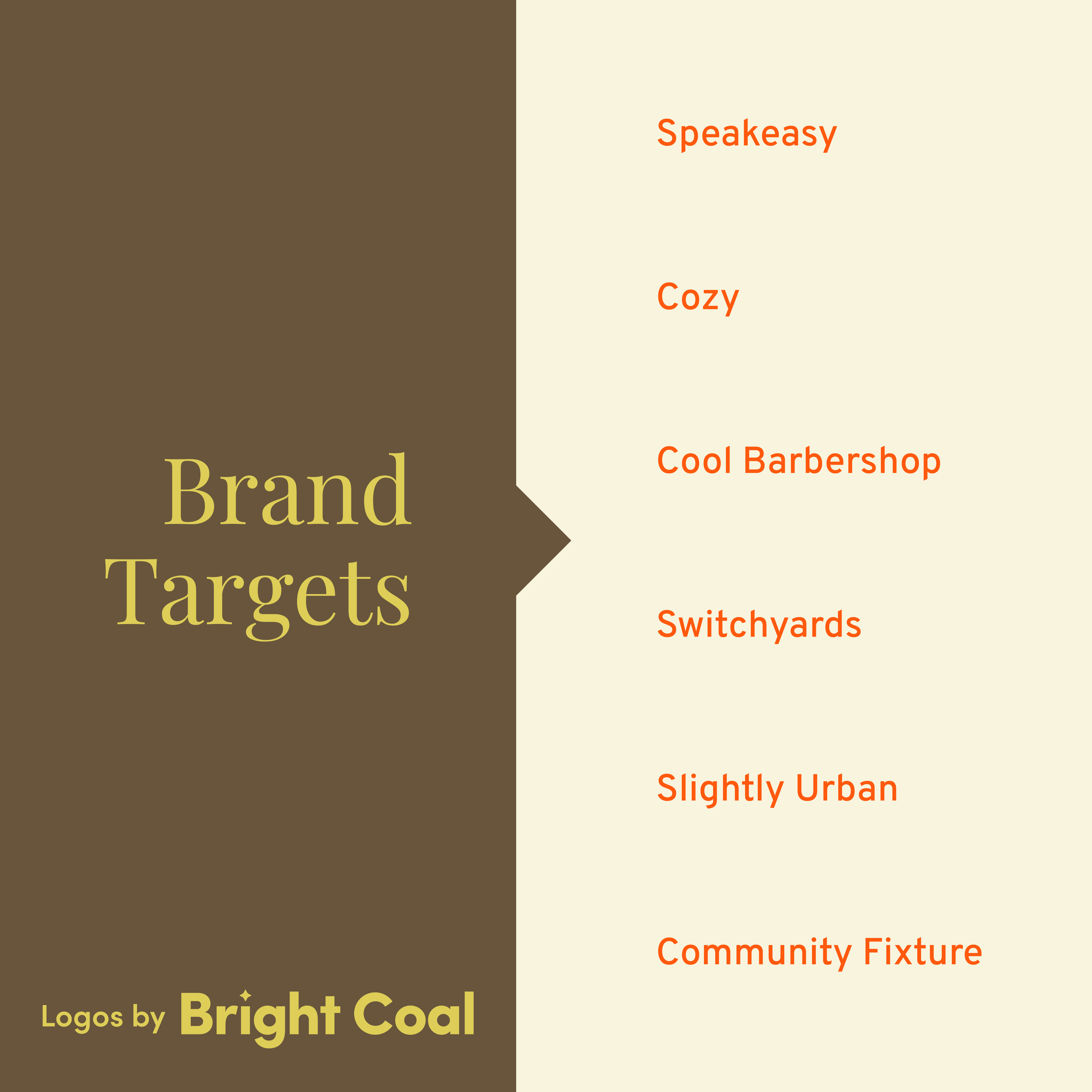
They’ve fully embraced the model of being a resource for the community rather than just a gathering that meets on Sundays. Our logo design goals were to bring in inspiration from unique gathering places that aren’t often associated with church logo inspiration. We started riffing on things like speakeasies and the local barber shop, and walked away with this contemporary design that felt classically homey.
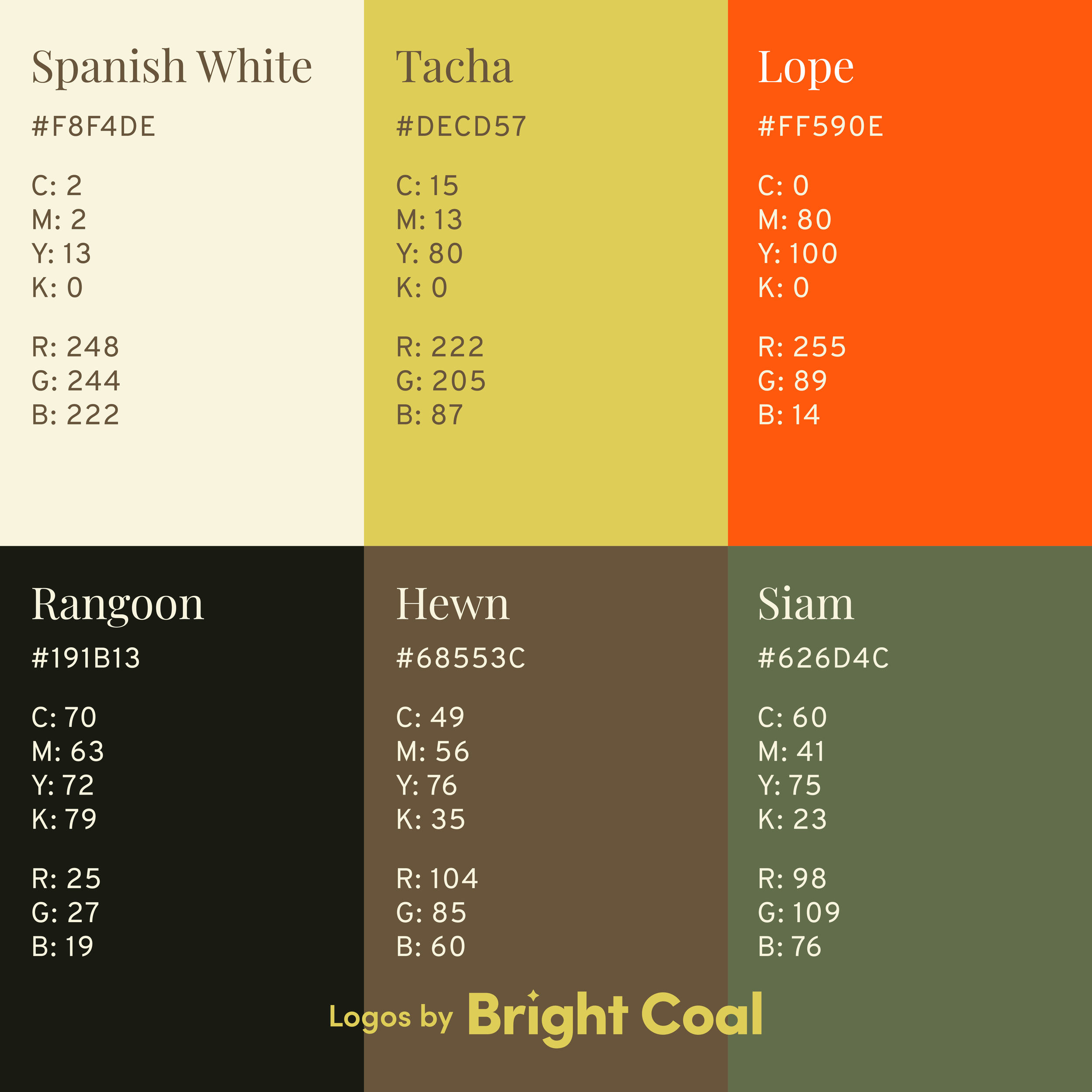
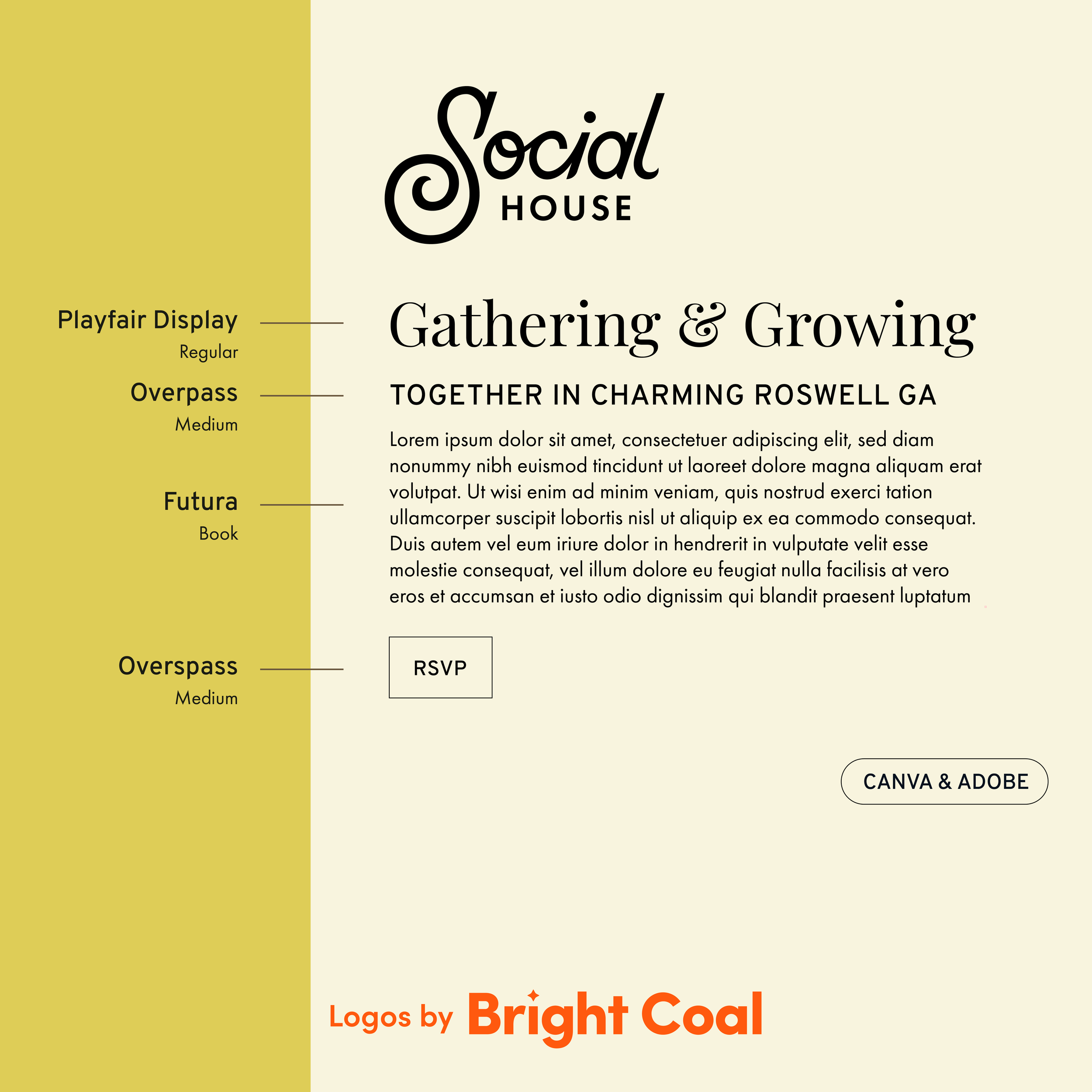
This multi-purpose space might be someone’s first encounter with the local church, which is unconventional and exciting. Choosing a warm, grounded color palette with pops of color kept things stimulating and optimistic. The balance of warmth and energy were something we really wanted to capture since it highlights the openness this venue exudes. What a joy it was to play a supporting role in helping this ministry continue to welcome people home.