
Church Logo Design for an International Client
Pukekohe, Auckland, New Zealand
CLIENT: Revive Pukekohe / @RevivePukekohe
PROJECT: Main Church Logo and Brand Guide
Ever had someone from New Zealand slide into your DMs? That’s exactly how we got connected to Revive Pukekohe (pronounced: poo-keh-KOH-heh) from Auckland, New Zealand. Maybe you’re immediately thinking of Lord of the Rings with dramatic, larger-than-life soundtracks of Middle-earth magic. Lucky for us, this international church client was a very real and vibrant church looking to tell a story of their own through clear branding. To know them is to love them and we were honored to hang all the way across the ocean. It’s always an added layer of fun when we get to serve a client from across the globe. This group helped us remember some key takeaways when working through international brand strategies.

TIME ZONES ARE JUST MATH - BUT MESSIER
Working with international clients about their church branding strategy is something we enjoy, but it comes with logistical snags. They’re called time zones! For this case study, it was a 16-hour difference. Our 8 AM was their midnight. Cross-continental calls always require caffeine and flexibility. More sharpness and collaboration were required on our end, but we always enjoy the challenge. It helped that this was a group of people you’d want to call at 3 AM if you needed to.
CLEAR STORYTELLING THROUGH BRANDING WILL TRAVEL WELL
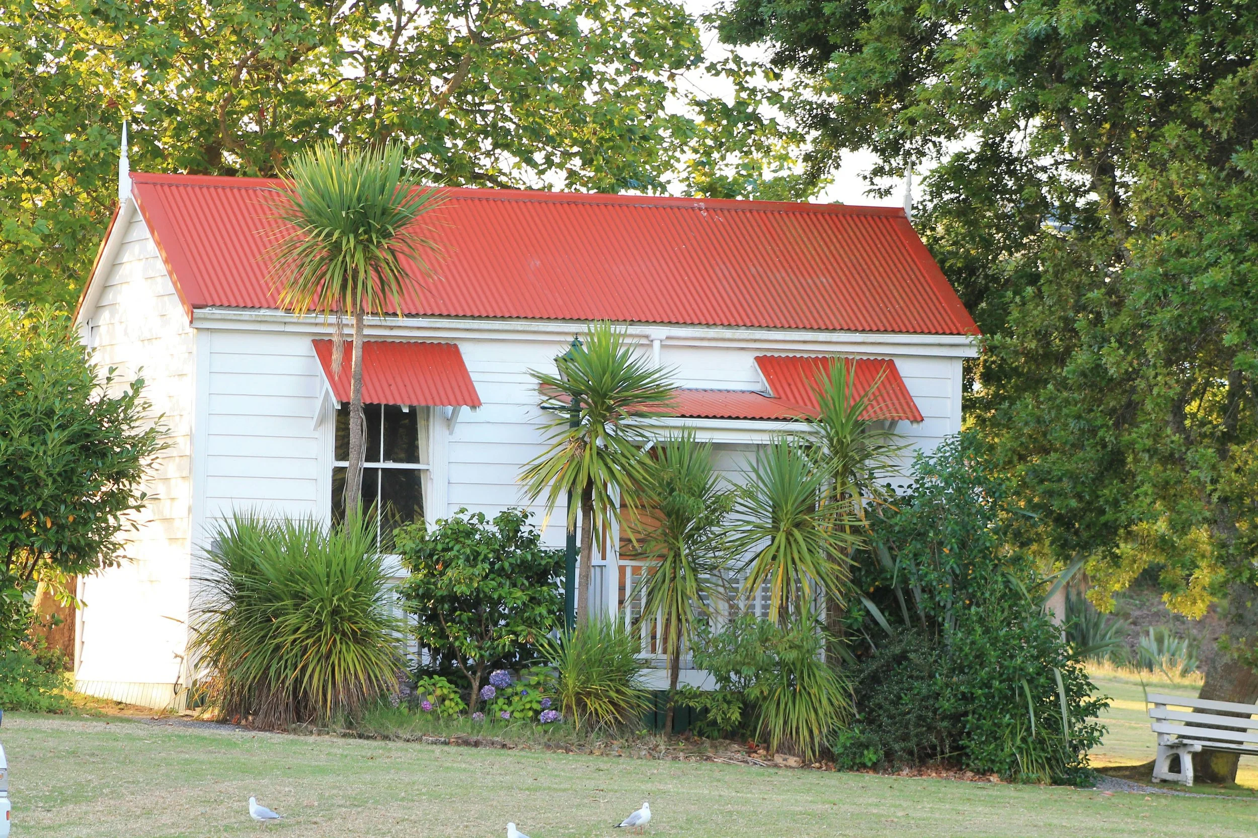
Revive is located in a rural part of the country with sweeping hills. The name of the town derives from a type of tree that’s native to New Zealand. The city itself is quite literally on a hill, surrounded by green fields and open skies. AKA, we’ve added Pukekohe to the destination bucket list.
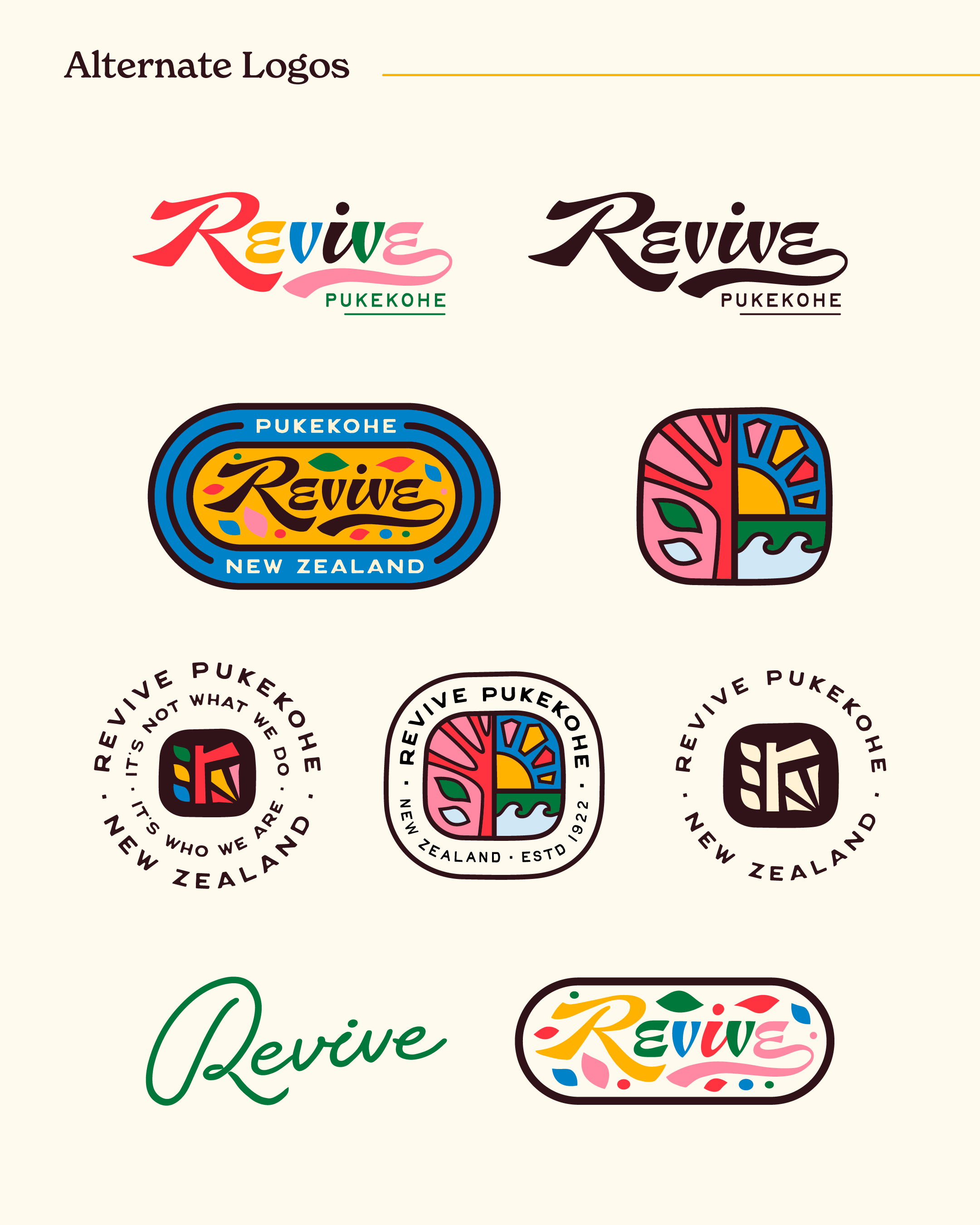
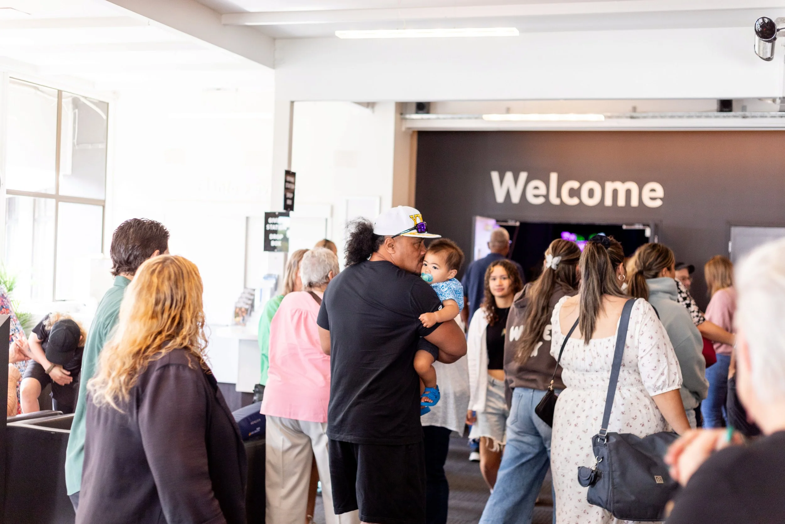
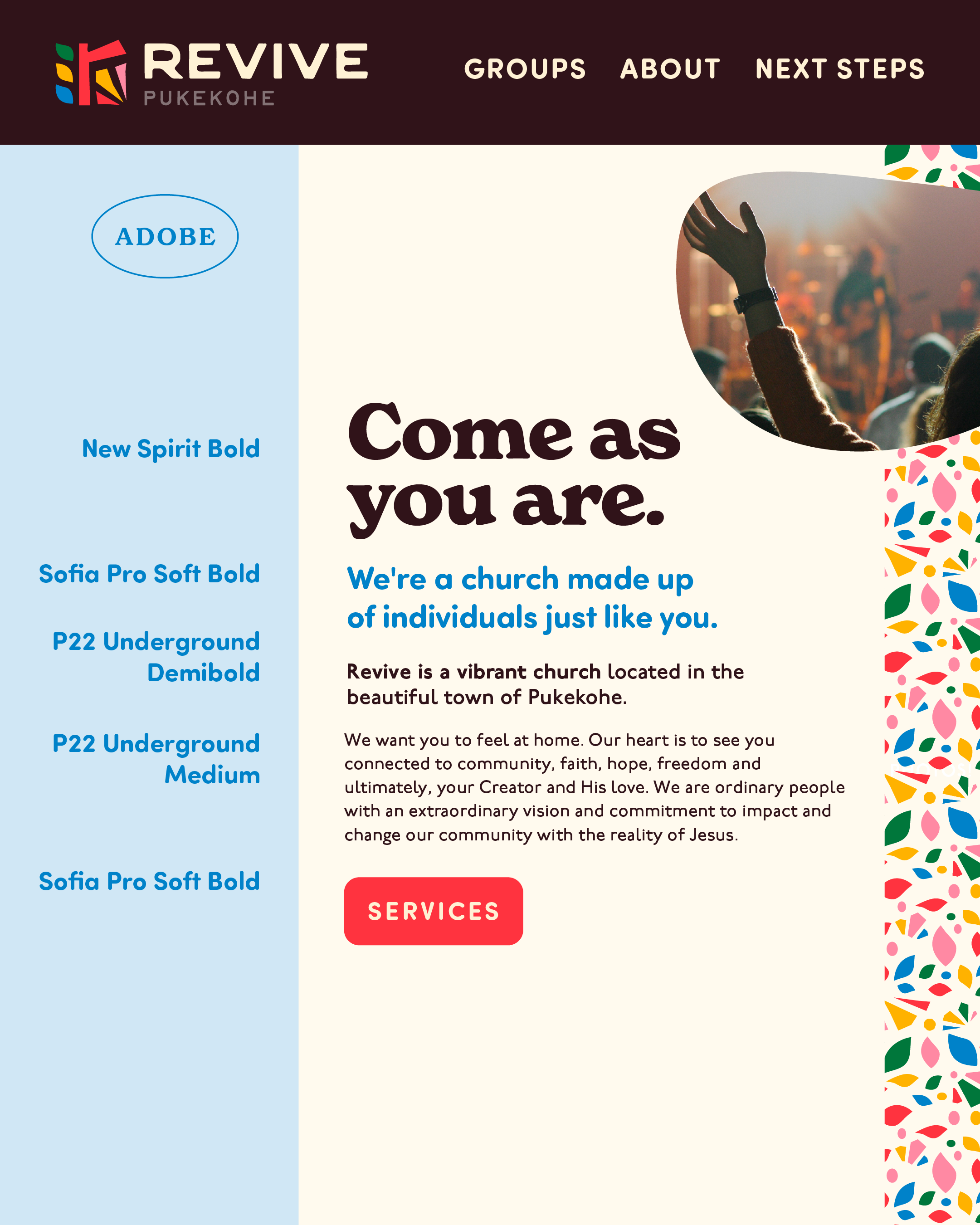
The church itself is rooted in the legacy of revival and provides a place for growth and new life. What started as a movement 100 years ago had grown into a community that found themselves in need of a more permanent logo design.
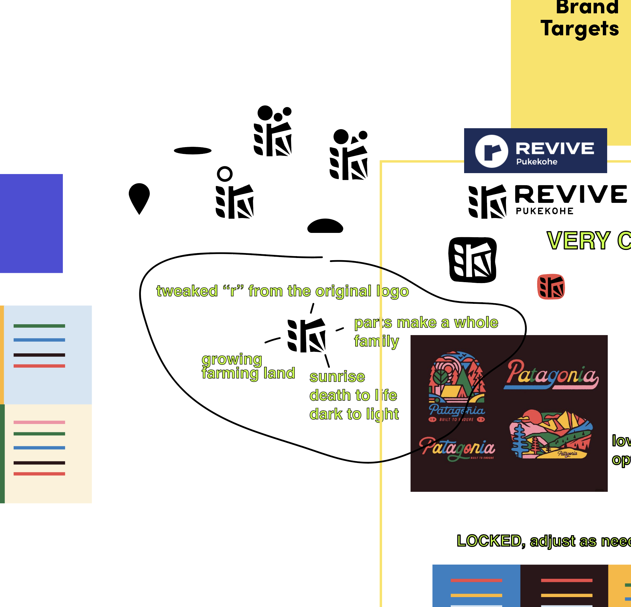
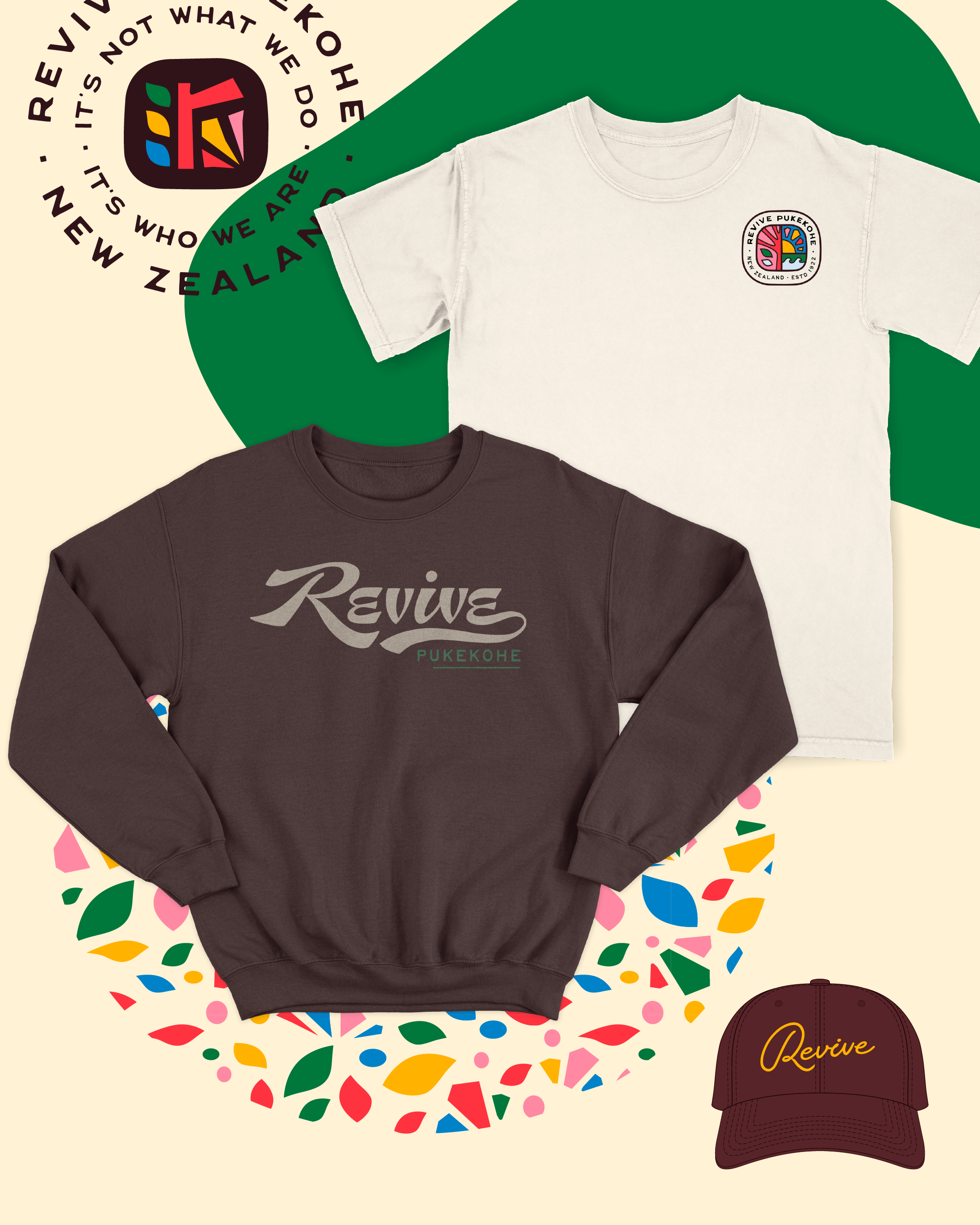
Mood Meeting - Brand Elements
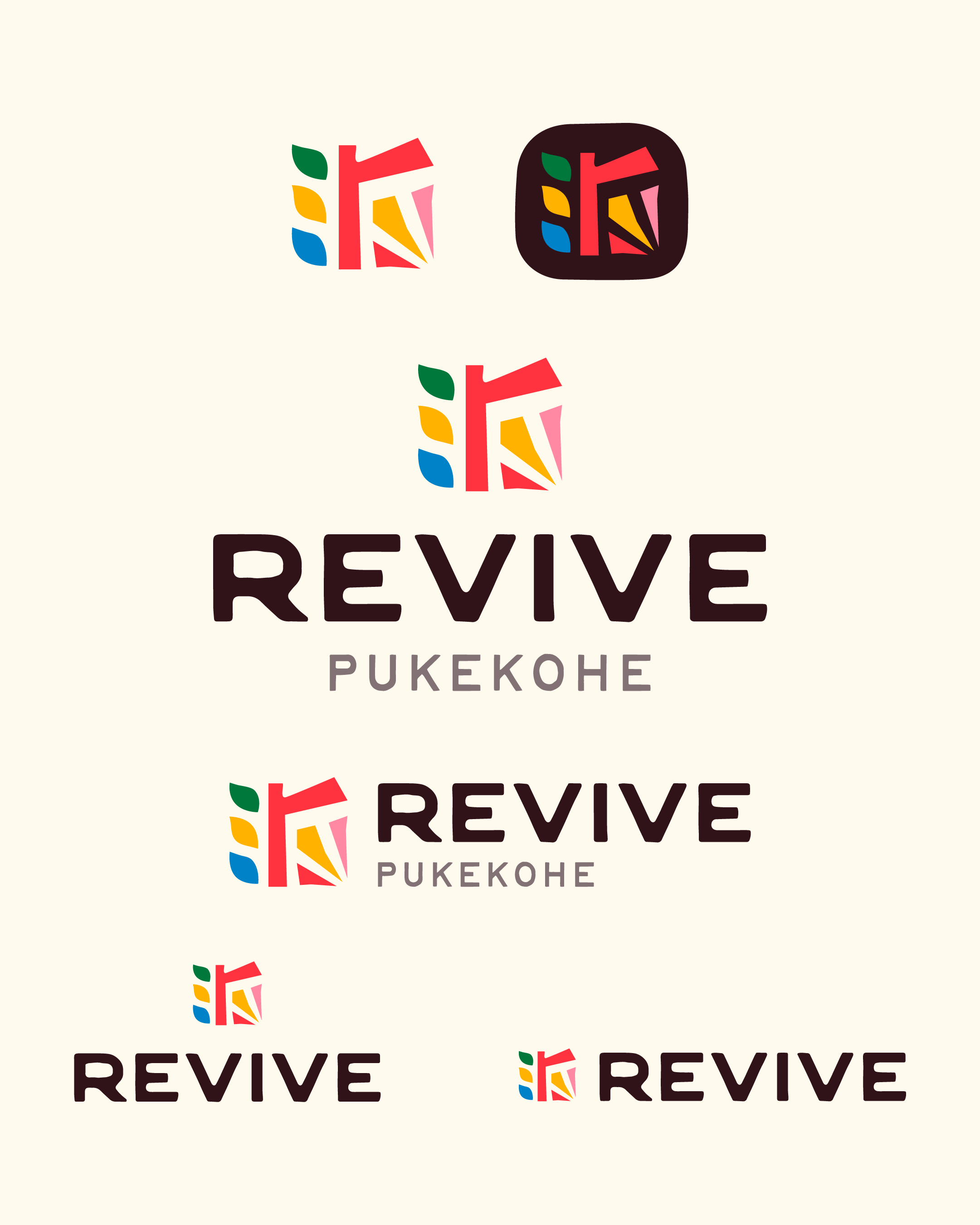
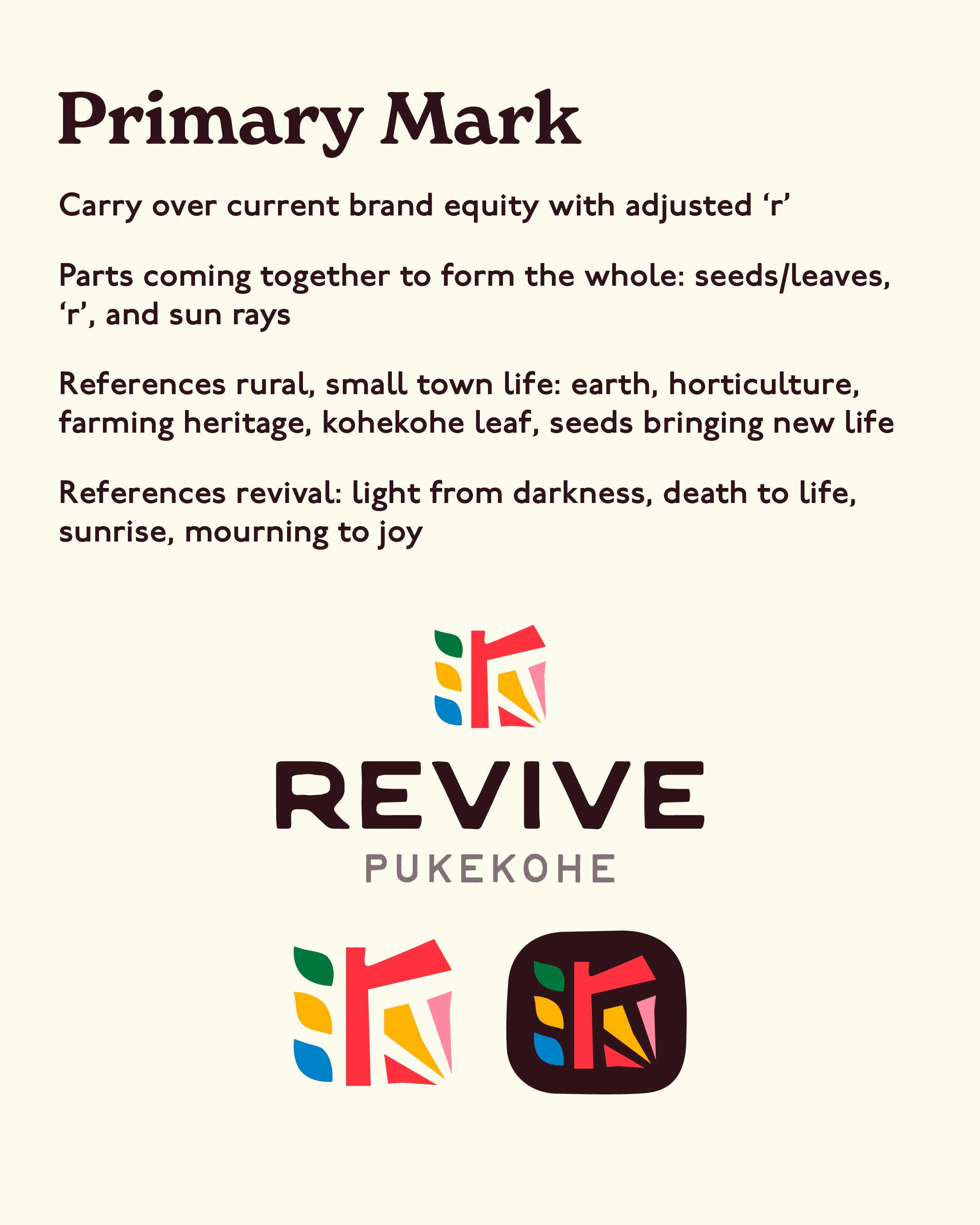
They brought with them this pre-existing “R” that needed to be revived - pun intended. This anchored the rest of the artwork.
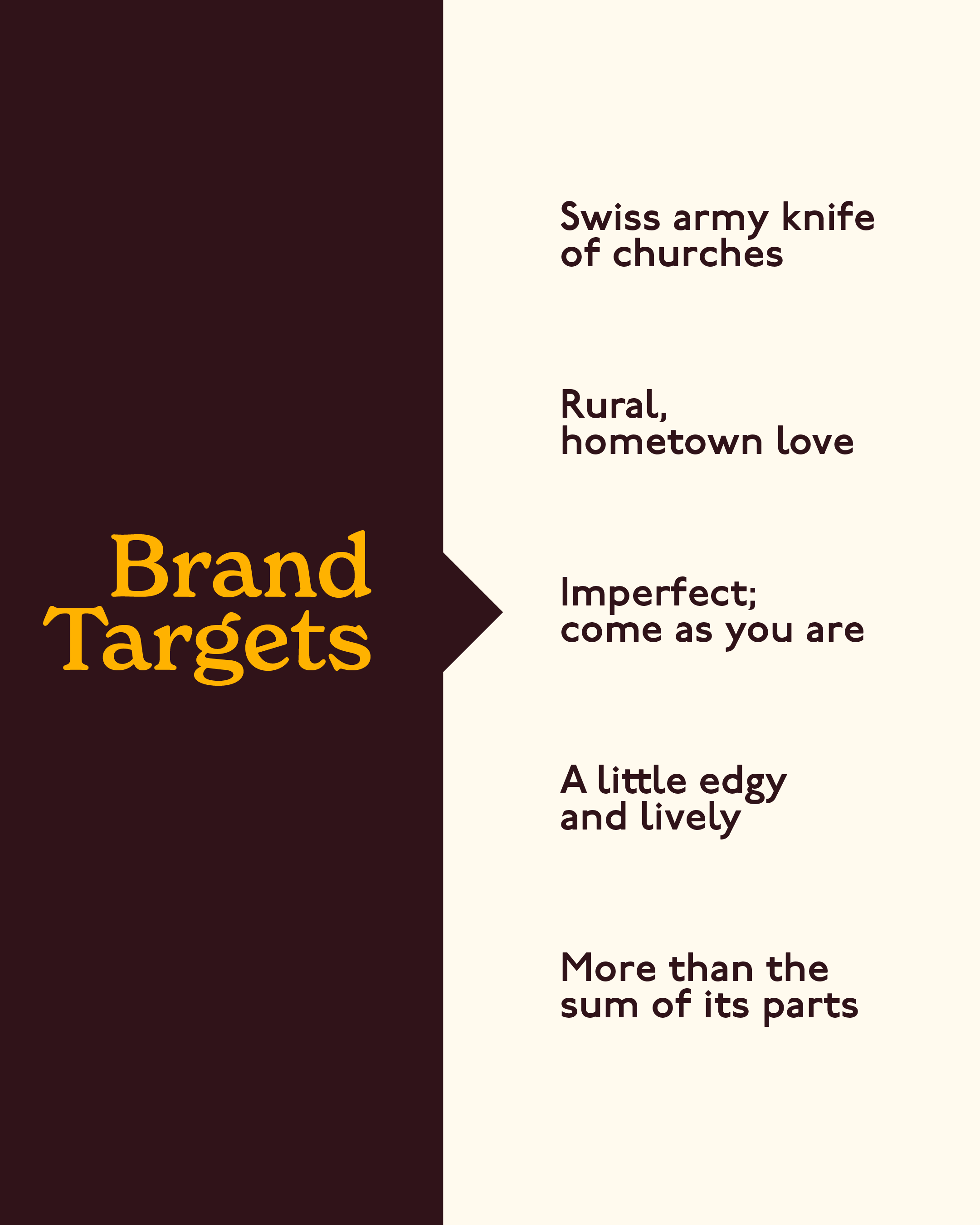
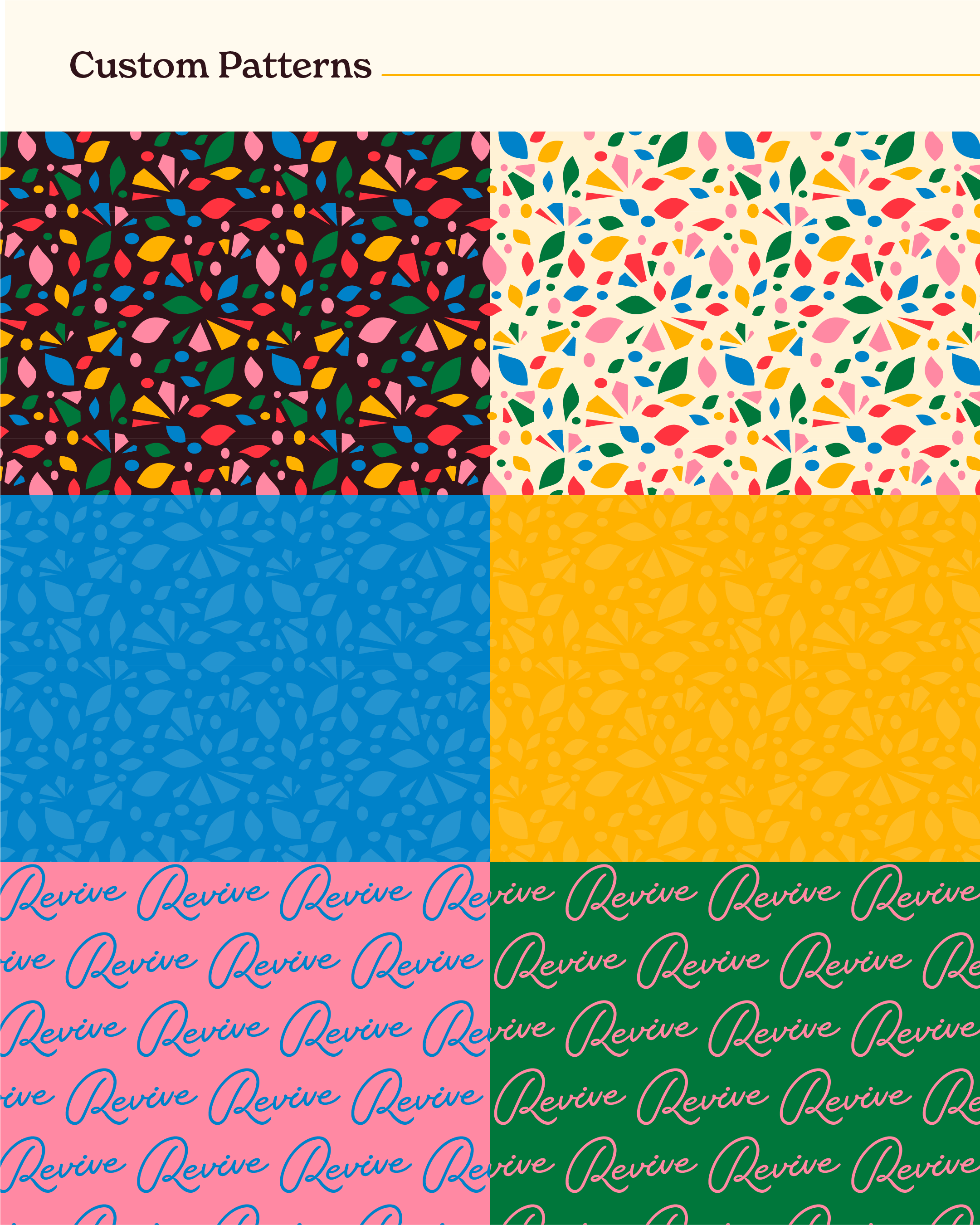
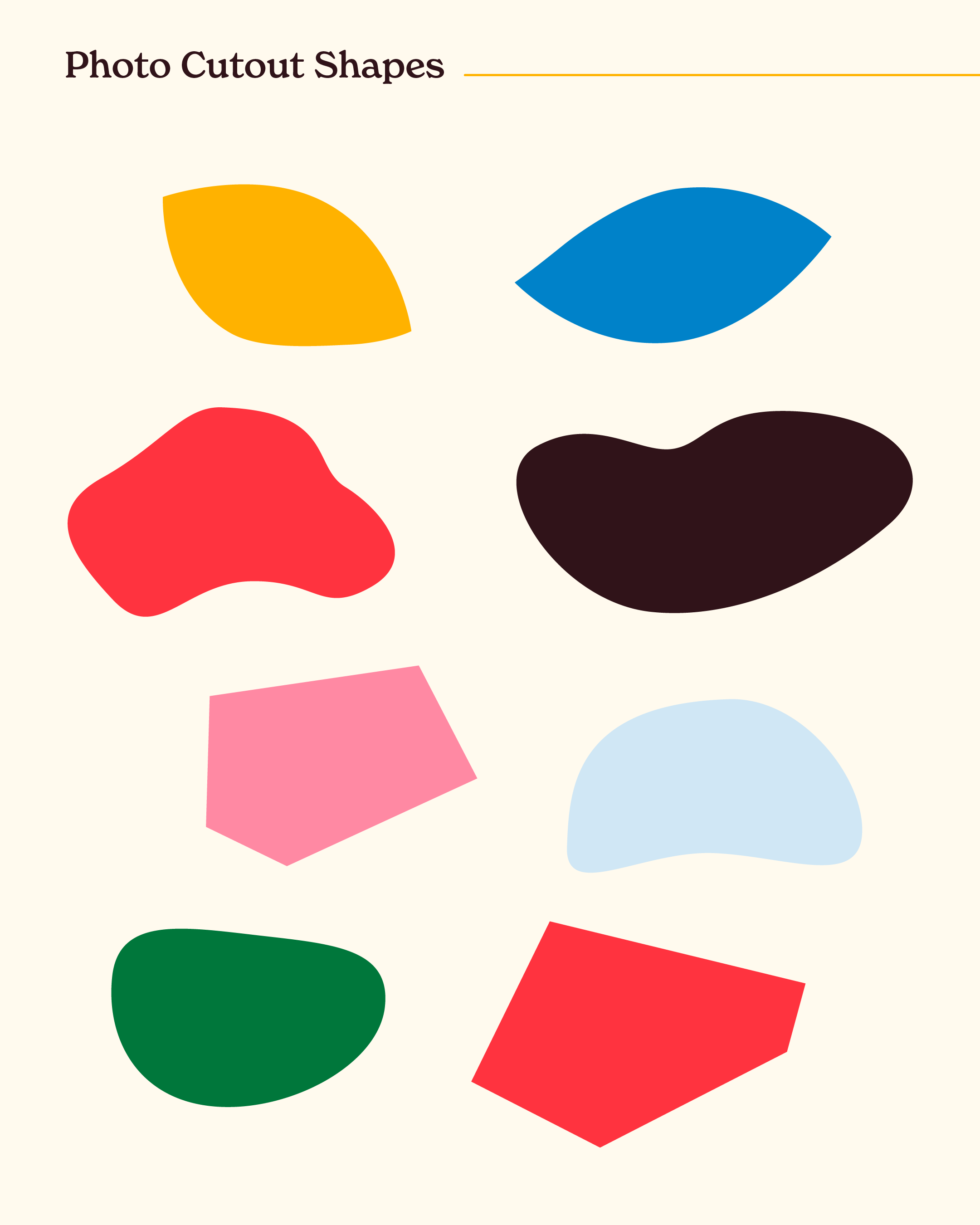
The Revive team described themselves as the “Swiss Army knife of churches” and so the logo needed to fit that multipurpose vibe. We landed on a colorful, earthy and full of love logo design. It’s got the offshoots of seeds and growth on the left and this sunrise sketch on the right to symbolize new life and fresh beginnings.
“You and the team delivered us something that feels just right!”
KEEP CORE DESIGN PRINCIPLES, REGARDLESS OF CONTEXT
Great church logo designs and brand inspiration come directly from the heart of the church members themselves. They’re the clients and we’re here to cook up the order just the way they dream it. That’s the thing about a good recipe of key design ingredients - it will work no matter what kitchen, or country, you’re in.