
Building a Ministry Brand Family: Jersey Church
Project Client: Jersey Church || @jerseychurch
Project Type: Main Church Logo, Youth Ministry Logo & Kids Ministry Logo
What happens when Silicon Valley meets the Heartland? Hello Jersey Church! They needed a church brand identity that could tell the story of where they came from while representing the rapidly changing community around them.
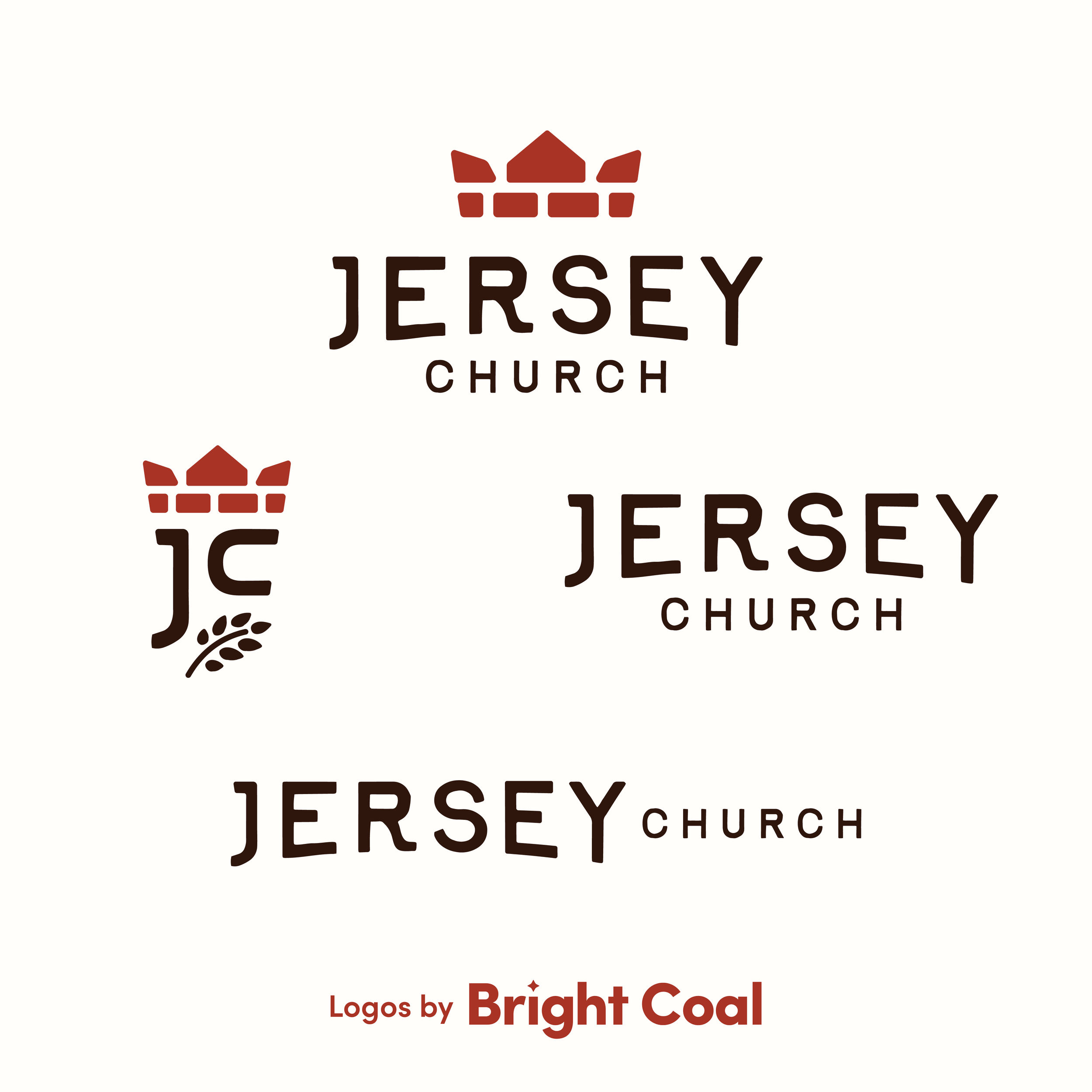
Jersey Church began in the 80s in the middle of Ohio cornfields. This area has since transformed from a predominantly blue-collar farmland community into a more modern city with things like Google, Amazon, Meta, and Intel building around the church. Jersey Church needed branding to bridge those two worlds.
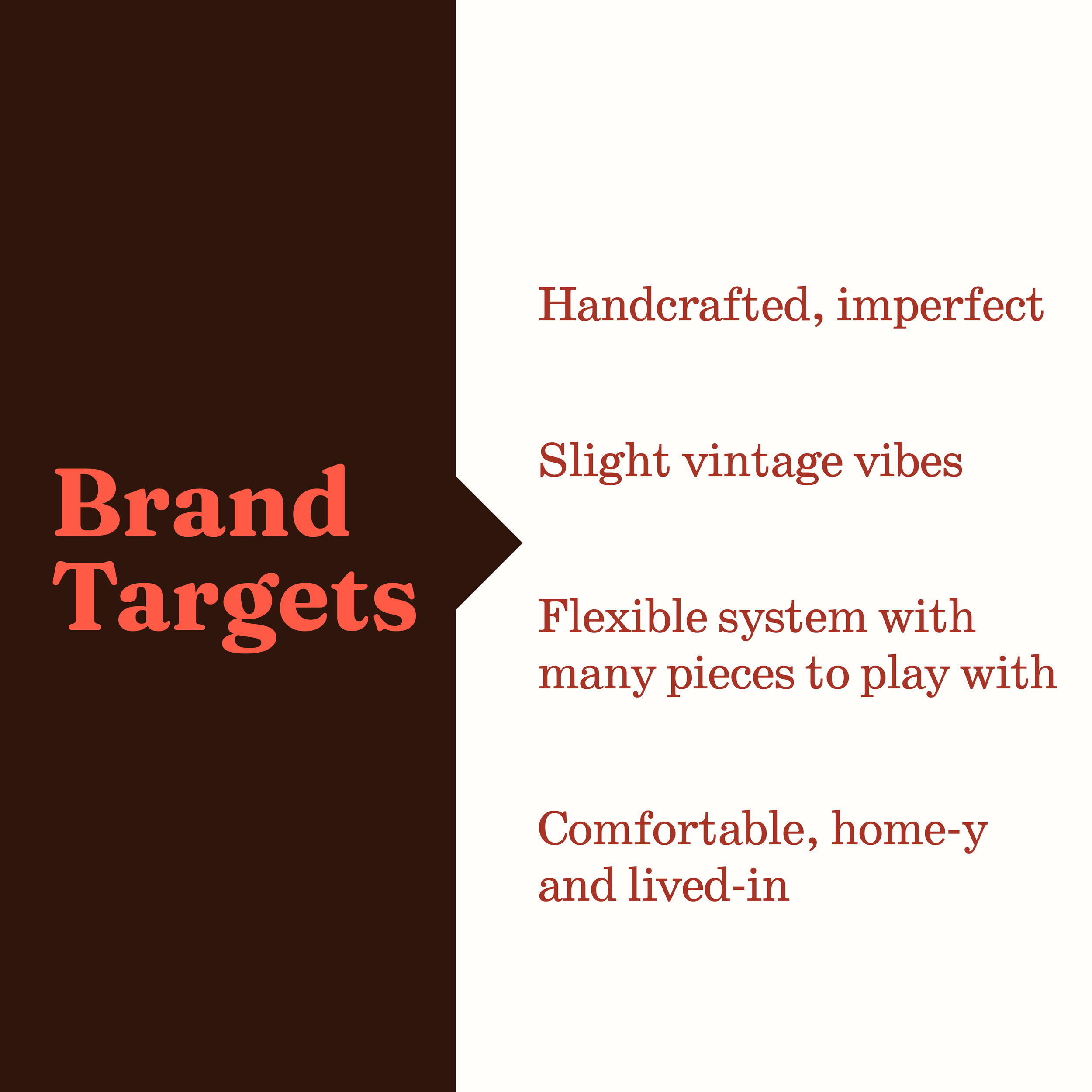
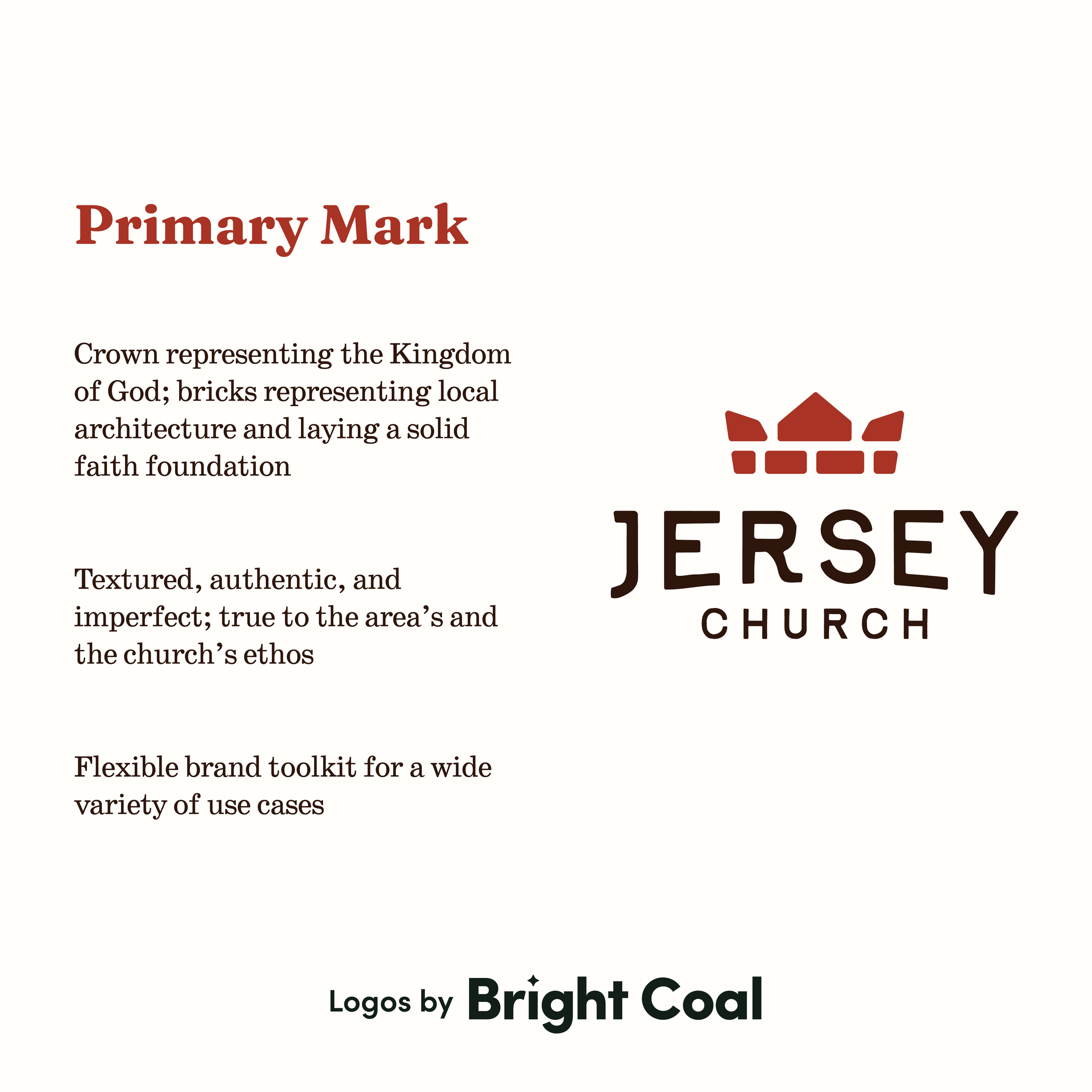
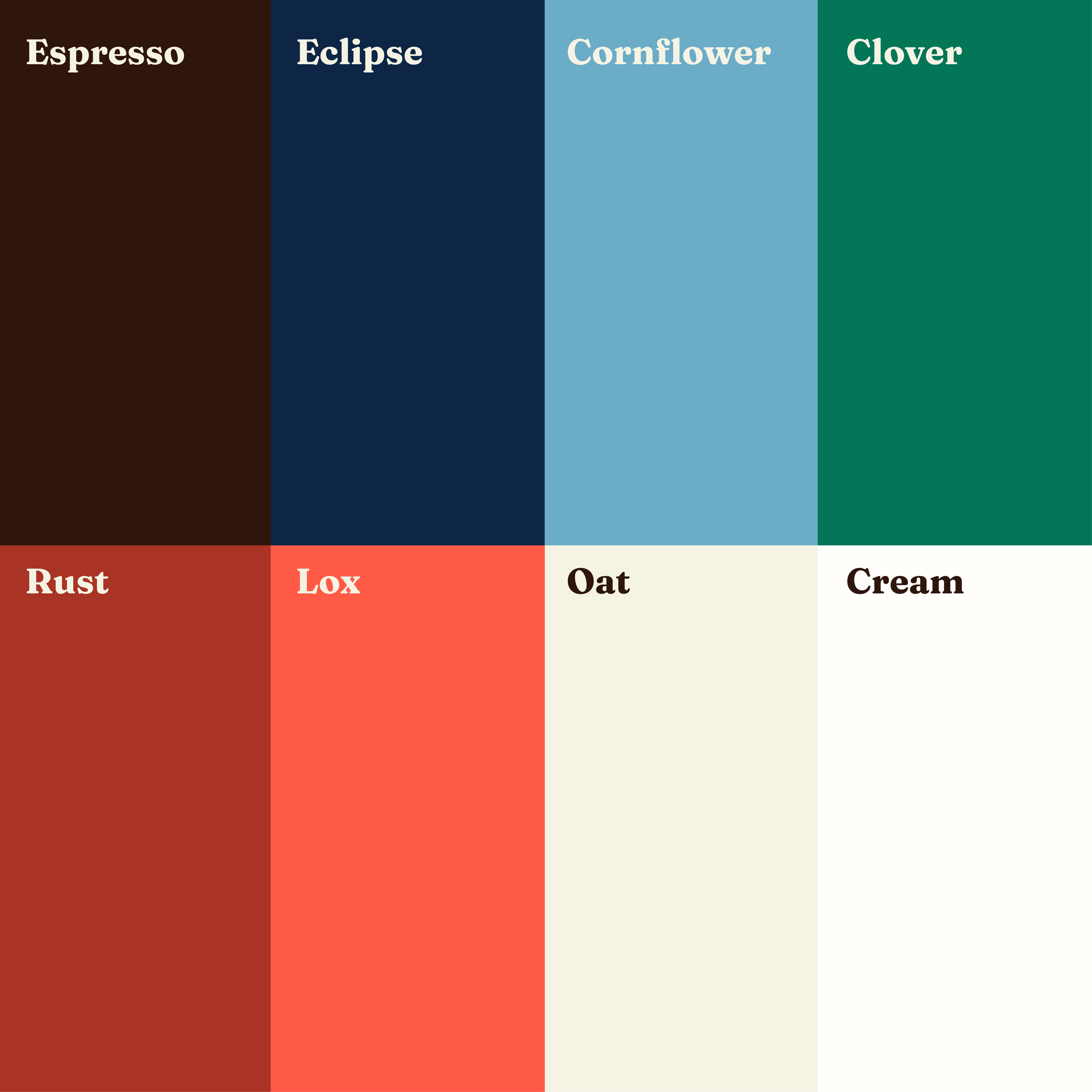
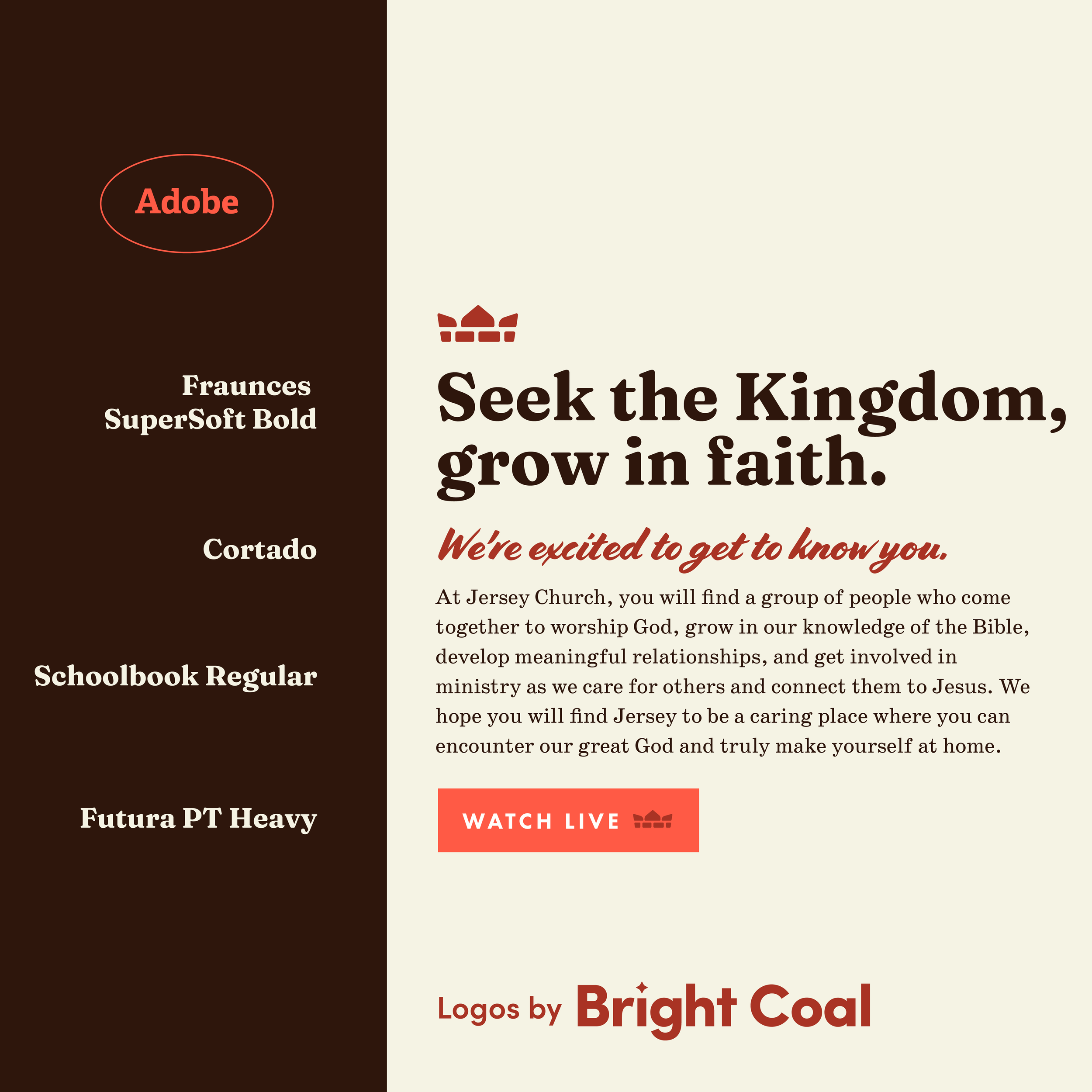
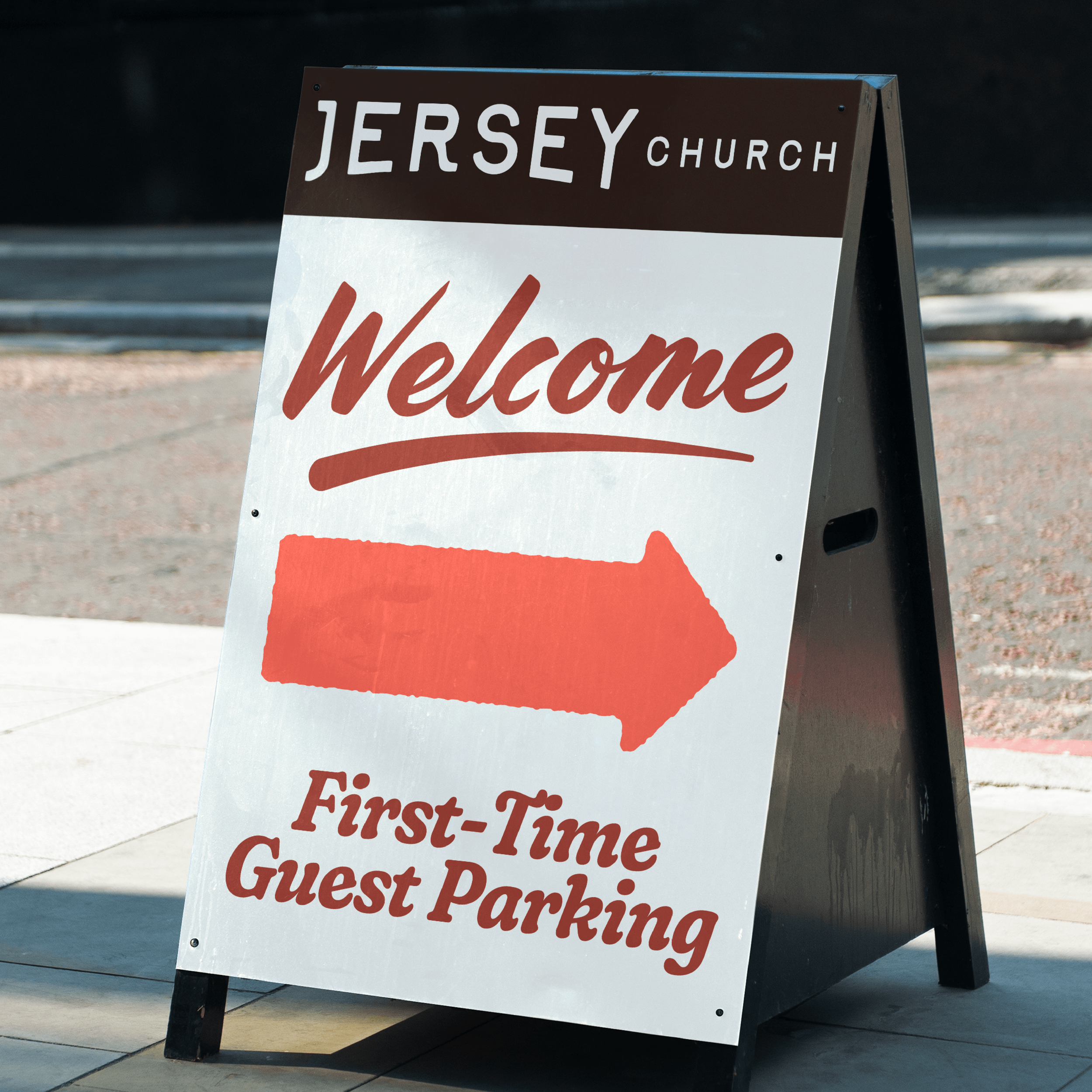
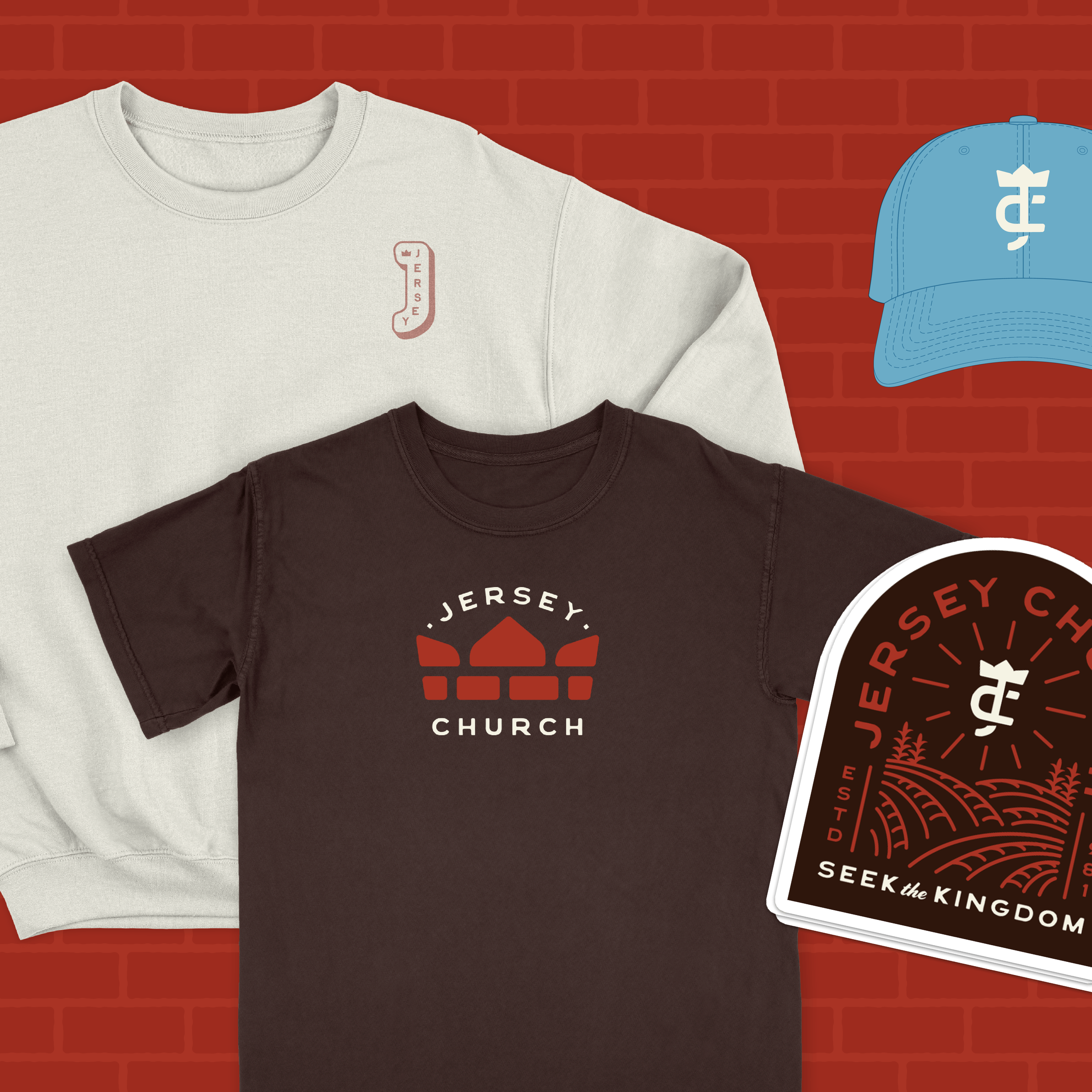
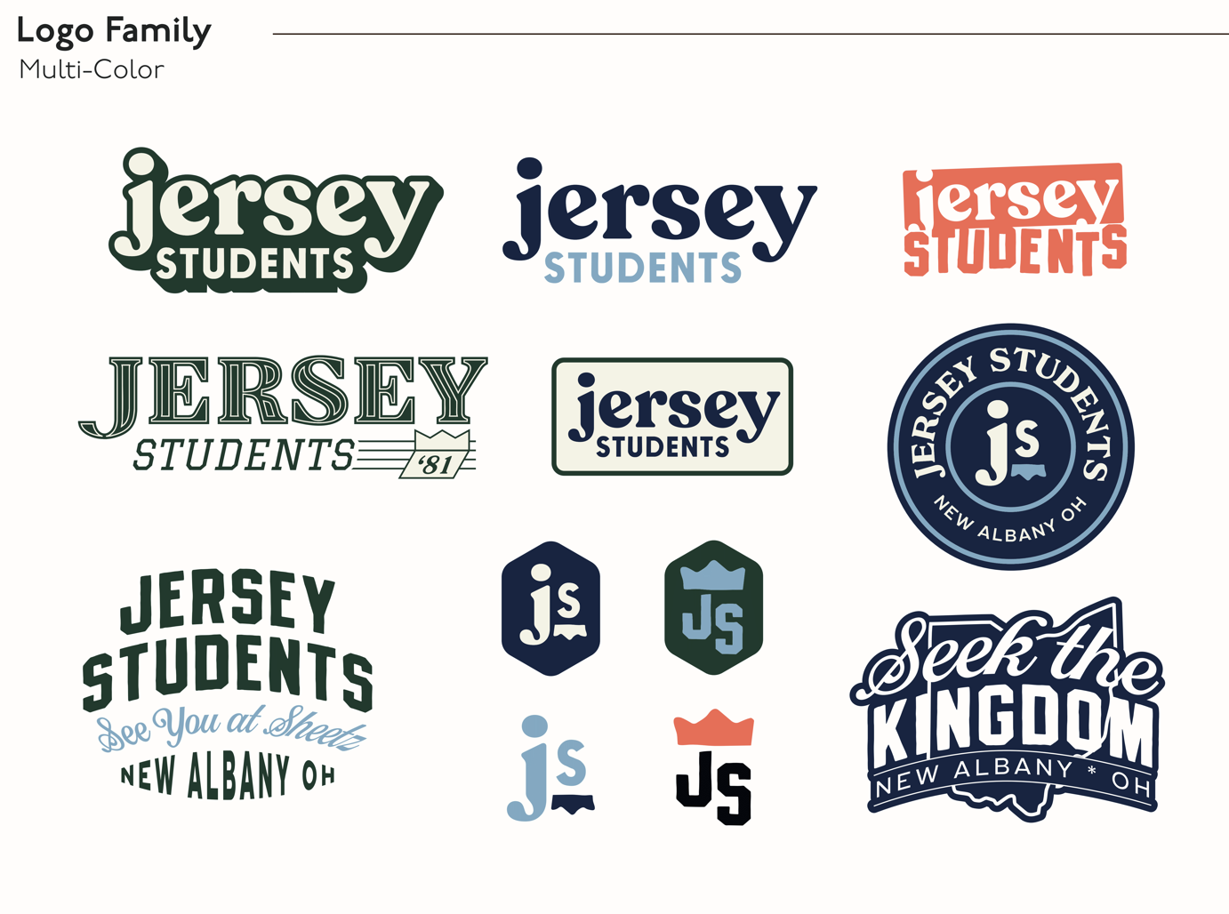
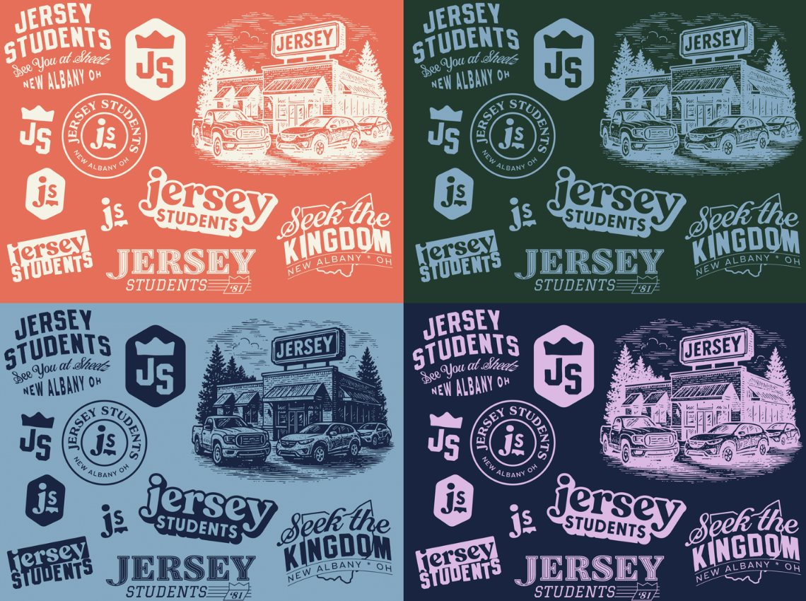
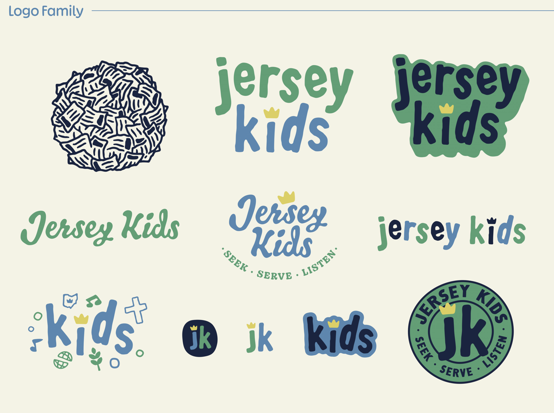
Their church logo design inspiration leaned slightly vintage and handcrafted, incorporating texture, muted earth tones, and a lived-in warmth. The crown represents Christ as King, while a subtle brick pattern symbolizes a solid faith built on the Word.
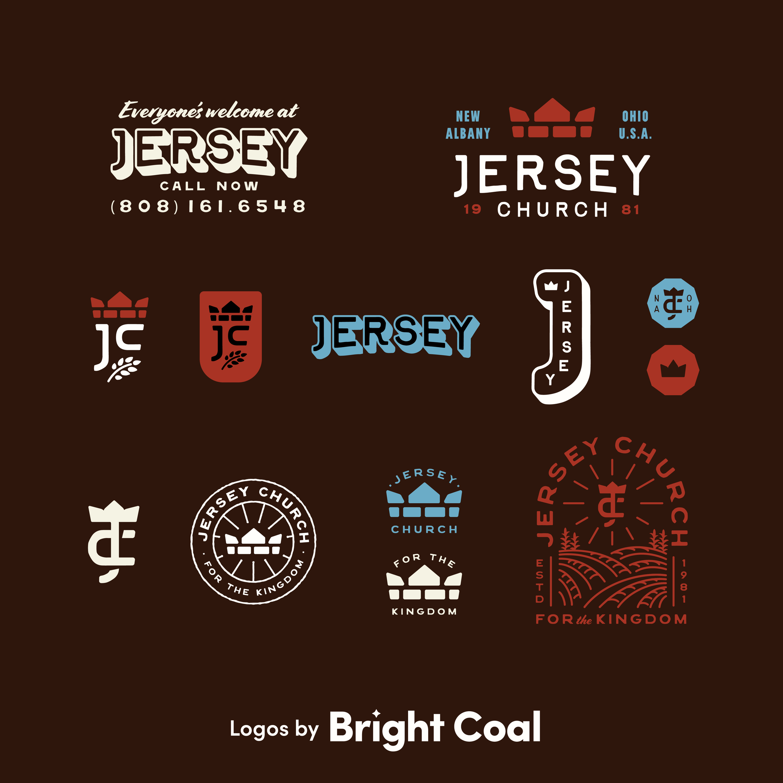
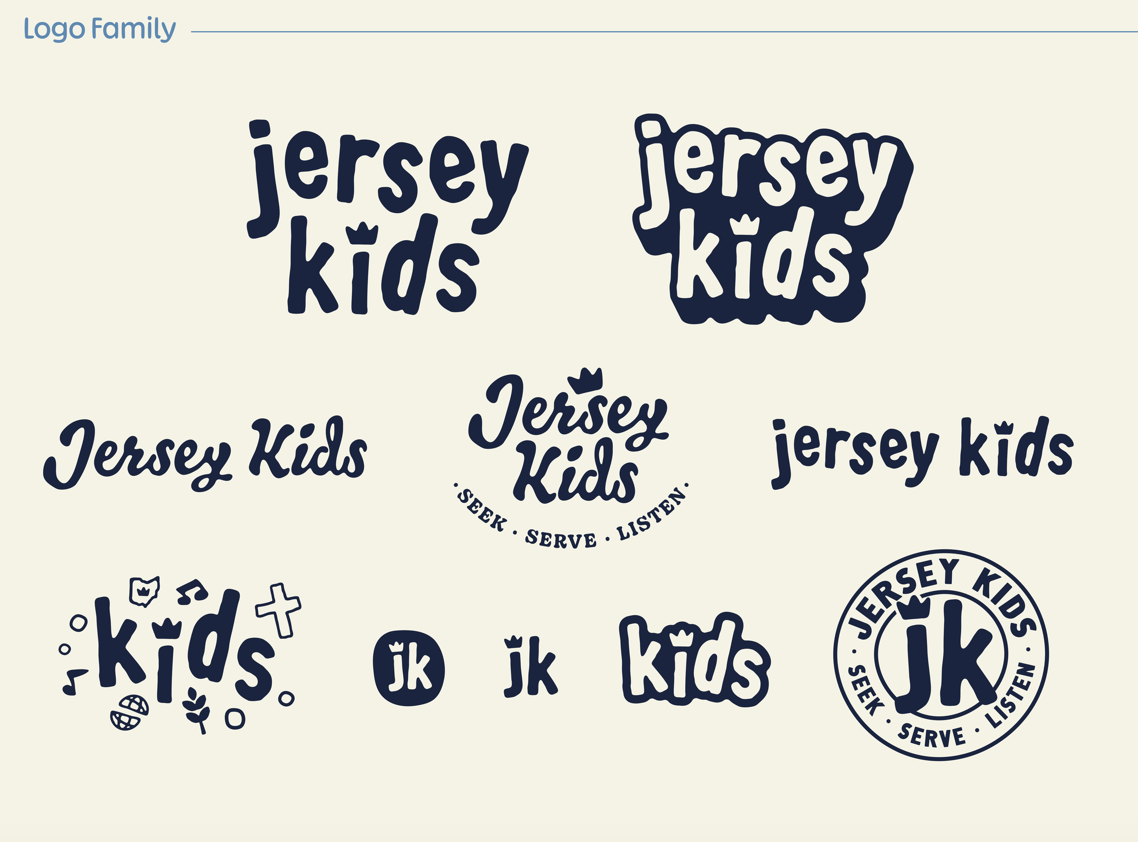
The finished church logo and brand system is flexible enough to work across everything from Sunday services to youth ministry branding. We were thrilled to help craft their student ministry and children’s ministry logo kits, as well.
“With a new mission and vision at the church, we were excited to see it reflected in our logo and branding!”
SMALL SURPRISE:
Creating a new church branding system should feel fun. We couldn’t resist presenting a completely ridiculous cornfield logo concept based off their roots. Obviously this wasn’t final direction, but it is a reminder that great church branding doesn’t have to start with a room full of serious faces and perfectly formed ideas. Sometimes the best creative conversations happen when everyone feels free to laugh, explore the unexpected, and throw a few wild ideas on the table. If we can help your church get a little corny, let’s hop on a call.